back to art styles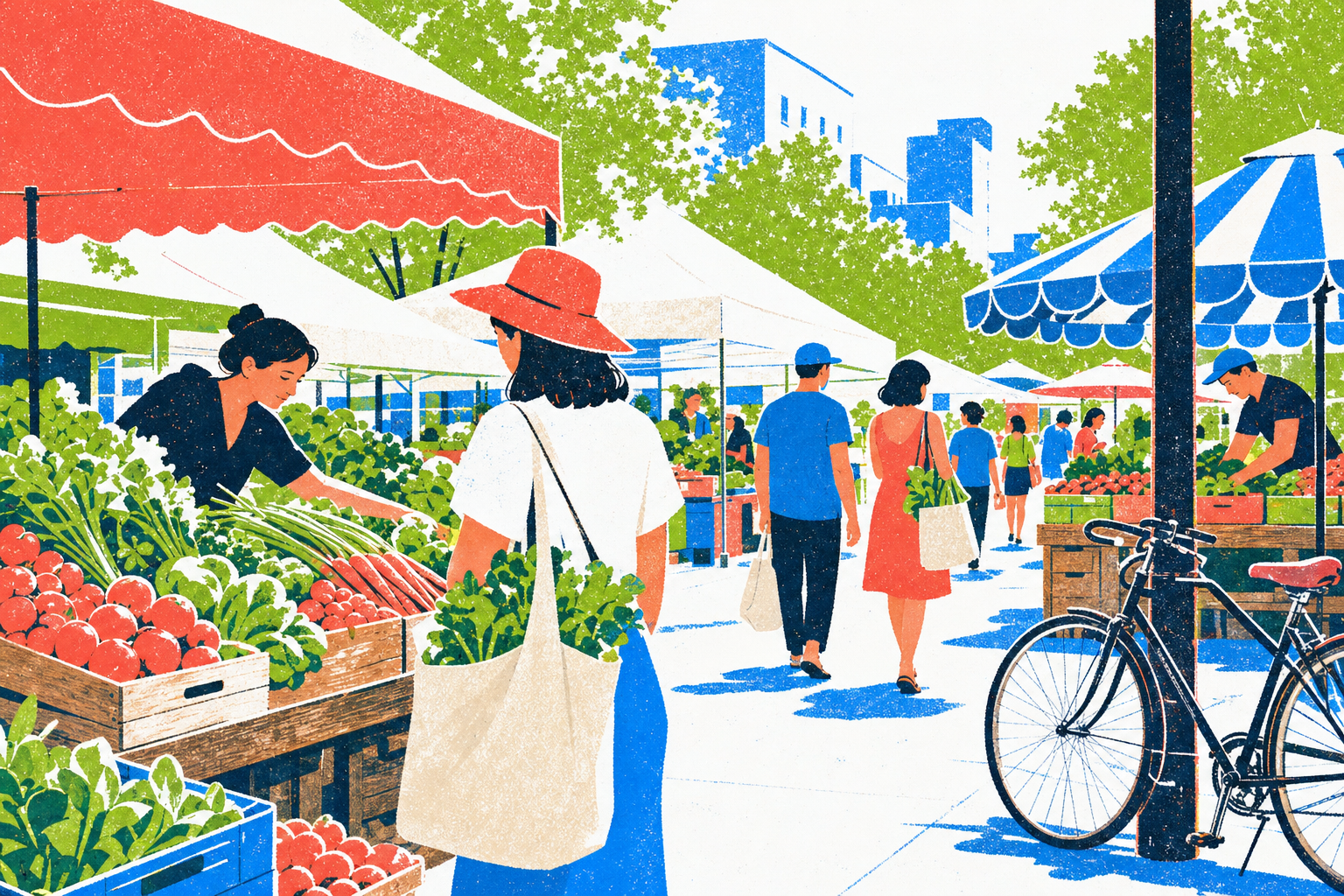
Art lane
Riso Poster Illustration
An engine-agnostic style recipe: a wide hero, proof shots across subjects, and a portable prompt.
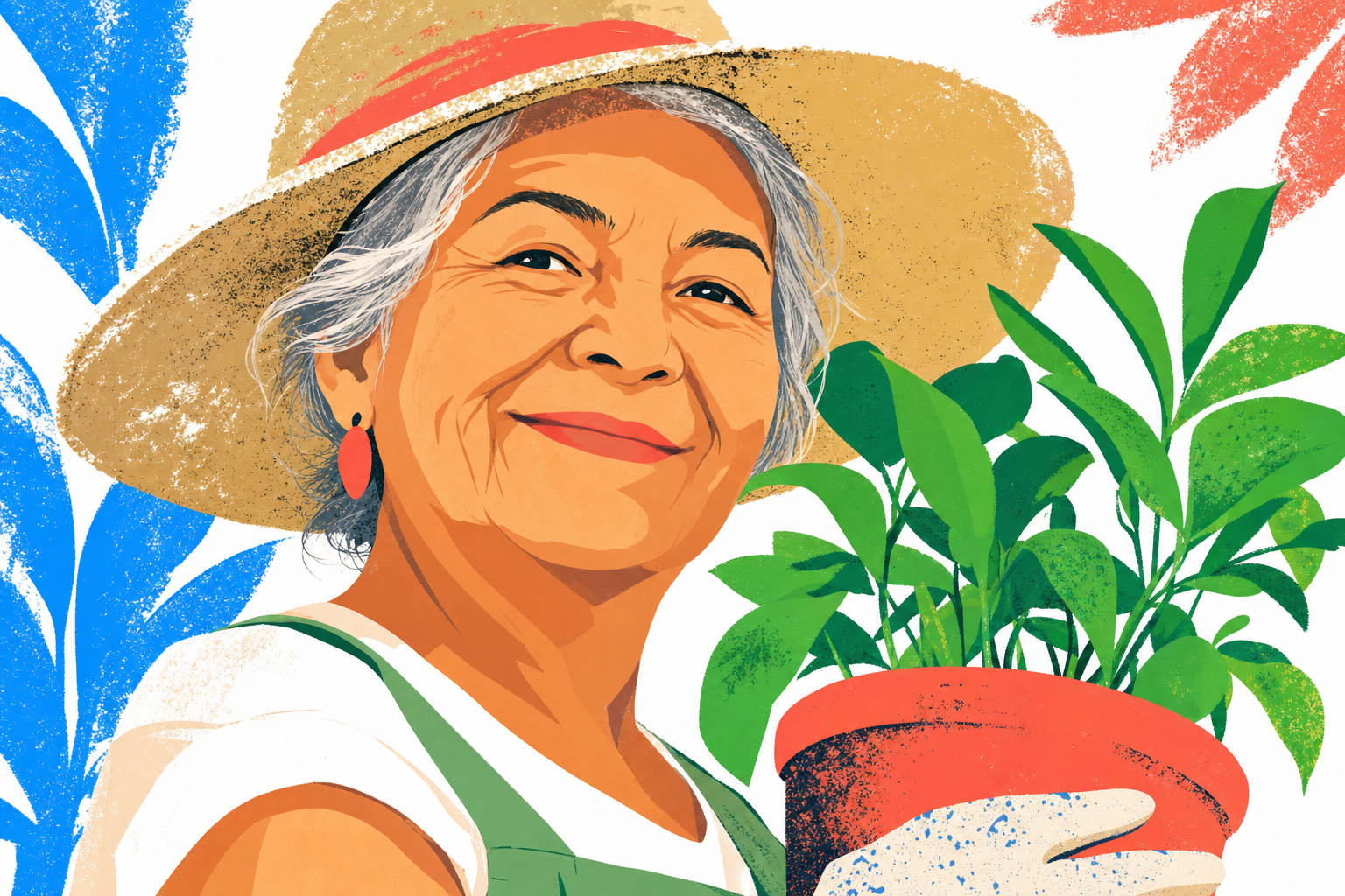
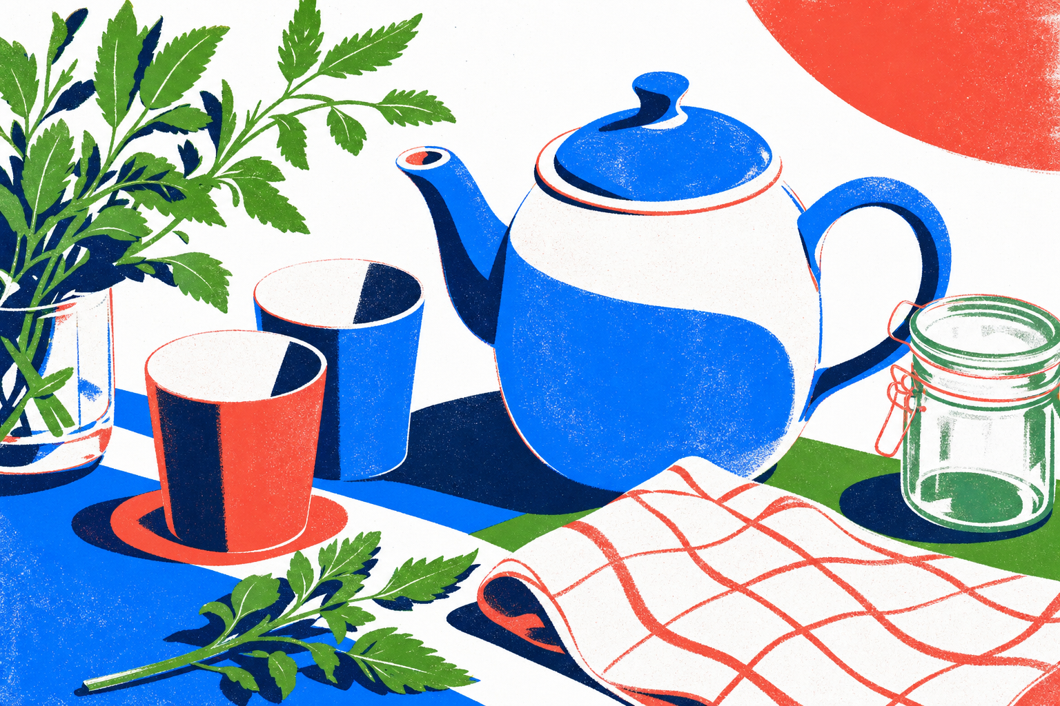
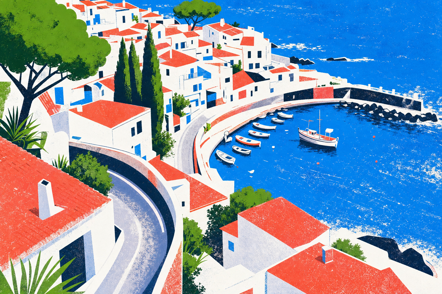
1 hero · 3 proofs
Prompt template
Bright editorial poster illustration of {subject}. Bold flat vector color shapes with crisp clean edges and confident graphic-design composition; simplified, decisive silhouettes with strong figure-ground separation. A restrained high-chroma palette of three highlighter accents (electric sky-blue, fresh leaf-green, hot coral) placed sparingly against generous pure-white negative space; flat shading with no soft gradients on the forms. Layer a subtle silkscreen / risograph print texture across the whole frame: fine paper grain, gentle ink misregistration, and a faint halftone tooth, as if pulled on a hand press. Clean and bright, never muddy or washed-out. Full-frame, style-representative composition. NO text, NO letters, NO logos.Slot recipes
hero — A full-bleed scene of {subject} at confident poster scale, the main forms reading instantly as bold flat shapes; keep one open region of pure-white sky or ground for overlay copy. Accents used like highlighter strokes on the few most important shapes.
feature — A tighter editorial vignette of {subject} — fewer elements, larger shapes, one dominant accent and two supporting ones, lots of white around the subject.
spot — A single small object or figure as {subject}, centered, maximum silhouette clarity, two accents at most, heavy print grain.
editorial-illustrationscreenprintrisographflat-graphicposter
Credits · in the lineage of
- Mid-century silkscreen poster illustrationTraditionFlat bold color shapes, limited spot-ink palettes, and confident graphic composition.
- Risograph printmakingmediumFluorescent spot inks, paper grain, and deliberate misregistration as visible texture.
- Contemporary editorial illustrationTraditionSimplified decisive silhouettes and figure-ground clarity used in modern magazine and poster illustration.
A generated style is an aggregate of many influences — credit is given to the artists and traditions it draws on, not a claim of authorship.
images by gpt-image-2
Do
- · Treat any subject — a face, a city, a teapot, a festival — with the same flat editorial technique.
- · Keep three accents maximum and let pure white carry most of the frame.
- · Use the silkscreen grain and slight misregistration as the through-line texture.
- · Read the forms as bold, decisive shapes before any detail.
Don't
- · Don't add soft gradients, glossy 3D, or photographic lighting.
- · Don't let the palette go muddy, grey, or pastel-washed.
- · Don't crowd the frame — negative space is part of the technique.
- · Don't render the style as one fixed subject; it dresses whatever it is given.
try it
remix with this style
Apply Riso Poster Illustration to any UI language and swap the palette — the preview takes this style's hero image.
Needs a Published language and palette to remix.