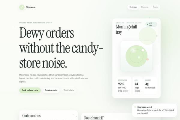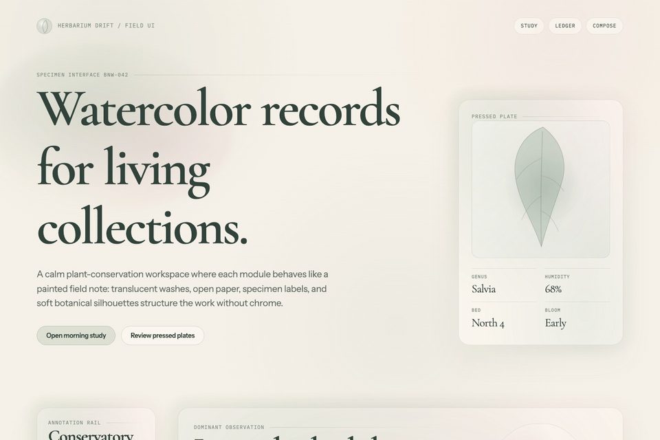
Lychee Soda Editorial Minimalism
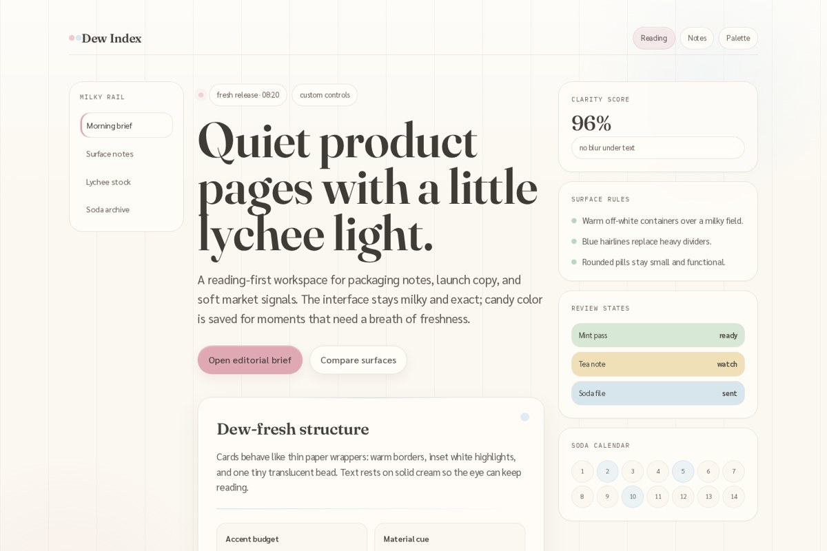
Lychee Soda Editorial Minimalism is a quiet reading-first Katagami language for dew-fresh product and editorial interfaces. It treats the page like a milky sheet of Japanese stationery: w...
lychee-sodamilky-whitejapanese-minimalism