back to art styles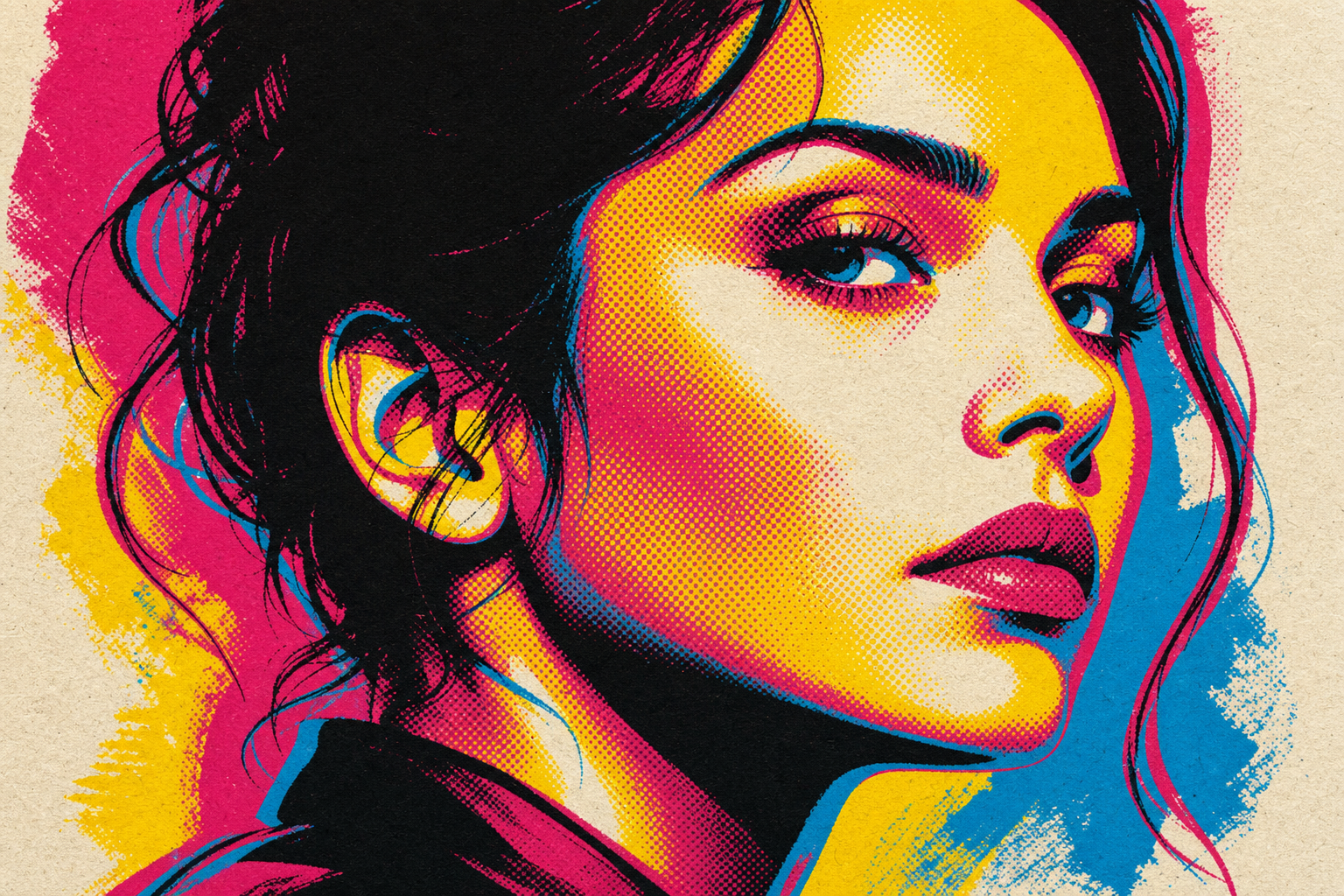
Art lane
Serigraph
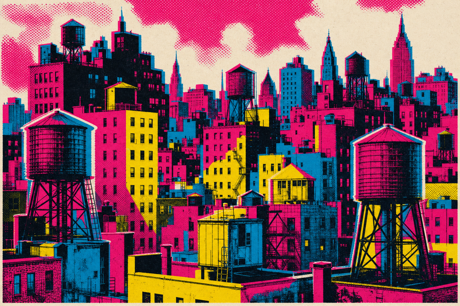
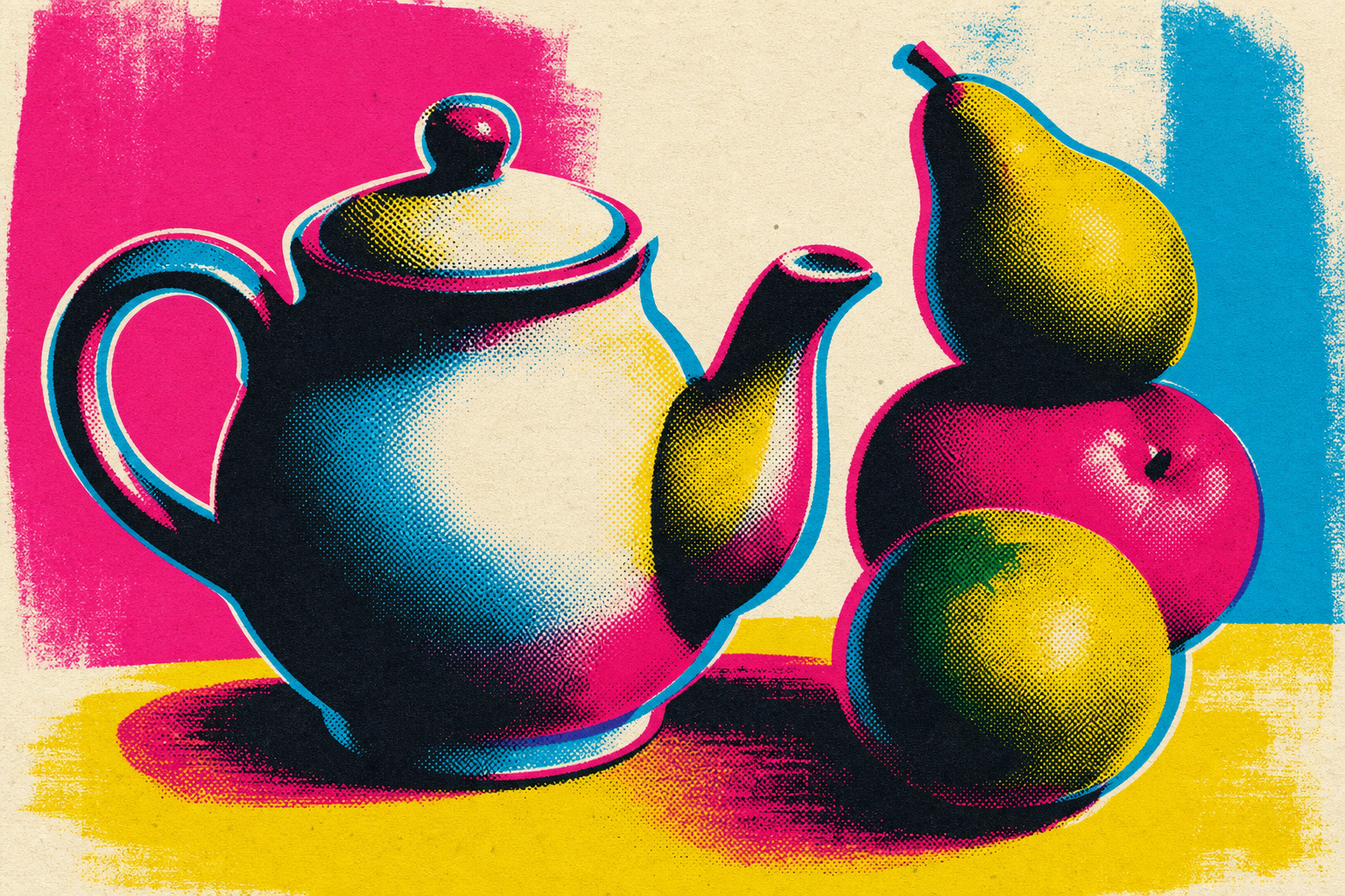
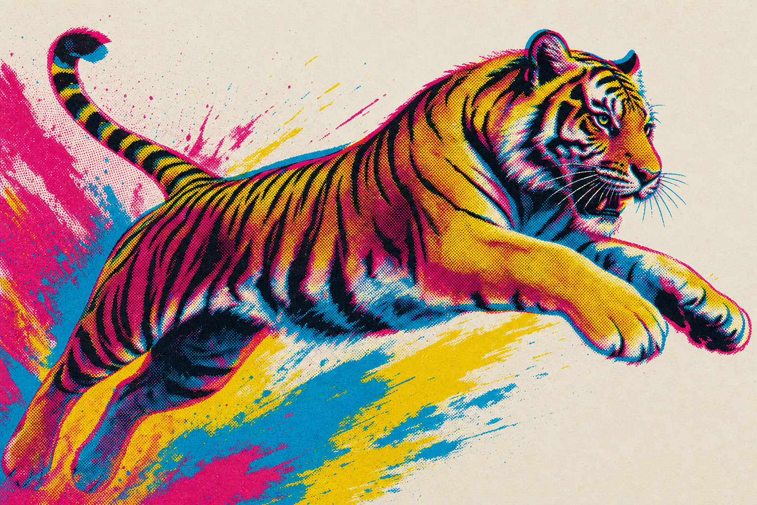
An engine-agnostic style recipe: a wide hero, proof shots across subjects, and a portable prompt.
1 hero · 3 proofs
Prompt template
A hand-pulled silkscreen print of {subject}. Built from 3 to 4 solid flat spot inks with NO gradients, pulled one screen at a time onto warm off-white cotton paper with visible paper tooth and fibre. Deliberate misregistration: each colour layer is offset by a few millimetres so a thin chromatic halo shifts away from the bold key line, and where two inks overlap they overprint into a translucent third hue. Mid-tones are built from coarse, visibly enlarged halftone dot screens rather than smooth shading. Crisp posterised flat shapes, high contrast, confident outlines. Colours drawn from {palette}, printed as flat opaque inks on bone-white paper. Full-frame screenprint poster aesthetic. NO text, NO letters, NO logos.Slot recipes
hero — A single bold subject or burst composition with one ink layer deliberately mis-shifted for a chromatic halo; leave one generous quiet zone of bare paper for an overlaid headline.
feature — A medium subject rendered in 3 flat inks with halftone mid-tones; tight crop, full bleed of paper tooth.
avatar — A bust or single object posterised to 2-3 flat inks with a crisp key line and a small misregistration halo; square, centred.
empty-state — A small lonely object in two flat inks on lots of bare paper, a few stray halftone dots scattered around it.
illustration — A layered scene of overlapping shapes where overprint mixing creates extra hues; coarse screens throughout.
silkscreenserigraphspot-colourmisregistrationhalftone
Credits · in the lineage of
- Screenprinting / serigraphy traditionTraditionHand-pulled flat spot-colour ink on paper, one screen per colour.
- Pop ArtMovementPosterised flat colour, bold outlines, consumer-culture brightness.
- Andy WarholArtistSilkscreen spot-colour portraits and deliberate off-register layers.
- Risograph printingTraditionLimited bright spot inks, visible misregistration and overprint mixing.
A generated style is an aggregate of many influences — credit is given to the artists and traditions it draws on, not a claim of authorship.
images by gpt-image-2
Do
- · Keep inks flat and opaque; build all shading from coarse halftone dot screens, never gradients.
- · Offset one or two colour layers a few millimetres so a chromatic halo and overprint mixing are clearly visible.
- · Let the warm paper tooth show through in the quiet areas.
- · Hold shapes with a confident dark key line and posterise to a few values.
Don't
- · Do not use smooth gradients, soft airbrushed shading, or a glossy digital sheen.
- · Do not register the layers perfectly clean — the small misalignment is the point.
- · Do not mute or desaturate the inks into pastels.
- · Do not add text, lettering, or logos.
try it
remix with this style
Apply Serigraph to any UI language and swap the palette — the preview takes this style's hero image.
Needs a Published language and palette to remix.