accent#B13A2E
bg#FFFFFF
surface#F4F1EB
text#000000
muted#655B52
border#E4DED4
on accent#FFFFFF
success#2F6A53
warning#9A6A2C
Cicero is a quarterly field journal of applied silicon, and its interface is the issue itself.
Its pictures are drawn in Gravure.
Tokens, rules and the paired art style Gravure.
Each face set in this language's own words.
Cicero
Cicero
Cicero is a quarterly field journal of applied silicon, and its interface is the issue itself.
Cicero is a quarterly field journal of applied silicon, and its interface is the issue itself.
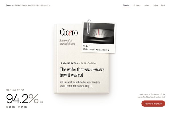
Cicero is a quarterly field journal of applied silicon, and its interface is the issue itself. Vol. 14, No. 3 lies square on a white presentation table, a perfect-bound journal with a laid-paper cover, and Fig. 1, a silver print of the Plant 4 test wafer, is paperclipped to its cover with one saw street marked in red grease pencil. Lift the clip and the print peels up toward you. Around the object everything is small, flat and precise: Manrope for reading and controls, Instrument Serif for the nameplate and headlines, Fragment Mono only on data labels, one big light number, and one oxblood for the answer and the action.
A revision of Cicero (generation 2), rebuilt the Inspora way from the approved elevated specimen. It keeps the field journal of applied silicon, the Instrument Serif nameplate with its oxblood e, Manrope, one oxblood accent, the figure plate and the Plant 4 wafer, and drops IBM Plex Mono, uppercase microtype everywhere, the rounded sheet and hairline rules, the fake halftone with crop ticks and leader line, and the cream ground.
Calm product-page density: one object and a short headline per view, 160 to 168px between sections on desktop and 112 to 120px on phones, 52px controls, table rows parted by 15 to 16px padding, and prose held under about 60 characters.
Phones (390px) stack to one column, put the issue above the headline at about 70% of the width, hide non-essential nav links and table columns, and keep one action. Tablets (768 to 1100px) stack the ledger and move the margin rail under the reading column. Ultra-wide caps and centres the content; only the landing hero image spans the full width.
gravure
Two kinds of image. The prints inside the journal (Fig. 1, Fig. 2) follow Gravure's documentary technology photography: strong directional light, deep shadow, warm-black tonality, printed here as fibre-paper silver prints rather than halftone, with the red limited to one grease-pencil mark drawn in the page. The table is a plain high-key studio photograph: an empty pale paper surface in soft window light from the top left, used as the landing hero with the live issue lying on it.
One full-bleed hero per landing: the empty table photograph, with the live CSS issue lying on it beside the headline. Figures inside pages are silver prints with a typed caption on their own bottom margin, never a separate caption rule. From Gravure keep the subject matter, the directional light and the warm ink-black tonality; leave out its halftone rosette, crop-mark brackets, hairline rules and leader lines, and move its oxblood from the rule to one grease-pencil mark on the print. No text or numbers inside the photographs.
# Cicero

## Philosophy

Cicero is a quarterly field journal of applied silicon, and its interface is the issue itself. Vol. 14, No. 3 lies square on a white presentation table, a perfect-bound journal with a laid-paper cover, and Fig. 1, a silver print of the Plant 4 test wafer, is paperclipped to its cover with one saw street marked in red grease pencil. Lift the clip and the print peels up toward you. Around the object everything is small, flat and precise: Manrope for reading and controls, Instrument Serif for the nameplate and headlines, Fragment Mono only on data labels, one big light number, and one oxblood for the answer and the action.

### Values

- One object is the interface: the issue with Fig. 1 clipped to its cover, rendered as a real thing and the only raised or lit element in a view.
- Every claim arrives with its figure. Prints, plots and tables are numbered and captioned where they sit.
- Depth is a verb. The print peels only while you lift the clip; a loose print lifts only while you pick it up.
- One oxblood that means something: the nameplate e, the current tab, the grease-pencil street and the one action.
- Small quiet type around one big light element: a 104px Manrope Light figure or a serif headline, never both loud.
- The journal's own words are the content: Vol. 14, No. 3, Fig. 1, R9, the close-line, a note to the desk.

### Anti-Values

- Rounded paper sheets, hairline rules and a masthead rule in place of space and value.
- Fake halftone, crop ticks, leader lines and red dots as ornament.
- Uppercase mono microtype on everything; mono is for data.
- Warm cream or beige page washes and radial gradients on the ground.
- A second accent, glow, glass, or a filled red block for a risky action.
- Cards, stat bands of big numbers, and a primary plus secondary button pair.

### Visual Character

- The issue lies whole on the white table, once per page, at about 400 to 620px wide beside the headline on the landing and centred with small UI in the corners on the embodiment: laid-paper cover #FBF8F1, a hinge score by the spine, four page-edge tones and a three-layer warm shadow.
- Fig. 1 is a glossy fibre-paper print (#FCFBF7) turned 2.4 degrees under a steel Gem clip, with a window-light band across the photograph, a typed Fragment Mono caption on its bottom margin and one waxy oxblood stroke on a saw street.
- Oxblood #B13A2E is spent only on the nameplate e, the current nav item, the grease-pencil marks, the action pill and the latest run.
- Nothing is boxed: lists, tables, forms and the contents sit straight on #FFFFFF, parted by space; wells are square #F4F1EB and pills are round.
- Type is small and quiet around one big element: 17px Manrope, 14.5px captions, Instrument Serif at 28 to 64px, and one 104px Manrope Light number with its % dimmed.

### Lineage

> A revision of Cicero (generation 2), rebuilt the Inspora way from the approved elevated specimen. It keeps the field journal of applied silicon, the Instrument Serif nameplate with its oxblood e, Manrope, one oxblood accent, the figure plate and the Plant 4 wafer, and drops IBM Plex Mono, uppercase microtype everywhere, the rounded sheet and hairline rules, the fake halftone with crop ticks and leader line, and the cream ground.

## Tokens

### Colors

| Name | Value |
|------|-------|
| bg | `#FFFFFF` |
| surface | `#F4F1EB` |
| text | `#000000` |
| muted | `#655B52` |
| border | `#E4DED4` |
| accent | `#B13A2E` |
| on_accent | `#FFFFFF` |
| success | `#2F6A53` |
| warning | `#9A6A2C` |
| error | `#A8392F` |
| info | `#3F6178` |
| cover | `#FBF8F1` |
| fibre | `#FCFBF7` |
| silver | `#12100F` |
| shade | `#46301C` |
| light | `#FFFFFF` |
| steel_hi | `#F4F5F6` |
| steel | `#A3A6AC` |
| steel_lo | `#4B4E54` |
| dim | `#908982` |
| ink_soft | `#1C1917` |

### Derived

- **Dim**: color-mix(in srgb, var(--muted) 72%, var(--bg))
- **Ink Soft**: color-mix(in srgb, var(--text) 72%, var(--muted))
- **Page Block**: four page-edge tones mixed from cover and shade at 4, 6, 7, 12 and 17%
- **Note**: The eleven role colours are what a palette swap changes. cover, fibre, silver, shade, light and steel are the object's own materials and stay put; the grease-pencil street, the nameplate e and the current tab take var(--accent), so they recolour with the palette.

### Typography

- **Heading Font**: Instrument Serif
- **Body Font**: Manrope
- **Mono Font**: Fragment Mono
- **Heading Weight**: 400
- **Body Weight**: 400
- **Body Light Weight**: 300
- **Button Weight**: 600
- **Heading Transform**: none
- **Letter Spacing**: -0.02em on Instrument Serif display, -0.035em on the nameplate; -0.005em on body
- **Line Height**: 1.6
- **Base Size**: 17px
- **Scale**: ["14.5px","17px","21px","28px","40px","64px","104px"]
- **Roles**: {"display":"Instrument Serif 400: the nameplate with its oxblood italic e, headlines, the cover lines, table-of-contents titles and pull quotes","body":"Manrope 400 at 17px for reading, nav and every control; 300 for the one big light number; 500 for emphasis; 600 only on button labels","mono":"Fragment Mono 400 at 14.5px, only where a label names data: Fig. numbers, run ids, page folios and table heads"}
- **Object Type**: Type printed on the issue (nameplate, cover lines, the typed caption on the print) is sized in container units of the object, so it scales with the journal like real print.
- **Google Fonts Url**: https://fonts.googleapis.com/css2?family=Instrument+Serif:ital@0;1&family=Manrope:wght@300;400;500;600&family=Fragment+Mono&display=swap

### Radii

- **None**: 0px
- **Full**: 9999px

### Shadows

- **Print**: 0 .21cqi .38cqi shade 30% (contact) plus .86cqi 1.9cqi 2.59cqi -.86cqi shade 28% (ambient), both falling down and right
- **Issue**: four stacked page-edge tones, then 1.38cqi 2.14cqi .52cqi shade 34%, 2.41cqi 5.17cqi 7.93cqi -1.38cqi shade 30% and 5.17cqi 12.07cqi 17.24cqi -5.17cqi shade 16%
- **Overlay**: 0 2px 4px shade 12% plus 10px 26px 60px -16px shade 30%
- **Note**: One light from the top left. Every shadow is two or three layers tinted warm brown from the paper, never grey, and only real paper on the table casts one.

### Spacing

- **Base**: 8px
- **Scale**: ["4px","8px","16px","24px","32px","48px","64px","96px","160px"]

### Surfaces

- **Treatment**: one-object-on-a-white-presentation-table
- **Material**: The issue is the only material object: Cicero Vol. 14 No. 3, a perfect-bound journal with a laid-paper cover (tooth from SVG noise, laid and chain lines at 2%, a hinge score by the spine, a page block of four paper tones), and Fig. 1, a glossy fibre-paper silver print held to the cover by a steel Gem clip, with one saw street marked in red grease pencil. Everything else is flat.
- **Card Style**: No cards or panels. Content sits straight on the white table, grouped by space and an Instrument Serif title. A --surface tint appears only as an input well, a selected tab, a row hover or an open menu; an overlay is white on its two-layer shadow. At most one filled surface per view.
- **Table**: The page ground --bg is the presentation table. On the landing the hero image is the same table photographed empty in soft window light, with the live issue lying on it.

### Borders

- **Default Width**: 0
- **Style**: none
- **Character**: No borders, rules or outlines. Rows separate by space and by the value of their type; wells are the one tinted surface. The only lines are data (the close-line on a chart) and the oxblood underline under the current nav item and quiet links. Focus is a 2px oxblood outline at 2 to 3px offset.

### Motion

- **Duration**: 460ms
- **Easing**: cubic-bezier(.2,.9,.25,1.2)
- **Clip**: the clip rocks up on cubic-bezier(.3,1.4,.4,1) over 420ms while the print peels to rotateX(24deg) about its top edge over 500ms
- **Reveal**: 900ms cubic-bezier(.2,.7,.2,1), rising 24px, staggered 110ms
- **Philosophy**: Motion is a physical verb: lift the clip, pick up the print, count up from the close-line. The settled state is the default and renders with no JavaScript; an inline script adds .anim to <html> to gate start states, and prefers-reduced-motion skips all of it.

### Controls

- **Height**: 52px
- **Radius**: 0 for wells, 9999px for the action pill, tabs and switches
- **Wells**: --surface on the white table, no border

## Rules

### Composition

- Give a view at most one object moment: the issue with Fig. 1 clipped on, a loose print lying on the table, or a line drawing of the issue taken apart. Everything else in the view stays flat.
- Lay the issue square on the table with air on every side; only the print is turned. Never frame it in a card or put a panel or scrim over it.
- Order a page like a product page: the object and its headline, copy and one action beside it on the ground, then the reading, the ledger and the desk.
- Separate by space and value, never by boxes: lists, tables and forms sit straight on the table; a filled --surface appears only as a well, a selected tab, a hover or an open menu.
- Show the whole issue once per page; later views take another moment (a loose print, the anatomy drawing).
- One oxblood action per view; a second action is a quiet link with a grease-pencil underline.

### Hierarchy

- The object, one serif headline and one big light number are the only large things; ledes, labels and card copy stay at 14.5 to 21px.
- Instrument Serif 400 at -0.02em for headlines (40px, 64px on the landing hero), contents titles (28px) and pull quotes (28 to 40px).
- Manrope 400 at 17px for reading and controls, muted #655B52 for secondary words and ink for the lead phrase; 300 for the one 104px figure.
- Fragment Mono 400 at 14.5px only for data labels: Fig. numbers, run ids, folios, table heads.
- Status is a small round dot and a word, never a coloured field.

### Density

Calm product-page density: one object and a short headline per view, 160 to 168px between sections on desktop and 112 to 120px on phones, 52px controls, table rows parted by 15 to 16px padding, and prose held under about 60 characters.

### Signature Patterns

- The issue: Cicero Vol. 14 No. 3 as a CSS object (container units), laid-paper cover with tooth, hinge score and page block, three-layer warm shadow, lying square on the white table.
- Fig. 1 clipped on: a fibre-paper silver print turned 2.4 degrees, held by a two-layer SVG Gem clip (back loop under the cover, front loop over the print), with a typed caption on its bottom margin.
- Lift the clip: hovering or focusing the print (or tapping it) rocks the clip up with rotateX(48deg) and peels the print to rotateX(24deg) about its top edge, while its shadow slides down and right and softens.
- The grease-pencil mark: one waxy oxblood stroke drawn with an SVG displacement filter over a real feature of the photograph (a saw street, one ringed die).
- Pick up the print: a loose print at -1.8 degrees straightens, lifts and grows its shadow on a spring when pointed at.
- The one big light number: Manrope Light at 104px with the % dimmed, counting up from the close-line (88.0) to the run it reports.

## Layout

### Grid

- **Type**: object-first product page
- **Max Width**: 1240px content (1360px from 1800px wide); the landing hero content runs to 1400px, 1560px on ultra-wide
- **Gutter**: 40px desktop, 28px tablet, 16px phone
- **Column Behavior**: Two-column rows on minmax(0,5fr) minmax(0,6fr) or minmax(0,4fr) minmax(0,8fr); the reading view adds a minmax(0,3fr) margin rail; three-column method rows. Every track is minmax(0,1fr)-style and every grid child min-width:0.

### Whitespace

- **Section Gap**: 160 to 168px desktop, 112 to 120px phone
- **Card Gap**: no cards; 16 to 22px row padding, 48 to 96px between groups
- **Content Padding**: content sits on the table, aligned to the grid edge; overlays pad 36px
- **Approach**: The table is empty space by design: the issue needs air on every side, and each view carries one focal point.

### Density

- **Default**: comfortable
- **Comfortable**: {"button_height":"52px","input_height":"52px","row_height":"about 54px table rows, 22px contents padding"}

### Responsive

Phones (390px) stack to one column, put the issue above the headline at about 70% of the width, hide non-essential nav links and table columns, and keep one action. Tablets (768 to 1100px) stack the ledger and move the margin rail under the reading column. Ultra-wide caps and centres the content; only the landing hero image spans the full width.

### Breakpoints

- **Mobile**: 390px
- **Phone Max**: 640px
- **Tablet**: 900 to 1100px
- **Desktop**: 1280px
- **Wide**: 1440px
- **Ultrawide**: 1800px and 2560px

## Guidance

### Do

- Put the issue, with Fig. 1 clipped to its cover, at the centre of the first view on the white table with air all round.
- Cite by figure: every claim points to a numbered print, plot or table captioned where it sits.
- Spend oxblood on the nameplate e, the current tab, grease-pencil marks and one action per view.
- Separate rows by space and value, and keep at most one filled surface in a view.
- Keep mono for data labels only, and set everything else in small Manrope in sentence case.
- Style every control explicitly: square 52px wells, a round oxblood pill, round switches, drawn chevrons and ticks, an oxblood focus ring.

### Don't

- Don't draw rules, hairlines, borders or a rounded sheet around content.
- Don't use fake halftone, crop ticks, leader lines or red dots as ornament.
- Don't set labels in uppercase mono unless they name data.
- Don't put a cream wash, gradient or grain on the page ground.
- Don't lift more than one thing at a time or show the whole issue twice on a page.
- Don't pair a secondary button with the oxblood one; use a quiet link.
- Don't put emoji or symbol glyphs on buttons.

### Accessibility

WCAG AA on the white table: ink #000000 is 21:1, muted #655B52 is 6.6:1 (5.9:1 on the #F4F1EB well, 6.2:1 on the cover), oxblood #B13A2E is 6.0:1 and white on oxblood is 6.0:1; the dimmed % (#908982) is 3.5:1 and only used on the 104px figure. Semantic colours clear 4.7:1 on white. Focus is a visible 2px oxblood outline on every control; the print and loose prints are focusable and lift on focus, and tap toggles them. prefers-reduced-motion skips the reveals, the count-up and the clip-on entrance; the verbs still change state.

## Imagery Direction

### Pairs With

gravure

### Summary

Two kinds of image. The prints inside the journal (Fig. 1, Fig. 2) follow Gravure's documentary technology photography: strong directional light, deep shadow, warm-black tonality, printed here as fibre-paper silver prints rather than halftone, with the red limited to one grease-pencil mark drawn in the page. The table is a plain high-key studio photograph: an empty pale paper surface in soft window light from the top left, used as the landing hero with the live issue lying on it.

### Subjects

- silicon wafers on inspection stages
- inspection sheets, tweezers and raking light
- saw streets and dies in close-up
- the empty presentation table in window light

### Usage

One full-bleed hero per landing: the empty table photograph, with the live CSS issue lying on it beside the headline. Figures inside pages are silver prints with a typed caption on their own bottom margin, never a separate caption rule. From Gravure keep the subject matter, the directional light and the warm ink-black tonality; leave out its halftone rosette, crop-mark brackets, hairline rules and leader lines, and move its oxblood from the rule to one grease-pencil mark on the print. No text or numbers inside the photographs.
---
version: "alpha"
name: "Cicero"
description: "Cicero is a quarterly field journal of applied silicon, and its interface is the issue itself. Vol. 14, No. 3 lies square on a white presentation table, a perfect-bound journal with a laid-paper cover, and Fig. 1, a silver print of the P..."
colors:
  bg: "#FFFFFF"
  surface: "#F4F1EB"
  text: "#000000"
  muted: "#655B52"
  border: "#E4DED4"
  accent: "#B13A2E"
  on_accent: "#FFFFFF"
  success: "#2F6A53"
  warning: "#9A6A2C"
  error: "#A8392F"
  info: "#3F6178"
  cover: "#FBF8F1"
  fibre: "#FCFBF7"
  silver: "#12100F"
  shade: "#46301C"
  light: "#FFFFFF"
  steel_hi: "#F4F5F6"
  steel: "#A3A6AC"
  steel_lo: "#4B4E54"
  dim: "#908982"
  ink_soft: "#1C1917"
typography:
  headline-lg:
    fontFamily: "Instrument Serif"
    fontSize: "2.075rem"
    fontWeight: 700
    lineHeight: 1.1
    letterSpacing: "-0.02em"
  headline-md:
    fontFamily: "Instrument Serif"
    fontSize: "1.66rem"
    fontWeight: 600
    lineHeight: 1.15
    letterSpacing: "-0.02em"
  body-md:
    fontFamily: "Manrope"
    fontSize: "17px"
    fontWeight: 400
    lineHeight: 1.6
    letterSpacing: "-0.02em"
  label-md:
    fontFamily: "Fragment Mono"
    fontSize: "0.75rem"
    fontWeight: 600
    lineHeight: 1
    letterSpacing: "0.08em"
rounded:
  none: "0px"
  full: "9999px"
spacing:
  base: "8px"
  xs: "4px"
  sm: "8px"
  md: "16px"
  lg: "24px"
  xl: "32px"
  2xl: "48px"
  3xl: "64px"
  4xl: "96px"
  step-8: "160px"
components:
  color-reference-bg:
    backgroundColor: "{colors.bg}"
  color-reference-surface:
    backgroundColor: "{colors.surface}"
  color-reference-text:
    backgroundColor: "{colors.text}"
  color-reference-muted:
    backgroundColor: "{colors.muted}"
  color-reference-border:
    backgroundColor: "{colors.border}"
  color-reference-accent:
    backgroundColor: "{colors.accent}"
  color-reference-on_accent:
    backgroundColor: "{colors.on_accent}"
  color-reference-success:
    backgroundColor: "{colors.success}"
  color-reference-warning:
    backgroundColor: "{colors.warning}"
  color-reference-error:
    backgroundColor: "{colors.error}"
  color-reference-info:
    backgroundColor: "{colors.info}"
  color-reference-cover:
    backgroundColor: "{colors.cover}"
  color-reference-fibre:
    backgroundColor: "{colors.fibre}"
  color-reference-silver:
    backgroundColor: "{colors.silver}"
  color-reference-shade:
    backgroundColor: "{colors.shade}"
  color-reference-light:
    backgroundColor: "{colors.light}"
  color-reference-steel_hi:
    backgroundColor: "{colors.steel_hi}"
  color-reference-steel:
    backgroundColor: "{colors.steel}"
  color-reference-steel_lo:
    backgroundColor: "{colors.steel_lo}"
  color-reference-dim:
    backgroundColor: "{colors.dim}"
  color-reference-ink_soft:
    backgroundColor: "{colors.ink_soft}"
  button-primary:
    backgroundColor: "{colors.accent}"
    textColor: "{colors.on_accent}"
    typography: "{typography.label-md}"
    rounded: "{rounded.none}"
    padding: "{spacing.md}"
  card-surface:
    backgroundColor: "{colors.surface}"
    textColor: "{colors.text}"
    rounded: "{rounded.none}"
    padding: "{spacing.md}"
  input-default:
    backgroundColor: "{colors.surface}"
    textColor: "{colors.text}"
    rounded: "{rounded.none}"
    height: "44px"
---

# Cicero

## Overview

Cicero is a quarterly field journal of applied silicon, and its interface is the issue itself. Vol. 14, No. 3 lies square on a white presentation table, a perfect-bound journal with a laid-paper cover, and Fig. 1, a silver print of the Plant 4 test wafer, is paperclipped to its cover with one saw street marked in red grease pencil. Lift the clip and the print peels up toward you. Around the object everything is small, flat and precise: Manrope for reading and controls, Instrument Serif for the nameplate and headlines, Fragment Mono only on data labels, one big light number, and one oxblood for the answer and the action.

### Values

- One object is the interface: the issue with Fig. 1 clipped to its cover, rendered as a real thing and the only raised or lit element in a view.
- Every claim arrives with its figure. Prints, plots and tables are numbered and captioned where they sit.
- Depth is a verb. The print peels only while you lift the clip; a loose print lifts only while you pick it up.
- One oxblood that means something: the nameplate e, the current tab, the grease-pencil street and the one action.
- Small quiet type around one big light element: a 104px Manrope Light figure or a serif headline, never both loud.
- The journal's own words are the content: Vol. 14, No. 3, Fig. 1, R9, the close-line, a note to the desk.

### Anti-Values

- Rounded paper sheets, hairline rules and a masthead rule in place of space and value.
- Fake halftone, crop ticks, leader lines and red dots as ornament.
- Uppercase mono microtype on everything; mono is for data.
- Warm cream or beige page washes and radial gradients on the ground.
- A second accent, glow, glass, or a filled red block for a risky action.
- Cards, stat bands of big numbers, and a primary plus secondary button pair.

### Visual Character

- The issue lies whole on the white table, once per page, at about 400 to 620px wide beside the headline on the landing and centred with small UI in the corners on the embodiment: laid-paper cover #FBF8F1, a hinge score by the spine, four page-edge tones and a three-layer warm shadow.
- Fig. 1 is a glossy fibre-paper print (#FCFBF7) turned 2.4 degrees under a steel Gem clip, with a window-light band across the photograph, a typed Fragment Mono caption on its bottom margin and one waxy oxblood stroke on a saw street.
- Oxblood #B13A2E is spent only on the nameplate e, the current nav item, the grease-pencil marks, the action pill and the latest run.
- Nothing is boxed: lists, tables, forms and the contents sit straight on #FFFFFF, parted by space; wells are square #F4F1EB and pills are round.
- Type is small and quiet around one big element: 17px Manrope, 14.5px captions, Instrument Serif at 28 to 64px, and one 104px Manrope Light number with its % dimmed.

### Lineage

> A revision of Cicero (generation 2), rebuilt the Inspora way from the approved elevated specimen. It keeps the field journal of applied silicon, the Instrument Serif nameplate with its oxblood e, Manrope, one oxblood accent, the figure plate and the Plant 4 wafer, and drops IBM Plex Mono, uppercase microtype everywhere, the rounded sheet and hairline rules, the fake halftone with crop ticks and leader line, and the cream ground.

## Colors

Use the YAML color tokens as the normative palette. The prose below names the roles agents should preserve when generating UI.

| Token | Value |
|-------|-------|
| bg | `#FFFFFF` |
| surface | `#F4F1EB` |
| text | `#000000` |
| muted | `#655B52` |
| border | `#E4DED4` |
| accent | `#B13A2E` |
| on_accent | `#FFFFFF` |
| success | `#2F6A53` |
| warning | `#9A6A2C` |
| error | `#A8392F` |
| info | `#3F6178` |
| cover | `#FBF8F1` |
| fibre | `#FCFBF7` |
| silver | `#12100F` |
| shade | `#46301C` |
| light | `#FFFFFF` |
| steel_hi | `#F4F5F6` |
| steel | `#A3A6AC` |
| steel_lo | `#4B4E54` |
| dim | `#908982` |
| ink_soft | `#1C1917` |

## Typography

Load the fonts from Google Fonts: https://fonts.googleapis.com/css2?family=Instrument+Serif:ital@0;1&family=Manrope:wght@300;400;500;600&family=Fragment+Mono&display=swap

- **Headline-Lg**: Instrument Serif, 2.075rem, weight 700, line-height 1.1.
- **Headline-Md**: Instrument Serif, 1.66rem, weight 600, line-height 1.15.
- **Body-Md**: Manrope, 17px, weight 400, line-height 1.6.
- **Label-Md**: Fragment Mono, 0.75rem, weight 600, line-height 1.

## Layout

### Spacing Tokens

- **Base**: `8px`
- **Xs**: `4px`
- **Sm**: `8px`
- **Md**: `16px`
- **Lg**: `24px`
- **Xl**: `32px`
- **2xl**: `48px`
- **3xl**: `64px`
- **4xl**: `96px`
- **Step-8**: `160px`

### Grid

- **Type**: object-first product page
- **Max Width**: 1240px content (1360px from 1800px wide); the landing hero content runs to 1400px, 1560px on ultra-wide
- **Gutter**: 40px desktop, 28px tablet, 16px phone
- **Column Behavior**: Two-column rows on minmax(0,5fr) minmax(0,6fr) or minmax(0,4fr) minmax(0,8fr); the reading view adds a minmax(0,3fr) margin rail; three-column method rows. Every track is minmax(0,1fr)-style and every grid child min-width:0.

### Whitespace

- **Section Gap**: 160 to 168px desktop, 112 to 120px phone
- **Card Gap**: no cards; 16 to 22px row padding, 48 to 96px between groups
- **Content Padding**: content sits on the table, aligned to the grid edge; overlays pad 36px
- **Approach**: The table is empty space by design: the issue needs air on every side, and each view carries one focal point.

### Density

- **Default**: comfortable
- **Comfortable**: {"button_height":"52px","input_height":"52px","row_height":"about 54px table rows, 22px contents padding"}

### Responsive

Phones (390px) stack to one column, put the issue above the headline at about 70% of the width, hide non-essential nav links and table columns, and keep one action. Tablets (768 to 1100px) stack the ledger and move the margin rail under the reading column. Ultra-wide caps and centres the content; only the landing hero image spans the full width.

### Breakpoints

- **Mobile**: 390px
- **Phone Max**: 640px
- **Tablet**: 900 to 1100px
- **Desktop**: 1280px
- **Wide**: 1440px
- **Ultrawide**: 1800px and 2560px

## Elevation & Depth

### Shadows

- **Print**: 0 .21cqi .38cqi shade 30% (contact) plus .86cqi 1.9cqi 2.59cqi -.86cqi shade 28% (ambient), both falling down and right
- **Issue**: four stacked page-edge tones, then 1.38cqi 2.14cqi .52cqi shade 34%, 2.41cqi 5.17cqi 7.93cqi -1.38cqi shade 30% and 5.17cqi 12.07cqi 17.24cqi -5.17cqi shade 16%
- **Overlay**: 0 2px 4px shade 12% plus 10px 26px 60px -16px shade 30%
- **Note**: One light from the top left. Every shadow is two or three layers tinted warm brown from the paper, never grey, and only real paper on the table casts one.

## Shapes

### Rounded

- **None**: `0px`
- **Full**: `9999px`

### Surfaces

- **Treatment**: one-object-on-a-white-presentation-table
- **Material**: The issue is the only material object: Cicero Vol. 14 No. 3, a perfect-bound journal with a laid-paper cover (tooth from SVG noise, laid and chain lines at 2%, a hinge score by the spine, a page block of four paper tones), and Fig. 1, a glossy fibre-paper silver print held to the cover by a steel Gem clip, with one saw street marked in red grease pencil. Everything else is flat.
- **Card Style**: No cards or panels. Content sits straight on the white table, grouped by space and an Instrument Serif title. A --surface tint appears only as an input well, a selected tab, a row hover or an open menu; an overlay is white on its two-layer shadow. At most one filled surface per view.
- **Table**: The page ground --bg is the presentation table. On the landing the hero image is the same table photographed empty in soft window light, with the live issue lying on it.

### Borders

- **Default Width**: 0
- **Style**: none
- **Character**: No borders, rules or outlines. Rows separate by space and by the value of their type; wells are the one tinted surface. The only lines are data (the close-line on a chart) and the oxblood underline under the current nav item and quiet links. Focus is a 2px oxblood outline at 2 to 3px offset.

## Components

### Composition

- Give a view at most one object moment: the issue with Fig. 1 clipped on, a loose print lying on the table, or a line drawing of the issue taken apart. Everything else in the view stays flat.
- Lay the issue square on the table with air on every side; only the print is turned. Never frame it in a card or put a panel or scrim over it.
- Order a page like a product page: the object and its headline, copy and one action beside it on the ground, then the reading, the ledger and the desk.
- Separate by space and value, never by boxes: lists, tables and forms sit straight on the table; a filled --surface appears only as a well, a selected tab, a hover or an open menu.
- Show the whole issue once per page; later views take another moment (a loose print, the anatomy drawing).
- One oxblood action per view; a second action is a quiet link with a grease-pencil underline.

### Hierarchy

- The object, one serif headline and one big light number are the only large things; ledes, labels and card copy stay at 14.5 to 21px.
- Instrument Serif 400 at -0.02em for headlines (40px, 64px on the landing hero), contents titles (28px) and pull quotes (28 to 40px).
- Manrope 400 at 17px for reading and controls, muted #655B52 for secondary words and ink for the lead phrase; 300 for the one 104px figure.
- Fragment Mono 400 at 14.5px only for data labels: Fig. numbers, run ids, folios, table heads.
- Status is a small round dot and a word, never a coloured field.

### Density

Calm product-page density: one object and a short headline per view, 160 to 168px between sections on desktop and 112 to 120px on phones, 52px controls, table rows parted by 15 to 16px padding, and prose held under about 60 characters.

### Signature Patterns

- The issue: Cicero Vol. 14 No. 3 as a CSS object (container units), laid-paper cover with tooth, hinge score and page block, three-layer warm shadow, lying square on the white table.
- Fig. 1 clipped on: a fibre-paper silver print turned 2.4 degrees, held by a two-layer SVG Gem clip (back loop under the cover, front loop over the print), with a typed caption on its bottom margin.
- Lift the clip: hovering or focusing the print (or tapping it) rocks the clip up with rotateX(48deg) and peels the print to rotateX(24deg) about its top edge, while its shadow slides down and right and softens.
- The grease-pencil mark: one waxy oxblood stroke drawn with an SVG displacement filter over a real feature of the photograph (a saw street, one ringed die).
- Pick up the print: a loose print at -1.8 degrees straightens, lifts and grows its shadow on a spring when pointed at.
- The one big light number: Manrope Light at 104px with the % dimmed, counting up from the close-line (88.0) to the run it reports.

## shadcn/ui Usage

When the target app uses shadcn/ui, copy DESIGN.md with shadcn instead of the plain DESIGN.md. It contains the same Katagami design-language source plus the shadcn/ui primitives, imports, theme variables, component recipes, and preview-shot guidance.

DESIGN.md with shadcn: `/language/en-01a0ecae-9bbe-7db0-b747-e821ef734e1a/DESIGN.with-shadcn.md`.

Machine-readable companions for automation: `/language/en-01a0ecae-9bbe-7db0-b747-e821ef734e1a/shadcn.json` (registry theme), `/language/en-01a0ecae-9bbe-7db0-b747-e821ef734e1a/shadcn-components.md` (component recipes) and `/language/en-01a0ecae-9bbe-7db0-b747-e821ef734e1a/shadcn-shots.json` (preview shots). The human-facing handoff is still DESIGN.md with shadcn.

Install recommended primitives with `npx shadcn@latest add button card input textarea select dialog sheet tabs badge separator checkbox switch slider tooltip dropdown-menu table`.

Use these primitives in shadcn apps:
- button
- card
- input
- textarea
- select
- dialog
- sheet
- tabs
- badge
- separator
- checkbox
- switch
- slider
- tooltip
- dropdown-menu
- table

Implementation rule for agents: import shadcn primitives from `@/components/ui/*`, apply the generated CSS variables first, then compose the language-specific recipes from the companion MD. Katagami remains the source of truth; shadcn names are the implementation surface.

## Do's and Don'ts

- Do Put the issue, with Fig. 1 clipped to its cover, at the centre of the first view on the white table with air all round.
- Do Cite by figure: every claim points to a numbered print, plot or table captioned where it sits.
- Do Spend oxblood on the nameplate e, the current tab, grease-pencil marks and one action per view.
- Do Separate rows by space and value, and keep at most one filled surface in a view.
- Do Keep mono for data labels only, and set everything else in small Manrope in sentence case.
- Do Style every control explicitly: square 52px wells, a round oxblood pill, round switches, drawn chevrons and ticks, an oxblood focus ring.
- Don't Don't draw rules, hairlines, borders or a rounded sheet around content.
- Don't Don't use fake halftone, crop ticks, leader lines or red dots as ornament.
- Don't Don't set labels in uppercase mono unless they name data.
- Don't Don't put a cream wash, gradient or grain on the page ground.
- Don't Don't lift more than one thing at a time or show the whole issue twice on a page.
- Don't Don't pair a secondary button with the oxblood one; use a quiet link.
- Don't Don't put emoji or symbol glyphs on buttons.

### Accessibility

WCAG AA on the white table: ink #000000 is 21:1, muted #655B52 is 6.6:1 (5.9:1 on the #F4F1EB well, 6.2:1 on the cover), oxblood #B13A2E is 6.0:1 and white on oxblood is 6.0:1; the dimmed % (#908982) is 3.5:1 and only used on the 104px figure. Semantic colours clear 4.7:1 on white. Focus is a visible 2px oxblood outline on every control; the print and loose prints are focusable and lift on focus, and tap toggles them. prefers-reduced-motion skips the reveals, the count-up and the clip-on entrance; the verbs still change state.

## Imagery Direction

### Pairs With

gravure

### Summary

Two kinds of image. The prints inside the journal (Fig. 1, Fig. 2) follow Gravure's documentary technology photography: strong directional light, deep shadow, warm-black tonality, printed here as fibre-paper silver prints rather than halftone, with the red limited to one grease-pencil mark drawn in the page. The table is a plain high-key studio photograph: an empty pale paper surface in soft window light from the top left, used as the landing hero with the live issue lying on it.

### Subjects

- silicon wafers on inspection stages
- inspection sheets, tweezers and raking light
- saw streets and dies in close-up
- the empty presentation table in window light

### Usage

One full-bleed hero per landing: the empty table photograph, with the live CSS issue lying on it beside the headline. Figures inside pages are silver prints with a typed caption on their own bottom margin, never a separate caption rule. From Gravure keep the subject matter, the directional light and the warm ink-black tonality; leave out its halftone rosette, crop-mark brackets, hairline rules and leader lines, and move its oxblood from the rule to one grease-pencil mark on the print. No text or numbers inside the photographs.
```json
{
  "$schema": "https://ui.shadcn.com/schema/registry-item.json",
  "name": "cicero",
  "type": "registry:theme",
  "title": "Cicero shadcn Theme",
  "cssVars": {
    "theme": {},
    "light": {
      "background": "#FFFFFF",
      "foreground": "#000000",
      "card": "#F4F1EB",
      "card-foreground": "#000000",
      "popover": "#F4F1EB",
      "popover-foreground": "#000000",
      "primary": "#000000",
      "primary-foreground": "#ffffff",
      "secondary": "#f4f4f5",
      "secondary-foreground": "#111111",
      "muted": "#655B52",
      "muted-foreground": "#000000",
      "accent": "#B13A2E",
      "accent-foreground": "#ffffff",
      "destructive": "#A8392F",
      "border": "#E4DED4",
      "input": "#E4DED4",
      "ring": "#B13A2E",
      "chart-1": "#000000",
      "chart-2": "#f4f4f5",
      "chart-3": "#B13A2E",
      "chart-4": "#2F6A53",
      "chart-5": "#9A6A2C",
      "sidebar": "#F4F1EB",
      "sidebar-foreground": "#000000",
      "sidebar-primary": "#000000",
      "sidebar-primary-foreground": "#ffffff",
      "sidebar-accent": "#3F6178",
      "sidebar-accent-foreground": "#ffffff",
      "sidebar-border": "#E4DED4",
      "sidebar-ring": "#B13A2E",
      "radius": "0.625rem"
    },
    "dark": {
      "background": "#0f1115",
      "foreground": "#f8fafc",
      "card": "#181b22",
      "card-foreground": "#f8fafc",
      "popover": "#181b22",
      "popover-foreground": "#f8fafc",
      "primary": "#000000",
      "primary-foreground": "#ffffff",
      "secondary": "#252a33",
      "secondary-foreground": "#f8fafc",
      "muted": "#252a33",
      "muted-foreground": "#a1a1aa",
      "accent": "#B13A2E",
      "accent-foreground": "#ffffff",
      "destructive": "#A8392F",
      "border": "#303642",
      "input": "#303642",
      "ring": "#B13A2E",
      "chart-1": "#000000",
      "chart-2": "#f4f4f5",
      "chart-3": "#B13A2E",
      "chart-4": "#2F6A53",
      "chart-5": "#9A6A2C",
      "sidebar": "#181b22",
      "sidebar-foreground": "#f8fafc",
      "sidebar-primary": "#000000",
      "sidebar-primary-foreground": "#ffffff",
      "sidebar-accent": "#B13A2E",
      "sidebar-accent-foreground": "#ffffff",
      "sidebar-border": "#303642",
      "sidebar-ring": "#B13A2E",
      "radius": "0.625rem"
    }
  },
  "meta": {
    "source": "katagami",
    "languageId": "en-01a0ecae-9bbe-7db0-b747-e821ef734e1a",
    "slug": "cicero",
    "componentManifest": [
      "button",
      "card",
      "input",
      "textarea",
      "select",
      "dialog",
      "sheet",
      "tabs",
      "badge",
      "separator",
      "checkbox",
      "switch",
      "slider",
      "tooltip",
      "dropdown-menu",
      "table"
    ],
    "installCommand": "npx shadcn@latest add button card input textarea select dialog sheet tabs badge separator checkbox switch slider tooltip dropdown-menu table",
    "nativeTokenNames": {
      "colors": [
        "accent",
        "bg",
        "border",
        "cover",
        "dim",
        "error",
        "fibre",
        "info",
        "ink_soft",
        "light",
        "muted",
        "on_accent",
        "shade",
        "silver",
        "steel",
        "steel_hi",
        "steel_lo",
        "success",
        "surface",
        "text",
        "warning"
      ],
      "derived": [
        "dim",
        "ink_soft",
        "note",
        "page_block"
      ],
      "typography": [
        "base_size",
        "body_font",
        "body_light_weight",
        "body_weight",
        "button_weight",
        "google_fonts_url",
        "heading_font",
        "heading_transform",
        "heading_weight",
        "letter_spacing",
        "line_height",
        "mono_font",
        "object_type",
        "roles",
        "scale"
      ],
      "radii": [
        "full",
        "none"
      ],
      "shadows": [
        "issue",
        "note",
        "overlay",
        "print"
      ],
      "spacing": [
        "base",
        "scale"
      ],
      "surfaces": [
        "card_style",
        "material",
        "table",
        "treatment"
      ],
      "borders": [
        "character",
        "default_width",
        "style"
      ],
      "motion": [
        "clip",
        "duration",
        "easing",
        "philosophy",
        "reveal"
      ],
      "controls": [
        "height",
        "radius",
        "wells"
      ]
    }
  }
}
```The art style its pictures are drawn in and the colours its tokens carry.
The theme variables are generated from the tokens. Component recipes and preview shots have not been written for this language yet.
For an app that uses shadcn/ui: the DESIGN.md plus the install list, theme variables, component recipes, preview shots and a starter TSX file, in one Markdown file.
The same pieces as separate files: theme, CSS, TSX starter, recipes and the preview contract.
npx shadcn@latest add button card input textarea select dialog sheet tabs badge separator checkbox switch slider tooltip dropdown-menu table:root {
--background: #FFFFFF;
--foreground: #000000;
--card: #F4F1EB;
--card-foreground: #000000;
--popover: #F4F1EB;
--popover-foreground: #000000;
--primary: #000000;
--primary-foreground: #ffffff;
--secondary: #f4f4f5;
--secondary-foreground: #111111;
--muted: #655B52;
--muted-foreground: #000000;
--accent: #B13A2E;
--accent-foreground: #ffffff;
--destructive: #A8392F;
--border: #E4DED4;
--input: #E4DED4;
--ring: #B13A2E;
--chart-1: #000000;
--chart-2: #f4f4f5;
--chart-3: #B13A2E;
--chart-4: #2F6A53;
--chart-5: #9A6A2C;
--sidebar: #F4F1EB;
--sidebar-foreground: #000000;
--sidebar-primary: #000000;
--sidebar-primary-foreground: #ffffff;
--sidebar-accent: #3F6178;
--sidebar-accent-foreground: #ffffff;
--sidebar-border: #E4DED4;
--sidebar-ring: #B13A2E;
--radius: 0.625rem;
}
.dark {
--background: #0f1115;
--foreground: #f8fafc;
--card: #181b22;
--card-foreground: #f8fafc;
--popover: #181b22;
--popover-foreground: #f8fafc;
--primary: #000000;
--primary-foreground: #ffffff;
--secondary: #252a33;
--secondary-foreground: #f8fafc;
--muted: #252a33;
--muted-foreground: #a1a1aa;
--accent: #B13A2E;
--accent-foreground: #ffffff;
--destructive: #A8392F;
--border: #303642;
--input: #303642;
--ring: #B13A2E;
--chart-1: #000000;
--chart-2: #f4f4f5;
--chart-3: #B13A2E;
--chart-4: #2F6A53;
--chart-5: #9A6A2C;
--sidebar: #181b22;
--sidebar-foreground: #f8fafc;
--sidebar-primary: #000000;
--sidebar-primary-foreground: #ffffff;
--sidebar-accent: #B13A2E;
--sidebar-accent-foreground: #ffffff;
--sidebar-border: #303642;
--sidebar-ring: #B13A2E;
--radius: 0.625rem;
}
import { Badge } from "@/components/ui/badge";
import { Button } from "@/components/ui/button";
import {
  Card,
  CardContent,
  CardDescription,
  CardFooter,
  CardHeader,
  CardTitle,
} from "@/components/ui/card";
import { Input } from "@/components/ui/input";
import { Tabs, TabsList, TabsTrigger } from "@/components/ui/tabs";

export function CiceroShadcnKit() {
  return (
    <section className="grid gap-4 rounded-[var(--radius)] border bg-background p-4 text-foreground">
      <div className="flex items-start justify-between gap-4">
        <div>
          <Badge variant="outline">shadcn/ui</Badge>
          <h2 className="mt-3 text-2xl font-semibold tracking-tight">Cicero</h2>
          <p className="mt-1 max-w-xl text-sm text-muted-foreground">
            Use the Katagami registry theme, then compose these shadcn primitives
            with the language-specific component recipes.
          </p>
        </div>
        <Button>Apply theme</Button>
      </div>

      <Tabs defaultValue="components">
        <TabsList>
          <TabsTrigger value="components">Components</TabsTrigger>
          <TabsTrigger value="states">States</TabsTrigger>
          <TabsTrigger value="export">Export</TabsTrigger>
        </TabsList>
      </Tabs>

      <Card>
        <CardHeader>
          <CardTitle>Component recipe</CardTitle>
          <CardDescription>
            Replace this starter content with the agent-authored product scene
            from components.md and preview-shots.json.
          </CardDescription>
        </CardHeader>
        <CardContent className="grid gap-3 sm:grid-cols-[1fr_auto]">
          <Input defaultValue="Tokenized shadcn surface" aria-label="Recipe name" />
          <Button variant="secondary">Preview state</Button>
        </CardContent>
        <CardFooter className="justify-between">
          <Badge>Ready</Badge>
          <Button variant="outline">Copy recipe</Button>
        </CardFooter>
      </Card>
    </section>
  );
}
{
  "$schema": "https://ui.shadcn.com/schema/registry-item.json",
  "name": "cicero",
  "type": "registry:theme",
  "title": "Cicero",
  "description": "The issue of a field journal on a white table: flat square wells, no borders, one oxblood pill, Instrument Serif headlines over quiet Manrope.",
  "cssVars": {
    "theme": {
      "font-sans": "Manrope, system-ui, sans-serif",
      "font-mono": "Fragment Mono, ui-monospace, monospace",
      "font-serif": "Instrument Serif, Times New Roman, serif",
      "radius": "0px"
    },
    "light": {
      "background": "#FFFFFF",
      "foreground": "#000000",
      "card": "#FFFFFF",
      "card-foreground": "#000000",
      "popover": "#FFFFFF",
      "popover-foreground": "#000000",
      "primary": "#B13A2E",
      "primary-foreground": "#FFFFFF",
      "secondary": "#F4F1EB",
      "secondary-foreground": "#000000",
      "muted": "#F4F1EB",
      "muted-foreground": "#655B52",
      "accent": "#F4F1EB",
      "accent-foreground": "#000000",
      "destructive": "#A8392F",
      "destructive-foreground": "#FFFFFF",
      "border": "transparent",
      "input": "transparent",
      "ring": "#B13A2E",
      "chart-1": "#000000",
      "chart-2": "#655B52",
      "chart-3": "#B13A2E",
      "chart-4": "#2F6A53",
      "chart-5": "#3F6178",
      "radius": "0px"
    },
    "dark": {
      "background": "#FFFFFF",
      "foreground": "#000000",
      "card": "#FFFFFF",
      "card-foreground": "#000000",
      "popover": "#FFFFFF",
      "popover-foreground": "#000000",
      "primary": "#B13A2E",
      "primary-foreground": "#FFFFFF",
      "secondary": "#F4F1EB",
      "secondary-foreground": "#000000",
      "muted": "#F4F1EB",
      "muted-foreground": "#655B52",
      "accent": "#F4F1EB",
      "accent-foreground": "#000000",
      "destructive": "#A8392F",
      "destructive-foreground": "#FFFFFF",
      "border": "transparent",
      "input": "transparent",
      "ring": "#B13A2E",
      "chart-1": "#000000",
      "chart-2": "#655B52",
      "chart-3": "#B13A2E",
      "chart-4": "#2F6A53",
      "chart-5": "#3F6178",
      "radius": "0px"
    }
  },
  "componentManifest": [
    "button",
    "card",
    "input",
    "textarea",
    "select",
    "dialog",
    "sheet",
    "tabs",
    "badge",
    "separator",
    "checkbox",
    "switch",
    "slider",
    "tooltip",
    "dropdown-menu",
    "table"
  ],
  "meta": {
    "nativeTokenNames": {
      "bg": "background",
      "surface": "secondary / muted / accent",
      "text": "foreground",
      "muted": "muted-foreground",
      "accent": "primary",
      "on_accent": "primary-foreground",
      "error": "destructive",
      "border": "native only (tracks)",
      "cover": "native only",
      "fibre": "native only",
      "silver": "native only",
      "shade": "native only",
      "light": "native only",
      "steel": "native only"
    },
    "note": "Cicero is a light language by concept; the dark scope repeats the light values. Pills use rounded-full; every rectangle uses --radius 0.",
    "componentManifest": [
      "button",
      "card",
      "input",
      "textarea",
      "select",
      "dialog",
      "sheet",
      "tabs",
      "badge",
      "separator",
      "checkbox",
      "switch",
      "slider",
      "tooltip",
      "dropdown-menu",
      "table"
    ]
  }
}
---
artifact: component-recipes-v1
language: cicero
author: katagami-agent
primitives: 16
---

# Cicero shadcn/ui Components

Author: `katagami-agent`

## Intent

Cicero dresses shadcn/ui as the precise, flat interface around one real object: the issue of a field journal, Vol. 14 No. 3, lying on a white table with Fig. 1, a silver print, paperclipped to its laid-paper cover. The issue is the only raised thing in a view, shown whole once per page. Nothing else is boxed: content sits straight on the table, parted by space; the only filled surfaces are square wells, a selected tab, a hover or one open overlay. Oxblood is spent on one action per view.

## Required primitives

button, card, input, textarea, select, dialog, sheet, tabs, badge, separator, checkbox, switch, slider, tooltip, dropdown-menu, table. Import them from `@/components/ui/*`; do not build a second component system.

## Token cues

```css
--background:#FFFFFF;
--foreground:#000000;
--card:#FFFFFF;
--card-foreground:#000000;
--popover:#FFFFFF;
--popover-foreground:#000000;
--primary:#B13A2E;
--primary-foreground:#FFFFFF;
--secondary:#F4F1EB;
--secondary-foreground:#000000;
--muted:#F4F1EB;
--muted-foreground:#655B52;
--accent:#F4F1EB;
--accent-foreground:#000000;
--destructive:#A8392F;
--destructive-foreground:#FFFFFF;
--border:transparent;
--input:transparent;
--ring:#B13A2E;
--chart-1:#000000;
--chart-2:#655B52;
--chart-3:#B13A2E;
--chart-4:#2F6A53;
--chart-5:#3F6178;
--radius:0px;
--font-sans:Manrope; --font-mono:"Fragment Mono"; --font-serif:"Instrument Serif";
```

Native names are kept in the theme: `bg`, `surface`, `text`, `muted`, `border` (tracks only), `cover`, `fibre`, `silver`, `shade`, `light`, steel.

## Visual character to preserve

- One object per view: the issue with Fig. 1 clipped on, lying on the table. Never put it in a Card.
- No borders, dividers, cards or panels. Rows and groups separate by space and type value; at most one filled surface per view.
- Paper is cut square: radius 0 on every rectangle; the action pill, tabs, dots and switches are rounded-full.
- Oxblood only on the primary action, the current tab, grease-pencil marks and the latest run.
- Instrument Serif for the nameplate and headlines, Manrope for reading and controls, Fragment Mono only for data labels.
- Shadows fall down and right from one top-left light, in two tinted warm layers, and only on paper that is really on the table or an open overlay.

## ShadSync visual profile

- family: journal-object
- material: flat white table and square paper wells around one lit paper object
- contour: default, radius 0 with rounded-full pills
- border: none
- underlay: false
- grain: false
- stickerBadges: false
- motion: lift the clip and peel the print on a spring
- density: comfortable
- accents: oxblood

## Signature component recipes

- **button:** h-[52px] rounded-full px-7 font-semibold text-[17px] whitespace-nowrap, no border. default is bg-primary text-primary-foreground, one per view; hover darkens it 14% toward ink, active presses 1px. A second action is a quiet link (link variant): ink text, font-medium, with a 2px oxblood underline that grows from a 22% stub to full width on hover. destructive is text-destructive with no fill. Focus: outline-2 outline-offset-[3px] outline-ring.
- **card:** No frame around content: bg-transparent border-0 shadow-none p-0, grouped by space under an Instrument Serif title. Never wrap the issue, a print or the ledger in a Card; overlays use popover.
- **input:** A square well on the page: h-[52px] rounded-none border-0 bg-secondary px-[18px] text-[17px]; placeholder in muted-foreground; focus is a 2px oxblood outline at 2px offset. Search adds a drawn glass at the left.
- **textarea:** The input well at min-h-32 py-3.5 leading-[1.55], resize-none.
- **select:** The input well with a drawn 14px SVG chevron in muted-foreground; SelectContent is a white rounded-none panel with the two-layer warm shadow; items tint bg-secondary when highlighted and the selected one is semibold.
- **dialog:** White rounded-none panel, p-9, the two-layer warm shadow (0 2px 4px shade 12%, 10px 26px 60px -16px shade 30%); Instrument Serif title at 28px, muted body; one oxblood pill to keep going and the risky choice as an oxblood word. Close is a 36px round ghost with a drawn cross.
- **sheet:** A white side panel with the same warm shadow, rounded-none, sliding in on cubic-bezier(.2,.9,.25,1.2); used for the figure archive with Fragment Mono Fig. numbers.
- **tabs:** No tray: TabsList bg-transparent p-0 gap-1.5; triggers are 44px rounded-full pills of Manrope 500 at 14.5px in muted-foreground; the active one takes bg-secondary text-foreground. No underline.
- **badge:** A status dot, not a pill: bg-transparent p-0 text-[17px] with an 8px round dot in the semantic colour before the word (Released, In review, Held a week, Scrapped).
- **separator:** Not drawn. Row padding and 48 to 96px between groups do the job; render it transparent if a primitive needs one.
- **checkbox:** 22px square well in the native border tone; checked fills bg-primary with a drawn tick in primary-foreground that springs in.
- **switch:** A 48 by 28px round track in the border tone with a white knob and a warm contact shadow; checked turns the track oxblood and slides the knob on the spring ease.
- **slider:** A 4px round track in the border tone, range in ink, a 20px round ink thumb; the value prints in Manrope 500 beside the label (Reading size 19 px).
- **tooltip:** Ink pill (rounded-full) with white Manrope at 14.5px, anchored to a Fragment Mono figure citation; it answers what the figure shows.
- **dropdown-menu:** A white rounded-none panel with the warm two-layer shadow; rows of Manrope 14.5px with a muted count on the right (Anneal-IV 2 runs), highlighted bg-secondary.
- **table:** The ledger: rows on the page (bg-transparent, no dividers, 15 to 16px padding), Fragment Mono run ids and uppercase heads at 14.5px, values muted with tabular figures, the latest run in ink with its id in oxblood; hover tints the row bg-secondary. Hide non-essential columns below 640px.

### The issue and Fig. 1 (the signature, outside shadcn)

The issue is not a shadcn primitive. Build it once as a container-sized component: a laid-paper cover with a hinge score and a page block, a fibre-paper print turned 2.4 degrees at the top right, a two-layer SVG Gem clip (back loop under the cover, front loop over the print), and one grease-pencil stroke drawn with an SVG displacement filter over a real feature of the photograph. Hover, focus or tap the print: the clip rotates to `rotateX(48deg)` and the print peels to `rotateX(24deg)` about its top edge while its shadow slides down and right. Respect `prefers-reduced-motion`.

## Preview shots

- `application-shell`: the issue desk. Issue line and nav, the journal with Fig. 1 clipped on in the middle of the table, 94.2% as one big light number, one oxblood Read the dispatch.
- `detail-editor`: a note to the desk. Search well with focus ring, selects, the note textarea, checkboxes, switches, the reading-size slider, one oxblood Send to the desk.
- `data-operations`: the ledger. Tab pills, a substrate menu, bars with the close-line, the runs table with status dots, and a dialog to stop the subscription.

Each shot carries a renderable `scene` with headline, description, actions and rows, fields or stats.

## Implementation contract

- Start from local `@/components/ui/*` shadcn primitives and apply `/katagami/shadcn/cicero/registry-theme.json`.
- Keep `--border` and `--input` transparent; wells get their tone from `bg-secondary` on the page.
- Set `--radius: 0`; use `rounded-full` only on the action pill, tabs, dots, switches, the toast and tooltips.
- One `default` (oxblood) button per view; a second action is a quiet link.
- No Card frames around content; show the whole issue once per page.
- Respect `prefers-reduced-motion`: skip the entrance and reveals, keep the state change.

## Copy-paste component example

```tsx
import { Button } from "@/components/ui/button";
import { Card, CardContent, CardHeader, CardTitle } from "@/components/ui/card";
import { Badge } from "@/components/ui/badge";

const runs = [
  { run: "R9", substrate: "Anneal-IV", yieldPct: "94.2%", status: "In review" },
  { run: "R8", substrate: "Anneal-IV", yieldPct: "93.5%", status: "Released" },
  { run: "R7", substrate: "Anneal-III", yieldPct: "91.8%", status: "Released" },
];

export function DieYield() {
  return (
    <Card className="gap-6 border-0 bg-transparent p-0 shadow-none">
      <CardHeader className="p-0">
        <p className="font-mono text-[14.5px] uppercase tracking-[0.06em] text-muted-foreground">Fig. 3 · Die yield by run</p>
        <CardTitle className="flex items-baseline gap-4 font-light text-[104px] leading-none tracking-[-0.045em] tabular-nums">
          94.2<span className="text-[#908982]">%</span>
          <span className="text-[17px] font-normal tracking-normal text-muted-foreground">R9</span>
        </CardTitle>
      </CardHeader>
      <CardContent className="flex flex-col p-0 text-[17px] tabular-nums">
        {runs.map((r, i) => (
          <div key={r.run} className="grid grid-cols-[56px_1fr_auto_auto] items-baseline gap-4 py-4 hover:bg-secondary">
            <span className={"font-mono text-[14.5px] " + (i === 0 ? "text-primary" : "text-foreground")}>{r.run}</span>
            <span className="text-muted-foreground">{r.substrate}</span>
            <span className={i === 0 ? "text-foreground" : "text-muted-foreground"}>{r.yieldPct}</span>
            <Badge className="gap-2 bg-transparent p-0 text-[17px] font-normal text-foreground">
              <span className={"size-2 rounded-full " + (r.status === "Released" ? "bg-[var(--success)]" : "bg-[var(--info)]")} />
              {r.status}
            </Badge>
          </div>
        ))}
        <Button className="mt-8 h-[52px] self-start rounded-full px-7 text-[17px] font-semibold">Read the dispatch</Button>
      </CardContent>
    </Card>
  );
}
```
{
  "artifact": "katagami:shadcn-preview-shots",
  "version": "preview-shots-v1",
  "schema": "katagami:shadcn-preview-shots/renderable-v1",
  "renderable": true,
  "author": "katagami-agent",
  "requiresVisualProfile": true,
  "language": {
    "id": "en-019efa19-e69d-7a83-918c-ca9f01a0b8c3",
    "name": "Cicero",
    "slug": "cicero"
  },
  "installCommand": "npx shadcn@latest add button card input textarea select dialog sheet tabs badge separator checkbox switch slider tooltip dropdown-menu table",
  "primitives": [
    "button",
    "card",
    "input",
    "textarea",
    "select",
    "dialog",
    "sheet",
    "tabs",
    "badge",
    "separator",
    "checkbox",
    "switch",
    "slider",
    "tooltip",
    "dropdown-menu",
    "table"
  ],
  "identityNotes": [
    "One object per view: the issue with Fig. 1 paperclipped to its cover, lying on a white table.",
    "No borders, dividers, cards or panels; content sits on the table, parted by space, with at most one filled surface per view.",
    "One oxblood for the nameplate e, the current tab, grease-pencil marks and the one action.",
    "Instrument Serif for the nameplate and headlines, Manrope for reading and controls, Fragment Mono only for data labels."
  ],
  "visualProfile": {
    "family": "journal-object",
    "material": "flat white table and square paper wells around one lit paper object",
    "contour": "default",
    "border": "none",
    "underlay": false,
    "grain": false,
    "stickerBadges": false,
    "motion": "lift the clip and peel the print on a spring",
    "density": "comfortable",
    "radius": [
      0,
      9999
    ],
    "accents": [
      "oxblood"
    ]
  },
  "componentRecipes": [
    {
      "primitive": "button",
      "intent": "h-[52px] rounded-full px-7 font-semibold text-[17px] whitespace-nowrap, no border. default is bg-primary text-primary-foreground, one per view; hover darkens it 14% toward ink, active presses 1px. A second action is a quiet link (link variant): ink text, font-medium, with a 2px oxblood underline that grows from a 22% stub to full width on hover. destructive is text-destructive with no fill. Focus: outline-2 outline-offset-[3px] outline-ring.",
      "recipe": "h-[52px] rounded-full px-7 font-semibold text-[17px] whitespace-nowrap, no border. default is bg-primary text-primary-foreground, one per view; hover darkens it 14% toward ink, active presses 1px. A second action is a quiet link (link variant): ink text, font-medium, with a 2px oxblood underline that grows from a 22% stub to full width on hover. destructive is text-destructive with no fill. Focus: outline-2 outline-offset-[3px] outline-ring."
    },
    {
      "primitive": "card",
      "intent": "No frame around content: bg-transparent border-0 shadow-none p-0, grouped by space under an Instrument Serif title. Never wrap the issue, a print or the ledger in a Card; overlays use popover.",
      "recipe": "No frame around content: bg-transparent border-0 shadow-none p-0, grouped by space under an Instrument Serif title. Never wrap the issue, a print or the ledger in a Card; overlays use popover."
    },
    {
      "primitive": "input",
      "intent": "A square well on the page: h-[52px] rounded-none border-0 bg-secondary px-[18px] text-[17px]; placeholder in muted-foreground; focus is a 2px oxblood outline at 2px offset. Search adds a drawn glass at the left.",
      "recipe": "A square well on the page: h-[52px] rounded-none border-0 bg-secondary px-[18px] text-[17px]; placeholder in muted-foreground; focus is a 2px oxblood outline at 2px offset. Search adds a drawn glass at the left."
    },
    {
      "primitive": "textarea",
      "intent": "The input well at min-h-32 py-3.5 leading-[1.55], resize-none.",
      "recipe": "The input well at min-h-32 py-3.5 leading-[1.55], resize-none."
    },
    {
      "primitive": "select",
      "intent": "The input well with a drawn 14px SVG chevron in muted-foreground; SelectContent is a white rounded-none panel with the two-layer warm shadow; items tint bg-secondary when highlighted and the selected one is semibold.",
      "recipe": "The input well with a drawn 14px SVG chevron in muted-foreground; SelectContent is a white rounded-none panel with the two-layer warm shadow; items tint bg-secondary when highlighted and the selected one is semibold."
    },
    {
      "primitive": "dialog",
      "intent": "White rounded-none panel, p-9, the two-layer warm shadow (0 2px 4px shade 12%, 10px 26px 60px -16px shade 30%); Instrument Serif title at 28px, muted body; one oxblood pill to keep going and the risky choice as an oxblood word. Close is a 36px round ghost with a drawn cross.",
      "recipe": "White rounded-none panel, p-9, the two-layer warm shadow (0 2px 4px shade 12%, 10px 26px 60px -16px shade 30%); Instrument Serif title at 28px, muted body; one oxblood pill to keep going and the risky choice as an oxblood word. Close is a 36px round ghost with a drawn cross."
    },
    {
      "primitive": "sheet",
      "intent": "A white side panel with the same warm shadow, rounded-none, sliding in on cubic-bezier(.2,.9,.25,1.2); used for the figure archive with Fragment Mono Fig. numbers.",
      "recipe": "A white side panel with the same warm shadow, rounded-none, sliding in on cubic-bezier(.2,.9,.25,1.2); used for the figure archive with Fragment Mono Fig. numbers."
    },
    {
      "primitive": "tabs",
      "intent": "No tray: TabsList bg-transparent p-0 gap-1.5; triggers are 44px rounded-full pills of Manrope 500 at 14.5px in muted-foreground; the active one takes bg-secondary text-foreground. No underline.",
      "recipe": "No tray: TabsList bg-transparent p-0 gap-1.5; triggers are 44px rounded-full pills of Manrope 500 at 14.5px in muted-foreground; the active one takes bg-secondary text-foreground. No underline."
    },
    {
      "primitive": "badge",
      "intent": "A status dot, not a pill: bg-transparent p-0 text-[17px] with an 8px round dot in the semantic colour before the word (Released, In review, Held a week, Scrapped).",
      "recipe": "A status dot, not a pill: bg-transparent p-0 text-[17px] with an 8px round dot in the semantic colour before the word (Released, In review, Held a week, Scrapped)."
    },
    {
      "primitive": "separator",
      "intent": "Not drawn. Row padding and 48 to 96px between groups do the job; render it transparent if a primitive needs one.",
      "recipe": "Not drawn. Row padding and 48 to 96px between groups do the job; render it transparent if a primitive needs one."
    },
    {
      "primitive": "checkbox",
      "intent": "22px square well in the native border tone; checked fills bg-primary with a drawn tick in primary-foreground that springs in.",
      "recipe": "22px square well in the native border tone; checked fills bg-primary with a drawn tick in primary-foreground that springs in."
    },
    {
      "primitive": "switch",
      "intent": "A 48 by 28px round track in the border tone with a white knob and a warm contact shadow; checked turns the track oxblood and slides the knob on the spring ease.",
      "recipe": "A 48 by 28px round track in the border tone with a white knob and a warm contact shadow; checked turns the track oxblood and slides the knob on the spring ease."
    },
    {
      "primitive": "slider",
      "intent": "A 4px round track in the border tone, range in ink, a 20px round ink thumb; the value prints in Manrope 500 beside the label (Reading size 19 px).",
      "recipe": "A 4px round track in the border tone, range in ink, a 20px round ink thumb; the value prints in Manrope 500 beside the label (Reading size 19 px)."
    },
    {
      "primitive": "tooltip",
      "intent": "Ink pill (rounded-full) with white Manrope at 14.5px, anchored to a Fragment Mono figure citation; it answers what the figure shows.",
      "recipe": "Ink pill (rounded-full) with white Manrope at 14.5px, anchored to a Fragment Mono figure citation; it answers what the figure shows."
    },
    {
      "primitive": "dropdown-menu",
      "intent": "A white rounded-none panel with the warm two-layer shadow; rows of Manrope 14.5px with a muted count on the right (Anneal-IV 2 runs), highlighted bg-secondary.",
      "recipe": "A white rounded-none panel with the warm two-layer shadow; rows of Manrope 14.5px with a muted count on the right (Anneal-IV 2 runs), highlighted bg-secondary."
    },
    {
      "primitive": "table",
      "intent": "The ledger: rows on the page (bg-transparent, no dividers, 15 to 16px padding), Fragment Mono run ids and uppercase heads at 14.5px, values muted with tabular figures, the latest run in ink with its id in oxblood; hover tints the row bg-secondary. Hide non-essential columns below 640px.",
      "recipe": "The ledger: rows on the page (bg-transparent, no dividers, 15 to 16px padding), Fragment Mono run ids and uppercase heads at 14.5px, values muted with tabular figures, the latest run in ink with its id in oxblood; hover tints the row bg-secondary. Hide non-essential columns below 640px."
    }
  ],
  "shots": [
    {
      "id": "application-shell",
      "title": "Vol. 14, No. 3",
      "viewport": "desktop",
      "primitives": [
        "button",
        "card",
        "badge",
        "table",
        "tabs",
        "tooltip"
      ],
      "composition": "The issue desk: issue line and nav across the top, the journal with Fig. 1 clipped to its cover as the one object in the middle of a white table, die yield by run as one big light number bottom left, and one oxblood Read the dispatch pill bottom right.",
      "mustShow": [
        "the issue with Fig. 1 clipped on",
        "one oxblood action pill",
        "94.2% in Manrope Light with the % dimmed",
        "current nav item underlined in oxblood"
      ],
      "avoid": [
        "borders or dividers",
        "cards or panels around content",
        "a stat band of several big numbers",
        "a second accent"
      ],
      "mustShowStates": [
        "current nav",
        "primary pill",
        "print lifted on hover"
      ],
      "avoidRules": [
        "no borders",
        "no rounded sheets",
        "no fake halftone",
        "no emoji on buttons"
      ],
      "scene": {
        "eyebrow": "Vol. 14, No. 3 · September 2026",
        "headline": "The wafer that remembers how it was cut",
        "description": "Self-annealing substrates are changing small-batch fabrication. Fig. 1 is clipped to the cover so you can check the claim first.",
        "primaryAction": "Read the dispatch",
        "secondaryAction": "Lift the clip",
        "stats": [
          {
            "label": "Die yield, R9",
            "value": "94.2%",
            "tone": "success"
          },
          {
            "label": "R8",
            "value": "93.5%"
          },
          {
            "label": "R7",
            "value": "91.8%"
          }
        ]
      }
    },
    {
      "id": "detail-editor",
      "title": "A note to the desk",
      "viewport": "desktop",
      "primitives": [
        "card",
        "input",
        "select",
        "textarea",
        "checkbox",
        "switch",
        "slider",
        "button",
        "tooltip"
      ],
      "composition": "A form straight on the table: search well with focus ring, plate type and volume selects, the note textarea, two checkboxes, two switches, the reading-size slider, one oxblood Send to the desk and a quiet Save as draft link.",
      "mustShow": [
        "focused search well with oxblood ring",
        "drawn select chevrons",
        "checked oxblood checkbox",
        "switch on in oxblood",
        "slider at 19 px"
      ],
      "avoid": [
        "browser default controls",
        "outlined inputs",
        "grey borders",
        "a second filled button"
      ],
      "mustShowStates": [
        "focus",
        "checked",
        "switch on",
        "primary button"
      ],
      "avoidRules": [
        "no borders",
        "no nested cards"
      ],
      "scene": {
        "eyebrow": "The reader's desk",
        "headline": "A note to the desk",
        "description": "Find a figure in the archive, write to the desk, and set how the issue reads.",
        "primaryAction": "Send to the desk",
        "secondaryAction": "Save as draft",
        "fields": [
          {
            "label": "Search the figure archive",
            "value": "saw street",
            "type": "search"
          },
          {
            "label": "Plate type",
            "value": "All plates",
            "type": "select"
          },
          {
            "label": "A note to the desk",
            "value": "Fig. 2: the ringed die sits two streets in from the flat on our copy, not three.",
            "type": "textarea"
          },
          {
            "label": "Reading size",
            "value": "19 px",
            "type": "range"
          }
        ],
        "statuses": [
          "Focus",
          "Checked",
          "Sent"
        ]
      }
    },
    {
      "id": "data-operations",
      "title": "The ledger",
      "viewport": "desktop",
      "primitives": [
        "tabs",
        "dropdown-menu",
        "table",
        "badge",
        "dialog",
        "sheet",
        "button",
        "separator"
      ],
      "composition": "Period tabs as round pills, a substrate menu, flat bars with the close-line as the only line and R9 in oxblood, the runs table on the page with status dots, and a dialog to stop the subscription with the risky choice as an oxblood word.",
      "mustShow": [
        "selected tab pill",
        "open substrate menu",
        "R9 bar in oxblood above the close-line",
        "status dots in four semantic colours",
        "dialog with Stop after No. 4 as a word"
      ],
      "avoid": [
        "row dividers",
        "solid red buttons",
        "boxed chart frame"
      ],
      "mustShowStates": [
        "active tab",
        "menu open",
        "row hover",
        "destructive action"
      ],
      "avoidRules": [
        "no dividers",
        "no second accent"
      ],
      "scene": {
        "eyebrow": "Plant 4 · nine logged runs",
        "headline": "The ledger",
        "description": "Median die yield for every run on the same collimator. Only the substrate changed between batches; the close-line is 88.0%.",
        "primaryAction": "Download the raw log",
        "secondaryAction": "Stop after No. 4",
        "rows": [
          {
            "label": "R9 · Anneal-IV",
            "value": "94.2%",
            "status": "In review"
          },
          {
            "label": "R8 · Anneal-IV",
            "value": "93.5%",
            "status": "Released"
          },
          {
            "label": "R7 · Anneal-III",
            "value": "91.8%",
            "status": "Released"
          },
          {
            "label": "R6 · Anneal-III",
            "value": "90.6%",
            "status": "Held a week"
          },
          {
            "label": "R5 · Anneal-II",
            "value": "89.8%",
            "status": "2 scrapped"
          }
        ],
        "statuses": [
          "Released",
          "In review",
          "Held a week",
          "Scrapped"
        ]
      }
    }
  ],
  "qualityRules": {
    "do": [
      "Keep the issue as the one object per view, shown whole once per page",
      "Separate with space and type value",
      "One oxblood action per view; a second action is a quiet link",
      "Keep mono for data labels"
    ],
    "dont": [
      "No borders or dividers",
      "No cards or panels around content",
      "No fake halftone, crop ticks or leader lines",
      "No second accent",
      "No emoji on buttons"
    ]
  }
}
Keep Cicero and swap a palette and an art style onto it. The landing recolors live.
 Cicero