accent#2E5C63
bg#F1EADC
surface#FBF7EE
text#1C1B18
muted#6A645A
border#E3DAC8
copy#4E4A42
on accent#FBF7EE
success#5C6F54
Leerstelle is German for the blank a text leaves for its reader to fill.
Its pictures are drawn in Marginalia.
Tokens, rules and the paired art style Marginalia.
Each face set in this language's own words.
Leerstelle
Leerstelle
Leerstelle is German for the blank a text leaves for its reader to fill.
Leerstelle is German for the blank a text leaves for its reader to fill.
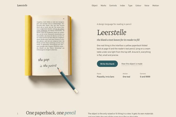
Leerstelle is German for the blank a text leaves for its reader to fill. The interface is one real thing on a cream table: a yellow school paperback of Kafka's Die Verwandlung folded back at page 41, where Part II goes quiet two thirds down the page, and the reader's teal pencil lying across it with an answer written into the blank. Around it everything is flat and precise: small Inria Sans, one big light Piazzolla line, page numbers in old-style figures, and teal only for the thing you can do next.
A revision of Leerstelle, rebuilt the Inspora way from the approved elevated specimen. It keeps the name, the idea of the meaningful blank, the warm paper world, the teal ink and the handwritten margin note, and drops the android-diary scene, archival plates with corner ticks, registration crosses, coordinate gutters, monospace terminal logs, the pale-cyan glint and all three over-used faces (Newsreader, IBM Plex Sans, IBM Plex Mono).
Calm notebook density: one object and a short headline per view, 128 to 160px between sections on desktop and 96 to 112px on phones, 52px controls, list rows 44 to 56px parted by space, and prose held under about 32em.
Phones (390px) stack to one column, hide non-essential nav links and table columns, lay the book at full width with the headline below it, and stack log rows (page, then kind, words and time). Tablets (768 to 1100px) keep the book beside a narrower column with a 40px headline. Ultra-wide caps and centres the content; only the landing hero spans the full width.
marginalia
Overhead studio photographs of one reader's things on a cream paper table: a thin yellow school paperback folded back on itself, cream book-wove paper with a faint tooth, a used teal lacquered pencil with a cedar point, under one soft key light from the top left with warm brown two-layer shadows. The reader's graphite marks are drawn live on top, in the line, grain and hand of Marginalia.
One full-bleed hero per landing: the empty cream paper table under a top-left light, with the live paperback and pencil lying on it at about 45% of the width and the headline beside it on the ground. Inside pages use the cut-out book or the pencil alone on the flat table rather than more photographs. Page text and the reader's marks are live, never baked into an image. From Marginalia keep the thin graphite line, the pencil grain, the handwritten note and the warm paper; leave out its hairline panel rules, corner ticks, coordinate gutters and the pale-cyan glint, which this revision no longer uses.
# Leerstelle

## Philosophy

Leerstelle is German for the blank a text leaves for its reader to fill. The interface is one real thing on a cream table: a yellow school paperback of Kafka's Die Verwandlung folded back at page 41, where Part II goes quiet two thirds down the page, and the reader's teal pencil lying across it with an answer written into the blank. Around it everything is flat and precise: small Inria Sans, one big light Piazzolla line, page numbers in old-style figures, and teal only for the thing you can do next.

### Values

- One object is the interface: the paperback and its pencil, rendered as real things with one light, and the only raised or lit thing in a view.
- The blank is content. Where the text goes quiet, the page stays empty or holds the reader's own four words; the interface never fills a gap just because it is there.
- The reader's hand is graphite. Marks, underlines, the drawn blank and link strokes share one pencil texture, so every trace reads as the same person.
- Depth is a verb. The pencil stands only while it writes and lies back down; everything else stays flat on the table.
- Two faces by job: Piazzolla, a book face, for what is read; Inria Sans for what is used.
- Reading conventions are content: page numbers, the kind of mark in words, times of day, the reading you are on.

### Anti-Values

- Archival plates, corner ticks, registration crosses and coordinate labels as ornament.
- Decorative codes such as [gap] or x:041 in place of words.
- Boxes, cards and hairline rules around content.
- A glow, a gradient wash or a second accent.
- A handwriting font used for interface text.
- Percentages and progress dashboards where a page number will do.

### Visual Character

- The paperback lies whole on the flat #F1EADC table once per page, with table on every side: yellow rolled spine on the left, the cream page with the last paragraph of Part II set live in Piazzolla, the underline under 'vor der schreienden Schwester', and 'the gap / is the point' in graphite in the blank.
- The teal pencil (#2E5C63 lacquer, cedar point, cream dipped end) lies at 52 degrees from the end of the note across the fore-edge, casting a two-layer warm shadow; later views use a smaller moment of it, lying at the end of a drawn blank in the reading log.
- Teal is spent on the one action per view, the italic word in a headline and the current reading; graphite is the reader's hand; yellow lives only in the photograph of the cover.
- Nothing is boxed: logs, schedules, forms and tables sit straight on the table, rows parted by space; the only filled rectangles are square --surface paper slips and one open overlay; only the pressed pill and round parts use 9999px.
- Type is small and quiet around one big light line: 17px Inria Sans, 14.5px times and captions, Piazzolla 300 at 40 to 64px with -0.02em tracking, italic titles at 21px.

### Lineage

> A revision of Leerstelle, rebuilt the Inspora way from the approved elevated specimen. It keeps the name, the idea of the meaningful blank, the warm paper world, the teal ink and the handwritten margin note, and drops the android-diary scene, archival plates with corner ticks, registration crosses, coordinate gutters, monospace terminal logs, the pale-cyan glint and all three over-used faces (Newsreader, IBM Plex Sans, IBM Plex Mono).

## Tokens

### Colors

| Name | Value |
|------|-------|
| bg | `#F1EADC` |
| surface | `#FBF7EE` |
| text | `#1C1B18` |
| copy | `#4E4A42` |
| muted | `#6A645A` |
| border | `#E3DAC8` |
| accent | `#2E5C63` |
| on_accent | `#FBF7EE` |
| success | `#5C6F54` |
| warning | `#7F5F36` |
| error | `#8E4D46` |
| info | `#46696E` |
| graphite | `#52504B` |
| print | `#2E2D29` |
| shade | `#2B251C` |

### Derived

- **Copy**: color-mix(in srgb, var(--text) 36%, var(--muted))
- **Graphite**: color-mix(in srgb, var(--text) 76%, var(--surface))
- **Print**: color-mix(in srgb, var(--text) 92%, var(--surface))
- **Shade**: color-mix(in srgb, var(--text) 85%, var(--warning))
- **Note**: Only the eleven role colours are literal. Copy, the reader's graphite, the page's print and the shadow tint are mixed from them in CSS, so a palette swap carries the hand, the page and the shadows with it.

### Typography

- **Heading Font**: Piazzolla
- **Body Font**: Inria Sans
- **Heading Weight**: 300
- **Body Weight**: 400
- **Button Weight**: 700
- **Heading Transform**: none
- **Letter Spacing**: -0.02em on Piazzolla display (-0.022em on the 64px line); 0 on Inria Sans
- **Line Height**: 1.55
- **Base Size**: 17px
- **Scale**: ["14.5px","17px","21px","28px","40px","64px"]
- **Roles**: {"display":"Piazzolla: 300 for the one big light line per view (64px) and section titles (40px); italic 400 for titles, notes and dates (21px); 500 for the wordmark; old-style figures for page numbers (21 to 28px).","body":"Inria Sans 400 at 17px for copy, labels and control text; 14.5px with tabular figures for times, captions and page counts; 700 only on the pill you press.","object_print":"Inside the paperback, Piazzolla is the book's own print and scales with the object (2.27% of the book's width); it is part of the object, not the interface scale.","hand":"The reader's pencil answer is drawn as SVG outlines (shaped from the Lateinische Ausgangsschrift of Playwrite DE LA), so no third typeface loads."}
- **Google Fonts Url**: https://fonts.googleapis.com/css2?family=Piazzolla:ital,opsz,wght@0,8..30,300..500;1,8..30,300..500&family=Inria+Sans:ital,wght@0,400;0,700;1,400&display=swap

### Radii

- **None**: 0px
- **Full**: 9999px

### Shadows

- **Contact**: drop-shadow(0.25cqi 0.36cqi 0.25cqi color-mix(in srgb, var(--shade) 40%, transparent)) on the pencil at rest
- **Ambient**: drop-shadow(1.25cqi 2.14cqi 1.8cqi color-mix(in srgb, var(--shade) 20%, transparent)) under it
- **Lifted**: 0.7cqi 1.25cqi 0.9cqi at 22% and 4.6cqi 7.1cqi 4.6cqi at 14% while the pencil stands
- **Overlay**: 1px 2px 3px at 20% plus 10px 22px 48px -18px at 40% of --shade on an open dialog or menu
- **Book**: baked into assets/book.webp as a transparent warm-brown shadow, so the book sits on any table
- **Note**: One key light from the top left. Every shadow falls to the lower right in two layers, tight contact and soft ambient, tinted warm brown from the table, never grey. Only the object and open overlays cast one.

### Spacing

- **Base**: 8px
- **Scale**: ["4px","8px","12px","16px","24px","32px","48px","64px","96px","128px"]

### Surfaces

- **Treatment**: one-object-on-a-flat-cream-table
- **Material**: The paperback is the only material object: lemon-yellow card with a rolled spine, cream book-wove paper with real Kafka set live on it, photographed overhead and cut out with a real transparent shadow. The teal lacquered pencil with a cedar point lies across it. Everything else is flat colour.
- **Card Style**: No cards or panels. Content sits straight on the table, grouped by space and a Piazzolla title. The paper value --surface appears only as a control slip, a row hover or an open overlay, square at radius 0, so a view has at most one filled surface.
- **Table**: The page ground --bg is the reading table. On the landing the hero image is the empty cream paper table under one top-left light, with the live book lying on it.
- **Graphite**: The reader's marks (the answer in the blank, underlines, the drawn blank, link strokes, progress strokes) are graphite through an SVG filter: fractal grain that lets the paper through, a slight edge wobble and low-frequency pressure.

### Borders

- **Default Width**: 0
- **Style**: none
- **Character**: No borders, rules or outlines. Rows and groups part by space and by the value of their type; paper slips are the one tinted surface. Focus is a 2px ink ring. The only lines are the reader's graphite marks, which are content, not dividers.

### Motion

- **Duration**: 240ms
- **Easing**: cubic-bezier(.3,1.4,.5,1) for landings; cubic-bezier(.2,.7,.2,1) to settle
- **Write**: 2.8s: the note fades, the pencil stands (scaleX .66, shadow out and soft), writes each line with its point on the front while the line is revealed left to right, then lies down on the spring
- **Draw**: 1.6s: in the log, the pencil goes back to the start of the blank and draws the graphite rule again
- **Underline**: 420ms: a graphite stroke draws under a link from the left
- **Reveal**: 900ms cubic-bezier(.2,.7,.2,1), 18px rise, staggered 100ms; progress strokes draw to their page
- **Philosophy**: Motion is something a pencil does. The settled state is the default and renders with no JavaScript; an inline script adds .anim to <html> to gate start states, and prefers-reduced-motion skips all of it.

### Controls

- **Height**: 52px
- **Radius**: 0 on slips, 9999px on the pressed pill
- **Wells**: --surface slips straight on the --bg table

## Rules

### Composition

- Give every view one focal thing: the paperback with its pencil on the table, or a smaller moment of it (the pencil lying at a drawn blank). Everything else in that view stays flat.
- Lay the book on the table with air on every side; never frame it, crop it or put a panel over it. Headline, copy and one action sit on the ground beside it.
- Order a page like a reader's notebook: the object and the line that stopped you, then the marks, then the close reading, then what comes next.
- Separate by space and value, never by boxes: logs, lists and forms sit straight on the table; a filled --surface appears only as a control slip or an open overlay.
- Show the whole book once per page; later views take other moments of it.
- Keep teal to one action per view, the italic word in a headline and the current reading.

### Hierarchy

- One big light line per view: Piazzolla 300 at 64px (40px on phones) with -0.022em tracking, one italic word in teal.
- Section titles in Piazzolla 300 at 40px; titles, notes and dates in Piazzolla italic 400 at 21px.
- Inria Sans 400 at 17px for copy and labels; 14.5px for times, captions and counts with tabular figures; 700 only on the pill.
- Page numbers in Piazzolla old-style figures, light, at 21 to 28px; the current one in ink, earlier ones quiet.
- Status is a small round dot and a word in a paper pill, never a coloured field.

### Density

Calm notebook density: one object and a short headline per view, 128 to 160px between sections on desktop and 96 to 112px on phones, 52px controls, list rows 44 to 56px parted by space, and prose held under about 32em.

### Signature Patterns

- The paperback: a photographed yellow school paperback folded back at page 41 (assets/book.webp, with its own transparent shadow), whole and once per page, with the page text set live in Piazzolla and multiplied onto the paper.
- The reader's hand: 'the gap / is the point' drawn in graphite into the blank as SVG outlines through a pencil filter (grain, edge wobble, pressure).
- Write the blank: hovering or focusing the book (or the teal action) fades the answer, stands the pencil up (scaleX .66, shadow moving out), writes each line with its point on the front, and lays it down on a spring, 2.8s.
- The drawn blank: in the reading log, the current row ends in a graphite rule with the pencil lying at its end; hover or focus draws it again, 1.6s.
- Graphite strokes: underlines under quoted lines, links that draw a pencil stroke under the word, and progress strokes that draw to the page you reached.
- The one teal: a 9999px pill for the action, the italic word in a headline, the current reading.

## Layout

### Grid

- **Type**: object-first reading page
- **Max Width**: 1240px content, 1360px from 1800px wide
- **Gutter**: 40px desktop, 20px phone
- **Column Behavior**: Below the object, headers run on minmax(0,5fr) minmax(0,6fr); logs run page, kind, words and time columns; the read-along row is minmax(0,6fr) minmax(0,5fr). Every track is minmax(0,1fr) or fixed, and every grid child min-width:0.

### Whitespace

- **Section Gap**: 128 to 160px desktop, 96 to 112px phone
- **Card Gap**: no cards; 13 to 22px row padding in lists, 40 to 72px between groups
- **Content Padding**: content sits on the table aligned to the grid edge; overlays pad 28 to 30px
- **Approach**: The table is empty by design: the book needs air on every side, and each view carries one focal point.

### Density

- **Default**: comfortable
- **Comfortable**: {"button_height":"52px","input_height":"52px","row_height":"44 to 56px log and table rows parted by space"}

### Responsive

Phones (390px) stack to one column, hide non-essential nav links and table columns, lay the book at full width with the headline below it, and stack log rows (page, then kind, words and time). Tablets (768 to 1100px) keep the book beside a narrower column with a 40px headline. Ultra-wide caps and centres the content; only the landing hero spans the full width.

### Breakpoints

- **Mobile**: 390px
- **Phone Max**: 640px
- **Tablet**: 900 to 1100px
- **Desktop**: 1280px
- **Wide**: 1440px
- **Ultrawide**: 1800px and 2560px

## Guidance

### Do

- Put the paperback and its pencil at the centre of the first view, on the flat table with air all round.
- Set real text on the page and let it stop where the text goes quiet; leave the blank blank, or give it the reader's own words.
- Spend teal on one action per view, the italic word in a headline and the current reading only.
- Separate rows by space and value, and keep at most one filled surface in a view.
- Write like a reader's notes: page 41, Left blank, Three underlines, Nine of twelve chairs taken.
- Style every control explicitly: square 52px paper slips, a drawn tick, a round teal switch, a 2px ink focus ring.

### Don't

- Don't bring back plates with corner ticks, registration crosses or coordinate labels.
- Don't write decorative codes like [gap] or x:041; use words.
- Don't box content in cards or panels, or add rules and borders between rows.
- Don't use a handwriting font for interface text; the hand belongs to the pencil in the book.
- Don't show the whole book twice on one page, or pair a secondary button with the teal one; use a graphite link.
- Don't add a second accent, a glow, a gradient or yellow outside the book's cover.
- Don't put emoji or symbol glyphs on buttons.

### Accessibility

WCAG AA and better on the cream table: ink #1C1B18 is 14.4:1, copy #4E4A42 is 7.4:1 and quiet labels #6A645A are 4.9:1 on #F1EADC; #FBF7EE on teal is 7.0:1; teal as text is 6.2:1; graphite is 6.7:1; every semantic colour clears 4.5:1 on the table and 5.0:1 on paper. Focus is a visible 2px ink ring on every control. The book is a focusable image with a full description of the page, the note and the pencil. prefers-reduced-motion skips the writing, the drawing and the reveals; the finished state is always there.

## Imagery Direction

### Pairs With

marginalia

### Summary

Overhead studio photographs of one reader's things on a cream paper table: a thin yellow school paperback folded back on itself, cream book-wove paper with a faint tooth, a used teal lacquered pencil with a cedar point, under one soft key light from the top left with warm brown two-layer shadows. The reader's graphite marks are drawn live on top, in the line, grain and hand of Marginalia.

### Subjects

- a paperback folded back at a page
- a used pencil lying on a page
- the empty cream reading table
- a page corner with a folio
- an underlined line on a page
- a pencil note in a margin

### Usage

One full-bleed hero per landing: the empty cream paper table under a top-left light, with the live paperback and pencil lying on it at about 45% of the width and the headline beside it on the ground. Inside pages use the cut-out book or the pencil alone on the flat table rather than more photographs. Page text and the reader's marks are live, never baked into an image. From Marginalia keep the thin graphite line, the pencil grain, the handwritten note and the warm paper; leave out its hairline panel rules, corner ticks, coordinate gutters and the pale-cyan glint, which this revision no longer uses.
---
version: "alpha"
name: "Leerstelle"
description: "Leerstelle is German for the blank a text leaves for its reader to fill. The interface is one real thing on a cream table: a yellow school paperback of Kafka's Die Verwandlung folded back at page 41, where Part II goes quiet two thirds d..."
colors:
  bg: "#F1EADC"
  surface: "#FBF7EE"
  text: "#1C1B18"
  copy: "#4E4A42"
  muted: "#6A645A"
  border: "#E3DAC8"
  accent: "#2E5C63"
  on_accent: "#FBF7EE"
  success: "#5C6F54"
  warning: "#7F5F36"
  error: "#8E4D46"
  info: "#46696E"
  graphite: "#52504B"
  print: "#2E2D29"
  shade: "#2B251C"
typography:
  headline-lg:
    fontFamily: "Piazzolla"
    fontSize: "2.075rem"
    fontWeight: 700
    lineHeight: 1.1
    letterSpacing: "-0.02em"
  headline-md:
    fontFamily: "Piazzolla"
    fontSize: "1.66rem"
    fontWeight: 600
    lineHeight: 1.15
    letterSpacing: "-0.02em"
  body-md:
    fontFamily: "Inria Sans"
    fontSize: "17px"
    fontWeight: 400
    lineHeight: 1.55
    letterSpacing: "-0.02em"
  label-md:
    fontFamily: "Inria Sans"
    fontSize: "0.75rem"
    fontWeight: 600
    lineHeight: 1
    letterSpacing: "0.08em"
rounded:
  none: "0px"
  full: "9999px"
spacing:
  base: "8px"
  xs: "4px"
  sm: "8px"
  md: "12px"
  lg: "16px"
  xl: "24px"
  2xl: "32px"
  3xl: "48px"
  4xl: "64px"
  step-8: "96px"
  step-9: "128px"
components:
  color-reference-bg:
    backgroundColor: "{colors.bg}"
  color-reference-surface:
    backgroundColor: "{colors.surface}"
  color-reference-text:
    backgroundColor: "{colors.text}"
  color-reference-copy:
    backgroundColor: "{colors.copy}"
  color-reference-muted:
    backgroundColor: "{colors.muted}"
  color-reference-border:
    backgroundColor: "{colors.border}"
  color-reference-accent:
    backgroundColor: "{colors.accent}"
  color-reference-on_accent:
    backgroundColor: "{colors.on_accent}"
  color-reference-success:
    backgroundColor: "{colors.success}"
  color-reference-warning:
    backgroundColor: "{colors.warning}"
  color-reference-error:
    backgroundColor: "{colors.error}"
  color-reference-info:
    backgroundColor: "{colors.info}"
  color-reference-graphite:
    backgroundColor: "{colors.graphite}"
  color-reference-print:
    backgroundColor: "{colors.print}"
  color-reference-shade:
    backgroundColor: "{colors.shade}"
  button-primary:
    backgroundColor: "{colors.accent}"
    textColor: "{colors.on_accent}"
    typography: "{typography.label-md}"
    rounded: "{rounded.none}"
    padding: "{spacing.md}"
  card-surface:
    backgroundColor: "{colors.surface}"
    textColor: "{colors.text}"
    rounded: "{rounded.none}"
    padding: "{spacing.md}"
  input-default:
    backgroundColor: "{colors.surface}"
    textColor: "{colors.text}"
    rounded: "{rounded.none}"
    height: "44px"
---

# Leerstelle

## Overview

Leerstelle is German for the blank a text leaves for its reader to fill. The interface is one real thing on a cream table: a yellow school paperback of Kafka's Die Verwandlung folded back at page 41, where Part II goes quiet two thirds down the page, and the reader's teal pencil lying across it with an answer written into the blank. Around it everything is flat and precise: small Inria Sans, one big light Piazzolla line, page numbers in old-style figures, and teal only for the thing you can do next.

### Values

- One object is the interface: the paperback and its pencil, rendered as real things with one light, and the only raised or lit thing in a view.
- The blank is content. Where the text goes quiet, the page stays empty or holds the reader's own four words; the interface never fills a gap just because it is there.
- The reader's hand is graphite. Marks, underlines, the drawn blank and link strokes share one pencil texture, so every trace reads as the same person.
- Depth is a verb. The pencil stands only while it writes and lies back down; everything else stays flat on the table.
- Two faces by job: Piazzolla, a book face, for what is read; Inria Sans for what is used.
- Reading conventions are content: page numbers, the kind of mark in words, times of day, the reading you are on.

### Anti-Values

- Archival plates, corner ticks, registration crosses and coordinate labels as ornament.
- Decorative codes such as [gap] or x:041 in place of words.
- Boxes, cards and hairline rules around content.
- A glow, a gradient wash or a second accent.
- A handwriting font used for interface text.
- Percentages and progress dashboards where a page number will do.

### Visual Character

- The paperback lies whole on the flat #F1EADC table once per page, with table on every side: yellow rolled spine on the left, the cream page with the last paragraph of Part II set live in Piazzolla, the underline under 'vor der schreienden Schwester', and 'the gap / is the point' in graphite in the blank.
- The teal pencil (#2E5C63 lacquer, cedar point, cream dipped end) lies at 52 degrees from the end of the note across the fore-edge, casting a two-layer warm shadow; later views use a smaller moment of it, lying at the end of a drawn blank in the reading log.
- Teal is spent on the one action per view, the italic word in a headline and the current reading; graphite is the reader's hand; yellow lives only in the photograph of the cover.
- Nothing is boxed: logs, schedules, forms and tables sit straight on the table, rows parted by space; the only filled rectangles are square --surface paper slips and one open overlay; only the pressed pill and round parts use 9999px.
- Type is small and quiet around one big light line: 17px Inria Sans, 14.5px times and captions, Piazzolla 300 at 40 to 64px with -0.02em tracking, italic titles at 21px.

### Lineage

> A revision of Leerstelle, rebuilt the Inspora way from the approved elevated specimen. It keeps the name, the idea of the meaningful blank, the warm paper world, the teal ink and the handwritten margin note, and drops the android-diary scene, archival plates with corner ticks, registration crosses, coordinate gutters, monospace terminal logs, the pale-cyan glint and all three over-used faces (Newsreader, IBM Plex Sans, IBM Plex Mono).

## Colors

Use the YAML color tokens as the normative palette. The prose below names the roles agents should preserve when generating UI.

| Token | Value |
|-------|-------|
| bg | `#F1EADC` |
| surface | `#FBF7EE` |
| text | `#1C1B18` |
| copy | `#4E4A42` |
| muted | `#6A645A` |
| border | `#E3DAC8` |
| accent | `#2E5C63` |
| on_accent | `#FBF7EE` |
| success | `#5C6F54` |
| warning | `#7F5F36` |
| error | `#8E4D46` |
| info | `#46696E` |
| graphite | `#52504B` |
| print | `#2E2D29` |
| shade | `#2B251C` |

## Typography

Load the fonts from Google Fonts: https://fonts.googleapis.com/css2?family=Piazzolla:ital,opsz,wght@0,8..30,300..500;1,8..30,300..500&family=Inria+Sans:ital,wght@0,400;0,700;1,400&display=swap

- **Headline-Lg**: Piazzolla, 2.075rem, weight 700, line-height 1.1.
- **Headline-Md**: Piazzolla, 1.66rem, weight 600, line-height 1.15.
- **Body-Md**: Inria Sans, 17px, weight 400, line-height 1.55.
- **Label-Md**: Inria Sans, 0.75rem, weight 600, line-height 1.

## Layout

### Spacing Tokens

- **Base**: `8px`
- **Xs**: `4px`
- **Sm**: `8px`
- **Md**: `12px`
- **Lg**: `16px`
- **Xl**: `24px`
- **2xl**: `32px`
- **3xl**: `48px`
- **4xl**: `64px`
- **Step-8**: `96px`
- **Step-9**: `128px`

### Grid

- **Type**: object-first reading page
- **Max Width**: 1240px content, 1360px from 1800px wide
- **Gutter**: 40px desktop, 20px phone
- **Column Behavior**: Below the object, headers run on minmax(0,5fr) minmax(0,6fr); logs run page, kind, words and time columns; the read-along row is minmax(0,6fr) minmax(0,5fr). Every track is minmax(0,1fr) or fixed, and every grid child min-width:0.

### Whitespace

- **Section Gap**: 128 to 160px desktop, 96 to 112px phone
- **Card Gap**: no cards; 13 to 22px row padding in lists, 40 to 72px between groups
- **Content Padding**: content sits on the table aligned to the grid edge; overlays pad 28 to 30px
- **Approach**: The table is empty by design: the book needs air on every side, and each view carries one focal point.

### Density

- **Default**: comfortable
- **Comfortable**: {"button_height":"52px","input_height":"52px","row_height":"44 to 56px log and table rows parted by space"}

### Responsive

Phones (390px) stack to one column, hide non-essential nav links and table columns, lay the book at full width with the headline below it, and stack log rows (page, then kind, words and time). Tablets (768 to 1100px) keep the book beside a narrower column with a 40px headline. Ultra-wide caps and centres the content; only the landing hero spans the full width.

### Breakpoints

- **Mobile**: 390px
- **Phone Max**: 640px
- **Tablet**: 900 to 1100px
- **Desktop**: 1280px
- **Wide**: 1440px
- **Ultrawide**: 1800px and 2560px

## Elevation & Depth

### Shadows

- **Contact**: drop-shadow(0.25cqi 0.36cqi 0.25cqi color-mix(in srgb, var(--shade) 40%, transparent)) on the pencil at rest
- **Ambient**: drop-shadow(1.25cqi 2.14cqi 1.8cqi color-mix(in srgb, var(--shade) 20%, transparent)) under it
- **Lifted**: 0.7cqi 1.25cqi 0.9cqi at 22% and 4.6cqi 7.1cqi 4.6cqi at 14% while the pencil stands
- **Overlay**: 1px 2px 3px at 20% plus 10px 22px 48px -18px at 40% of --shade on an open dialog or menu
- **Book**: baked into assets/book.webp as a transparent warm-brown shadow, so the book sits on any table
- **Note**: One key light from the top left. Every shadow falls to the lower right in two layers, tight contact and soft ambient, tinted warm brown from the table, never grey. Only the object and open overlays cast one.

## Shapes

### Rounded

- **None**: `0px`
- **Full**: `9999px`

### Surfaces

- **Treatment**: one-object-on-a-flat-cream-table
- **Material**: The paperback is the only material object: lemon-yellow card with a rolled spine, cream book-wove paper with real Kafka set live on it, photographed overhead and cut out with a real transparent shadow. The teal lacquered pencil with a cedar point lies across it. Everything else is flat colour.
- **Card Style**: No cards or panels. Content sits straight on the table, grouped by space and a Piazzolla title. The paper value --surface appears only as a control slip, a row hover or an open overlay, square at radius 0, so a view has at most one filled surface.
- **Table**: The page ground --bg is the reading table. On the landing the hero image is the empty cream paper table under one top-left light, with the live book lying on it.
- **Graphite**: The reader's marks (the answer in the blank, underlines, the drawn blank, link strokes, progress strokes) are graphite through an SVG filter: fractal grain that lets the paper through, a slight edge wobble and low-frequency pressure.

### Borders

- **Default Width**: 0
- **Style**: none
- **Character**: No borders, rules or outlines. Rows and groups part by space and by the value of their type; paper slips are the one tinted surface. Focus is a 2px ink ring. The only lines are the reader's graphite marks, which are content, not dividers.

## Components

### Composition

- Give every view one focal thing: the paperback with its pencil on the table, or a smaller moment of it (the pencil lying at a drawn blank). Everything else in that view stays flat.
- Lay the book on the table with air on every side; never frame it, crop it or put a panel over it. Headline, copy and one action sit on the ground beside it.
- Order a page like a reader's notebook: the object and the line that stopped you, then the marks, then the close reading, then what comes next.
- Separate by space and value, never by boxes: logs, lists and forms sit straight on the table; a filled --surface appears only as a control slip or an open overlay.
- Show the whole book once per page; later views take other moments of it.
- Keep teal to one action per view, the italic word in a headline and the current reading.

### Hierarchy

- One big light line per view: Piazzolla 300 at 64px (40px on phones) with -0.022em tracking, one italic word in teal.
- Section titles in Piazzolla 300 at 40px; titles, notes and dates in Piazzolla italic 400 at 21px.
- Inria Sans 400 at 17px for copy and labels; 14.5px for times, captions and counts with tabular figures; 700 only on the pill.
- Page numbers in Piazzolla old-style figures, light, at 21 to 28px; the current one in ink, earlier ones quiet.
- Status is a small round dot and a word in a paper pill, never a coloured field.

### Density

Calm notebook density: one object and a short headline per view, 128 to 160px between sections on desktop and 96 to 112px on phones, 52px controls, list rows 44 to 56px parted by space, and prose held under about 32em.

### Signature Patterns

- The paperback: a photographed yellow school paperback folded back at page 41 (assets/book.webp, with its own transparent shadow), whole and once per page, with the page text set live in Piazzolla and multiplied onto the paper.
- The reader's hand: 'the gap / is the point' drawn in graphite into the blank as SVG outlines through a pencil filter (grain, edge wobble, pressure).
- Write the blank: hovering or focusing the book (or the teal action) fades the answer, stands the pencil up (scaleX .66, shadow moving out), writes each line with its point on the front, and lays it down on a spring, 2.8s.
- The drawn blank: in the reading log, the current row ends in a graphite rule with the pencil lying at its end; hover or focus draws it again, 1.6s.
- Graphite strokes: underlines under quoted lines, links that draw a pencil stroke under the word, and progress strokes that draw to the page you reached.
- The one teal: a 9999px pill for the action, the italic word in a headline, the current reading.

## shadcn/ui Usage

When the target app uses shadcn/ui, copy DESIGN.md with shadcn instead of the plain DESIGN.md. It contains the same Katagami design-language source plus the shadcn/ui primitives, imports, theme variables, component recipes, and preview-shot guidance.

DESIGN.md with shadcn: `/language/en-01a0ecaf-7f2f-7611-be4a-e9b9562de80a/DESIGN.with-shadcn.md`.

Machine-readable companions for automation: `/language/en-01a0ecaf-7f2f-7611-be4a-e9b9562de80a/shadcn.json` (registry theme), `/language/en-01a0ecaf-7f2f-7611-be4a-e9b9562de80a/shadcn-components.md` (component recipes) and `/language/en-01a0ecaf-7f2f-7611-be4a-e9b9562de80a/shadcn-shots.json` (preview shots). The human-facing handoff is still DESIGN.md with shadcn.

Install recommended primitives with `npx shadcn@latest add button card input textarea select dialog sheet tabs badge separator checkbox switch slider tooltip dropdown-menu table`.

Use these primitives in shadcn apps:
- button
- card
- input
- textarea
- select
- dialog
- sheet
- tabs
- badge
- separator
- checkbox
- switch
- slider
- tooltip
- dropdown-menu
- table

Implementation rule for agents: import shadcn primitives from `@/components/ui/*`, apply the generated CSS variables first, then compose the language-specific recipes from the companion MD. Katagami remains the source of truth; shadcn names are the implementation surface.

## Do's and Don'ts

- Do Put the paperback and its pencil at the centre of the first view, on the flat table with air all round.
- Do Set real text on the page and let it stop where the text goes quiet; leave the blank blank, or give it the reader's own words.
- Do Spend teal on one action per view, the italic word in a headline and the current reading only.
- Do Separate rows by space and value, and keep at most one filled surface in a view.
- Do Write like a reader's notes: page 41, Left blank, Three underlines, Nine of twelve chairs taken.
- Do Style every control explicitly: square 52px paper slips, a drawn tick, a round teal switch, a 2px ink focus ring.
- Don't Don't bring back plates with corner ticks, registration crosses or coordinate labels.
- Don't Don't write decorative codes like [gap] or x:041; use words.
- Don't Don't box content in cards or panels, or add rules and borders between rows.
- Don't Don't use a handwriting font for interface text; the hand belongs to the pencil in the book.
- Don't Don't show the whole book twice on one page, or pair a secondary button with the teal one; use a graphite link.
- Don't Don't add a second accent, a glow, a gradient or yellow outside the book's cover.
- Don't Don't put emoji or symbol glyphs on buttons.

### Accessibility

WCAG AA and better on the cream table: ink #1C1B18 is 14.4:1, copy #4E4A42 is 7.4:1 and quiet labels #6A645A are 4.9:1 on #F1EADC; #FBF7EE on teal is 7.0:1; teal as text is 6.2:1; graphite is 6.7:1; every semantic colour clears 4.5:1 on the table and 5.0:1 on paper. Focus is a visible 2px ink ring on every control. The book is a focusable image with a full description of the page, the note and the pencil. prefers-reduced-motion skips the writing, the drawing and the reveals; the finished state is always there.

## Imagery Direction

### Pairs With

marginalia

### Summary

Overhead studio photographs of one reader's things on a cream paper table: a thin yellow school paperback folded back on itself, cream book-wove paper with a faint tooth, a used teal lacquered pencil with a cedar point, under one soft key light from the top left with warm brown two-layer shadows. The reader's graphite marks are drawn live on top, in the line, grain and hand of Marginalia.

### Subjects

- a paperback folded back at a page
- a used pencil lying on a page
- the empty cream reading table
- a page corner with a folio
- an underlined line on a page
- a pencil note in a margin

### Usage

One full-bleed hero per landing: the empty cream paper table under a top-left light, with the live paperback and pencil lying on it at about 45% of the width and the headline beside it on the ground. Inside pages use the cut-out book or the pencil alone on the flat table rather than more photographs. Page text and the reader's marks are live, never baked into an image. From Marginalia keep the thin graphite line, the pencil grain, the handwritten note and the warm paper; leave out its hairline panel rules, corner ticks, coordinate gutters and the pale-cyan glint, which this revision no longer uses.
```json
{
  "$schema": "https://ui.shadcn.com/schema/registry-item.json",
  "name": "leerstelle",
  "type": "registry:theme",
  "title": "Leerstelle shadcn Theme",
  "cssVars": {
    "theme": {},
    "light": {
      "background": "#F1EADC",
      "foreground": "#1C1B18",
      "card": "#FBF7EE",
      "card-foreground": "#1C1B18",
      "popover": "#FBF7EE",
      "popover-foreground": "#1C1B18",
      "primary": "#1C1B18",
      "primary-foreground": "#ffffff",
      "secondary": "#f4f4f5",
      "secondary-foreground": "#111111",
      "muted": "#6A645A",
      "muted-foreground": "#1C1B18",
      "accent": "#2E5C63",
      "accent-foreground": "#ffffff",
      "destructive": "#8E4D46",
      "border": "#E3DAC8",
      "input": "#E3DAC8",
      "ring": "#2E5C63",
      "chart-1": "#1C1B18",
      "chart-2": "#f4f4f5",
      "chart-3": "#2E5C63",
      "chart-4": "#5C6F54",
      "chart-5": "#7F5F36",
      "sidebar": "#FBF7EE",
      "sidebar-foreground": "#1C1B18",
      "sidebar-primary": "#1C1B18",
      "sidebar-primary-foreground": "#ffffff",
      "sidebar-accent": "#46696E",
      "sidebar-accent-foreground": "#ffffff",
      "sidebar-border": "#E3DAC8",
      "sidebar-ring": "#2E5C63",
      "radius": "0.625rem"
    },
    "dark": {
      "background": "#0f1115",
      "foreground": "#f8fafc",
      "card": "#181b22",
      "card-foreground": "#f8fafc",
      "popover": "#181b22",
      "popover-foreground": "#f8fafc",
      "primary": "#1C1B18",
      "primary-foreground": "#ffffff",
      "secondary": "#252a33",
      "secondary-foreground": "#f8fafc",
      "muted": "#252a33",
      "muted-foreground": "#a1a1aa",
      "accent": "#2E5C63",
      "accent-foreground": "#ffffff",
      "destructive": "#8E4D46",
      "border": "#303642",
      "input": "#303642",
      "ring": "#2E5C63",
      "chart-1": "#1C1B18",
      "chart-2": "#f4f4f5",
      "chart-3": "#2E5C63",
      "chart-4": "#5C6F54",
      "chart-5": "#7F5F36",
      "sidebar": "#181b22",
      "sidebar-foreground": "#f8fafc",
      "sidebar-primary": "#1C1B18",
      "sidebar-primary-foreground": "#ffffff",
      "sidebar-accent": "#2E5C63",
      "sidebar-accent-foreground": "#ffffff",
      "sidebar-border": "#303642",
      "sidebar-ring": "#2E5C63",
      "radius": "0.625rem"
    }
  },
  "meta": {
    "source": "katagami",
    "languageId": "en-01a0ecaf-7f2f-7611-be4a-e9b9562de80a",
    "slug": "leerstelle",
    "componentManifest": [
      "button",
      "card",
      "input",
      "textarea",
      "select",
      "dialog",
      "sheet",
      "tabs",
      "badge",
      "separator",
      "checkbox",
      "switch",
      "slider",
      "tooltip",
      "dropdown-menu",
      "table"
    ],
    "installCommand": "npx shadcn@latest add button card input textarea select dialog sheet tabs badge separator checkbox switch slider tooltip dropdown-menu table",
    "nativeTokenNames": {
      "colors": [
        "accent",
        "bg",
        "border",
        "copy",
        "error",
        "graphite",
        "info",
        "muted",
        "on_accent",
        "print",
        "shade",
        "success",
        "surface",
        "text",
        "warning"
      ],
      "derived": [
        "copy",
        "graphite",
        "note",
        "print",
        "shade"
      ],
      "typography": [
        "base_size",
        "body_font",
        "body_weight",
        "button_weight",
        "google_fonts_url",
        "heading_font",
        "heading_transform",
        "heading_weight",
        "letter_spacing",
        "line_height",
        "roles",
        "scale"
      ],
      "radii": [
        "full",
        "none"
      ],
      "shadows": [
        "ambient",
        "book",
        "contact",
        "lifted",
        "note",
        "overlay"
      ],
      "spacing": [
        "base",
        "scale"
      ],
      "surfaces": [
        "card_style",
        "graphite",
        "material",
        "table",
        "treatment"
      ],
      "borders": [
        "character",
        "default_width",
        "style"
      ],
      "motion": [
        "draw",
        "duration",
        "easing",
        "philosophy",
        "reveal",
        "underline",
        "write"
      ],
      "controls": [
        "height",
        "radius",
        "wells"
      ]
    }
  }
}
```The art style its pictures are drawn in and the colours its tokens carry.
The theme variables are generated from the tokens. Component recipes and preview shots have not been written for this language yet.
For an app that uses shadcn/ui: the DESIGN.md plus the install list, theme variables, component recipes, preview shots and a starter TSX file, in one Markdown file.
The same pieces as separate files: theme, CSS, TSX starter, recipes and the preview contract.
npx shadcn@latest add button card input textarea select dialog sheet tabs badge separator checkbox switch slider tooltip dropdown-menu table:root {
--background: #F1EADC;
--foreground: #1C1B18;
--card: #FBF7EE;
--card-foreground: #1C1B18;
--popover: #FBF7EE;
--popover-foreground: #1C1B18;
--primary: #1C1B18;
--primary-foreground: #ffffff;
--secondary: #f4f4f5;
--secondary-foreground: #111111;
--muted: #6A645A;
--muted-foreground: #1C1B18;
--accent: #2E5C63;
--accent-foreground: #ffffff;
--destructive: #8E4D46;
--border: #E3DAC8;
--input: #E3DAC8;
--ring: #2E5C63;
--chart-1: #1C1B18;
--chart-2: #f4f4f5;
--chart-3: #2E5C63;
--chart-4: #5C6F54;
--chart-5: #7F5F36;
--sidebar: #FBF7EE;
--sidebar-foreground: #1C1B18;
--sidebar-primary: #1C1B18;
--sidebar-primary-foreground: #ffffff;
--sidebar-accent: #46696E;
--sidebar-accent-foreground: #ffffff;
--sidebar-border: #E3DAC8;
--sidebar-ring: #2E5C63;
--radius: 0.625rem;
}
.dark {
--background: #0f1115;
--foreground: #f8fafc;
--card: #181b22;
--card-foreground: #f8fafc;
--popover: #181b22;
--popover-foreground: #f8fafc;
--primary: #1C1B18;
--primary-foreground: #ffffff;
--secondary: #252a33;
--secondary-foreground: #f8fafc;
--muted: #252a33;
--muted-foreground: #a1a1aa;
--accent: #2E5C63;
--accent-foreground: #ffffff;
--destructive: #8E4D46;
--border: #303642;
--input: #303642;
--ring: #2E5C63;
--chart-1: #1C1B18;
--chart-2: #f4f4f5;
--chart-3: #2E5C63;
--chart-4: #5C6F54;
--chart-5: #7F5F36;
--sidebar: #181b22;
--sidebar-foreground: #f8fafc;
--sidebar-primary: #1C1B18;
--sidebar-primary-foreground: #ffffff;
--sidebar-accent: #2E5C63;
--sidebar-accent-foreground: #ffffff;
--sidebar-border: #303642;
--sidebar-ring: #2E5C63;
--radius: 0.625rem;
}
import { Badge } from "@/components/ui/badge";
import { Button } from "@/components/ui/button";
import {
  Card,
  CardContent,
  CardDescription,
  CardFooter,
  CardHeader,
  CardTitle,
} from "@/components/ui/card";
import { Input } from "@/components/ui/input";
import { Tabs, TabsList, TabsTrigger } from "@/components/ui/tabs";

export function LeerstelleShadcnKit() {
  return (
    <section className="grid gap-4 rounded-[var(--radius)] border bg-background p-4 text-foreground">
      <div className="flex items-start justify-between gap-4">
        <div>
          <Badge variant="outline">shadcn/ui</Badge>
          <h2 className="mt-3 text-2xl font-semibold tracking-tight">Leerstelle</h2>
          <p className="mt-1 max-w-xl text-sm text-muted-foreground">
            Use the Katagami registry theme, then compose these shadcn primitives
            with the language-specific component recipes.
          </p>
        </div>
        <Button>Apply theme</Button>
      </div>

      <Tabs defaultValue="components">
        <TabsList>
          <TabsTrigger value="components">Components</TabsTrigger>
          <TabsTrigger value="states">States</TabsTrigger>
          <TabsTrigger value="export">Export</TabsTrigger>
        </TabsList>
      </Tabs>

      <Card>
        <CardHeader>
          <CardTitle>Component recipe</CardTitle>
          <CardDescription>
            Replace this starter content with the agent-authored product scene
            from components.md and preview-shots.json.
          </CardDescription>
        </CardHeader>
        <CardContent className="grid gap-3 sm:grid-cols-[1fr_auto]">
          <Input defaultValue="Tokenized shadcn surface" aria-label="Recipe name" />
          <Button variant="secondary">Preview state</Button>
        </CardContent>
        <CardFooter className="justify-between">
          <Badge>Ready</Badge>
          <Button variant="outline">Copy recipe</Button>
        </CardFooter>
      </Card>
    </section>
  );
}
{
  "$schema": "https://ui.shadcn.com/schema/registry-item.json",
  "name": "leerstelle",
  "type": "registry:theme",
  "title": "Leerstelle",
  "description": "A yellow paperback and a teal pencil on a cream table: flat square paper slips, no borders, one teal pill for the action, graphite for the reader's marks.",
  "cssVars": {
    "theme": {
      "font-sans": "Inria Sans, system-ui, sans-serif",
      "font-serif": "Piazzolla, Georgia, serif",
      "radius": "0px"
    },
    "light": {
      "background": "#F1EADC",
      "foreground": "#1C1B18",
      "card": "#FBF7EE",
      "card-foreground": "#1C1B18",
      "popover": "#FBF7EE",
      "popover-foreground": "#1C1B18",
      "primary": "#2E5C63",
      "primary-foreground": "#FBF7EE",
      "secondary": "#FBF7EE",
      "secondary-foreground": "#1C1B18",
      "muted": "#FBF7EE",
      "muted-foreground": "#6A645A",
      "accent": "#FBF7EE",
      "accent-foreground": "#1C1B18",
      "destructive": "#8E4D46",
      "destructive-foreground": "#FBF7EE",
      "border": "transparent",
      "input": "transparent",
      "ring": "#1C1B18",
      "chart-1": "#1C1B18",
      "chart-2": "#2E5C63",
      "chart-3": "#52504B",
      "chart-4": "#5C6F54",
      "chart-5": "#7F5F36",
      "radius": "0px"
    },
    "dark": {
      "background": "#F1EADC",
      "foreground": "#1C1B18",
      "card": "#FBF7EE",
      "card-foreground": "#1C1B18",
      "popover": "#FBF7EE",
      "popover-foreground": "#1C1B18",
      "primary": "#2E5C63",
      "primary-foreground": "#FBF7EE",
      "secondary": "#FBF7EE",
      "secondary-foreground": "#1C1B18",
      "muted": "#FBF7EE",
      "muted-foreground": "#6A645A",
      "accent": "#FBF7EE",
      "accent-foreground": "#1C1B18",
      "destructive": "#8E4D46",
      "destructive-foreground": "#FBF7EE",
      "border": "transparent",
      "input": "transparent",
      "ring": "#1C1B18",
      "chart-1": "#1C1B18",
      "chart-2": "#2E5C63",
      "chart-3": "#52504B",
      "chart-4": "#5C6F54",
      "chart-5": "#7F5F36",
      "radius": "0px"
    }
  },
  "componentManifest": [
    "button",
    "card",
    "input",
    "textarea",
    "select",
    "dialog",
    "sheet",
    "tabs",
    "badge",
    "separator",
    "checkbox",
    "switch",
    "slider",
    "tooltip",
    "dropdown-menu",
    "table"
  ],
  "meta": {
    "nativeTokenNames": {
      "bg": "background",
      "surface": "card / popover / secondary / muted / accent",
      "text": "foreground",
      "muted": "muted-foreground",
      "accent": "primary",
      "on_accent": "primary-foreground",
      "error": "destructive",
      "copy": "native only",
      "graphite": "native only",
      "print": "native only",
      "shade": "native only"
    },
    "note": "Leerstelle is a light-ground language by concept; the dark scope repeats the light values. Rectangles are square (radius 0); the primary button, badges and switches are 9999px pills.",
    "componentManifest": [
      "button",
      "card",
      "input",
      "textarea",
      "select",
      "dialog",
      "sheet",
      "tabs",
      "badge",
      "separator",
      "checkbox",
      "switch",
      "slider",
      "tooltip",
      "dropdown-menu",
      "table"
    ]
  }
}
---
artifact: component-recipes-v1
language: leerstelle
author: katagami-agent
primitives: 16
---

# Leerstelle shadcn/ui Components

Author: `katagami-agent`

## Intent

Leerstelle dresses shadcn/ui as the flat, precise interface around one real thing: a yellow school paperback folded back at page 41 with the reader's teal pencil lying across it, on a cream table. The book is the only raised thing in a view, shown whole once per page. Nothing else is boxed: content sits straight on the table, parted by space; the only filled surfaces are square paper slips and one open overlay, with no border. Teal is spent on one action per view, and the reader's marks are graphite.

## Required primitives

button, card, input, textarea, select, dialog, sheet, tabs, badge, separator, checkbox, switch, slider, tooltip, dropdown-menu, table. Import them from `@/components/ui/*`; do not build a second component system.

## Token cues

```css
--background:#F1EADC; --foreground:#1C1B18;
--card:#FBF7EE; --card-foreground:#1C1B18;
--popover:#FBF7EE; --popover-foreground:#1C1B18;
--primary:#2E5C63; --primary-foreground:#FBF7EE;
--secondary:#FBF7EE; --muted:#FBF7EE; --muted-foreground:#6A645A;
--accent:#FBF7EE; --accent-foreground:#1C1B18;
--destructive:#8E4D46;
--border:transparent; --input:transparent; --ring:#1C1B18;
--radius:0px;
--font-sans:"Inria Sans"; --font-serif:Piazzolla;
```

Native names are kept in the theme: `bg`, `surface`, `copy`, `graphite`, `print`, `shade`.

## Visual character to preserve

- One object per view: the paperback and its pencil lying on the table. Never put it in a Card.
- No borders, dividers, cards or panels. Rows and groups separate by space and type value; at most one filled surface per view.
- Square paper: radius 0 on every rectangle; only the primary pill, badges and switch parts are 9999px.
- Teal only on the primary action, the italic word in a headline and the current reading. Graphite only for the reader's marks.
- Piazzolla for what is read (headlines at 300, italic titles, old-style page numbers), Inria Sans for what is used.
- Shadows fall down and right from one top-left light, in two warm layers, only under the object and open overlays.

## ShadSync visual profile

- family: reading-object
- material: flat cream paper slips around one photographed paperback and pencil
- contour: square, radius 0 (pills 9999)
- border: none
- underlay: false
- grain: false
- stickerBadges: false
- motion: the pencil stands, writes and lies down; strokes draw from the left
- density: comfortable
- accents: teal-pencil

## Signature component recipes

- **button:** `h-[52px] rounded-full px-7 font-bold text-[17px] whitespace-nowrap`, no border. `default` is `bg-primary text-primary-foreground`, one per view; hover mixes it 12% toward ink, active drops 1px. A second action is a graphite text link (a pencil stroke under the word at 40% that goes to full on hover), never a second button. `destructive` is an error pill used only as the one action inside its confirm dialog. Focus: `outline-2 outline-offset-[3px] outline-ring`.
- **card:** no frame around content: `bg-transparent border-0 shadow-none p-0 gap-5`, grouped by space with a Piazzolla title (300 at 40px for sections, italic 400 at 21px for groups). `bg-card rounded-none` is reserved for slips and overlays. Never wrap the book or the log in one.
- **input:** a square paper slip on the table: `h-[52px] rounded-none border-0 bg-card px-[18px] text-[17px]`. Placeholder in `text-muted-foreground`. Focus is `shadow-[inset_0_0_0_2px_var(--ring)]`.
- **textarea:** the input slip at `min-h-[112px] py-3.5 leading-[1.5] resize-none`.
- **select:** the input slip with a drawn 2px ink chevron; `SelectContent` is a `bg-popover rounded-none py-2` panel with the warm overlay shadow; the chosen item is ink with a teal dot.
- **dialog:** `bg-popover rounded-none p-[30px]` with `shadow-[1px_2px_3px_color-mix(in_srgb,var(--shade)_20%,transparent),10px_22px_48px_-18px_color-mix(in_srgb,var(--shade)_40%,transparent)]`; Piazzolla 300 title at 28px that names the page (Erase the mark on page 41?), Inria Sans body, one pill and a graphite Keep it link.
- **sheet:** a right-side `bg-popover rounded-none` panel of page notes, sliding in on `cubic-bezier(.2,.7,.2,1)` and closing back to flat.
- **tabs:** `TabsList` has no tray (`bg-transparent p-0 gap-7`); triggers are Inria Sans 17px in `text-muted-foreground`; the active trigger is `text-foreground` with a 6px teal pencil stroke masked under it. No pill, no box.
- **badge:** `h-[30px] rounded-full bg-card px-3.5 text-[14.5px]` with a 7px round dot before the word in the semantic colour; Left blank takes the teal dot.
- **separator:** do not draw one. Use spacing (13 to 22px row padding, 40 to 72px between groups); if a primitive needs it, render it transparent.
- **checkbox:** `size-[22px] rounded-none bg-card`; checked fills `bg-primary` with a drawn tick in `primary-foreground`, springing in on `cubic-bezier(.3,1.4,.5,1)`.
- **switch:** a round `w-12 h-7 bg-[var(--border)]` track with a paper knob; checked turns the track teal and slides the knob 20px on the spring.
- **slider:** a 4px round track in the native track colour, a teal range and a 22px round teal thumb; the value prints above it as a page number (41 of 71) in Piazzolla old-style figures.
- **tooltip:** `bg-foreground text-background rounded-none px-3.5 py-2 text-[14.5px]` with a small square pointer; no shadow.
- **dropdown-menu:** a `bg-popover rounded-none py-2` panel with the warm overlay shadow; Inria Sans rows at 14.5px, the chosen one ink with a teal dot on the right.
- **table:** the index. Rows sit on the page (`bg-transparent`, no dividers, no stripes); page numbers in Piazzolla old-style figures at 21px, quoted German in Piazzolla italic, times right-aligned with tabular figures; the current row in ink. Hover tints the row `bg-card`. Hide non-essential columns below 640px.

### The paperback and the pencil (the signature, outside shadcn)

The book is not a shadcn primitive. Build it once as its own component: `assets/book.webp` (672 by 880, with its transparent shadow) as the background of a `container-type:inline-size` box; the page at left 15.03%, top 5.85%, width 60.71%, height 75.29%, with the text in Piazzolla at 2.27cqi, justified, `hyphens:auto`, `lang="de"`, multiplied onto the paper; the reader's answer as SVG outlines in graphite through the pencil filter; the pencil (`assets/pencil.webp`) at `left:58.21cqi; top:93.39cqi`, 53.57cqi long, rotated 52 degrees, with a two-layer warm drop shadow. Hover or focus runs Write the blank (2.8s); reduced motion leaves the finished page.

## Preview shots

- `application-shell`: this morning's reading. The nav flat on the table, the paperback with its pencil beside the headline and one teal pill, then the log with the pencil at the drawn blank.
- `detail-editor`: log a mark. Page and kind, what I wrote, a focused quote slip, checkboxes, a switch, the where-I-stopped slider, one teal save.
- `data-operations`: every mark, by page. Tabs, an open sort menu, the index table with status dots, and a dialog to erase the mark on page 41.

Each shot carries a renderable `scene` with headline, description, actions and rows, fields or stats.

## Implementation contract

- Start from local `@/components/ui/*` shadcn primitives and apply `/katagami/shadcn/leerstelle/registry-theme.json`.
- Keep `--border` and `--input` transparent; slips get their tone from `bg-card` on the page.
- Set `--radius: 0px` on every rectangle; the primary button, badges and switch parts are `rounded-full`.
- One `default` (teal) button per view; a second action is a graphite link.
- No Card frames around content; show the whole book once per page.
- Respect `prefers-reduced-motion`: skip the writing, drawing and reveals, keep the finished state.

## Copy-paste component example

```tsx
import { Button } from "@/components/ui/button";
import { Card, CardContent, CardHeader, CardTitle } from "@/components/ui/card";
import { Badge } from "@/components/ui/badge";

const marks = [
  { page: 12, kind: "Three underlines", words: "the chief clerk, through the door", time: "09:14" },
  { page: 27, kind: "One question", words: "for him, or for herself?", time: "09:21" },
  { page: 41, kind: "Left blank", words: "", time: "09:30" },
];

export function MarksInTheMargin() {
  return (
    <Card className="gap-4 border-0 bg-transparent p-0 shadow-none">
      <CardHeader className="flex-row items-baseline justify-between p-0 pb-3">
        <CardTitle className="font-serif text-[21px] font-normal italic">This morning</CardTitle>
        <Badge className="h-[30px] rounded-full bg-card px-3.5 text-[14.5px] font-normal text-muted-foreground">Reading 03, pp. 12–41</Badge>
      </CardHeader>
      <CardContent className="flex flex-col p-0 text-[17px]">
        {marks.map((m, i) => (
          <div key={m.page} className={"grid grid-cols-[64px_44px_150px_1fr] items-baseline gap-x-5 py-3.5 " + (i === marks.length - 1 ? "text-foreground" : "text-muted-foreground")}>
            <span className="text-[14.5px] tabular-nums">{m.time}</span>
            <span className="font-serif text-[21px] text-foreground [font-variant-numeric:oldstyle-nums]">{m.page}</span>
            <span>{m.kind}</span>
            <span>{m.words}</span>
          </div>
        ))}
        <Button className="mt-6 h-[52px] self-start rounded-full px-7 text-[17px] font-bold">Open page 41</Button>
      </CardContent>
    </Card>
  );
}
```
{
  "artifact": "katagami:shadcn-preview-shots",
  "version": "preview-shots-v1",
  "schema": "katagami:shadcn-preview-shots/renderable-v1",
  "renderable": true,
  "author": "katagami-agent",
  "requiresVisualProfile": true,
  "language": {
    "id": "en-019ef852-b856-7501-bc7e-23209feb6fbb",
    "name": "Leerstelle",
    "slug": "leerstelle"
  },
  "installCommand": "npx shadcn@latest add button card input textarea select dialog sheet tabs badge separator checkbox switch slider tooltip dropdown-menu table",
  "primitives": [
    "button",
    "card",
    "input",
    "textarea",
    "select",
    "dialog",
    "sheet",
    "tabs",
    "badge",
    "separator",
    "checkbox",
    "switch",
    "slider",
    "tooltip",
    "dropdown-menu",
    "table"
  ],
  "identityNotes": [
    "One object per view: the yellow paperback folded back at page 41 with the reader's teal pencil, lying on a flat cream table.",
    "No borders, dividers, cards or panels; content sits on the table, parted by space, with at most one filled surface per view.",
    "One teal for the action, the italic headline word and the current reading; graphite for the reader's marks.",
    "Piazzolla for what is read (headlines, titles, page numbers), Inria Sans for what is used."
  ],
  "visualProfile": {
    "family": "reading-object",
    "material": "flat cream paper slips around one photographed paperback and pencil",
    "contour": "square",
    "border": "none",
    "underlay": false,
    "grain": false,
    "stickerBadges": false,
    "motion": "the pencil stands, writes and lies down; strokes draw from the left",
    "density": "comfortable",
    "radius": [
      0,
      9999
    ],
    "accents": [
      "teal-pencil"
    ]
  },
  "componentRecipes": [
    {
      "primitive": "button",
      "intent": "52px, Inria Sans 700 at 17px, no border, never wraps. Primary is a teal 9999px pill, one per view; it darkens toward ink on hover and drops 1px on press. A second action is a graphite text link, not a button. Destructive is an error-coloured pill only inside its own confirm dialog. Focus is a 2px ink ring at 3px offset.",
      "recipe": "52px, Inria Sans 700 at 17px, no border, never wraps. Primary is a teal 9999px pill, one per view; it darkens toward ink on hover and drops 1px on press. A second action is a graphite text link, not a button. Destructive is an error-coloured pill only inside its own confirm dialog. Focus is a 2px ink ring at 3px offset."
    },
    {
      "primitive": "card",
      "intent": "No frame around content: transparent, no padding, grouped by space and a Piazzolla title. The paper value (--card) is reserved for control slips and open overlays; never around the book or the log.",
      "recipe": "No frame around content: transparent, no padding, grouped by space and a Piazzolla title. The paper value (--card) is reserved for control slips and open overlays; never around the book or the log."
    },
    {
      "primitive": "input",
      "intent": "A square 52px paper slip on the table (bg-card, radius 0, no border), Inria Sans 17px, placeholder in the quiet colour; focus is an inset 2px ink ring.",
      "recipe": "A square 52px paper slip on the table (bg-card, radius 0, no border), Inria Sans 17px, placeholder in the quiet colour; focus is an inset 2px ink ring."
    },
    {
      "primitive": "textarea",
      "intent": "The input slip, 112px tall, no resize grip, line-height 1.5, the same ink focus ring. Used for what the reader wrote.",
      "recipe": "The input slip, 112px tall, no resize grip, line-height 1.5, the same ink focus ring. Used for what the reader wrote."
    },
    {
      "primitive": "select",
      "intent": "The input slip with a drawn ink chevron; content is a paper panel with the warm two-layer overlay shadow and square rows.",
      "recipe": "The input slip with a drawn ink chevron; content is a paper panel with the warm two-layer overlay shadow and square rows."
    },
    {
      "primitive": "dialog",
      "intent": "A square paper panel with the warm two-layer overlay shadow, a Piazzolla 300 title that names the page, Inria Sans body, one action pill and a graphite text link to back out.",
      "recipe": "A square paper panel with the warm two-layer overlay shadow, a Piazzolla 300 title that names the page, Inria Sans body, one action pill and a graphite text link to back out."
    },
    {
      "primitive": "sheet",
      "intent": "A square paper side panel of page notes that slides in on the settle ease and closes back to flat.",
      "recipe": "A square paper side panel of page notes that slides in on the settle ease and closes back to flat."
    },
    {
      "primitive": "tabs",
      "intent": "No tray: Inria Sans labels on the table, quiet when inactive; the active tab is ink with a teal pencil stroke drawn under it.",
      "recipe": "No tray: Inria Sans labels on the table, quiet when inactive; the active tab is ink with a teal pencil stroke drawn under it."
    },
    {
      "primitive": "badge",
      "intent": "A 30px paper pill (9999px) with a 7px round dot in the semantic colour and a word: Left blank in teal, Read aloud, Pages differ, Erased, Shared.",
      "recipe": "A 30px paper pill (9999px) with a 7px round dot in the semantic colour and a word: Left blank in teal, Read aloud, Pages differ, Erased, Shared."
    },
    {
      "primitive": "separator",
      "intent": "Not drawn. Row padding and space between groups do the job; render transparent if a primitive needs one.",
      "recipe": "Not drawn. Row padding and space between groups do the job; render transparent if a primitive needs one."
    },
    {
      "primitive": "checkbox",
      "intent": "A square 22px paper slip that fills teal with a drawn tick in paper when checked, springing in.",
      "recipe": "A square 22px paper slip that fills teal with a drawn tick in paper when checked, springing in."
    },
    {
      "primitive": "switch",
      "intent": "A round 48 by 28px track in the track colour with a paper knob; on turns the track teal and slides the knob on the spring.",
      "recipe": "A round 48 by 28px track in the track colour with a paper knob; on turns the track teal and slides the knob on the spring."
    },
    {
      "primitive": "slider",
      "intent": "A thin round track in the track colour, a teal range and a round teal thumb; the value prints above it as a page number in Piazzolla old-style figures (41 of 71).",
      "recipe": "A thin round track in the track colour, a teal range and a round teal thumb; the value prints above it as a page number in Piazzolla old-style figures (41 of 71)."
    },
    {
      "primitive": "tooltip",
      "intent": "A square ink label with paper text at 14.5px and a small pointer; no shadow.",
      "recipe": "A square ink label with paper text at 14.5px and a small pointer; no shadow."
    },
    {
      "primitive": "dropdown-menu",
      "intent": "A square paper panel with the warm overlay shadow; Inria Sans rows at 14.5px, the chosen row in ink with a teal dot.",
      "recipe": "A square paper panel with the warm overlay shadow; Inria Sans rows at 14.5px, the chosen row in ink with a teal dot."
    },
    {
      "primitive": "table",
      "intent": "The index: rows straight on the table, parted by space, no dividers or stripes; page numbers in Piazzolla old-style figures, quoted words in Piazzolla italic, times right-aligned with tabular figures; hover lifts a row to the paper value. Hide non-essential columns below 640px.",
      "recipe": "The index: rows straight on the table, parted by space, no dividers or stripes; page numbers in Piazzolla old-style figures, quoted words in Piazzolla italic, times right-aligned with tabular figures; hover lifts a row to the paper value. Hide non-essential columns below 640px."
    }
  ],
  "shots": [
    {
      "id": "application-shell",
      "title": "This morning's reading",
      "viewport": "desktop",
      "primitives": [
        "button",
        "card",
        "badge",
        "table",
        "switch",
        "slider",
        "tooltip"
      ],
      "composition": "A reading desk: the nav flat on the table, the paperback with its pencil as the one object beside the headline and one teal action, then the reading log with the pencil lying at the drawn blank, all on the page with no panels.",
      "mustShow": [
        "the paperback folded back at page 41 with the pencil",
        "one teal Open page 41 pill",
        "the log's current row in ink",
        "a drawn graphite blank",
        "status dots on paper pills"
      ],
      "avoid": [
        "borders or dividers",
        "cards or panels around content",
        "a handwriting font in the UI",
        "a second accent"
      ],
      "mustShowStates": [
        "active nav link with its pencil stroke",
        "primary teal button",
        "switch on",
        "row hover"
      ],
      "avoidRules": [
        "no borders",
        "no corner ticks or coordinate labels",
        "no gradient washes",
        "no emoji on buttons"
      ],
      "scene": {
        "eyebrow": "Reading 03 · Tue 29 Sep, 09:30",
        "headline": "I stopped where the text went quiet",
        "description": "Page 41, the end of Part II. Kafka never says what Grete decides; the reader marked the line and left the rest blank.",
        "primaryAction": "Open page 41",
        "secondaryAction": "Read Part III with me",
        "stats": [
          {
            "label": "Where I stopped",
            "value": "p. 41 of 71"
          },
          {
            "label": "Marks this reading",
            "value": "9"
          },
          {
            "label": "Blanks left",
            "value": "1",
            "tone": "info"
          },
          {
            "label": "Thursday circle",
            "value": "9 of 12 chairs",
            "tone": "warning"
          }
        ],
        "rows": [
          {
            "label": "p. 12 · Three underlines",
            "value": "the chief clerk, through the door",
            "status": "Underlined"
          },
          {
            "label": "p. 27 · One question",
            "value": "for him, or for herself?",
            "status": "Question"
          },
          {
            "label": "p. 41 · Left blank",
            "value": "the gap is the point",
            "status": "Left blank"
          }
        ]
      }
    },
    {
      "id": "detail-editor",
      "title": "Log a mark",
      "viewport": "desktop",
      "primitives": [
        "card",
        "input",
        "select",
        "textarea",
        "checkbox",
        "switch",
        "slider",
        "button",
        "badge"
      ],
      "composition": "A form straight on the table: page and kind side by side, what I wrote in a square textarea, a focused quote slip, two checkboxes, a switch, the where-I-stopped slider, one teal save pill, a Cancel link and a quiet Erase link.",
      "mustShow": [
        "focused quote slip with the ink ring",
        "drawn select chevron",
        "checked teal checkbox",
        "switch on in teal",
        "slider at page 41 of 71"
      ],
      "avoid": [
        "browser default controls",
        "outlined inputs",
        "rounded input boxes",
        "grey borders"
      ],
      "mustShowStates": [
        "focus ring in ink",
        "checked",
        "switch on",
        "primary button"
      ],
      "avoidRules": [
        "no borders",
        "no nested cards"
      ],
      "scene": {
        "eyebrow": "Reading 03 · page 41",
        "headline": "Log a mark",
        "description": "Pencil only: nothing you can't erase. The mark goes into this reading's log and, if you share it, to the Thursday circle.",
        "primaryAction": "Save the mark",
        "secondaryAction": "Cancel",
        "fields": [
          {
            "label": "Page",
            "value": "41",
            "type": "text"
          },
          {
            "label": "Kind of mark",
            "value": "Left blank",
            "type": "select"
          },
          {
            "label": "What I wrote",
            "value": "the gap is the point",
            "type": "textarea"
          },
          {
            "label": "Where I stopped",
            "value": "41 of 71",
            "type": "range"
          }
        ],
        "statuses": [
          "Focus",
          "Checked",
          "Saved"
        ]
      }
    },
    {
      "id": "data-operations",
      "title": "Every mark, by page",
      "viewport": "desktop",
      "primitives": [
        "tabs",
        "dropdown-menu",
        "table",
        "badge",
        "dialog",
        "sheet",
        "button",
        "separator"
      ],
      "composition": "Tabs for Reading 01, 02 and 03 with a teal stroke under the active one, a sort menu open, the index table on the table with page numbers in old-style figures, a sheet of page notes and a dialog to erase the mark on page 41.",
      "mustShow": [
        "active tab with its teal stroke",
        "open sort menu",
        "status dots in the semantic colours",
        "Erase the mark dialog"
      ],
      "avoid": [
        "row dividers",
        "zebra stripes",
        "cyan glints",
        "bracketed codes"
      ],
      "mustShowStates": [
        "active tab",
        "menu open",
        "row hover",
        "destructive action"
      ],
      "avoidRules": [
        "no dividers",
        "no second accent"
      ],
      "scene": {
        "eyebrow": "Reading 03 · pp. 5–41",
        "headline": "Every mark, by page",
        "description": "Nine marks in three weeks, most of them about the family, not about Gregor.",
        "primaryAction": "Export the marks",
        "secondaryAction": "Erase the mark on page 41",
        "rows": [
          {
            "label": "p. 5",
            "value": "ungeheueren Ungeziefer",
            "status": "Underlined"
          },
          {
            "label": "p. 9",
            "value": "Why is the train his first worry?",
            "status": "One question"
          },
          {
            "label": "p. 33",
            "value": "Pelzboa",
            "status": "Circled"
          },
          {
            "label": "p. 39",
            "value": "ein schwach geworfener Apfel",
            "status": "Underlined"
          },
          {
            "label": "p. 41",
            "value": "the gap is the point",
            "status": "Left blank"
          }
        ],
        "statuses": [
          "Underlined",
          "One question",
          "Circled",
          "Left blank"
        ]
      }
    }
  ],
  "qualityRules": {
    "do": [
      "Keep the paperback as the one object per view, shown once per page",
      "Separate with space and type value",
      "One teal action per view; a second action is a graphite link",
      "Set page numbers in Piazzolla old-style figures"
    ],
    "dont": [
      "No borders or dividers",
      "No cards or panels around content",
      "No corner ticks, coordinate labels or bracketed codes",
      "No handwriting font in the interface",
      "No emoji on buttons"
    ]
  }
}
Keep Leerstelle and swap a palette and an art style onto it. The landing recolors live.
 Leerstelle