accent#2BA7C4
bg#F7FAFB
surface#FFFFFF
text#0E1316
muted#5E6A70
surface 2#EEF3F4
on accent#FFFFFF
success#2F7A6E
warning#8A6126
Glassine is a glassine stamp sleeve used as an interface.
Its pictures are drawn in Veil Optics.
Tokens, rules and the paired art style Veil Optics.
Each face set in this language's own words.
Glassine
Glassine
Glassine is a glassine stamp sleeve used as an interface.
Glassine is a glassine stamp sleeve used as an interface.
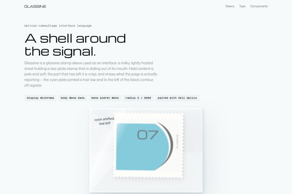
Glassine is a glassine stamp sleeve used as an interface. The sleeve is the one real object: a milky, lightly frosted sheet lying on an optical-white table, holding a two-plate postage stamp that is sliding out of its mouth. Inside the sleeve the stamp is pale and soft; the part that has left it is crisp, and shows what the page is actually reporting — the cyan plate printed a hair low and to the left of the black contour, off register. Everything around the sleeve is small, flat and precise: a Michroma title, quiet Mona Sans copy, Azeret Mono for the profile numbers and drift figures a diagnostic tool actually prints, and one pale cyan reserved for the stamp and its signal.
A revision of Glassine, rebuilt the Inspora way from the approved elevated direction (pilot-inspora/glassine.html, .p-glassine-e, post-review). It keeps the optical-shell-white world, the black ink contour, the scarce signal cyan and the shell-console voice, and turns the signature from a set of acrylic terminal panels into one real object — a glassine sleeve with a misregistered stamp sliding out of it — whose frosted/crisp states carry the language's whole idea of depth.
Calm product-page density: one object and a short headline per view, 96 to 128px between sections on desktop and 64 to 88px on phones, 48px controls, profile rows parted by 16 to 24px of space and a change in weight, prose held under about 46 characters beside the object.
Phones (390px) stack to one column, hide non-essential nav links and secondary hero actions, and let the sleeve keep its own aspect ratio at close to full width. Tablets (768 to 1100px) keep the two-column row but narrow the gutter. Ultra-wide caps and centres the content; only the landing hero spans the full width.
veil-optics
This revision spends Veil Optics on one clinical diagnostic scan of the glassine sleeve and its emerging stamp: a near-white camouflaged form under hairline coordinate crosshairs, one sweeping black ink contour arc that echoes the stamp's own printed contour, sparse pale-cyan signal ticks, and a restrained chrome glint on the sleeve's lit edge. The landing hero is that one full-bleed scan; every other view builds the sleeve and stamp directly in CSS and SVG rather than photographing it again, so the language's one real object stays exactly as precise as its own construction rules describe.
One full-bleed hero per landing, in the Veil Optics technique, built from the sleeve-and-stamp subject above with no baked-in text. Inside pages use the CSS/SVG sleeve and stamp rather than more photographs, so the object's frosted and crisp states stay under the page's own control.
# Glassine

## Philosophy

Glassine is a glassine stamp sleeve used as an interface. The sleeve is the one real object: a milky, lightly frosted sheet lying on an optical-white table, holding a two-plate postage stamp that is sliding out of its mouth. Inside the sleeve the stamp is pale and soft; the part that has left it is crisp, and shows what the page is actually reporting — the cyan plate printed a hair low and to the left of the black contour, off register. Everything around the sleeve is small, flat and precise: a Michroma title, quiet Mona Sans copy, Azeret Mono for the profile numbers and drift figures a diagnostic tool actually prints, and one pale cyan reserved for the stamp and its signal.

### Values

- One object is the interface: the glassine sleeve and the stamp sliding out of it, rendered as a real thing with a use, and it is the only raised or lit element in a view.
- Depth means state, not decoration. Held content is frosted and flat inside the sleeve; the one thing that has left it is crisp and carries the page's only shadow.
- Frame the signal, not the noise: at least a third of the canvas stays open shell, legible as deliberate quiet rather than unfinished layout.
- One light at the upper left. Every shadow, fold-highlight and gloss streak on the sleeve agrees with it.
- Cyan is scarce and means something specific: the stamp's own plate and the one signal mark, never a wash, a glow, or a second accent.
- Faces by job: Michroma for the one headline and the wordmark, Mona Sans for copy, Azeret Mono for what the audit actually measured.

### Anti-Values

- Glass as a decoration sprayed over flat colour: the frost must behave like one material, blurring everything under it evenly, or it doesn't earn the acrylic.
- A grey outline, floc texture or fibre veins standing in for the sleeve's material — those read as marble or plastic, not glassine.
- Saturated neon cyan, matrix rain, or a second accent colour.
- Generic dashboards, analytics cards, or component-library showcases.
- Cartoon anime characters or illustrated collage; ink appears only as the stamp's own printed contour.
- A decorative code language (folio marks, hex coordinates, crosshairs) standing in for real labels; every mono value on the page is something a real audit would print.

### Visual Character

- The sleeve lies on its side on the flat --bg table, air on every side, with a two-layer tinted shadow (tight contact, soft ambient) and no border, at roughly half the width of its section.
- The stamp is SVG on paper with a faint grain and CSS-masked perforations: a black G-pen contour arc and a Michroma numeral, and a flat cyan field printed low and left of the arc so a white sliver shows along the black line — the one piece of real evidence on the page.
- A milky glassine veil (--glassine at 34%, a small backdrop blur) sits over everything still inside the sleeve's mouth, including the perforations; only the part that has slid out is sharp.
- A short graphite-grey annotation sits on the sleeve itself in a quiet italic voice — the sleeve's own label, not a UI caption.
- Nothing else is boxed: the profile list and every other group sit straight on the shell, parted by space and the weight of their type; the one filled surface is a --surface_2 well or an open overlay, always square-cornered.
- Type is small and quiet around one big element: 17px Mona Sans copy, 14.5px Azeret Mono for profile numbers and drift, Michroma at 28 to 58px for the one headline.

### Lineage

> A revision of Glassine, rebuilt the Inspora way from the approved elevated direction (pilot-inspora/glassine.html, .p-glassine-e, post-review). It keeps the optical-shell-white world, the black ink contour, the scarce signal cyan and the shell-console voice, and turns the signature from a set of acrylic terminal panels into one real object — a glassine sleeve with a misregistered stamp sliding out of it — whose frosted/crisp states carry the language's whole idea of depth.

## Tokens

### Colors

| Name | Value |
|------|-------|
| bg | `#F7FAFB` |
| surface | `#FFFFFF` |
| surface_2 | `#EEF3F4` |
| text | `#0E1316` |
| muted | `#5E6A70` |
| border | `rgba(14,19,22,0)` |
| accent | `#2BA7C4` |
| on_accent | `#FFFFFF` |
| success | `#2F7A6E` |
| warning | `#8A6126` |
| error | `#A4313D` |
| info | `#3F7E94` |
| ink | `#0B0D0F` |
| chrome | `#B9C6CC` |
| glassine | `#E8EEF1` |

### Derived

- **Surface 2**: color-mix(in srgb, var(--surface), var(--text) 4%)
- **Glassine**: rgb(232 238 241 / 0.34)
- **Note**: The only literal colours are the twelve role values above. The glassine veil, its folds and gloss are opacity and blur on --text and --surface, so a palette swap still frosts and glints correctly. border is fully transparent by design: no rule ever draws it.

### Typography

- **Heading Font**: Michroma
- **Body Font**: Mona Sans
- **Mono Font**: Azeret Mono
- **Heading Weight**: 400
- **Body Weight**: 400
- **Body Light Weight**: 300
- **Button Weight**: 500
- **Heading Transform**: none
- **Letter Spacing**: -0.02em on Michroma display; -0.005em on body; -0.01em on mono figures
- **Line Height**: 1.5
- **Base Size**: 17px
- **Scale**: ["14.5px","17px","21px","28px","40px","58px"]
- **Roles**: {"display":"Michroma 400: wordmark, the one headline, section titles","body":"Mona Sans 400 at 17px for copy and labels, 300 for the light lede, 500 only on button labels and the profile table header","mono":"Azeret Mono 400 at 14.5px: profile numbers, drift percentages, timestamps and the handful of real telemetry values a diagnostic tool actually prints"}
- **Google Fonts Url**: https://fonts.googleapis.com/css2?family=Michroma&family=Mona+Sans:wdth,wght@75..125,300..600&family=Azeret+Mono:wght@400;500&display=swap

### Radii

- **None**: 0px
- **Md**: 0px
- **Lg**: 0px
- **Full**: 9999px

### Shadows

- **Contact**: a tight ellipse of tinted ink blurred a few px directly under the object
- **Ambient**: a soft, wider ellipse of the same tint blurred well past the object's edge
- **Lift**: the two layers grow and the object moves a little further out of its shell only while pointed at
- **Note**: Every shadow is drop-shadow(rgb(28 58 70 / a)) in two layers (tight contact, soft ambient), never grey, falling down and right from one light at the upper left. Nothing else on the page casts a shadow.

### Spacing

- **Base**: 8px
- **Scale**: ["4px","8px","12px","16px","24px","32px","48px","64px","96px","128px"]

### Surfaces

- **Treatment**: one-object-on-an-optical-white-shell
- **Material**: The glassine sleeve is the only material object: a smooth milky sheet, whiter on its lit folds, one gloss streak from the upper left, a construction seam and folded flap showing as white double layers, holding a two-plate stamp (SVG on paper with a faint tooth and CSS-masked perforations) that is crisp where it has left the sleeve's mouth and frosted where it hasn't. Everything else is flat colour.
- **Card Style**: No cards or panels. Content sits straight on the shell, grouped by space and a Michroma title. A --surface_2 recess appears only as a control well, a hover tint, or an open overlay, so a view has at most one filled surface.
- **Table**: The page ground --bg is the optical-white table the sleeve lies on: nothing else casts a shadow, so the one tinted, lit object reads as the only physical thing in the room.
- **Glassine Veil**: One milky frost over everything still inside the sleeve, perforations included: --glassine at 34% with a small backdrop blur, so held content goes pale and soft while the part that has slid out stays sharp. This is a state, not a decoration: depth means held vs. out of the shell.

### Borders

- **Default Width**: 0
- **Style**: none
- **Character**: No borders, rules, or dividers anywhere, including inside lists and tables. Rows and groups separate by space and by the value of their type; four small corner ticks mark the one acrylic well as a diagnostic register mark, not an edge. Focus is a 2px --ink outline at 2 to 3px offset.

### Motion

- **Duration**: 700ms
- **Easing**: cubic-bezier(.2,.9,.25,1.14)
- **Philosophy**: Motion is a physical verb: hovering or focusing the sleeve, or the one action, slides the stamp further out of the sleeve's mouth on a spring and lifts it a little, so its shadow grows and the misregistration comes fully out of the frost. The settled state is the default and renders with no JavaScript; an inline script adds .anim to <html> to gate start states, and prefers-reduced-motion holds the stamp at rest, half out.

### Controls

- **Height**: 48px
- **Radius**: 0px
- **Wells**: --surface_2 recess inside the shell, an open overlay on --surface

## Rules

### Composition

- Give every view one object moment: the sleeve with its stamp sliding out, or the stamp alone, frost still clinging to one edge, as a later headline figure. Everything else in that view stays flat.
- Lay the sleeve on the table with air on every side and a two-layer tinted shadow; never frame it in a card or crop it to a thumbnail.
- Order a page like a product page: the object stands alone first, straight on the ground with a short quiet caption underneath and nothing else riding along with it; a separate beat carries the Michroma headline, the lede and one action; the profile list is its own beat further down. Never fuse the object with a kicker, headline, lede and list into one bundled card — that reads as a page inside the page.
- Separate by space and value, never by boxes or rules: lists, forms and specimens sit straight on the shell; a --surface_2 well appears only as a control or an open overlay. No borders, no dividing rules, no cards.
- Show the whole sleeve once per page; later views take another moment of the same object — the stamp alone, or the sleeve's mouth and fold in close-up.
- Keep cyan to the stamp's own plate plus one signal mark per view; keep amber to the one exception row it names.

### Hierarchy

- The Michroma headline is the only large thing on a view; the mid-tier (ledes, section titles, labels) stays at 17 to 21px.
- Michroma 400 at -0.02em for the one headline (40 to 58px), section titles (24 to 28px) and the wordmark (18px).
- Mona Sans 400 at 17px for copy and control labels; 300 for the light lede; 500 only on button labels and the profile table header.
- Azeret Mono 400 at 14.5px, tabular figures, tightened tracking, for profile numbers, drift percentages and timestamps — real values only, never decorative coordinates.
- Status is a word in the semantic colour, never a coloured field or a pill with a border.

### Density

Calm product-page density: one object and a short headline per view, 96 to 128px between sections on desktop and 64 to 88px on phones, 48px controls, profile rows parted by 16 to 24px of space and a change in weight, prose held under about 46 characters beside the object.

### Signature Patterns

- The glassine sleeve: a milky SVG/CSS sheet with folded flaps, a construction seam, whiter lit edges and one gloss streak from the upper left, lying on the flat --bg table with a two-layer tinted shadow, at min(58%, 620px) on the landing and about half the section width on the embodiment.
- The stamp: SVG on paper with a faint tooth filter and CSS-masked perforations; a black G-pen contour arc and a Michroma numeral, and a flat cyan field bounded by the arc, printed a hair low and left of it so a white sliver shows along the black line and a deep top margin appears, like a real colour shift.
- The glassine veil: one milky overlay (--glassine at 34%, a small backdrop blur) over everything still inside the sleeve's mouth, perforations included, so held content is pale and soft while the part that has slid out stays crisp — the one and only place the page uses blur.
- Slide out: hovering the sleeve, or hovering or focusing the one action, slides the stamp further out of the mouth on a spring and lifts it a little; its shadow grows and the misregistration reads clearly. prefers-reduced-motion holds it at rest, half out.
- The annotation: a short graphite-grey (#465055) italic label on the sleeve itself, in the body voice, never a separate script face — the sleeve's own pencilled note, always legible at AA against the glassine behind it.
- The profile list: Azeret Mono rows straight on the shell, parted by space and weight, the one off-register row named in warning ink, no dividing rules, no badges, no corner brackets on the rows themselves.

## Layout

### Grid

- **Type**: object-first product page
- **Max Width**: 1200px content, 1320px from 1800px wide
- **Gutter**: 24px desktop, 16px phone
- **Column Behavior**: Below the hero, a two-column row (copy with the action, then the profile list) on minmax(0,5fr) minmax(0,6fr); the embodiment's specimen grids use three minmax(0,1fr) columns. Every grid child carries min-width:0.

### Whitespace

- **Section Gap**: 96 to 128px desktop, 64 to 88px phone
- **Card Gap**: no cards; 16 to 24px row padding in lists, 48 to 96px between groups
- **Content Padding**: content sits on the shell, aligned to the grid edge; overlays pad 24 to 28px
- **Approach**: The shell is empty space by design: at least a third of the canvas on desktop stays open so the object and the headline read as the only two things that matter in a view.

### Density

- **Default**: comfortable
- **Comfortable**: {"button_height":"48px","input_height":"48px","row_height":"44 to 52px profile rows with 16 to 24px gaps"}

### Responsive

Phones (390px) stack to one column, hide non-essential nav links and secondary hero actions, and let the sleeve keep its own aspect ratio at close to full width. Tablets (768 to 1100px) keep the two-column row but narrow the gutter. Ultra-wide caps and centres the content; only the landing hero spans the full width.

### Breakpoints

- **Mobile**: 390px
- **Phone Max**: 640px
- **Tablet**: 1024 to 1100px
- **Desktop**: 1280px
- **Wide**: 1440px
- **Ultrawide**: 1800px and 2560px

## Guidance

### Do

- Put the sleeve and its emerging stamp at the centre of the first view, on the flat shell with air all round.
- Keep the stamp's misregistration as the one piece of evidence the page reports; treat drift and profile figures as real audit values in Azeret Mono.
- Spend cyan on the stamp's own plate and one signal mark per view; spend warning ink only on the named exception.
- Separate rows by space and value, and keep at most one filled well or overlay in a view.
- Write in the audit's own words: profile numbers, a real date and time, a drift tolerance, a named exception.
- Style every control explicitly: flat 48px wells, square corners, a 2px ink focus ring.

### Don't

- Don't spray a blur or a translucent panel over flat colour and call it glassine — the frost must sit on everything it covers, evenly, or drop it.
- Don't give the sleeve a grey outline, a floc texture or fibre veins; they read as marble, not glassine.
- Don't add a second accent colour or let cyan spread past the stamp and its one signal.
- Don't use borders, dividing rules, dot fields, or grain.
- Don't box content in cards or panels, or lift more than one thing at a time.
- Don't show the whole sleeve twice on one page; take a different moment of it.
- Don't put emoji or symbol glyphs on buttons, and don't stand a decorative coordinate or crosshair in for a real label.
- Don't bundle a kicker, a headline, a lede and the profile list around the object as one tight card — that reads as a page inside the page. Take the object and its interaction straight on the ground; give the headline, the copy and the list their own separate beats.

### Accessibility

WCAG AA and better on the optical-white shell: ink #0E1316 is 17.5:1, muted #5E6A70 is 5.1:1 on #F7FAFB; #0B0D0F on white is 19.6:1; the on_accent white on #2BA7C4 is 3.3:1 so accent never carries small text, only large type, icons or fills with an ink label; warning #8A6126 on white is 4.9:1. The graphite annotation (#465055) clears AA on the glassine veil it sits on. Focus is a visible 2px ink outline on every control. prefers-reduced-motion holds the stamp at rest, half out of the sleeve; state changes (the exception naming itself) still happen without motion.

## Imagery Direction

### Pairs With

veil-optics

### Summary

This revision spends Veil Optics on one clinical diagnostic scan of the glassine sleeve and its emerging stamp: a near-white camouflaged form under hairline coordinate crosshairs, one sweeping black ink contour arc that echoes the stamp's own printed contour, sparse pale-cyan signal ticks, and a restrained chrome glint on the sleeve's lit edge. The landing hero is that one full-bleed scan; every other view builds the sleeve and stamp directly in CSS and SVG rather than photographing it again, so the language's one real object stays exactly as precise as its own construction rules describe.

### Subjects

- the glassine sleeve with the stamp sliding out of its mouth
- the stamp alone, mid-slide, frost still clinging to one edge
- the sleeve's folded flap and construction seam
- the misregistered cyan plate against the black contour

### Usage

One full-bleed hero per landing, in the Veil Optics technique, built from the sleeve-and-stamp subject above with no baked-in text. Inside pages use the CSS/SVG sleeve and stamp rather than more photographs, so the object's frosted and crisp states stay under the page's own control.
---
version: "alpha"
name: "Glassine"
description: "Glassine is a glassine stamp sleeve used as an interface. The sleeve is the one real object: a milky, lightly frosted sheet lying on an optical-white table, holding a two-plate postage stamp that is sliding out of its mouth. Inside the s..."
colors:
  bg: "#F7FAFB"
  surface: "#FFFFFF"
  surface_2: "#EEF3F4"
  text: "#0E1316"
  muted: "#5E6A70"
  accent: "#2BA7C4"
  on_accent: "#FFFFFF"
  success: "#2F7A6E"
  warning: "#8A6126"
  error: "#A4313D"
  info: "#3F7E94"
  ink: "#0B0D0F"
  chrome: "#B9C6CC"
  glassine: "#E8EEF1"
typography:
  headline-lg:
    fontFamily: "Michroma"
    fontSize: "2.075rem"
    fontWeight: 700
    lineHeight: 1.1
    letterSpacing: "-0.02em"
  headline-md:
    fontFamily: "Michroma"
    fontSize: "1.66rem"
    fontWeight: 600
    lineHeight: 1.15
    letterSpacing: "-0.02em"
  body-md:
    fontFamily: "Mona Sans"
    fontSize: "17px"
    fontWeight: 400
    lineHeight: 1.5
    letterSpacing: "-0.02em"
  label-md:
    fontFamily: "Azeret Mono"
    fontSize: "0.75rem"
    fontWeight: 600
    lineHeight: 1
    letterSpacing: "0.08em"
rounded:
  none: "0px"
  md: "0px"
  lg: "0px"
  full: "9999px"
spacing:
  base: "8px"
  xs: "4px"
  sm: "8px"
  md: "12px"
  lg: "16px"
  xl: "24px"
  2xl: "32px"
  3xl: "48px"
  4xl: "64px"
  step-8: "96px"
  step-9: "128px"
components:
  color-reference-bg:
    backgroundColor: "{colors.bg}"
  color-reference-surface:
    backgroundColor: "{colors.surface}"
  color-reference-surface_2:
    backgroundColor: "{colors.surface_2}"
  color-reference-text:
    backgroundColor: "{colors.text}"
  color-reference-muted:
    backgroundColor: "{colors.muted}"
  color-reference-accent:
    backgroundColor: "{colors.accent}"
  color-reference-on_accent:
    backgroundColor: "{colors.on_accent}"
  color-reference-success:
    backgroundColor: "{colors.success}"
  color-reference-warning:
    backgroundColor: "{colors.warning}"
  color-reference-error:
    backgroundColor: "{colors.error}"
  color-reference-info:
    backgroundColor: "{colors.info}"
  color-reference-ink:
    backgroundColor: "{colors.ink}"
  color-reference-chrome:
    backgroundColor: "{colors.chrome}"
  color-reference-glassine:
    backgroundColor: "{colors.glassine}"
  button-primary:
    backgroundColor: "{colors.accent}"
    textColor: "{colors.on_accent}"
    typography: "{typography.label-md}"
    rounded: "{rounded.md}"
    padding: "{spacing.md}"
  card-surface:
    backgroundColor: "{colors.surface}"
    textColor: "{colors.text}"
    rounded: "{rounded.md}"
    padding: "{spacing.md}"
  input-default:
    backgroundColor: "{colors.surface}"
    textColor: "{colors.text}"
    rounded: "{rounded.md}"
    height: "44px"
---

# Glassine

## Overview

Glassine is a glassine stamp sleeve used as an interface. The sleeve is the one real object: a milky, lightly frosted sheet lying on an optical-white table, holding a two-plate postage stamp that is sliding out of its mouth. Inside the sleeve the stamp is pale and soft; the part that has left it is crisp, and shows what the page is actually reporting — the cyan plate printed a hair low and to the left of the black contour, off register. Everything around the sleeve is small, flat and precise: a Michroma title, quiet Mona Sans copy, Azeret Mono for the profile numbers and drift figures a diagnostic tool actually prints, and one pale cyan reserved for the stamp and its signal.

### Values

- One object is the interface: the glassine sleeve and the stamp sliding out of it, rendered as a real thing with a use, and it is the only raised or lit element in a view.
- Depth means state, not decoration. Held content is frosted and flat inside the sleeve; the one thing that has left it is crisp and carries the page's only shadow.
- Frame the signal, not the noise: at least a third of the canvas stays open shell, legible as deliberate quiet rather than unfinished layout.
- One light at the upper left. Every shadow, fold-highlight and gloss streak on the sleeve agrees with it.
- Cyan is scarce and means something specific: the stamp's own plate and the one signal mark, never a wash, a glow, or a second accent.
- Faces by job: Michroma for the one headline and the wordmark, Mona Sans for copy, Azeret Mono for what the audit actually measured.

### Anti-Values

- Glass as a decoration sprayed over flat colour: the frost must behave like one material, blurring everything under it evenly, or it doesn't earn the acrylic.
- A grey outline, floc texture or fibre veins standing in for the sleeve's material — those read as marble or plastic, not glassine.
- Saturated neon cyan, matrix rain, or a second accent colour.
- Generic dashboards, analytics cards, or component-library showcases.
- Cartoon anime characters or illustrated collage; ink appears only as the stamp's own printed contour.
- A decorative code language (folio marks, hex coordinates, crosshairs) standing in for real labels; every mono value on the page is something a real audit would print.

### Visual Character

- The sleeve lies on its side on the flat --bg table, air on every side, with a two-layer tinted shadow (tight contact, soft ambient) and no border, at roughly half the width of its section.
- The stamp is SVG on paper with a faint grain and CSS-masked perforations: a black G-pen contour arc and a Michroma numeral, and a flat cyan field printed low and left of the arc so a white sliver shows along the black line — the one piece of real evidence on the page.
- A milky glassine veil (--glassine at 34%, a small backdrop blur) sits over everything still inside the sleeve's mouth, including the perforations; only the part that has slid out is sharp.
- A short graphite-grey annotation sits on the sleeve itself in a quiet italic voice — the sleeve's own label, not a UI caption.
- Nothing else is boxed: the profile list and every other group sit straight on the shell, parted by space and the weight of their type; the one filled surface is a --surface_2 well or an open overlay, always square-cornered.
- Type is small and quiet around one big element: 17px Mona Sans copy, 14.5px Azeret Mono for profile numbers and drift, Michroma at 28 to 58px for the one headline.

### Lineage

> A revision of Glassine, rebuilt the Inspora way from the approved elevated direction (pilot-inspora/glassine.html, .p-glassine-e, post-review). It keeps the optical-shell-white world, the black ink contour, the scarce signal cyan and the shell-console voice, and turns the signature from a set of acrylic terminal panels into one real object — a glassine sleeve with a misregistered stamp sliding out of it — whose frosted/crisp states carry the language's whole idea of depth.

## Colors

Use the YAML color tokens as the normative palette. The prose below names the roles agents should preserve when generating UI.

| Token | Value |
|-------|-------|
| bg | `#F7FAFB` |
| surface | `#FFFFFF` |
| surface_2 | `#EEF3F4` |
| text | `#0E1316` |
| muted | `#5E6A70` |
| accent | `#2BA7C4` |
| on_accent | `#FFFFFF` |
| success | `#2F7A6E` |
| warning | `#8A6126` |
| error | `#A4313D` |
| info | `#3F7E94` |
| ink | `#0B0D0F` |
| chrome | `#B9C6CC` |
| glassine | `#E8EEF1` |

## Typography

Load the fonts from Google Fonts: https://fonts.googleapis.com/css2?family=Michroma&family=Mona+Sans:wdth,wght@75..125,300..600&family=Azeret+Mono:wght@400;500&display=swap

- **Headline-Lg**: Michroma, 2.075rem, weight 700, line-height 1.1.
- **Headline-Md**: Michroma, 1.66rem, weight 600, line-height 1.15.
- **Body-Md**: Mona Sans, 17px, weight 400, line-height 1.5.
- **Label-Md**: Azeret Mono, 0.75rem, weight 600, line-height 1.

## Layout

### Spacing Tokens

- **Base**: `8px`
- **Xs**: `4px`
- **Sm**: `8px`
- **Md**: `12px`
- **Lg**: `16px`
- **Xl**: `24px`
- **2xl**: `32px`
- **3xl**: `48px`
- **4xl**: `64px`
- **Step-8**: `96px`
- **Step-9**: `128px`

### Grid

- **Type**: object-first product page
- **Max Width**: 1200px content, 1320px from 1800px wide
- **Gutter**: 24px desktop, 16px phone
- **Column Behavior**: Below the hero, a two-column row (copy with the action, then the profile list) on minmax(0,5fr) minmax(0,6fr); the embodiment's specimen grids use three minmax(0,1fr) columns. Every grid child carries min-width:0.

### Whitespace

- **Section Gap**: 96 to 128px desktop, 64 to 88px phone
- **Card Gap**: no cards; 16 to 24px row padding in lists, 48 to 96px between groups
- **Content Padding**: content sits on the shell, aligned to the grid edge; overlays pad 24 to 28px
- **Approach**: The shell is empty space by design: at least a third of the canvas on desktop stays open so the object and the headline read as the only two things that matter in a view.

### Density

- **Default**: comfortable
- **Comfortable**: {"button_height":"48px","input_height":"48px","row_height":"44 to 52px profile rows with 16 to 24px gaps"}

### Responsive

Phones (390px) stack to one column, hide non-essential nav links and secondary hero actions, and let the sleeve keep its own aspect ratio at close to full width. Tablets (768 to 1100px) keep the two-column row but narrow the gutter. Ultra-wide caps and centres the content; only the landing hero spans the full width.

### Breakpoints

- **Mobile**: 390px
- **Phone Max**: 640px
- **Tablet**: 1024 to 1100px
- **Desktop**: 1280px
- **Wide**: 1440px
- **Ultrawide**: 1800px and 2560px

## Elevation & Depth

### Shadows

- **Contact**: a tight ellipse of tinted ink blurred a few px directly under the object
- **Ambient**: a soft, wider ellipse of the same tint blurred well past the object's edge
- **Lift**: the two layers grow and the object moves a little further out of its shell only while pointed at
- **Note**: Every shadow is drop-shadow(rgb(28 58 70 / a)) in two layers (tight contact, soft ambient), never grey, falling down and right from one light at the upper left. Nothing else on the page casts a shadow.

## Shapes

### Rounded

- **None**: `0px`
- **Md**: `0px`
- **Lg**: `0px`
- **Full**: `9999px`

### Surfaces

- **Treatment**: one-object-on-an-optical-white-shell
- **Material**: The glassine sleeve is the only material object: a smooth milky sheet, whiter on its lit folds, one gloss streak from the upper left, a construction seam and folded flap showing as white double layers, holding a two-plate stamp (SVG on paper with a faint tooth and CSS-masked perforations) that is crisp where it has left the sleeve's mouth and frosted where it hasn't. Everything else is flat colour.
- **Card Style**: No cards or panels. Content sits straight on the shell, grouped by space and a Michroma title. A --surface_2 recess appears only as a control well, a hover tint, or an open overlay, so a view has at most one filled surface.
- **Table**: The page ground --bg is the optical-white table the sleeve lies on: nothing else casts a shadow, so the one tinted, lit object reads as the only physical thing in the room.
- **Glassine Veil**: One milky frost over everything still inside the sleeve, perforations included: --glassine at 34% with a small backdrop blur, so held content goes pale and soft while the part that has slid out stays sharp. This is a state, not a decoration: depth means held vs. out of the shell.

### Borders

- **Default Width**: 0
- **Style**: none
- **Character**: No borders, rules, or dividers anywhere, including inside lists and tables. Rows and groups separate by space and by the value of their type; four small corner ticks mark the one acrylic well as a diagnostic register mark, not an edge. Focus is a 2px --ink outline at 2 to 3px offset.

## Components

### Composition

- Give every view one object moment: the sleeve with its stamp sliding out, or the stamp alone, frost still clinging to one edge, as a later headline figure. Everything else in that view stays flat.
- Lay the sleeve on the table with air on every side and a two-layer tinted shadow; never frame it in a card or crop it to a thumbnail.
- Order a page like a product page: the object stands alone first, straight on the ground with a short quiet caption underneath and nothing else riding along with it; a separate beat carries the Michroma headline, the lede and one action; the profile list is its own beat further down. Never fuse the object with a kicker, headline, lede and list into one bundled card — that reads as a page inside the page.
- Separate by space and value, never by boxes or rules: lists, forms and specimens sit straight on the shell; a --surface_2 well appears only as a control or an open overlay. No borders, no dividing rules, no cards.
- Show the whole sleeve once per page; later views take another moment of the same object — the stamp alone, or the sleeve's mouth and fold in close-up.
- Keep cyan to the stamp's own plate plus one signal mark per view; keep amber to the one exception row it names.

### Hierarchy

- The Michroma headline is the only large thing on a view; the mid-tier (ledes, section titles, labels) stays at 17 to 21px.
- Michroma 400 at -0.02em for the one headline (40 to 58px), section titles (24 to 28px) and the wordmark (18px).
- Mona Sans 400 at 17px for copy and control labels; 300 for the light lede; 500 only on button labels and the profile table header.
- Azeret Mono 400 at 14.5px, tabular figures, tightened tracking, for profile numbers, drift percentages and timestamps — real values only, never decorative coordinates.
- Status is a word in the semantic colour, never a coloured field or a pill with a border.

### Density

Calm product-page density: one object and a short headline per view, 96 to 128px between sections on desktop and 64 to 88px on phones, 48px controls, profile rows parted by 16 to 24px of space and a change in weight, prose held under about 46 characters beside the object.

### Signature Patterns

- The glassine sleeve: a milky SVG/CSS sheet with folded flaps, a construction seam, whiter lit edges and one gloss streak from the upper left, lying on the flat --bg table with a two-layer tinted shadow, at min(58%, 620px) on the landing and about half the section width on the embodiment.
- The stamp: SVG on paper with a faint tooth filter and CSS-masked perforations; a black G-pen contour arc and a Michroma numeral, and a flat cyan field bounded by the arc, printed a hair low and left of it so a white sliver shows along the black line and a deep top margin appears, like a real colour shift.
- The glassine veil: one milky overlay (--glassine at 34%, a small backdrop blur) over everything still inside the sleeve's mouth, perforations included, so held content is pale and soft while the part that has slid out stays crisp — the one and only place the page uses blur.
- Slide out: hovering the sleeve, or hovering or focusing the one action, slides the stamp further out of the mouth on a spring and lifts it a little; its shadow grows and the misregistration reads clearly. prefers-reduced-motion holds it at rest, half out.
- The annotation: a short graphite-grey (#465055) italic label on the sleeve itself, in the body voice, never a separate script face — the sleeve's own pencilled note, always legible at AA against the glassine behind it.
- The profile list: Azeret Mono rows straight on the shell, parted by space and weight, the one off-register row named in warning ink, no dividing rules, no badges, no corner brackets on the rows themselves.

## shadcn/ui Usage

When the target app uses shadcn/ui, copy DESIGN.md with shadcn instead of the plain DESIGN.md. It contains the same Katagami design-language source plus the shadcn/ui primitives, imports, theme variables, component recipes, and preview-shot guidance.

DESIGN.md with shadcn: `/language/en-01a0ecb8-ec13-7393-b491-0b350ba4905f/DESIGN.with-shadcn.md`.

Machine-readable companions for automation: `/language/en-01a0ecb8-ec13-7393-b491-0b350ba4905f/shadcn.json` (registry theme), `/language/en-01a0ecb8-ec13-7393-b491-0b350ba4905f/shadcn-components.md` (component recipes) and `/language/en-01a0ecb8-ec13-7393-b491-0b350ba4905f/shadcn-shots.json` (preview shots). The human-facing handoff is still DESIGN.md with shadcn.

Install recommended primitives with `npx shadcn@latest add button card input textarea select dialog sheet tabs badge separator checkbox switch slider tooltip dropdown-menu table`.

Use these primitives in shadcn apps:
- button
- card
- input
- textarea
- select
- dialog
- sheet
- tabs
- badge
- separator
- checkbox
- switch
- slider
- tooltip
- dropdown-menu
- table

Implementation rule for agents: import shadcn primitives from `@/components/ui/*`, apply the generated CSS variables first, then compose the language-specific recipes from the companion MD. Katagami remains the source of truth; shadcn names are the implementation surface.

## Do's and Don'ts

- Do Put the sleeve and its emerging stamp at the centre of the first view, on the flat shell with air all round.
- Do Keep the stamp's misregistration as the one piece of evidence the page reports; treat drift and profile figures as real audit values in Azeret Mono.
- Do Spend cyan on the stamp's own plate and one signal mark per view; spend warning ink only on the named exception.
- Do Separate rows by space and value, and keep at most one filled well or overlay in a view.
- Do Write in the audit's own words: profile numbers, a real date and time, a drift tolerance, a named exception.
- Do Style every control explicitly: flat 48px wells, square corners, a 2px ink focus ring.
- Don't Don't spray a blur or a translucent panel over flat colour and call it glassine — the frost must sit on everything it covers, evenly, or drop it.
- Don't Don't give the sleeve a grey outline, a floc texture or fibre veins; they read as marble, not glassine.
- Don't Don't add a second accent colour or let cyan spread past the stamp and its one signal.
- Don't Don't use borders, dividing rules, dot fields, or grain.
- Don't Don't box content in cards or panels, or lift more than one thing at a time.
- Don't Don't show the whole sleeve twice on one page; take a different moment of it.
- Don't Don't put emoji or symbol glyphs on buttons, and don't stand a decorative coordinate or crosshair in for a real label.
- Don't Don't bundle a kicker, a headline, a lede and the profile list around the object as one tight card — that reads as a page inside the page. Take the object and its interaction straight on the ground; give the headline, the copy and the list their own separate beats.

### Accessibility

WCAG AA and better on the optical-white shell: ink #0E1316 is 17.5:1, muted #5E6A70 is 5.1:1 on #F7FAFB; #0B0D0F on white is 19.6:1; the on_accent white on #2BA7C4 is 3.3:1 so accent never carries small text, only large type, icons or fills with an ink label; warning #8A6126 on white is 4.9:1. The graphite annotation (#465055) clears AA on the glassine veil it sits on. Focus is a visible 2px ink outline on every control. prefers-reduced-motion holds the stamp at rest, half out of the sleeve; state changes (the exception naming itself) still happen without motion.

## Imagery Direction

### Pairs With

veil-optics

### Summary

This revision spends Veil Optics on one clinical diagnostic scan of the glassine sleeve and its emerging stamp: a near-white camouflaged form under hairline coordinate crosshairs, one sweeping black ink contour arc that echoes the stamp's own printed contour, sparse pale-cyan signal ticks, and a restrained chrome glint on the sleeve's lit edge. The landing hero is that one full-bleed scan; every other view builds the sleeve and stamp directly in CSS and SVG rather than photographing it again, so the language's one real object stays exactly as precise as its own construction rules describe.

### Subjects

- the glassine sleeve with the stamp sliding out of its mouth
- the stamp alone, mid-slide, frost still clinging to one edge
- the sleeve's folded flap and construction seam
- the misregistered cyan plate against the black contour

### Usage

One full-bleed hero per landing, in the Veil Optics technique, built from the sleeve-and-stamp subject above with no baked-in text. Inside pages use the CSS/SVG sleeve and stamp rather than more photographs, so the object's frosted and crisp states stay under the page's own control.
```json
{
  "$schema": "https://ui.shadcn.com/schema/registry-item.json",
  "name": "glassine",
  "type": "registry:theme",
  "title": "Glassine shadcn Theme",
  "cssVars": {
    "theme": {},
    "light": {
      "background": "#F7FAFB",
      "foreground": "#0E1316",
      "card": "#FFFFFF",
      "card-foreground": "#0E1316",
      "popover": "#FFFFFF",
      "popover-foreground": "#0E1316",
      "primary": "#0E1316",
      "primary-foreground": "#ffffff",
      "secondary": "#f4f4f5",
      "secondary-foreground": "#111111",
      "muted": "#5E6A70",
      "muted-foreground": "#0E1316",
      "accent": "#2BA7C4",
      "accent-foreground": "#ffffff",
      "destructive": "#A4313D",
      "border": "rgba(14,19,22,0)",
      "input": "rgba(14,19,22,0)",
      "ring": "#2BA7C4",
      "chart-1": "#0E1316",
      "chart-2": "#f4f4f5",
      "chart-3": "#2BA7C4",
      "chart-4": "#2F7A6E",
      "chart-5": "#8A6126",
      "sidebar": "#FFFFFF",
      "sidebar-foreground": "#0E1316",
      "sidebar-primary": "#0E1316",
      "sidebar-primary-foreground": "#ffffff",
      "sidebar-accent": "#3F7E94",
      "sidebar-accent-foreground": "#ffffff",
      "sidebar-border": "rgba(14,19,22,0)",
      "sidebar-ring": "#2BA7C4",
      "radius": "0px"
    },
    "dark": {
      "background": "#0f1115",
      "foreground": "#f8fafc",
      "card": "#181b22",
      "card-foreground": "#f8fafc",
      "popover": "#181b22",
      "popover-foreground": "#f8fafc",
      "primary": "#0E1316",
      "primary-foreground": "#ffffff",
      "secondary": "#252a33",
      "secondary-foreground": "#f8fafc",
      "muted": "#252a33",
      "muted-foreground": "#a1a1aa",
      "accent": "#2BA7C4",
      "accent-foreground": "#ffffff",
      "destructive": "#A4313D",
      "border": "#303642",
      "input": "#303642",
      "ring": "#2BA7C4",
      "chart-1": "#0E1316",
      "chart-2": "#f4f4f5",
      "chart-3": "#2BA7C4",
      "chart-4": "#2F7A6E",
      "chart-5": "#8A6126",
      "sidebar": "#181b22",
      "sidebar-foreground": "#f8fafc",
      "sidebar-primary": "#0E1316",
      "sidebar-primary-foreground": "#ffffff",
      "sidebar-accent": "#2BA7C4",
      "sidebar-accent-foreground": "#ffffff",
      "sidebar-border": "#303642",
      "sidebar-ring": "#2BA7C4",
      "radius": "0px"
    }
  },
  "meta": {
    "source": "katagami",
    "languageId": "en-01a0ecb8-ec13-7393-b491-0b350ba4905f",
    "slug": "glassine",
    "componentManifest": [
      "button",
      "card",
      "input",
      "textarea",
      "select",
      "dialog",
      "sheet",
      "tabs",
      "badge",
      "separator",
      "checkbox",
      "switch",
      "slider",
      "tooltip",
      "dropdown-menu",
      "table"
    ],
    "installCommand": "npx shadcn@latest add button card input textarea select dialog sheet tabs badge separator checkbox switch slider tooltip dropdown-menu table",
    "nativeTokenNames": {
      "colors": [
        "accent",
        "bg",
        "border",
        "chrome",
        "error",
        "glassine",
        "info",
        "ink",
        "muted",
        "on_accent",
        "success",
        "surface",
        "surface_2",
        "text",
        "warning"
      ],
      "derived": [
        "glassine",
        "note",
        "surface_2"
      ],
      "typography": [
        "base_size",
        "body_font",
        "body_light_weight",
        "body_weight",
        "button_weight",
        "google_fonts_url",
        "heading_font",
        "heading_transform",
        "heading_weight",
        "letter_spacing",
        "line_height",
        "mono_font",
        "roles",
        "scale"
      ],
      "radii": [
        "full",
        "lg",
        "md",
        "none"
      ],
      "shadows": [
        "ambient",
        "contact",
        "lift",
        "note"
      ],
      "spacing": [
        "base",
        "scale"
      ],
      "surfaces": [
        "card_style",
        "glassine_veil",
        "material",
        "table",
        "treatment"
      ],
      "borders": [
        "character",
        "default_width",
        "style"
      ],
      "motion": [
        "duration",
        "easing",
        "philosophy"
      ],
      "controls": [
        "height",
        "radius",
        "wells"
      ]
    }
  }
}
```The art style its pictures are drawn in and the colours its tokens carry.
The theme variables are generated from the tokens. Component recipes and preview shots have not been written for this language yet.
For an app that uses shadcn/ui: the DESIGN.md plus the install list, theme variables, component recipes, preview shots and a starter TSX file, in one Markdown file.
The same pieces as separate files: theme, CSS, TSX starter, recipes and the preview contract.
npx shadcn@latest add button card input textarea select dialog sheet tabs badge separator checkbox switch slider tooltip dropdown-menu table:root {
--background: #F7FAFB;
--foreground: #0E1316;
--card: #FFFFFF;
--card-foreground: #0E1316;
--popover: #FFFFFF;
--popover-foreground: #0E1316;
--primary: #0E1316;
--primary-foreground: #ffffff;
--secondary: #f4f4f5;
--secondary-foreground: #111111;
--muted: #5E6A70;
--muted-foreground: #0E1316;
--accent: #2BA7C4;
--accent-foreground: #ffffff;
--destructive: #A4313D;
--border: rgba(14,19,22,0);
--input: rgba(14,19,22,0);
--ring: #2BA7C4;
--chart-1: #0E1316;
--chart-2: #f4f4f5;
--chart-3: #2BA7C4;
--chart-4: #2F7A6E;
--chart-5: #8A6126;
--sidebar: #FFFFFF;
--sidebar-foreground: #0E1316;
--sidebar-primary: #0E1316;
--sidebar-primary-foreground: #ffffff;
--sidebar-accent: #3F7E94;
--sidebar-accent-foreground: #ffffff;
--sidebar-border: rgba(14,19,22,0);
--sidebar-ring: #2BA7C4;
--radius: 0px;
}
.dark {
--background: #0f1115;
--foreground: #f8fafc;
--card: #181b22;
--card-foreground: #f8fafc;
--popover: #181b22;
--popover-foreground: #f8fafc;
--primary: #0E1316;
--primary-foreground: #ffffff;
--secondary: #252a33;
--secondary-foreground: #f8fafc;
--muted: #252a33;
--muted-foreground: #a1a1aa;
--accent: #2BA7C4;
--accent-foreground: #ffffff;
--destructive: #A4313D;
--border: #303642;
--input: #303642;
--ring: #2BA7C4;
--chart-1: #0E1316;
--chart-2: #f4f4f5;
--chart-3: #2BA7C4;
--chart-4: #2F7A6E;
--chart-5: #8A6126;
--sidebar: #181b22;
--sidebar-foreground: #f8fafc;
--sidebar-primary: #0E1316;
--sidebar-primary-foreground: #ffffff;
--sidebar-accent: #2BA7C4;
--sidebar-accent-foreground: #ffffff;
--sidebar-border: #303642;
--sidebar-ring: #2BA7C4;
--radius: 0px;
}
import { Badge } from "@/components/ui/badge";
import { Button } from "@/components/ui/button";
import {
  Card,
  CardContent,
  CardDescription,
  CardFooter,
  CardHeader,
  CardTitle,
} from "@/components/ui/card";
import { Input } from "@/components/ui/input";
import { Tabs, TabsList, TabsTrigger } from "@/components/ui/tabs";

export function GlassineShadcnKit() {
  return (
    <section className="grid gap-4 rounded-[var(--radius)] border bg-background p-4 text-foreground">
      <div className="flex items-start justify-between gap-4">
        <div>
          <Badge variant="outline">shadcn/ui</Badge>
          <h2 className="mt-3 text-2xl font-semibold tracking-tight">Glassine</h2>
          <p className="mt-1 max-w-xl text-sm text-muted-foreground">
            Use the Katagami registry theme, then compose these shadcn primitives
            with the language-specific component recipes.
          </p>
        </div>
        <Button>Apply theme</Button>
      </div>

      <Tabs defaultValue="components">
        <TabsList>
          <TabsTrigger value="components">Components</TabsTrigger>
          <TabsTrigger value="states">States</TabsTrigger>
          <TabsTrigger value="export">Export</TabsTrigger>
        </TabsList>
      </Tabs>

      <Card>
        <CardHeader>
          <CardTitle>Component recipe</CardTitle>
          <CardDescription>
            Replace this starter content with the agent-authored product scene
            from components.md and preview-shots.json.
          </CardDescription>
        </CardHeader>
        <CardContent className="grid gap-3 sm:grid-cols-[1fr_auto]">
          <Input defaultValue="Tokenized shadcn surface" aria-label="Recipe name" />
          <Button variant="secondary">Preview state</Button>
        </CardContent>
        <CardFooter className="justify-between">
          <Badge>Ready</Badge>
          <Button variant="outline">Copy recipe</Button>
        </CardFooter>
      </Card>
    </section>
  );
}
{
  "$schema": "https://ui.shadcn.com/schema/registry-item.json",
  "name": "glassine",
  "type": "registry:theme",
  "title": "Glassine",
  "description": "A glassine stamp sleeve used as an interface: optical shell-white ground, soft contour ink, a milky frosted veil over held content, and scarce signal cyan. No borders, square corners, one chrome glint on the sleeve.",
  "cssVars": {
    "theme": {
      "font-sans": "Mona Sans, system-ui, sans-serif",
      "font-mono": "Azeret Mono, ui-monospace, monospace",
      "font-display": "Michroma, Mona Sans, system-ui, sans-serif",
      "radius": "0px"
    },
    "light": {
      "background": "#F7FAFB",
      "foreground": "#0E1316",
      "card": "#FFFFFF",
      "card-foreground": "#0E1316",
      "popover": "#FFFFFF",
      "popover-foreground": "#0E1316",
      "primary": "#0B0D0F",
      "primary-foreground": "#FFFFFF",
      "secondary": "#EEF3F4",
      "secondary-foreground": "#0E1316",
      "muted": "#EEF3F4",
      "muted-foreground": "#5E6A70",
      "accent": "#2BA7C4",
      "accent-foreground": "#FFFFFF",
      "destructive": "#A4313D",
      "destructive-foreground": "#FFFFFF",
      "border": "rgba(14,19,22,0)",
      "input": "#EEF3F4",
      "ring": "#2BA7C4",
      "chart-1": "#2BA7C4",
      "chart-2": "#0B0D0F",
      "chart-3": "#8A6126",
      "chart-4": "#2F7A6E",
      "chart-5": "#3F7E94",
      "radius": "0px"
    },
    "dark": {
      "background": "#F7FAFB",
      "foreground": "#0E1316",
      "card": "#FFFFFF",
      "card-foreground": "#0E1316",
      "popover": "#FFFFFF",
      "popover-foreground": "#0E1316",
      "primary": "#0B0D0F",
      "primary-foreground": "#FFFFFF",
      "secondary": "#EEF3F4",
      "secondary-foreground": "#0E1316",
      "muted": "#EEF3F4",
      "muted-foreground": "#5E6A70",
      "accent": "#2BA7C4",
      "accent-foreground": "#FFFFFF",
      "destructive": "#A4313D",
      "destructive-foreground": "#FFFFFF",
      "border": "rgba(14,19,22,0)",
      "input": "#EEF3F4",
      "ring": "#2BA7C4",
      "chart-1": "#2BA7C4",
      "chart-2": "#0B0D0F",
      "chart-3": "#8A6126",
      "chart-4": "#2F7A6E",
      "chart-5": "#3F7E94",
      "radius": "0px"
    }
  },
  "componentManifest": [
    "button",
    "card",
    "input",
    "textarea",
    "select",
    "dialog",
    "sheet",
    "tabs",
    "badge",
    "separator",
    "checkbox",
    "switch",
    "slider",
    "tooltip",
    "dropdown-menu",
    "table"
  ],
  "meta": {
    "nativeTokenNames": {
      "bg": "background",
      "surface": "card",
      "surface_2": "secondary / muted / input",
      "text": "foreground",
      "muted": "muted-foreground",
      "accent": "accent",
      "ink": "primary",
      "error": "destructive",
      "chrome": "native only",
      "glassine": "native only",
      "success": "native only",
      "warning": "native only",
      "info": "native only"
    },
    "note": "Glassine is a light-ground language by concept; the dark scope repeats the light values rather than inverting to a dark table.",
    "componentManifest": [
      "button",
      "card",
      "input",
      "textarea",
      "select",
      "dialog",
      "sheet",
      "tabs",
      "badge",
      "separator",
      "checkbox",
      "switch",
      "slider",
      "tooltip",
      "dropdown-menu",
      "table"
    ]
  }
}
---
artifact: component-recipes-v1
language: glassine
author: katagami-agent
primitives: 16
---

# Glassine shadcn/ui Components

Author: `katagami-agent`

## Intent

Glassine dresses shadcn/ui as the precise, flat interface around one real object: a glassine sleeve holding a two-plate stamp sliding out of its mouth. The sleeve is the only raised or lit thing in a view, shown whole once per page; held content sits under one even milky veil while the part that has left the mouth is crisp. Nothing else is boxed: content sits straight on the optical-white shell, parted by space; the only filled surface is a recess well or an open overlay, square-cornered, with no border anywhere. Cyan is spent only on the stamp's own plate and one signal mark per view.

## Required primitives

button, card, input, textarea, select, dialog, sheet, tabs, badge, separator, checkbox, switch, slider, tooltip, dropdown-menu, table. Import them from `@/components/ui/*`; do not build a second component system.

## Token cues

```css
--background:#F7FAFB; --foreground:#0E1316;
--card:#FFFFFF; --card-foreground:#0E1316;
--popover:#FFFFFF; --popover-foreground:#0E1316;
--primary:#0B0D0F; --primary-foreground:#FFFFFF;
--secondary:#EEF3F4; --secondary-foreground:#0E1316;
--muted:#EEF3F4; --muted-foreground:#5E6A70;
--accent:#2BA7C4; --accent-foreground:#FFFFFF;
--destructive:#A4313D;
--border:transparent; --input:#EEF3F4; --ring:#2BA7C4;
--radius:0px;
--font-sans:"Mona Sans"; --font-mono:"Azeret Mono"; --font-display:Michroma;
```

Native names are kept in the theme: `bg`, `surface`, `surface_2`, `ink`, `chrome`, `glassine`, `success`, `warning`.

## Visual character to preserve

- One object per view: the glassine sleeve with its stamp, lying on the shell. Never put it in a Card.
- No borders, dividers, cards or panels. Rows and groups separate by space and type value; at most one filled surface per view.
- One radius degree: `0px` on every rectangle, `9999px` on status dots and the signal mark's halo.
- Cyan only on the stamp's own plate and one signal mark; warning ink only on the named exception.
- Michroma for the one headline and the wordmark, Mona Sans for copy, Azeret Mono for real audit values.
- The only shadow and the only blur on the page belong to the sleeve and its veil. Everything else is flat.

## ShadSync visual profile

- family: object
- material: glassine
- contour: ticks, radius 0
- border: none
- underlay: true
- grain: false
- stickerBadges: false
- motion: slide out on hover/focus
- density: airy
- accents: signal-cyan, warning-exception

## Signature component recipes

- **button:** `h-12 rounded-none px-5 font-medium text-[16px] whitespace-nowrap`, no border. `default` is `bg-primary text-primary-foreground` with a trailing 8px cyan signal dot; one per view. `secondary` is `bg-secondary`; `ghost` is text only with a `bg-secondary` hover; `destructive` is `text-destructive` with no fill. Focus: `outline-2 outline-offset-[3px] outline-ring` in ink, not accent.
- **card:** no frame around content: `bg-transparent border-0 shadow-none p-0 gap-4`, grouped by space with a Michroma title at 19px and `tracking-[-0.02em]`. `bg-card rounded-none` is reserved for the one trace well and open overlays. Never wrap the sleeve in one.
- **input:** a flat well on the page: `h-11 rounded-none border-0 bg-secondary px-3.5 text-[15px]`. Placeholder in `text-muted-foreground`. Focus is a 2px ink outline, never a cyan glow.
- **textarea:** the input well at `min-h-[88px] py-2.5 leading-[1.5]`, vertical resize only.
- **select:** the input well with a custom 12px SVG chevron in `muted-foreground`; `SelectContent` is a `bg-popover rounded-none p-1` panel; items tint `bg-secondary` when highlighted.
- **dialog:** `bg-popover rounded-none p-6` over a 40% ink overlay; Michroma title, Mona Sans body, a destructive-tint button beside a secondary one. Close is a 36px ghost with a drawn SVG cross.
- **sheet:** a right-side `bg-popover` panel, square inner edge; the profile/archive sheet lists rows in Azeret Mono.
- **tabs:** `TabsList` has no tray (`bg-transparent p-0 gap-6`); triggers are 15px labels in `text-muted-foreground`; the active trigger takes a 2px ink underline. No pill.
- **badge:** a status dot, not a pill: `bg-transparent p-0 font-mono text-[12.5px]` with a 7px square-adjacent round dot before the word in the semantic colour (Held, Off register, Flagged). Cyan is kept for the signal dot only.
- **separator:** a soft gradient hairline that fades at both ends, used only where a real seam exists; if a primitive needs one and there is no real seam, render it transparent instead.
- **checkbox:** 20px, `rounded-none bg-secondary`; checked fills `bg-accent` with a drawn tick in `primary`.
- **switch:** a square recess track `w-10 h-[22px] bg-secondary` with a round knob; checked turns the track's knob `bg-accent`, sliding at 200ms ease, no bounce.
- **slider:** a 3px square-ended track in `secondary`, fill in `accent`, a square ink thumb; the drift-tolerance slider shows its value in Azeret Mono beside the track.
- **tooltip:** `bg-foreground text-background rounded-none px-2.5 py-1.5 font-mono text-[12.5px]`, no shadow beyond a soft ambient lift.
- **dropdown-menu:** a `bg-popover rounded-none p-1` panel; items are body rows with a muted mono detail on the right, highlighted with `bg-secondary`.
- **table:** the profile trace. Rows sit on the page (`bg-transparent h-11`, no dividers), Azeret Mono at 15px with tabular figures; held rows at 62% opacity, the one off-register row in `text-warning`. Hover tints the row `bg-secondary`. Hide non-essential columns below 640px.

### The sleeve and stamp (the signature, outside shadcn)

The sleeve and its stamp are not a shadcn primitive. Build them once: an SVG sleeve-back with folded flaps, a CSS-masked perforated stamp (a black G-pen contour arc and a Michroma numeral, a flat cyan field printed low and left of the arc), and a `.g-front` milky veil layer (layered linear-gradients plus a `backdrop-filter: blur()`) over everything still inside the mouth. Hovering or focusing the sleeve, or the one action, slides the stamp further out on a spring; `prefers-reduced-motion` holds it at rest, half out.

## Preview shots

- `application-shell`: the audit desk. Open masthead, the sleeve and headline as the one object, a flat trace well with corner ticks, and the profile table, all on the page with no panels.
- `detail-editor`: calibrate a profile. Labelled fields with a 2px ink focus ring, an invalid drift-tolerance state, a switch, a slider, one ink flag-confirm dialog.
- `data-operations`: the profile trace on mobile. Status labels, a faded seam, and the ink action with its cyan dot, density reduced, air preserved.

Each shot carries a renderable `scene` with headline, description, actions and rows, fields or stats.

## Implementation contract

- Start from local `@/components/ui/*` shadcn primitives and apply `/katagami/shadcn/glassine/registry-theme.json`.
- Keep `--border` transparent; wells get their tone from `bg-secondary` on the page.
- Set `--radius: 0px` and use it on every control; only status dots and the signal mark's halo are round.
- One `default` (ink, with a cyan signal dot) button per view; a second action is a quiet secondary button, never a second primary.
- No Card frames around content; show the whole sleeve once per page.
- Render the sleeve and stamp as their own component; never inside a Card.
- Respect `prefers-reduced-motion`: skip the slide, keep the state (half out, evidence visible).

## Copy-paste component example

```tsx
import { Button } from "@/components/ui/button";
import { Card, CardContent, CardHeader, CardTitle } from "@/components/ui/card";
import { Badge } from "@/components/ui/badge";

const profiles = [
  { num: "04", state: "Held", drift: "0.2%" },
  { num: "05", state: "Held", drift: "0.0%" },
  { num: "07", state: "Off register", drift: "1.1%" },
];

export function ProfileTrace() {
  return (
    <Card className="gap-3 border-0 bg-transparent p-0 shadow-none">
      <CardHeader className="flex-row items-baseline justify-between p-0 pb-3">
        <CardTitle className="font-[Michroma] text-[19px] tracking-[-0.02em]">Profile trace</CardTitle>
        <Badge className="h-7 bg-transparent p-0 font-mono text-[12.5px] text-muted-foreground">Night audit</Badge>
      </CardHeader>
      <CardContent className="flex flex-col p-0 font-mono text-[15px] tabular-nums">
        {profiles.map((r) => (
          <div key={r.num} className="grid h-11 grid-cols-[48px_1fr_auto] items-center">
            <span>{r.num}</span>
            <span className={r.state === "Held" ? "opacity-60" : "font-medium text-warning"}>{r.state}</span>
            <span className="text-right">{r.drift}</span>
          </div>
        ))}
        <Button className="mt-4 h-12 self-start rounded-none px-5 text-[16px] font-medium">
          Open profile 07 <span className="ml-2 inline-block size-2 bg-accent" />
        </Button>
      </CardContent>
    </Card>
  );
}
```
{
  "artifact": "katagami:shadcn-preview-shots",
  "version": "preview-shots-v1",
  "author": "katagami-agent",
  "generatedBy": "katagami-agent",
  "requiresVisualProfile": true,
  "schema": "katagami:shadcn-preview-shots/renderable-v1",
  "renderable": true,
  "language": { "id": "en-019ef822-58d7-71f1-b7de-f7b8b6baad04", "name": "Glassine", "slug": "glassine" },
  "installCommand": "npx shadcn@latest add button card input textarea select dialog sheet tabs badge separator checkbox switch slider tooltip dropdown-menu table",
  "primitives": ["button", "card", "input", "textarea", "select", "dialog", "sheet", "tabs", "badge", "separator", "checkbox", "switch", "slider", "tooltip", "dropdown-menu", "table"],
  "identityNotes": [
    "Depth means state, not decoration: held content sits flat under one milky veil; the one thing that has left its shell is crisp and carries the page's only shadow.",
    "Cyan is scarce — the stamp's own plate and one signal mark. Never matrix glow, neon, or a second accent.",
    "No borders anywhere: cards, inputs, and rows separate by space, weight, and a recess tint. Radius is 0 on every rectangle, 9999 only on round dots."
  ],
  "visualProfile": {
    "family": "object",
    "material": "glassine",
    "contour": "ticks",
    "border": "none",
    "underlay": true,
    "grain": false,
    "stickerBadges": false,
    "motion": "slide",
    "density": "airy",
    "accents": ["accent", "success", "warning"]
  },
  "shots": [
    {
      "id": "application-shell",
      "title": "The shell console",
      "viewport": "desktop",
      "primitives": ["button", "card", "input", "select", "tabs", "badge", "separator", "table"],
      "composition": "A calm audit console: an open masthead (no boxed nav), a Michroma headline beside the glassine sleeve, a flat trace well with corner ticks and one cyan signal mark, and a profile table with mono figures — held in deliberate negative space.",
      "mustShow": [
        "ink primary action with a trailing cyan signal dot vs a quiet recess secondary",
        "flat surface cards with four corner ticks and no border",
        "one scarce cyan mark and the warning-ink exception row",
        "square corners everywhere, no rounded rectangles"
      ],
      "avoid": [
        "saturated neon cyan, magenta, matrix-rain green, RGB gradients",
        "generic analytics cards or equal three-card rows",
        "any visible border or dividing rule",
        "rounded inputs or a boxed pill nav"
      ],
      "scene": {
        "eyebrow": "audit",
        "headline": "Profile 07 is off register",
        "description": "A night audit desk: profiles 04 to 06 held overnight, profile 07 out of its sleeve and off register by 1.1%, against a 0.5% tolerance.",
        "primaryAction": "Open profile 07",
        "secondaryAction": "View archive",
        "stats": [
          { "label": "profiles held", "value": "3", "tone": "success" },
          { "label": "drift, profile 07", "value": "1.1%", "tone": "warning" },
          { "label": "tolerance, max", "value": "0.5%", "tone": "accent" },
          { "label": "cyan offset", "value": "−9, −10", "tone": "accent" }
        ],
        "rows": [
          { "coord": "04", "channel": "black plate", "status": "held" },
          { "coord": "05", "channel": "black plate", "status": "held" },
          { "coord": "06", "channel": "black plate", "status": "held" },
          { "coord": "07", "channel": "cyan plate", "status": "off register" }
        ],
        "statuses": ["Held", "Off register", "Flagged"]
      }
    },
    {
      "id": "detail-editor",
      "title": "Calibrate a profile",
      "viewport": "tablet",
      "primitives": ["button", "card", "input", "textarea", "select", "checkbox", "switch", "slider", "dialog", "sheet"],
      "composition": "A clinical calibration form: labelled fields, a 2px ink focus ring on inputs, an invalid (error) drift-tolerance state, a recess-track switch, a drift-tolerance slider, and a formal flag-confirm dialog — set on a flat surface with no border.",
      "mustShow": [
        "a 2px ink focus outline on inputs, never a glow",
        "an invalid (error) state on the tolerance field",
        "the flag-confirm dialog as a calm clinical notice",
        "real audit values (a profile number, a drift percentage, a tolerance)"
      ],
      "avoid": [
        "unstyled browser controls",
        "missing labels",
        "nested cards",
        "rounded inputs or any visible border"
      ],
      "scene": {
        "eyebrow": "calibration",
        "headline": "Calibrate — profile 07",
        "description": "A profile form proving a labelled input, an invalid drift-tolerance state, a switch, a slider, and a flag-confirm dialog.",
        "primaryAction": "Flag it",
        "secondaryAction": "Cancel",
        "fields": [
          { "label": "Profile", "value": "07", "type": "text" },
          { "label": "Drift tolerance", "value": "— set a value before flagging", "type": "invalid" },
          { "label": "Calibration mode", "value": "Cyan plate", "type": "select" },
          { "label": "Auto-hold on drift", "value": "on", "type": "switch" }
        ],
        "statuses": ["Held", "Invalid", "Flagged"]
      }
    },
    {
      "id": "data-operations",
      "title": "Profile trace",
      "viewport": "mobile",
      "primitives": ["button", "badge", "table", "tabs", "dropdown-menu", "tooltip", "separator", "switch"],
      "composition": "A single-column trace on mobile that keeps the shell feeling: the Michroma headline and one signal mark survive, profile rows with status labels, a faded hairline seam where a real division exists, and the ink action with its cyan dot — density reduced, air preserved.",
      "mustShow": [
        "single-column stack with the headline and signal mark retained",
        "status labels (held / off register)",
        "no horizontal overflow at 390px",
        "ink primary action with a trailing cyan dot"
      ],
      "avoid": [
        "horizontal overflow",
        "neon glow",
        "equal modular cards",
        "a border standing in for a seam"
      ],
      "scene": {
        "eyebrow": "trace",
        "headline": "Profile trace",
        "description": "The overnight trace on a phone: profile 07's drift stays the one flagged row; the sleeve keeps its own aspect ratio near full width.",
        "primaryAction": "Open profile 07",
        "secondaryAction": "Dismiss",
        "rows": [
          { "coord": "04", "channel": "black plate", "status": "held" },
          { "coord": "05", "channel": "black plate", "status": "held" },
          { "coord": "06", "channel": "black plate", "status": "held" },
          { "coord": "07", "channel": "cyan plate", "status": "off register" }
        ],
        "statuses": ["Held", "Off register", "Flagged"]
      }
    }
  ],
  "componentRecipes": [
    { "primitive": "button", "intent": "Hierarchy: ink primary with a trailing 8px cyan signal dot = the emphasis; recess quiet = secondary; error text with no fill = destructive. Square, one shared 48px height, Mona Sans 500, label never wraps." },
    { "primitive": "card", "intent": "A flat surface panel, no border, square corners. A focal card earns four small corner ticks and, at most once per view, a cyan signal mark." },
    { "primitive": "input", "intent": "Solid recess fill, no border, a label above in body or mono; a 2px ink focus outline (no glow), error tint when invalid; square." },
    { "primitive": "textarea", "intent": "Same focus and invalid rhythm for longer notes; Mona Sans, generous, square." },
    { "primitive": "select", "intent": "Square trigger, recess fill, a small custom caret; no browser default." },
    { "primitive": "dialog", "intent": "A calm clinical 'Flag profile 07?' notice — centered, square, generous space, flat surface fill, no border, no glow." },
    { "primitive": "sheet", "intent": "The profile / archive side rail; flat surface, corner ticks, no border." },
    { "primitive": "tabs", "intent": "Switch Profiles / Archive / Settings; the active tab carries a 2px ink underline, never a pill." },
    { "primitive": "badge", "intent": "Mono status labels with a small coloured dot (held / off register / flagged); cyan reserved for the signal, never the primary read." },
    { "primitive": "separator", "intent": "A soft gradient hairline that fades at both ends, used only where a real seam exists — never a solid grey rule." },
    { "primitive": "checkbox", "intent": "Square recess box, ink tick on check; body label." },
    { "primitive": "switch", "intent": "Square recess track that fills accent when on; 200ms ease, no bounce." },
    { "primitive": "slider", "intent": "Drift-tolerance slider: recess track, accent fill, square thumb; tabular mono value." },
    { "primitive": "tooltip", "intent": "Small ink chip with a mono value; appears on resolve, never bouncing." },
    { "primitive": "dropdown-menu", "intent": "Square flat menu, no border; hover row tinted recess." },
    { "primitive": "table", "intent": "Profile trace: mono numbers and drift figures, tabular numerics, no row rules, the one exception row named in warning ink." }
  ],
  "qualityRules": {
    "do": [
      "Keep the sleeve and its stamp as the one object per view; everything else stays flat.",
      "Keep cyan scarce: the stamp's own plate and one signal mark.",
      "Separate with space, weight, and a recess tint — never a border or a dividing rule.",
      "Set real audit values (a profile number, a drift percentage, a timestamp) in mono, never decorative coordinates."
    ],
    "dont": [
      "Use neon cyan, magenta, matrix-rain green, RGB gradients, or nightclub glow.",
      "Build generic analytics cards, equal three-card rows, or a boxed pill nav.",
      "Draw a border, a dividing rule, or a card outline anywhere.",
      "Round a rectangle, or spray the glassine frost over anything that isn't held inside the sleeve."
    ]
  }
}
Keep Glassine and swap a palette and an art style onto it. The landing recolors live.
 Glassine