accent#3F9E8F
bg#FFFFFF
surface#EFE3D6
text#3A2C22
muted#6F5A4A
border#E6D9CA
accent soft#CFE9E3
on accent#FFFFFF
heat#B0532C
Bisque is studio software for potters where only the controls are clay.
Tokens and rules, ready for an agent to follow.
Each face set in this language's own words.
Bisque
Bisque
Bisque is studio software for potters where only the controls are clay.
Bisque is studio software for potters where only the controls are clay.
Bisque is studio software for potters where only the controls are clay. The page is white paper with full-bleed plates of the real work: the shelf of pieces waiting to fire, the dip-test tiles. Above that content sits a thin clay control layer holding exactly one raised button and one hollow field. Importance is height, editing is a hollow, and celadon glaze pools only where something is live.
Generation 3 of Bisque, revised in place from arni's approved range take (bisque-d, 2026-09-29). It keeps the concept (importance is height, editing is a hollow, glaze pools where something is live), the proud and well mechanic with one top-left light, capsule controls, celadon, ember, umber ink, the clay colour and the potter's studio. It moves the ground to white, confines clay to one button and one field, replaces Fraunces, Outfit and Spline Sans Mono with Hahmlet and Hanken Grotesk, and removes the grain, beads, pills and metric tiles.
Calm product-page density: 72 to 112px between sections, 13px row padding on alternate wash rows, prose held to about 56 characters.
Phones (390px) stack to one column: the shelf plate shows its left half, the title stays in ink blocks on the clay wall, the control cluster drops below the plate onto a clay band, shelf and dip labels become two-column lists, the programme curve keeps its shape with segment notes listed beneath, and non-essential log columns hide. Tablets keep two-column heads and forms with their own spacing. Ultra-wide keeps the landing's proportions and caps the embodiment content at 1152px, centred.
bisque-relief
en-019f7079-05df-7ea1-a013-1947675a78d5
Bisque Relief plates of the real work, in warm unglazed earthenware under one soft top-left light: the shelf of pieces waiting to fire seen straight on, and dip-test tiles with celadon pooling deeper in each well. The upper third stays quiet clay wall so the ink press-block title can sit on it; images run full bleed and flat, never in raised frames.
One full-bleed shelf plate per landing painted with var(--hero-image), background-size 100% auto at the top, with the control cluster in its quiet top-right corner and labels flat beneath each piece. A second full-bleed plate (the dip test) may carry one ink-block head. The embodiment reuses the dip-test plate only.
Grain overlays, raised frames around images, text on the busy part of a plate, glossy lacquer, all-over glaze, studio tools and interface elements in the picture.
# Bisque

## Philosophy

Bisque is studio software for potters where only the controls are clay. The page is white paper with full-bleed plates of the real work: the shelf of pieces waiting to fire, the dip-test tiles. Above that content sits a thin clay control layer holding exactly one raised button and one hollow field. Importance is height, editing is a hollow, and celadon glaze pools only where something is live.

### Values

- Clay only where a thumb goes: one raised button and one hollow field per page.
- Depth is spent, not sprayed: the press is the one physical verb.
- The irreversible action is a hold you commit to; its depth shows how far you are.
- Celadon marks what is live; ember marks a temperature; nothing else takes colour.
- The work carries the page: real pieces, a real kiln schedule, a real dip test.

### Anti-Values

- The same neumorphic shadow pair on every element.
- Insets on every input, tab and slider.
- Filled pills, status beads and metric tiles with sparklines.
- Grain laid over the whole field.
- Mood words in place of the rule the page follows.
- Warm beige page grounds.

### Visual Character

- A pure white page; clay #EFE3D6 appears only in the pictured work and in the control layer.
- One raised capsule button lit from the top left and one scooped capsule well, clustered at the edge of the hero.
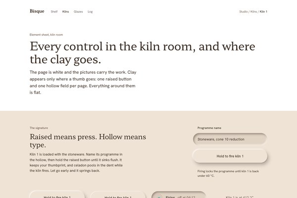
- Hold to fire: the button sinks flush, becomes a hollow that keeps a thumbprint, and celadon pools in the dent.
- A celadon wash #CFE9E3 highlighter on every label that is live: tonight's pieces, tonight's row, the chosen dip time.
- Hahmlet for the masthead, heads and one light big number; Hanken Grotesk for everything else.
- Titles on the plates set in tight umber ink press blocks, line by line.
- Flat reading bands: shelf labels under each piece, a kiln schedule drawn as a clay-filled curve, a plain log on alternate wash rows.

### Lineage

> Generation 3 of Bisque, revised in place from arni's approved range take (bisque-d, 2026-09-29). It keeps the concept (importance is height, editing is a hollow, glaze pools where something is live), the proud and well mechanic with one top-left light, capsule controls, celadon, ember, umber ink, the clay colour and the potter's studio. It moves the ground to white, confines clay to one button and one field, replaces Fraunces, Outfit and Spline Sans Mono with Hahmlet and Hanken Grotesk, and removes the grain, beads, pills and metric tiles.

## Tokens

### Colors

| Name | Value |
|------|-------|
| bg | `#FFFFFF` |
| surface | `#EFE3D6` |
| text | `#3A2C22` |
| muted | `#6F5A4A` |
| border | `#E6D9CA` |
| accent | `#3F9E8F` |
| accent_soft | `#CFE9E3` |
| on_accent | `#FFFFFF` |
| heat | `#B0532C` |
| wash | `#FAF6F1` |
| success | `#2F7A55` |
| warning | `#8A5A14` |
| error | `#A8402F` |
| info | `#3F6A8C` |

### Derived

- **Well Fill**: rgba(96, 66, 42, 0.10) over the clay, the fill of the one hollow
- **Proud Light**: rgba(255, 251, 246, 0.95), the top-left highlight on the one raised button
- **Proud Shadow**: rgba(58, 44, 34, 0.34) soft and rgba(58, 44, 34, 0.28) tight, falling down and to the right
- **Hollow Shadow**: inset rgba(58, 44, 34, 0.42) from the top left and inset rgba(255, 249, 240, 0.75) from the bottom right

### Typography

- **Heading Font**: Hahmlet
- **Body Font**: Hanken Grotesk
- **Mono Font**: none
- **Heading Weight**: 400
- **Body Weight**: 400
- **Button Weight**: 500
- **Display Weight**: 300 for the one big number, 600 for the wordmark
- **Heading Transform**: none
- **Letter Spacing**: -0.02em on Hahmlet display and heads; 0 on Hanken Grotesk
- **Base Size**: 17px
- **Line Height**: 1.55
- **Scale**: ["14.5px","17px","19px","21px","27px","34px","56px","88px"]
- **Fluid**: the landing sizes its type and spacing in container units of a 1280px design (1px = 100cqi / 1280), and of a 390px design on phones
- **Google Fonts Url**: https://fonts.googleapis.com/css2?family=Hahmlet:wght@300;400;600&family=Hanken+Grotesk:wght@400;500&display=swap

### Radii

- **None**: 0px
- **Md**: 0px
- **Lg**: 0px
- **Full**: 9999px

### Shadows

- **Proud**: -3px -3px 6px rgba(255, 251, 246, 0.95), 7px 10px 18px rgba(58, 44, 34, 0.34), 1px 2px 3px rgba(58, 44, 34, 0.28), only on the one raised button
- **Hollow**: inset 5px 6px 9px rgba(58, 44, 34, 0.42), inset -4px -4px 6px rgba(255, 249, 240, 0.75), only on the one hollow field and on the fired button
- **None**: everything else is flat

### Spacing

- **Base**: 8px
- **Scale**: ["4px","8px","12px","16px","24px","32px","48px","64px","72px","112px"]

### Surfaces

- **Treatment**: flat-content-under-a-clay-control-layer
- **Material**: The only clay is the control layer: one raised capsule button and one scooped capsule field in #EFE3D6, lit from the top left. Everything else is flat: white paper, full-bleed plates of the real work, and reading bands.
- **Card Style**: No cards. Shelf labels, the programme, the dip test and the log sit straight on the white page, parted by space and an alternate wash row.
- **Wells**: One hollow per page, the field you came to fill. Other fields, checkboxes, radios, switch tracks and slider tracks are flat clay #EFE3D6 capsules with no shadow.
- **Bg Pattern**: none; the page is flat white and the pictures carry the texture

### Borders

- **Default Width**: 0
- **Style**: none
- **Character**: No borders, rules or accent edges. Rows part on an alternate #FAF6F1 wash. The only drawn lines are the programme curve and its two temperature guides in #E6D9CA. Focus is a 3px celadon ring.

### Motion

- **Duration**: 220ms
- **Easing**: cubic-bezier(0.22, 1, 0.36, 1)
- **Press**: hold 900ms: the button sinks 2px and its shadow shortens with the hold; on commit it turns into a hollow that keeps a thumbprint
- **Settle**: 420ms cubic-bezier(0.34, 1.4, 0.64, 1) spring back when released early
- **Pool**: 600ms: the celadon wash fills the live labels
- **Philosophy**: One physical verb, the press. No scroll reveals, count-ups or parallax. The settled page renders with no JavaScript, and prefers-reduced-motion keeps the press as a state change with no travel.

### Controls

- **Height**: 64px raised button, 60px hollow field, 52px flat fields, 44px words
- **Radius**: 9999px on every control and on the celadon highlighter; 0 on everything else

## Rules

### Composition

- Build each page as a content layer and a control layer. Content is full-bleed plates of the real work and flat reading bands on white; the control layer is a small clay cluster at the edge of the hero.
- Give a page exactly one raised button and one hollow field, together in the control cluster. Every other control is flat.
- Set titles on a plate in tight umber press blocks, line by line (box-decoration-break: clone), never a panel over the image.
- Put labels flat under the pictured work, aligned to each piece.

### Hierarchy

- Height is importance: the raised button is the one action that matters; the hollow is the one field you came to fill.
- Hahmlet 400 for the page title (56px desktop, 34px phone) and section heads (34px, 27px phone); Hahmlet 300 for one big number at 88px.
- Hanken Grotesk 400 at 17px for prose; 500 for names, live labels and the button; 14.5px for captions in muted.
- State is a word at weight 500 in the right ink; the live one carries the celadon wash.

### Density

Calm product-page density: 72 to 112px between sections, 13px row padding on alternate wash rows, prose held to about 56 characters.

### Signature Patterns

- The clay control layer: one raised capsule button and one hollow capsule field, lit from the top left, clustered at the hero's edge above flat content.
- Hold to fire: the raised button sinks as you hold it, turns into a hollow that keeps a thumbprint when it commits, and springs back if you let go early.
- Pooled celadon: when the kiln fires, the celadon wash fills every label that is now live, and the thumbprint holds a celadon pool.
- Ember is heat: temperatures and the heat meter are the only ember marks.
- Umber press blocks: plate titles, tooltips and toasts are solid umber ink with clay-coloured text.
- Pooled links: every word action carries the celadon wash in its lower third, like glaze settled in a bowl, and it rises to fill the word on hover and focus.

## Layout

### Grid

- **Type**: content layer under a clay control layer
- **Max Width**: 1152px content on the embodiment with 64px gutters; the landing is a 1280px design scaled in container units
- **Gutter**: 64px desktop, 40px tablet, 20px phone
- **Column Behavior**: Two-column heads use minmax(0,5fr) minmax(0,6fr); lists and forms use minmax(0,1fr) columns; every grid child has min-width:0.

### Whitespace

- **Section Gap**: 112px desktop, 96px tablet, 72px phone
- **Card Gap**: no cards; 13 to 18px row padding on alternate wash rows
- **Content Padding**: reading bands align to the gutter; the control cluster sits 40px from the hero's top and right edges
- **Approach**: White paper and pictures of the work; space and the value of the type do the separating.

### Density

- **Default**: comfortable
- **Comfortable**: {"button_height":"64px raised, 44px words","input_height":"60px hollow, 52px flat","row_height":"50 to 72px log rows"}

### Responsive

Phones (390px) stack to one column: the shelf plate shows its left half, the title stays in ink blocks on the clay wall, the control cluster drops below the plate onto a clay band, shelf and dip labels become two-column lists, the programme curve keeps its shape with segment notes listed beneath, and non-essential log columns hide. Tablets keep two-column heads and forms with their own spacing. Ultra-wide keeps the landing's proportions and caps the embodiment content at 1152px, centred.

### Breakpoints

- **Mobile**: 390px
- **Phone Max**: 640px
- **Tablet**: 834 to 1100px
- **Desktop**: 1280px
- **Ultrawide**: 2560px

## Guidance

### Do

- Keep the page white and let the pictured work carry the clay.
- Give each page exactly one raised button and one hollow field, together.
- Make the irreversible action a hold with visible depth.
- Spend celadon only on live labels, the thumbprint pool and focus; spend ember only on temperatures.
- Set plate titles in tight umber press blocks.
- Make secondary actions words with celadon pooled in their lower third that rises to fill them on hover and focus.
- Keep controls capsules (9999) and everything else square.

### Don't

- Don't put the proud shadow pair on a second element, or an inset on every field.
- Don't draw borders, rules or accent edges; part rows on an alternate wash.
- Don't use filled pills, status beads, metric tiles or sparklines.
- Don't lay grain or texture over the page.
- Don't put a panel or scrim over a plate.
- Don't use warm beige as the page ground, or put emoji on buttons.

### Accessibility

AA on white: umber #3A2C22 is 13.4:1, muted #6F5A4A 6.5:1, ember #B0532C 5.1:1; the state inks clear 5.2:1 (success #2F7A55, warning #8A5A14, error #A8402F, info #3F6A8C). Umber on the celadon wash is 10.5:1 and on clay 10.6:1. Celadon #3F9E8F is never text; it is the focus ring and the thumbprint pool. The hold works with Enter or Space held; the settled page renders with no JavaScript and reduced motion keeps the press as a state change.

### Usage Context

Studio and workshop software for makers: kiln controllers, glaze logs, booking for shared studios, and any product with one consequential action that deserves a press you commit to.

## Imagery Direction

### Pairs With

bisque-relief

### Art Style Id

en-019f7079-05df-7ea1-a013-1947675a78d5

### Summary

Bisque Relief plates of the real work, in warm unglazed earthenware under one soft top-left light: the shelf of pieces waiting to fire seen straight on, and dip-test tiles with celadon pooling deeper in each well. The upper third stays quiet clay wall so the ink press-block title can sit on it; images run full bleed and flat, never in raised frames.

### Subjects

- a low shelf of hand-thrown pieces seen straight on
- a row of glaze dip-test tiles
- teabowls with celadon pooled in their wells

### Usage

One full-bleed shelf plate per landing painted with var(--hero-image), background-size 100% auto at the top, with the control cluster in its quiet top-right corner and labels flat beneath each piece. A second full-bleed plate (the dip test) may carry one ink-block head. The embodiment reuses the dip-test plate only.

### Avoid

Grain overlays, raised frames around images, text on the busy part of a plate, glossy lacquer, all-over glaze, studio tools and interface elements in the picture.
---
version: "alpha"
name: "Bisque"
description: "Bisque is studio software for potters where only the controls are clay. The page is white paper with full-bleed plates of the real work: the shelf of pieces waiting to fire, the dip-test tiles. Above that content sits a thin clay control..."
colors:
  bg: "#FFFFFF"
  surface: "#EFE3D6"
  text: "#3A2C22"
  muted: "#6F5A4A"
  border: "#E6D9CA"
  accent: "#3F9E8F"
  accent_soft: "#CFE9E3"
  on_accent: "#FFFFFF"
  heat: "#B0532C"
  wash: "#FAF6F1"
  success: "#2F7A55"
  warning: "#8A5A14"
  error: "#A8402F"
  info: "#3F6A8C"
typography:
  headline-lg:
    fontFamily: "Hahmlet"
    fontSize: "2.075rem"
    fontWeight: 700
    lineHeight: 1.1
    letterSpacing: "-0.02em"
  headline-md:
    fontFamily: "Hahmlet"
    fontSize: "1.66rem"
    fontWeight: 600
    lineHeight: 1.15
    letterSpacing: "-0.02em"
  body-md:
    fontFamily: "Hanken Grotesk"
    fontSize: "17px"
    fontWeight: 400
    lineHeight: 1.5
    letterSpacing: "-0.02em"
  label-md:
    fontFamily: "none"
    fontSize: "0.75rem"
    fontWeight: 600
    lineHeight: 1
    letterSpacing: "0.08em"
rounded:
  none: "0px"
  md: "0px"
  lg: "0px"
  full: "9999px"
spacing:
  base: "8px"
  xs: "4px"
  sm: "8px"
  md: "12px"
  lg: "16px"
  xl: "24px"
  2xl: "32px"
  3xl: "48px"
  4xl: "64px"
  step-8: "72px"
  step-9: "112px"
components:
  color-reference-bg:
    backgroundColor: "{colors.bg}"
  color-reference-surface:
    backgroundColor: "{colors.surface}"
  color-reference-text:
    backgroundColor: "{colors.text}"
  color-reference-muted:
    backgroundColor: "{colors.muted}"
  color-reference-border:
    backgroundColor: "{colors.border}"
  color-reference-accent:
    backgroundColor: "{colors.accent}"
  color-reference-accent_soft:
    backgroundColor: "{colors.accent_soft}"
  color-reference-on_accent:
    backgroundColor: "{colors.on_accent}"
  color-reference-heat:
    backgroundColor: "{colors.heat}"
  color-reference-wash:
    backgroundColor: "{colors.wash}"
  color-reference-success:
    backgroundColor: "{colors.success}"
  color-reference-warning:
    backgroundColor: "{colors.warning}"
  color-reference-error:
    backgroundColor: "{colors.error}"
  color-reference-info:
    backgroundColor: "{colors.info}"
  button-primary:
    backgroundColor: "{colors.accent}"
    textColor: "{colors.on_accent}"
    typography: "{typography.label-md}"
    rounded: "{rounded.md}"
    padding: "{spacing.md}"
  card-surface:
    backgroundColor: "{colors.surface}"
    textColor: "{colors.text}"
    rounded: "{rounded.md}"
    padding: "{spacing.md}"
  input-default:
    backgroundColor: "{colors.surface}"
    textColor: "{colors.text}"
    rounded: "{rounded.md}"
    height: "44px"
---

# Bisque

## Overview

Bisque is studio software for potters where only the controls are clay. The page is white paper with full-bleed plates of the real work: the shelf of pieces waiting to fire, the dip-test tiles. Above that content sits a thin clay control layer holding exactly one raised button and one hollow field. Importance is height, editing is a hollow, and celadon glaze pools only where something is live.

### Values

- Clay only where a thumb goes: one raised button and one hollow field per page.
- Depth is spent, not sprayed: the press is the one physical verb.
- The irreversible action is a hold you commit to; its depth shows how far you are.
- Celadon marks what is live; ember marks a temperature; nothing else takes colour.
- The work carries the page: real pieces, a real kiln schedule, a real dip test.

### Anti-Values

- The same neumorphic shadow pair on every element.
- Insets on every input, tab and slider.
- Filled pills, status beads and metric tiles with sparklines.
- Grain laid over the whole field.
- Mood words in place of the rule the page follows.
- Warm beige page grounds.

### Visual Character

- A pure white page; clay #EFE3D6 appears only in the pictured work and in the control layer.
- One raised capsule button lit from the top left and one scooped capsule well, clustered at the edge of the hero.
- Hold to fire: the button sinks flush, becomes a hollow that keeps a thumbprint, and celadon pools in the dent.
- A celadon wash #CFE9E3 highlighter on every label that is live: tonight's pieces, tonight's row, the chosen dip time.
- Hahmlet for the masthead, heads and one light big number; Hanken Grotesk for everything else.
- Titles on the plates set in tight umber ink press blocks, line by line.
- Flat reading bands: shelf labels under each piece, a kiln schedule drawn as a clay-filled curve, a plain log on alternate wash rows.

### Lineage

> Generation 3 of Bisque, revised in place from arni's approved range take (bisque-d, 2026-09-29). It keeps the concept (importance is height, editing is a hollow, glaze pools where something is live), the proud and well mechanic with one top-left light, capsule controls, celadon, ember, umber ink, the clay colour and the potter's studio. It moves the ground to white, confines clay to one button and one field, replaces Fraunces, Outfit and Spline Sans Mono with Hahmlet and Hanken Grotesk, and removes the grain, beads, pills and metric tiles.

## Colors

Use the YAML color tokens as the normative palette. The prose below names the roles agents should preserve when generating UI.

| Token | Value |
|-------|-------|
| bg | `#FFFFFF` |
| surface | `#EFE3D6` |
| text | `#3A2C22` |
| muted | `#6F5A4A` |
| border | `#E6D9CA` |
| accent | `#3F9E8F` |
| accent_soft | `#CFE9E3` |
| on_accent | `#FFFFFF` |
| heat | `#B0532C` |
| wash | `#FAF6F1` |
| success | `#2F7A55` |
| warning | `#8A5A14` |
| error | `#A8402F` |
| info | `#3F6A8C` |

## Typography

Load the fonts from Google Fonts: https://fonts.googleapis.com/css2?family=Hahmlet:wght@300;400;600&family=Hanken+Grotesk:wght@400;500&display=swap

- **Headline-Lg**: Hahmlet, 2.075rem, weight 700, line-height 1.1.
- **Headline-Md**: Hahmlet, 1.66rem, weight 600, line-height 1.15.
- **Body-Md**: Hanken Grotesk, 17px, weight 400, line-height 1.5.
- **Label-Md**: none, 0.75rem, weight 600, line-height 1.

## Layout

### Spacing Tokens

- **Base**: `8px`
- **Xs**: `4px`
- **Sm**: `8px`
- **Md**: `12px`
- **Lg**: `16px`
- **Xl**: `24px`
- **2xl**: `32px`
- **3xl**: `48px`
- **4xl**: `64px`
- **Step-8**: `72px`
- **Step-9**: `112px`

### Grid

- **Type**: content layer under a clay control layer
- **Max Width**: 1152px content on the embodiment with 64px gutters; the landing is a 1280px design scaled in container units
- **Gutter**: 64px desktop, 40px tablet, 20px phone
- **Column Behavior**: Two-column heads use minmax(0,5fr) minmax(0,6fr); lists and forms use minmax(0,1fr) columns; every grid child has min-width:0.

### Whitespace

- **Section Gap**: 112px desktop, 96px tablet, 72px phone
- **Card Gap**: no cards; 13 to 18px row padding on alternate wash rows
- **Content Padding**: reading bands align to the gutter; the control cluster sits 40px from the hero's top and right edges
- **Approach**: White paper and pictures of the work; space and the value of the type do the separating.

### Density

- **Default**: comfortable
- **Comfortable**: {"button_height":"64px raised, 44px words","input_height":"60px hollow, 52px flat","row_height":"50 to 72px log rows"}

### Responsive

Phones (390px) stack to one column: the shelf plate shows its left half, the title stays in ink blocks on the clay wall, the control cluster drops below the plate onto a clay band, shelf and dip labels become two-column lists, the programme curve keeps its shape with segment notes listed beneath, and non-essential log columns hide. Tablets keep two-column heads and forms with their own spacing. Ultra-wide keeps the landing's proportions and caps the embodiment content at 1152px, centred.

### Breakpoints

- **Mobile**: 390px
- **Phone Max**: 640px
- **Tablet**: 834 to 1100px
- **Desktop**: 1280px
- **Ultrawide**: 2560px

## Elevation & Depth

### Shadows

- **Proud**: -3px -3px 6px rgba(255, 251, 246, 0.95), 7px 10px 18px rgba(58, 44, 34, 0.34), 1px 2px 3px rgba(58, 44, 34, 0.28), only on the one raised button
- **Hollow**: inset 5px 6px 9px rgba(58, 44, 34, 0.42), inset -4px -4px 6px rgba(255, 249, 240, 0.75), only on the one hollow field and on the fired button
- **None**: everything else is flat

## Shapes

### Rounded

- **None**: `0px`
- **Md**: `0px`
- **Lg**: `0px`
- **Full**: `9999px`

### Surfaces

- **Treatment**: flat-content-under-a-clay-control-layer
- **Material**: The only clay is the control layer: one raised capsule button and one scooped capsule field in #EFE3D6, lit from the top left. Everything else is flat: white paper, full-bleed plates of the real work, and reading bands.
- **Card Style**: No cards. Shelf labels, the programme, the dip test and the log sit straight on the white page, parted by space and an alternate wash row.
- **Wells**: One hollow per page, the field you came to fill. Other fields, checkboxes, radios, switch tracks and slider tracks are flat clay #EFE3D6 capsules with no shadow.
- **Bg Pattern**: none; the page is flat white and the pictures carry the texture

### Borders

- **Default Width**: 0
- **Style**: none
- **Character**: No borders, rules or accent edges. Rows part on an alternate #FAF6F1 wash. The only drawn lines are the programme curve and its two temperature guides in #E6D9CA. Focus is a 3px celadon ring.

## Components

### Composition

- Build each page as a content layer and a control layer. Content is full-bleed plates of the real work and flat reading bands on white; the control layer is a small clay cluster at the edge of the hero.
- Give a page exactly one raised button and one hollow field, together in the control cluster. Every other control is flat.
- Set titles on a plate in tight umber press blocks, line by line (box-decoration-break: clone), never a panel over the image.
- Put labels flat under the pictured work, aligned to each piece.

### Hierarchy

- Height is importance: the raised button is the one action that matters; the hollow is the one field you came to fill.
- Hahmlet 400 for the page title (56px desktop, 34px phone) and section heads (34px, 27px phone); Hahmlet 300 for one big number at 88px.
- Hanken Grotesk 400 at 17px for prose; 500 for names, live labels and the button; 14.5px for captions in muted.
- State is a word at weight 500 in the right ink; the live one carries the celadon wash.

### Density

Calm product-page density: 72 to 112px between sections, 13px row padding on alternate wash rows, prose held to about 56 characters.

### Signature Patterns

- The clay control layer: one raised capsule button and one hollow capsule field, lit from the top left, clustered at the hero's edge above flat content.
- Hold to fire: the raised button sinks as you hold it, turns into a hollow that keeps a thumbprint when it commits, and springs back if you let go early.
- Pooled celadon: when the kiln fires, the celadon wash fills every label that is now live, and the thumbprint holds a celadon pool.
- Ember is heat: temperatures and the heat meter are the only ember marks.
- Umber press blocks: plate titles, tooltips and toasts are solid umber ink with clay-coloured text.
- Pooled links: every word action carries the celadon wash in its lower third, like glaze settled in a bowl, and it rises to fill the word on hover and focus.

## shadcn/ui Usage

When the target app uses shadcn/ui, copy DESIGN.md with shadcn instead of the plain DESIGN.md. It contains the same Katagami design-language source plus the shadcn/ui primitives, imports, theme variables, component recipes, and preview-shot guidance.

DESIGN.md with shadcn: `/language/en-01a0ee7e-f421-7321-869f-8878fcb4fe78/DESIGN.with-shadcn.md`.

Machine-readable companions for automation: `/language/en-01a0ee7e-f421-7321-869f-8878fcb4fe78/shadcn.json` (registry theme), `/language/en-01a0ee7e-f421-7321-869f-8878fcb4fe78/shadcn-components.md` (component recipes) and `/language/en-01a0ee7e-f421-7321-869f-8878fcb4fe78/shadcn-shots.json` (preview shots). The human-facing handoff is still DESIGN.md with shadcn.

Install recommended primitives with `npx shadcn@latest add button card input textarea select dialog sheet tabs badge separator checkbox switch slider tooltip dropdown-menu table`.

Use these primitives in shadcn apps:
- button
- card
- input
- textarea
- select
- dialog
- sheet
- tabs
- badge
- separator
- checkbox
- switch
- slider
- tooltip
- dropdown-menu
- table

Implementation rule for agents: import shadcn primitives from `@/components/ui/*`, apply the generated CSS variables first, then compose the language-specific recipes from the companion MD. Katagami remains the source of truth; shadcn names are the implementation surface.

## Do's and Don'ts

- Do Keep the page white and let the pictured work carry the clay.
- Do Give each page exactly one raised button and one hollow field, together.
- Do Make the irreversible action a hold with visible depth.
- Do Spend celadon only on live labels, the thumbprint pool and focus; spend ember only on temperatures.
- Do Set plate titles in tight umber press blocks.
- Do Make secondary actions words with celadon pooled in their lower third that rises to fill them on hover and focus.
- Do Keep controls capsules (9999) and everything else square.
- Don't Don't put the proud shadow pair on a second element, or an inset on every field.
- Don't Don't draw borders, rules or accent edges; part rows on an alternate wash.
- Don't Don't use filled pills, status beads, metric tiles or sparklines.
- Don't Don't lay grain or texture over the page.
- Don't Don't put a panel or scrim over a plate.
- Don't Don't use warm beige as the page ground, or put emoji on buttons.

### Accessibility

AA on white: umber #3A2C22 is 13.4:1, muted #6F5A4A 6.5:1, ember #B0532C 5.1:1; the state inks clear 5.2:1 (success #2F7A55, warning #8A5A14, error #A8402F, info #3F6A8C). Umber on the celadon wash is 10.5:1 and on clay 10.6:1. Celadon #3F9E8F is never text; it is the focus ring and the thumbprint pool. The hold works with Enter or Space held; the settled page renders with no JavaScript and reduced motion keeps the press as a state change.

### Usage Context

Studio and workshop software for makers: kiln controllers, glaze logs, booking for shared studios, and any product with one consequential action that deserves a press you commit to.

## Imagery Direction

### Pairs With

bisque-relief

### Art Style Id

en-019f7079-05df-7ea1-a013-1947675a78d5

### Summary

Bisque Relief plates of the real work, in warm unglazed earthenware under one soft top-left light: the shelf of pieces waiting to fire seen straight on, and dip-test tiles with celadon pooling deeper in each well. The upper third stays quiet clay wall so the ink press-block title can sit on it; images run full bleed and flat, never in raised frames.

### Subjects

- a low shelf of hand-thrown pieces seen straight on
- a row of glaze dip-test tiles
- teabowls with celadon pooled in their wells

### Usage

One full-bleed shelf plate per landing painted with var(--hero-image), background-size 100% auto at the top, with the control cluster in its quiet top-right corner and labels flat beneath each piece. A second full-bleed plate (the dip test) may carry one ink-block head. The embodiment reuses the dip-test plate only.

### Avoid

Grain overlays, raised frames around images, text on the busy part of a plate, glossy lacquer, all-over glaze, studio tools and interface elements in the picture.
```json
{
  "$schema": "https://ui.shadcn.com/schema/registry-item.json",
  "name": "bisque",
  "type": "registry:theme",
  "title": "Bisque shadcn Theme",
  "cssVars": {
    "theme": {},
    "light": {
      "background": "#FFFFFF",
      "foreground": "#3A2C22",
      "card": "#EFE3D6",
      "card-foreground": "#3A2C22",
      "popover": "#EFE3D6",
      "popover-foreground": "#3A2C22",
      "primary": "#3A2C22",
      "primary-foreground": "#ffffff",
      "secondary": "#f4f4f5",
      "secondary-foreground": "#111111",
      "muted": "#6F5A4A",
      "muted-foreground": "#3A2C22",
      "accent": "#3F9E8F",
      "accent-foreground": "#ffffff",
      "destructive": "#A8402F",
      "border": "#E6D9CA",
      "input": "#E6D9CA",
      "ring": "#3F9E8F",
      "chart-1": "#3A2C22",
      "chart-2": "#f4f4f5",
      "chart-3": "#3F9E8F",
      "chart-4": "#2F7A55",
      "chart-5": "#8A5A14",
      "sidebar": "#EFE3D6",
      "sidebar-foreground": "#3A2C22",
      "sidebar-primary": "#3A2C22",
      "sidebar-primary-foreground": "#ffffff",
      "sidebar-accent": "#3F6A8C",
      "sidebar-accent-foreground": "#ffffff",
      "sidebar-border": "#E6D9CA",
      "sidebar-ring": "#3F9E8F",
      "radius": "0px"
    },
    "dark": {
      "background": "#0f1115",
      "foreground": "#f8fafc",
      "card": "#181b22",
      "card-foreground": "#f8fafc",
      "popover": "#181b22",
      "popover-foreground": "#f8fafc",
      "primary": "#3A2C22",
      "primary-foreground": "#ffffff",
      "secondary": "#252a33",
      "secondary-foreground": "#f8fafc",
      "muted": "#252a33",
      "muted-foreground": "#a1a1aa",
      "accent": "#3F9E8F",
      "accent-foreground": "#ffffff",
      "destructive": "#A8402F",
      "border": "#303642",
      "input": "#303642",
      "ring": "#3F9E8F",
      "chart-1": "#3A2C22",
      "chart-2": "#f4f4f5",
      "chart-3": "#3F9E8F",
      "chart-4": "#2F7A55",
      "chart-5": "#8A5A14",
      "sidebar": "#181b22",
      "sidebar-foreground": "#f8fafc",
      "sidebar-primary": "#3A2C22",
      "sidebar-primary-foreground": "#ffffff",
      "sidebar-accent": "#3F9E8F",
      "sidebar-accent-foreground": "#ffffff",
      "sidebar-border": "#303642",
      "sidebar-ring": "#3F9E8F",
      "radius": "0px"
    }
  },
  "meta": {
    "source": "katagami",
    "languageId": "en-01a0ee7e-f421-7321-869f-8878fcb4fe78",
    "slug": "bisque",
    "componentManifest": [
      "button",
      "card",
      "input",
      "textarea",
      "select",
      "dialog",
      "sheet",
      "tabs",
      "badge",
      "separator",
      "checkbox",
      "switch",
      "slider",
      "tooltip",
      "dropdown-menu",
      "table"
    ],
    "installCommand": "npx shadcn@latest add button card input textarea select dialog sheet tabs badge separator checkbox switch slider tooltip dropdown-menu table",
    "nativeTokenNames": {
      "colors": [
        "accent",
        "accent_soft",
        "bg",
        "border",
        "error",
        "heat",
        "info",
        "muted",
        "on_accent",
        "success",
        "surface",
        "text",
        "warning",
        "wash"
      ],
      "derived": [
        "hollow_shadow",
        "proud_light",
        "proud_shadow",
        "well_fill"
      ],
      "typography": [
        "base_size",
        "body_font",
        "body_weight",
        "button_weight",
        "display_weight",
        "fluid",
        "google_fonts_url",
        "heading_font",
        "heading_transform",
        "heading_weight",
        "letter_spacing",
        "line_height",
        "mono_font",
        "scale"
      ],
      "radii": [
        "full",
        "lg",
        "md",
        "none"
      ],
      "shadows": [
        "hollow",
        "none",
        "proud"
      ],
      "spacing": [
        "base",
        "scale"
      ],
      "surfaces": [
        "bg_pattern",
        "card_style",
        "material",
        "treatment",
        "wells"
      ],
      "borders": [
        "character",
        "default_width",
        "style"
      ],
      "motion": [
        "duration",
        "easing",
        "philosophy",
        "pool",
        "press",
        "settle"
      ],
      "controls": [
        "height",
        "radius"
      ]
    }
  }
}
```The art style its pictures are drawn in and the colours its tokens carry.
The theme variables are generated from the tokens. Component recipes and preview shots have not been written for this language yet.
For an app that uses shadcn/ui: the DESIGN.md plus the install list, theme variables, component recipes, preview shots and a starter TSX file, in one Markdown file.
The same pieces as separate files: theme, CSS, TSX starter, recipes and the preview contract.
npx shadcn@latest add button card input textarea select dialog sheet tabs badge separator checkbox switch slider tooltip dropdown-menu table:root {
--background: #FFFFFF;
--foreground: #3A2C22;
--card: #EFE3D6;
--card-foreground: #3A2C22;
--popover: #EFE3D6;
--popover-foreground: #3A2C22;
--primary: #3A2C22;
--primary-foreground: #ffffff;
--secondary: #f4f4f5;
--secondary-foreground: #111111;
--muted: #6F5A4A;
--muted-foreground: #3A2C22;
--accent: #3F9E8F;
--accent-foreground: #ffffff;
--destructive: #A8402F;
--border: #E6D9CA;
--input: #E6D9CA;
--ring: #3F9E8F;
--chart-1: #3A2C22;
--chart-2: #f4f4f5;
--chart-3: #3F9E8F;
--chart-4: #2F7A55;
--chart-5: #8A5A14;
--sidebar: #EFE3D6;
--sidebar-foreground: #3A2C22;
--sidebar-primary: #3A2C22;
--sidebar-primary-foreground: #ffffff;
--sidebar-accent: #3F6A8C;
--sidebar-accent-foreground: #ffffff;
--sidebar-border: #E6D9CA;
--sidebar-ring: #3F9E8F;
--radius: 0px;
}
.dark {
--background: #0f1115;
--foreground: #f8fafc;
--card: #181b22;
--card-foreground: #f8fafc;
--popover: #181b22;
--popover-foreground: #f8fafc;
--primary: #3A2C22;
--primary-foreground: #ffffff;
--secondary: #252a33;
--secondary-foreground: #f8fafc;
--muted: #252a33;
--muted-foreground: #a1a1aa;
--accent: #3F9E8F;
--accent-foreground: #ffffff;
--destructive: #A8402F;
--border: #303642;
--input: #303642;
--ring: #3F9E8F;
--chart-1: #3A2C22;
--chart-2: #f4f4f5;
--chart-3: #3F9E8F;
--chart-4: #2F7A55;
--chart-5: #8A5A14;
--sidebar: #181b22;
--sidebar-foreground: #f8fafc;
--sidebar-primary: #3A2C22;
--sidebar-primary-foreground: #ffffff;
--sidebar-accent: #3F9E8F;
--sidebar-accent-foreground: #ffffff;
--sidebar-border: #303642;
--sidebar-ring: #3F9E8F;
--radius: 0px;
}
import { Badge } from "@/components/ui/badge";
import { Button } from "@/components/ui/button";
import {
  Card,
  CardContent,
  CardDescription,
  CardFooter,
  CardHeader,
  CardTitle,
} from "@/components/ui/card";
import { Input } from "@/components/ui/input";
import { Tabs, TabsList, TabsTrigger } from "@/components/ui/tabs";

export function BisqueShadcnKit() {
  return (
    <section className="grid gap-4 rounded-[var(--radius)] border bg-background p-4 text-foreground">
      <div className="flex items-start justify-between gap-4">
        <div>
          <Badge variant="outline">shadcn/ui</Badge>
          <h2 className="mt-3 text-2xl font-semibold tracking-tight">Bisque</h2>
          <p className="mt-1 max-w-xl text-sm text-muted-foreground">
            Use the Katagami registry theme, then compose these shadcn primitives
            with the language-specific component recipes.
          </p>
        </div>
        <Button>Apply theme</Button>
      </div>

      <Tabs defaultValue="components">
        <TabsList>
          <TabsTrigger value="components">Components</TabsTrigger>
          <TabsTrigger value="states">States</TabsTrigger>
          <TabsTrigger value="export">Export</TabsTrigger>
        </TabsList>
      </Tabs>

      <Card>
        <CardHeader>
          <CardTitle>Component recipe</CardTitle>
          <CardDescription>
            Replace this starter content with the agent-authored product scene
            from components.md and preview-shots.json.
          </CardDescription>
        </CardHeader>
        <CardContent className="grid gap-3 sm:grid-cols-[1fr_auto]">
          <Input defaultValue="Tokenized shadcn surface" aria-label="Recipe name" />
          <Button variant="secondary">Preview state</Button>
        </CardContent>
        <CardFooter className="justify-between">
          <Badge>Ready</Badge>
          <Button variant="outline">Copy recipe</Button>
        </CardFooter>
      </Card>
    </section>
  );
}
{
  "$schema": "https://ui.shadcn.com/schema/registry-item.json",
  "name": "bisque",
  "type": "registry:theme",
  "title": "Bisque",
  "description": "White paper and umber ink with one clay control layer: a raised capsule button and one hollow field, celadon for what is live, ember for heat; borderless, flat everywhere else.",
  "cssVars": {
    "theme": {
      "font-sans": "Hanken Grotesk, system-ui, sans-serif",
      "font-mono": "Hanken Grotesk, system-ui, sans-serif",
      "font-display": "Hahmlet, Georgia, serif",
      "radius": "9999px"
    },
    "light": {
      "background": "#FFFFFF",
      "foreground": "#3A2C22",
      "card": "#FFFFFF",
      "card-foreground": "#3A2C22",
      "popover": "#EFE3D6",
      "popover-foreground": "#3A2C22",
      "primary": "#EFE3D6",
      "primary-foreground": "#3A2C22",
      "secondary": "#EFE3D6",
      "secondary-foreground": "#3A2C22",
      "muted": "#FAF6F1",
      "muted-foreground": "#6F5A4A",
      "accent": "#CFE9E3",
      "accent-foreground": "#3A2C22",
      "destructive": "#A8402F",
      "destructive-foreground": "#FFFFFF",
      "border": "transparent",
      "input": "transparent",
      "ring": "#3F9E8F",
      "chart-1": "#3A2C22",
      "chart-2": "#3F9E8F",
      "chart-3": "#B0532C",
      "chart-4": "#6F5A4A",
      "chart-5": "#CFE9E3",
      "radius": "9999px"
    },
    "dark": {
      "background": "#FFFFFF",
      "foreground": "#3A2C22",
      "card": "#FFFFFF",
      "card-foreground": "#3A2C22",
      "popover": "#EFE3D6",
      "popover-foreground": "#3A2C22",
      "primary": "#EFE3D6",
      "primary-foreground": "#3A2C22",
      "secondary": "#EFE3D6",
      "secondary-foreground": "#3A2C22",
      "muted": "#FAF6F1",
      "muted-foreground": "#6F5A4A",
      "accent": "#CFE9E3",
      "accent-foreground": "#3A2C22",
      "destructive": "#A8402F",
      "destructive-foreground": "#FFFFFF",
      "border": "transparent",
      "input": "transparent",
      "ring": "#3F9E8F",
      "chart-1": "#3A2C22",
      "chart-2": "#3F9E8F",
      "chart-3": "#B0532C",
      "chart-4": "#6F5A4A",
      "chart-5": "#CFE9E3",
      "radius": "9999px"
    }
  },
  "componentManifest": [
    "button",
    "card",
    "input",
    "textarea",
    "select",
    "dialog",
    "sheet",
    "tabs",
    "badge",
    "separator",
    "checkbox",
    "switch",
    "slider",
    "tooltip",
    "dropdown-menu",
    "table"
  ],
  "meta": {
    "nativeTokenNames": {
      "bg": "background / card",
      "surface": "primary / secondary / popover (clay: the raised button, the well, flat fields, menus)",
      "text": "foreground",
      "muted": "muted-foreground",
      "accent": "ring and the thumbprint pool (celadon is never text)",
      "accent_soft": "accent (the celadon wash on live labels, checked controls, the chosen tab)",
      "heat": "chart-3 and temperatures (native only)",
      "wash": "muted (alternate rows, the empty state)",
      "error": "destructive",
      "border": "native only (the programme's temperature guides); --border stays transparent"
    },
    "note": "Bisque is a light, white-ground language; the dark scope repeats the light values. The shadcn primary is clay, not celadon: the primary action is the one raised clay button, and celadon only marks what is live.",
    "componentManifest": [
      "button",
      "card",
      "input",
      "textarea",
      "select",
      "dialog",
      "sheet",
      "tabs",
      "badge",
      "separator",
      "checkbox",
      "switch",
      "slider",
      "tooltip",
      "dropdown-menu",
      "table"
    ]
  }
}
---
artifact: component-recipes-v1
language: bisque
author: katagami-agent
primitives: 16
---

# Bisque shadcn/ui Components

Author: `katagami-agent`

## Intent

Bisque dresses shadcn/ui as flat white paper under a thin clay control layer. Only the controls are clay: one raised capsule button and one hollow capsule field per view, lit from the top left. Hold the button to commit an irreversible action: it sinks flush, keeps a thumbprint, and celadon pools on every label that is now live. Everything else is flat: no borders, no cards, rows on an alternate wash, words for every secondary action, umber press blocks for titles on images, tooltips and toasts.

## Required primitives

button, card, input, textarea, select, dialog, sheet, tabs, badge, separator, checkbox, switch, slider, tooltip, dropdown-menu, table. Import them from `@/components/ui/*`; do not build a second component system.

## Token cues

```css
--background:#FFFFFF;
--foreground:#3A2C22;
--card:#FFFFFF;
--card-foreground:#3A2C22;
--popover:#EFE3D6;
--popover-foreground:#3A2C22;
--primary:#EFE3D6;
--primary-foreground:#3A2C22;
--secondary:#EFE3D6;
--secondary-foreground:#3A2C22;
--muted:#FAF6F1;
--muted-foreground:#6F5A4A;
--accent:#CFE9E3;
--accent-foreground:#3A2C22;
--destructive:#A8402F;
--destructive-foreground:#FFFFFF;
--border:transparent;
--input:transparent;
--ring:#3F9E8F;
--chart-1:#3A2C22;
--chart-2:#3F9E8F;
--chart-3:#B0532C;
--chart-4:#6F5A4A;
--chart-5:#CFE9E3;
--radius:9999px;
```

Native names are kept in the theme: `bg`, `surface` (clay), `wash`, `accent_soft` (the celadon wash) and `heat` (ember), which is never an action colour.

## Visual character to preserve

- Clay only where a thumb goes: one raised Button and one hollow Input per view, together.
- No borders, dividers, cards or panels. Rows part on an alternate wash; sections part by space; controls are flat clay unless they are the one raised button or the one hollow.
- Capsules (9999) for controls and the celadon highlighter; square (0) for everything else.
- Celadon marks what is live; ember marks a temperature; neither is a fill for an action.
- Hahmlet for titles and one big number, Hanken Grotesk 17px for the work.
- One light from the top left; only the raised button and the hollow carry depth.

## ShadSync visual profile

- family: clay-controls
- material: flat white paper with one clay control cluster lit from the top left
- contour: default
- border: none
- underlay: False
- grain: False
- stickerBadges: False
- motion: hold to press
- density: comfortable
- radius: 0, 9999
- accents: celadon-live, ember-heat

## Signature component recipes

- **button:** One per view is the raised clay capsule: `h-16 rounded-full border-0 bg-primary px-6 text-[17px] font-medium text-primary-foreground whitespace-nowrap shadow-[-3px_-3px_6px_rgba(255,251,246,.95),7px_10px_18px_rgba(58,44,34,.34),1px_2px_3px_rgba(58,44,34,.28)]`, placed on a clay (`bg-primary`) band so its highlight reads. Irreversible actions are hold-to-commit: the shadow shortens with the hold and the button settles into a hollow (`shadow-[inset_5px_6px_9px_rgba(58,44,34,.42),inset_-4px_-4px_6px_rgba(255,249,240,.75)]`). Every other action is the `ghost` or `link` variant: a 500-weight word with the celadon wash pooled in its lower third that rises to fill it on hover and focus; destructive is a word in `text-destructive`.
- **card:** no frame around content: `bg-transparent border-0 shadow-none p-0 gap-5 rounded-none`, grouped by space under a Hahmlet title at 27 to 34px with `tracking-[-0.02em]`. Never wrap a plate, the log or the control cluster in one.
- **input:** The one hollow per view: `h-[60px] rounded-full border-0 bg-[rgba(96,66,42,.10)] px-[22px] text-[17px]` with the hollow inset shadow, on the clay band beside the raised button. Every other field is flat clay with no shadow: `h-[52px] rounded-full border-0 bg-secondary px-5 shadow-none`; focus `ring-[3px] ring-ring ring-offset-0`; an error uses `ring-2 ring-destructive` and a 14.5px message in the destructive ink.
- **textarea:** a square flat clay field: `rounded-none border-0 bg-secondary min-h-32 px-5 py-3.5 leading-[1.55]`, vertical resize only, the same celadon focus ring.
- **select:** the flat field capsule with a drawn 14px chevron in `muted-foreground`; `SelectContent` is `bg-popover rounded-none border-0 p-2 shadow-none` (a flat clay sheet); the highlighted item carries the celadon wash `bg-accent rounded-full`.
- **dialog:** `bg-background rounded-none border-0 p-8 shadow-none` laid on a clay overlay (`bg-primary/90`); a Hahmlet 21px title, a muted body, and actions as words (Keep firing, and Stop the kiln in the destructive ink). No second raised button.
- **sheet:** a right-side `bg-background rounded-none border-0 shadow-none` panel on the same clay overlay, sliding in on `cubic-bezier(.22,1,.36,1)`; its fields are flat clay capsules.
- **tabs:** `TabsList` has no tray (`bg-transparent p-0 gap-7`); triggers are 17px words in `text-muted-foreground`; the active trigger is `text-foreground font-medium` with the celadon wash as a capsule behind the word. No underline, no raised tab.
- **badge:** a state word, not a pill: `bg-transparent p-0 text-[17px] font-medium` in the right ink (success, warning, destructive, heat for temperatures); the live state alone carries the celadon wash `bg-accent rounded-full px-2`. No beads, no filled pills.
- **separator:** do not draw one. Use space (72 to 112px between sections) and alternate wash rows.
- **checkbox:** `size-6 rounded-full border-0 bg-secondary`; checked fills `bg-accent` with a 2px umber tick; focus takes the celadon ring.
- **switch:** a `w-12 h-7 rounded-full bg-secondary` track with an 18px muted knob; checked turns the track the celadon wash and the knob umber, sliding on `cubic-bezier(.34,1.4,.64,1)`.
- **slider:** an 8px `bg-secondary rounded-full` track, a celadon-wash range and a 22px umber thumb; the value reads in words above (8 seconds).
- **tooltip:** an umber press block: `bg-foreground text-primary rounded-none px-3 py-1.5 text-[14.5px]`, no arrow.
- **dropdown-menu:** `bg-popover rounded-none border-0 py-2.5 shadow-none` (a flat clay sheet); 17px rows with a muted shortcut on the right; the highlighted row carries the celadon wash behind its word; a destructive row is in the destructive ink.
- **table:** the kiln log. Rows sit on alternate wash (`even:bg-transparent odd:bg-muted`), no dividers, tabular numbers, headers 14.5px muted at 400; hover tints the row `bg-primary`; the live row's state carries the celadon wash and temperatures are ember. Hide non-essential columns below 640px.

### Hold to fire (the signature, outside shadcn)

Build the raised button and its hollow once as their own component on a clay band (`bg-primary`). The button is a 64px capsule in clay with a three-layer shadow from one top-left light, scaled by a `--p` custom property (0 to 1) that the hold drives: `translateY(calc(2px * var(--p)))` and every shadow offset times `1 - var(--p)`. Holding for 900ms (pointer, Enter or Space) commits: the button becomes a hollow with the inset shadow, a drawn thumbprint appears with a celadon pool, the label reads Firing with its off time, and the celadon wash fills every live label on the page over 600ms. An early release springs back over 420ms on `cubic-bezier(.34,1.4,.64,1)`. The settled state renders with no JavaScript; under `prefers-reduced-motion` the press is a state change with no travel.

## Preview shots

- `application-shell`: Five pieces fire tonight. A full-bleed shelf plate with the title in umber press blocks on its quiet wall, the clay control cluster at the top right (the programme name hollow and the raised Hold to fire kiln 2 button), flat shelf labels under each piece, then the kiln log on alternate wash rows with tonight's row in the celadon wash.
- `detail-editor`: Log a glaze day. A glaze-day form straight on the white page: flat clay capsules for pieces and clay body with a celadon focus ring, an error ring on the glaze weight, a square note field, the dip-test plate with the dip-time slider under it, checkboxes and switches that fill with the celadon wash, and one word action.
- `data-operations`: Glaze buckets. Word tabs for All glazes, Cone 6 and Cone 10 with the chosen one in the celadon wash, the kiln menu open as a flat clay sheet, the bucket table on alternate wash rows with state words, and a white dialog laid on clay asking to stop kiln 2.

Each shot carries a renderable `scene` with headline, description, actions and rows or fields.

## Implementation contract

- Start from local `@/components/ui/*` shadcn primitives and apply `/katagami/shadcn/bisque/registry-theme.json`.
- Keep `--border` and `--input` transparent; flat fields get their tone from `bg-secondary`.
- Set `--radius: 9999px` for controls and `rounded-none` on cards, menus, dialogs, sheets, tooltips and tables.
- One raised clay `default` button and one hollow field per view; every other action is a word.
- No Card frames around content; rows part on an alternate wash.
- Keep celadon off action fills and text; it is the focus ring, the thumbprint pool and the live wash.
- Respect `prefers-reduced-motion`: the hold still commits, with no travel or transition.

## Copy-paste component example

```tsx
import { Button } from "@/components/ui/button";
import { Input } from "@/components/ui/input";
import { Badge } from "@/components/ui/badge";

const load = [
  { piece: "Faceted vase", cone: "6", live: true },
  { piece: "Three teabowls", cone: "6", live: true },
  { piece: "Serving platter", cone: "04", live: false },
];

export function KilnTwo() {
  return (
    <section className="bg-background text-foreground">
      <div className="flex flex-col gap-3.5 bg-primary p-8">
        <label className="pl-[22px] text-[14.5px] font-medium" htmlFor="prog">Programme name</label>
        <Input id="prog" defaultValue="Celadon soak, long cool" className="h-[60px] rounded-full border-0 bg-[rgba(96,66,42,.10)] px-[22px] text-[17px] shadow-[inset_5px_6px_9px_rgba(58,44,34,.42),inset_-4px_-4px_6px_rgba(255,249,240,.75)]" />
        <Button className="h-16 rounded-full border-0 bg-primary text-[17px] font-medium text-primary-foreground shadow-[-3px_-3px_6px_rgba(255,251,246,.95),7px_10px_18px_rgba(58,44,34,.34),1px_2px_3px_rgba(58,44,34,.28)]">
          Hold to fire kiln 2
        </Button>
      </div>
      <ul className="mt-8 flex flex-col">
        {load.map((p) => (
          <li key={p.piece} className="grid grid-cols-[1fr_auto] gap-6 py-3 odd:bg-muted">
            <span className="font-medium">{p.piece}</span>
            <Badge className={p.live ? "rounded-full bg-accent px-2 text-[17px] font-medium text-accent-foreground" : "bg-transparent p-0 text-[17px] font-normal text-muted-foreground"}>
              cone {p.cone}
            </Badge>
          </li>
        ))}
      </ul>
    </section>
  );
}
```
{
  "artifact": "katagami:shadcn-preview-shots",
  "version": "preview-shots-v1",
  "schema": "katagami:shadcn-preview-shots/renderable-v1",
  "renderable": true,
  "author": "katagami-agent",
  "requiresVisualProfile": true,
  "language": {
    "id": "en-019f707a-6442-7c62-ae6e-2bdcbe136840",
    "name": "Bisque",
    "slug": "bisque"
  },
  "installCommand": "npx shadcn@latest add button card input textarea select dialog sheet tabs badge separator checkbox switch slider tooltip dropdown-menu table",
  "primitives": [
    "button",
    "card",
    "input",
    "textarea",
    "select",
    "dialog",
    "sheet",
    "tabs",
    "badge",
    "separator",
    "checkbox",
    "switch",
    "slider",
    "tooltip",
    "dropdown-menu",
    "table"
  ],
  "identityNotes": [
    "One raised clay button and one hollow field per view; everything else is flat.",
    "Hold to fire: the button sinks, becomes a hollow with a thumbprint, and celadon pools in the dent.",
    "The celadon wash highlights every live label; ember marks temperatures only.",
    "Hahmlet heads over Hanken Grotesk, on white paper, with umber press blocks for titles on images."
  ],
  "visualProfile": {
    "family": "clay-controls",
    "material": "flat white paper with one clay control cluster lit from the top left",
    "contour": "default",
    "border": "none",
    "underlay": false,
    "grain": false,
    "stickerBadges": false,
    "motion": "hold to press",
    "density": "comfortable",
    "radius": [
      0,
      9999
    ],
    "accents": [
      "celadon-live",
      "ember-heat"
    ]
  },
  "componentRecipes": [
    {
      "primitive": "button",
      "intent": "One per view is the raised clay capsule: `h-16 rounded-full border-0 bg-primary px-6 text-[17px] font-medium text-primary-foreground whitespace-nowrap shadow-[-3px_-3px_6px_rgba(255,251,246,.95),7px_10px_18px_rgba(58,44,34,.34),1px_2px_3px_rgba(58,44,34,.28)]`, placed on a clay (`bg-primary`) band so its highlight reads. Irreversible actions are hold-to-commit: the shadow shortens with the hold and the button settles into a hollow (`shadow-[inset_5px_6px_9px_rgba(58,44,34,.42),inset_-4px_-4px_6px_rgba(255,249,240,.75)]`). Every other action is the `ghost` or `link` variant: a 500-weight word with the celadon wash pooled in its lower third that rises to fill it on hover and focus; destructive is a word in `text-destructive`.",
      "recipe": "One per view is the raised clay capsule: `h-16 rounded-full border-0 bg-primary px-6 text-[17px] font-medium text-primary-foreground whitespace-nowrap shadow-[-3px_-3px_6px_rgba(255,251,246,.95),7px_10px_18px_rgba(58,44,34,.34),1px_2px_3px_rgba(58,44,34,.28)]`, placed on a clay (`bg-primary`) band so its highlight reads. Irreversible actions are hold-to-commit: the shadow shortens with the hold and the button settles into a hollow (`shadow-[inset_5px_6px_9px_rgba(58,44,34,.42),inset_-4px_-4px_6px_rgba(255,249,240,.75)]`). Every other action is the `ghost` or `link` variant: a 500-weight word with the celadon wash pooled in its lower third that rises to fill it on hover and focus; destructive is a word in `text-destructive`."
    },
    {
      "primitive": "card",
      "intent": "no frame around content: `bg-transparent border-0 shadow-none p-0 gap-5 rounded-none`, grouped by space under a Hahmlet title at 27 to 34px with `tracking-[-0.02em]`. Never wrap a plate, the log or the control cluster in one.",
      "recipe": "no frame around content: `bg-transparent border-0 shadow-none p-0 gap-5 rounded-none`, grouped by space under a Hahmlet title at 27 to 34px with `tracking-[-0.02em]`. Never wrap a plate, the log or the control cluster in one."
    },
    {
      "primitive": "input",
      "intent": "The one hollow per view: `h-[60px] rounded-full border-0 bg-[rgba(96,66,42,.10)] px-[22px] text-[17px]` with the hollow inset shadow, on the clay band beside the raised button. Every other field is flat clay with no shadow: `h-[52px] rounded-full border-0 bg-secondary px-5 shadow-none`; focus `ring-[3px] ring-ring ring-offset-0`; an error uses `ring-2 ring-destructive` and a 14.5px message in the destructive ink.",
      "recipe": "The one hollow per view: `h-[60px] rounded-full border-0 bg-[rgba(96,66,42,.10)] px-[22px] text-[17px]` with the hollow inset shadow, on the clay band beside the raised button. Every other field is flat clay with no shadow: `h-[52px] rounded-full border-0 bg-secondary px-5 shadow-none`; focus `ring-[3px] ring-ring ring-offset-0`; an error uses `ring-2 ring-destructive` and a 14.5px message in the destructive ink."
    },
    {
      "primitive": "textarea",
      "intent": "a square flat clay field: `rounded-none border-0 bg-secondary min-h-32 px-5 py-3.5 leading-[1.55]`, vertical resize only, the same celadon focus ring.",
      "recipe": "a square flat clay field: `rounded-none border-0 bg-secondary min-h-32 px-5 py-3.5 leading-[1.55]`, vertical resize only, the same celadon focus ring."
    },
    {
      "primitive": "select",
      "intent": "the flat field capsule with a drawn 14px chevron in `muted-foreground`; `SelectContent` is `bg-popover rounded-none border-0 p-2 shadow-none` (a flat clay sheet); the highlighted item carries the celadon wash `bg-accent rounded-full`.",
      "recipe": "the flat field capsule with a drawn 14px chevron in `muted-foreground`; `SelectContent` is `bg-popover rounded-none border-0 p-2 shadow-none` (a flat clay sheet); the highlighted item carries the celadon wash `bg-accent rounded-full`."
    },
    {
      "primitive": "dialog",
      "intent": "`bg-background rounded-none border-0 p-8 shadow-none` laid on a clay overlay (`bg-primary/90`); a Hahmlet 21px title, a muted body, and actions as words (Keep firing, and Stop the kiln in the destructive ink). No second raised button.",
      "recipe": "`bg-background rounded-none border-0 p-8 shadow-none` laid on a clay overlay (`bg-primary/90`); a Hahmlet 21px title, a muted body, and actions as words (Keep firing, and Stop the kiln in the destructive ink). No second raised button."
    },
    {
      "primitive": "sheet",
      "intent": "a right-side `bg-background rounded-none border-0 shadow-none` panel on the same clay overlay, sliding in on `cubic-bezier(.22,1,.36,1)`; its fields are flat clay capsules.",
      "recipe": "a right-side `bg-background rounded-none border-0 shadow-none` panel on the same clay overlay, sliding in on `cubic-bezier(.22,1,.36,1)`; its fields are flat clay capsules."
    },
    {
      "primitive": "tabs",
      "intent": "`TabsList` has no tray (`bg-transparent p-0 gap-7`); triggers are 17px words in `text-muted-foreground`; the active trigger is `text-foreground font-medium` with the celadon wash as a capsule behind the word. No underline, no raised tab.",
      "recipe": "`TabsList` has no tray (`bg-transparent p-0 gap-7`); triggers are 17px words in `text-muted-foreground`; the active trigger is `text-foreground font-medium` with the celadon wash as a capsule behind the word. No underline, no raised tab."
    },
    {
      "primitive": "badge",
      "intent": "a state word, not a pill: `bg-transparent p-0 text-[17px] font-medium` in the right ink (success, warning, destructive, heat for temperatures); the live state alone carries the celadon wash `bg-accent rounded-full px-2`. No beads, no filled pills.",
      "recipe": "a state word, not a pill: `bg-transparent p-0 text-[17px] font-medium` in the right ink (success, warning, destructive, heat for temperatures); the live state alone carries the celadon wash `bg-accent rounded-full px-2`. No beads, no filled pills."
    },
    {
      "primitive": "separator",
      "intent": "do not draw one. Use space (72 to 112px between sections) and alternate wash rows.",
      "recipe": "do not draw one. Use space (72 to 112px between sections) and alternate wash rows."
    },
    {
      "primitive": "checkbox",
      "intent": "`size-6 rounded-full border-0 bg-secondary`; checked fills `bg-accent` with a 2px umber tick; focus takes the celadon ring.",
      "recipe": "`size-6 rounded-full border-0 bg-secondary`; checked fills `bg-accent` with a 2px umber tick; focus takes the celadon ring."
    },
    {
      "primitive": "switch",
      "intent": "a `w-12 h-7 rounded-full bg-secondary` track with an 18px muted knob; checked turns the track the celadon wash and the knob umber, sliding on `cubic-bezier(.34,1.4,.64,1)`.",
      "recipe": "a `w-12 h-7 rounded-full bg-secondary` track with an 18px muted knob; checked turns the track the celadon wash and the knob umber, sliding on `cubic-bezier(.34,1.4,.64,1)`."
    },
    {
      "primitive": "slider",
      "intent": "an 8px `bg-secondary rounded-full` track, a celadon-wash range and a 22px umber thumb; the value reads in words above (8 seconds).",
      "recipe": "an 8px `bg-secondary rounded-full` track, a celadon-wash range and a 22px umber thumb; the value reads in words above (8 seconds)."
    },
    {
      "primitive": "tooltip",
      "intent": "an umber press block: `bg-foreground text-primary rounded-none px-3 py-1.5 text-[14.5px]`, no arrow.",
      "recipe": "an umber press block: `bg-foreground text-primary rounded-none px-3 py-1.5 text-[14.5px]`, no arrow."
    },
    {
      "primitive": "dropdown-menu",
      "intent": "`bg-popover rounded-none border-0 py-2.5 shadow-none` (a flat clay sheet); 17px rows with a muted shortcut on the right; the highlighted row carries the celadon wash behind its word; a destructive row is in the destructive ink.",
      "recipe": "`bg-popover rounded-none border-0 py-2.5 shadow-none` (a flat clay sheet); 17px rows with a muted shortcut on the right; the highlighted row carries the celadon wash behind its word; a destructive row is in the destructive ink."
    },
    {
      "primitive": "table",
      "intent": "the kiln log. Rows sit on alternate wash (`even:bg-transparent odd:bg-muted`), no dividers, tabular numbers, headers 14.5px muted at 400; hover tints the row `bg-primary`; the live row's state carries the celadon wash and temperatures are ember. Hide non-essential columns below 640px.",
      "recipe": "the kiln log. Rows sit on alternate wash (`even:bg-transparent odd:bg-muted`), no dividers, tabular numbers, headers 14.5px muted at 400; hover tints the row `bg-primary`; the live row's state carries the celadon wash and temperatures are ember. Hide non-essential columns below 640px."
    }
  ],
  "shots": [
    {
      "id": "application-shell",
      "title": "Five pieces fire tonight",
      "viewport": "desktop",
      "primitives": [
        "button",
        "card",
        "badge",
        "table",
        "separator",
        "tooltip"
      ],
      "composition": "A full-bleed shelf plate with the title in umber press blocks on its quiet wall, the clay control cluster at the top right (the programme name hollow and the raised Hold to fire kiln 2 button), flat shelf labels under each piece, then the kiln log on alternate wash rows with tonight's row in the celadon wash.",
      "mustShow": [
        "one raised clay button",
        "one hollow field beside it",
        "tonight's log row in the celadon wash",
        "temperatures in ember"
      ],
      "avoid": [
        "borders or dividers",
        "cards around content",
        "a second raised element",
        "status beads or filled pills"
      ],
      "mustShowStates": [
        "raised primary at rest",
        "live row highlighted",
        "tooltip on a cone",
        "finished state in muted"
      ],
      "avoidRules": [
        "no borders",
        "no grain",
        "no nested cards",
        "no emoji on buttons"
      ],
      "scene": {
        "eyebrow": "Kiln 2 · cone 6 glaze firing",
        "headline": "Five pieces fire tonight.",
        "description": "Kiln 2, cone 6. Eleven hours to the top, a two-hour soak, then a slow cool through the night.",
        "primaryAction": "Hold to fire kiln 2",
        "secondaryAction": "Open the kiln log",
        "rows": [
          {
            "label": "Tonight · Kiln 2 · vase, three teabowls, tea caddy",
            "value": "cone 6",
            "status": "Loaded, not fired"
          },
          {
            "label": "Wednesday · Kiln 1 · bisque load, 25 pieces",
            "value": "cone 04",
            "status": "24 of 25 whole"
          },
          {
            "label": "Tuesday · Kiln 2 · celadon teabowls, twelve",
            "value": "cone 6",
            "status": "16 of 16 whole"
          },
          {
            "label": "Next · Kiln 1 · ember bottle and stoneware",
            "value": "cone 10",
            "status": "Waiting for a full shelf"
          }
        ]
      }
    },
    {
      "id": "detail-editor",
      "title": "Log a glaze day",
      "viewport": "desktop",
      "primitives": [
        "card",
        "input",
        "select",
        "textarea",
        "checkbox",
        "switch",
        "slider",
        "button",
        "badge"
      ],
      "composition": "A glaze-day form straight on the white page: flat clay capsules for pieces and clay body with a celadon focus ring, an error ring on the glaze weight, a square note field, the dip-test plate with the dip-time slider under it, checkboxes and switches that fill with the celadon wash, and one word action.",
      "mustShow": [
        "celadon focus ring on a flat field",
        "custom select chevron",
        "error in words beneath",
        "checked checkbox in the celadon wash",
        "switch on with an umber knob",
        "dip-time slider at 8 seconds"
      ],
      "avoid": [
        "browser default controls",
        "insets on every field",
        "outlined inputs",
        "a raised button in the form"
      ],
      "mustShowStates": [
        "focus ring",
        "checked",
        "switch on",
        "error",
        "slider value"
      ],
      "avoidRules": [
        "no borders",
        "no nested cards"
      ],
      "scene": {
        "eyebrow": "Glazes · bucket 3",
        "headline": "Log a glaze day",
        "description": "Sea-glass celadon at an eight-second dip. Seven kilos left in the bucket; the teabowls need about four.",
        "primaryAction": "Add to tonight's log",
        "secondaryAction": "Clear the form",
        "fields": [
          {
            "label": "Pieces",
            "value": "Three teabowls, one tea caddy",
            "type": "text"
          },
          {
            "label": "Clay body",
            "value": "Porcelain, cone 6",
            "type": "select"
          },
          {
            "label": "Glaze weighed out",
            "value": "9.4 kg",
            "type": "text"
          },
          {
            "label": "Dip time",
            "value": "8 seconds",
            "type": "range"
          }
        ],
        "statuses": [
          "Focus",
          "Checked",
          "Only 7 kg left"
        ]
      }
    },
    {
      "id": "data-operations",
      "title": "Glaze buckets",
      "viewport": "desktop",
      "primitives": [
        "tabs",
        "dropdown-menu",
        "table",
        "badge",
        "dialog",
        "sheet",
        "button",
        "separator"
      ],
      "composition": "Word tabs for All glazes, Cone 6 and Cone 10 with the chosen one in the celadon wash, the kiln menu open as a flat clay sheet, the bucket table on alternate wash rows with state words, and a white dialog laid on clay asking to stop kiln 2.",
      "mustShow": [
        "chosen tab in the celadon wash",
        "open clay menu",
        "Reorder in warning ink",
        "Stop kiln 2 dialog with word actions"
      ],
      "avoid": [
        "row dividers",
        "solid red buttons",
        "tab trays or raised tabs"
      ],
      "mustShowStates": [
        "active tab",
        "menu open",
        "row hover on clay",
        "destructive word"
      ],
      "avoidRules": [
        "no dividers",
        "no second raised button"
      ],
      "scene": {
        "eyebrow": "Glazes · this week",
        "headline": "Glaze buckets",
        "description": "Twelve glazes across five buckets. Tenmoku runs low before Friday; the oatmeal matte has settled hard.",
        "primaryAction": "Mix a new bucket",
        "secondaryAction": "Stop kiln 2",
        "rows": [
          {
            "label": "Sea-glass celadon · bucket 3",
            "value": "7 kg",
            "status": "On tonight's teabowls"
          },
          {
            "label": "Clear liner · bucket 2",
            "value": "14 kg",
            "status": "Ready"
          },
          {
            "label": "Tenmoku · bucket 4",
            "value": "2 kg",
            "status": "Reorder before Friday"
          },
          {
            "label": "Oatmeal matte · bucket 5",
            "value": "9 kg",
            "status": "Settled hard"
          },
          {
            "label": "Shino · bucket 1",
            "value": "11 kg",
            "status": "Waits for cone 10"
          }
        ],
        "statuses": [
          "On tonight's teabowls",
          "Ready",
          "Reorder",
          "Settled hard"
        ]
      }
    }
  ],
  "qualityRules": {
    "do": [
      "Keep one raised button and one hollow field per view, together",
      "Make the irreversible action a hold",
      "Part rows on an alternate wash",
      "Spend celadon only on live labels and focus"
    ],
    "dont": [
      "No borders, rules or dividers",
      "No cards or panels around content",
      "No status beads or filled pills",
      "No grain or texture",
      "No emoji on buttons"
    ]
  }
}
Keep Bisque and swap a palette and an art style onto it. The landing recolors live.
 Bisque