accent#FF2E88
bg#F3EAD8
surface#FBF5E8
text#211A2E
muted#5E4B5C
border#E4D6BA
surface 2#ECE0C6
accent 2#1F5CFF
accent 3#FFC21F
Risograph is a print-shop language: warm cream stock, three loud spot inks (fluoro pink, press blue, sunflower) and one rule, that every emphatic thing is two plates pulled slightly out of register.
Its pictures are drawn in Misprint.
Tokens, rules and the paired art style Misprint.
Each face set in this language's own words.
Risograph
Risograph
Risograph is a print-shop language: warm cream stock, three loud spot inks (fluoro pink, press blue, sunflower) and one rule, that every emphatic t...
Risograph is a print-shop language: warm cream stock, three loud spot inks (fluoro pink, press blue, sunflower) and one rule, that every emphatic t...
Risograph is a print-shop language: warm cream stock, three loud spot inks (fluoro pink, press blue, sunflower) and one rule, that every emphatic thing is two plates pulled slightly out of register. Buttons, cards and plaques stand on a solid offset plate of a second ink instead of a shadow, headlines carry a flat highlighter stripe behind one word, and where pink crosses blue the seam multiplies to violet, which is the only depth the page has. The hero is one full-bleed riso scene whose empty paper holds the headline, so type sits straight on the picture with no box, scrim or fade.
Generation 2 of Risograph, revised in place from arni's approved Round 7 specimen (risograph-i, 2026-10-06). It keeps the pink, blue and yellow on warm paper, the page order, the misregistration offset signature and the riso hero picture. It changes the fonts to Encode Sans Expanded, Reddit Sans and Fira Mono, moves the label ink to dark plum so pink passes AA, repairs muted and the semantic colours, replaces gradients with solid plates and SVG dots, turns the three cards into three passes, and drops the quote, eyebrows and footer.
Lively but printed: 64 to 104px between sections, 24 to 36px inside plaques, and an open paper strip between every burst of ink so colour never turns into a muddy field.
Phones (390px) stack to one column and swap to the portrait hero with the headline in the empty paper above the scene; the three passes drop their stagger. Tablets (601 to 1199px) use the portrait hero too and two-up plaques. From 1440px the content caps and centres; only the hero stays full bleed.
misprint-riso
en-019efd20-27ed-7ec3-9d1a-ba1553784762
Risograph screen-print scenes in the Misprint art style: pink, blue and yellow spot inks on warm cream stock, deliberately offset layers, coarse halftone and flat poster shading. The landing hero keeps a calm empty sheet of paper for the headline.
One full-bleed hero per landing, painted with var(--hero-image): a wide scene whose left side is open paper for the headline, and a portrait scene with open paper on top for tablets and phones. Inside pages use ink discs and plates, not extra pictures.
Text, gradients or a scrim over the picture; photography; 3D renders; smooth airbrush; muddy brown washes; perfectly registered edges.
# Risograph

## Philosophy

Risograph is a print-shop language: warm cream stock, three loud spot inks (fluoro pink, press blue, sunflower) and one rule, that every emphatic thing is two plates pulled slightly out of register. Buttons, cards and plaques stand on a solid offset plate of a second ink instead of a shadow, headlines carry a flat highlighter stripe behind one word, and where pink crosses blue the seam multiplies to violet, which is the only depth the page has. The hero is one full-bleed riso scene whose empty paper holds the headline, so type sits straight on the picture with no box, scrim or fade.

### Values

- Misregistration is the signature: every emphatic surface is a plate offset a few pixels from the ink above it.
- Paper out-areas ink: saturated colour always lands against open cream stock, never as a flooded field.
- Depth comes from overprint: violet exists only where pink and blue plates cross.
- Type stays legible while colour stays loud: deep plum ink at 17px or larger on cream, dark labels on pink and yellow.
- A real printed picture leads: one full-bleed riso hero in the paired art style, never CSS blobs standing in for it.

### Anti-Values

- Gradients, glows and grey drop shadows.
- Borders, outlines and heavy keylines around cards.
- Eyebrow micro-labels, numbered section tags, invented testimonials and colophon footers.
- White text on pink, or a pink that reads as the error colour.
- Flooding a whole panel in saturated ink until it goes muddy.
- Text laid over a busy part of the picture, or a scrim to rescue it.

### Visual Character

- Warm cream stock #F3EAD8 with lighter sheets #FBF5E8 and deep plum ink #211A2E.
- Three spot inks used like highlighters: pink #FF2E88, blue #1F5CFF, sunflower #FFC21F.
- Solid offset plates in a second ink under buttons, plaques and the closing card; a violet #6A2AB0 plate under the overprint figure.
- A flat highlighter stripe behind one word of every large heading, and a pink ghost offset 4px behind the hero headline.
- Encode Sans Expanded 900 headlines at -0.02em, Reddit Sans 17px prose, Fira Mono press labels.
- Radius from 16, 24 and 9999 only: soft plates and round ink dots, no rectangles with square corners.

### Lineage

> Generation 2 of Risograph, revised in place from arni's approved Round 7 specimen (risograph-i, 2026-10-06). It keeps the pink, blue and yellow on warm paper, the page order, the misregistration offset signature and the riso hero picture. It changes the fonts to Encode Sans Expanded, Reddit Sans and Fira Mono, moves the label ink to dark plum so pink passes AA, repairs muted and the semantic colours, replaces gradients with solid plates and SVG dots, turns the three cards into three passes, and drops the quote, eyebrows and footer.

## Tokens

### Colors

| Name | Value |
|------|-------|
| bg | `#F3EAD8` |
| surface | `#FBF5E8` |
| surface-2 | `#ECE0C6` |
| text | `#211A2E` |
| muted | `#5E4B5C` |
| border | `#E4D6BA` |
| accent | `#FF2E88` |
| accent-2 | `#1F5CFF` |
| accent-3 | `#FFC21F` |
| overprint | `#6A2AB0` |
| on-accent | `#211A2E` |
| on-blue | `#FBF5E8` |
| success | `#0B6B3A` |
| warning | `#8A5A00` |
| error | `#B0123A` |
| info | `#1749D6` |

### Typography

- **Heading Font**: Encode Sans Expanded
- **Body Font**: Reddit Sans
- **Mono Font**: Fira Mono
- **Heading Weight**: 900
- **Body Weight**: 400
- **Button Weight**: 800
- **Mono Weight**: 400, 500 for press labels
- **Heading Transform**: none
- **Letter Spacing**: -0.02em on display
- **Base Size**: 17px
- **Line Height**: 1.55
- **Scale**: ["17px","19px","22px","28px","34px","48px","64px","88px"]
- **Google Fonts Url**: https://fonts.googleapis.com/css2?family=Encode+Sans+Expanded:wght@600;800;900&family=Reddit+Sans:wght@400;500;700&family=Fira+Mono:wght@400;500&display=swap

### Radii

- **None**: 0px
- **Md**: 16px
- **Lg**: 24px
- **Full**: 9999px

### Spacing

- **Base**: 8px
- **Scale**: ["4px","8px","12px","16px","24px","32px","48px","72px","112px"]

### Shadows

- **Plate-Blue**: 6px 6px 0 0 #1F5CFF
- **Plate-Pink**: 6px 6px 0 0 #FF2E88
- **Plate-Yellow**: 6px 6px 0 0 #FFC21F
- **Plate-Violet**: 8px 8px 0 0 #6A2AB0

### Surfaces

- **Treatment**: paper
- **Card Style**: Cream sheets on warm stock, lifted by a solid offset ink plate (blue, pink, yellow or violet), never a grey shadow or an outline.
- **Bg Pattern**: a faint paper-light dot field on the blue band and the dark closing card; open stock elsewhere

### Borders

- **Default Width**: 0px
- **Accent Width**: 0px
- **Style**: none
- **Character**: No outlines anywhere. The offset ink plate and open paper separate surfaces; focus is a 3px ink outline at 3px offset.

### Motion

- **Duration**: 200ms
- **Easing**: cubic-bezier(0.2,0.9,0.2,1)
- **Philosophy**: Plates re-register on hover (the offset collapses to 1px as the button moves into it) and slip out on press. Reveals rise 20px over 700ms. All of it is skipped under prefers-reduced-motion; the settled page renders with no JavaScript.

### Controls

- **Height**: 52px
- **Radius**: 16px
- **Well Height**: 52px

## Rules

### Composition

- Lay every view as a press sheet on warm paper: a wide lead column, generous paper gutters, one full-bleed riso picture at the top of a landing.
- Set the headline straight on the empty paper of the hero picture: no panel, scrim or fade behind it.
- Separate surfaces with open stock and a solid offset plate of a second ink, never an outline or a grey shadow.
- Give one section a full-width press-blue band with a faint dot field and a single overprint figure.

### Hierarchy

- Display in Encode Sans Expanded 900, 34 to 64px on phones to desktop, with a flat highlighter stripe behind one word.
- Prose in Reddit Sans 17px or more in plum ink, with muted #5E4B5C for the second tone.
- Fira Mono at 17px captions the press: counts, prices, offsets.
- Primary action is the pink plate; the second action is blue or a quiet cream plate.

### Density

Lively but printed: 64 to 104px between sections, 24 to 36px inside plaques, and an open paper strip between every burst of ink so colour never turns into a muddy field.

### Signature Patterns

- Misregistration plate: buttons, run plaques and the closing card stand on a solid 6 to 10px offset plate of a second ink; on hover the button moves into its plate, and on press it slips out of register.
- Highlighter stripe: one word of each large heading sits on a flat stripe of pink, blue or yellow 0.4em tall, behind the letters.
- Ghost headline: the hero headline carries a pink copy offset 4px behind each line.
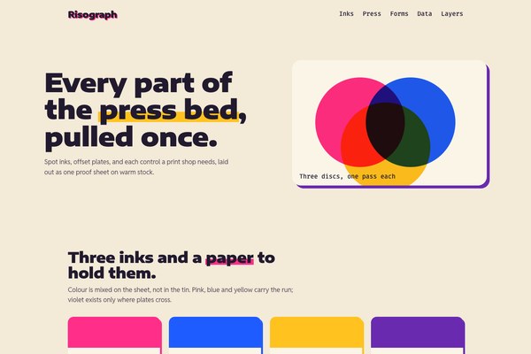
- Overprint seam: two discs in pink and blue multiply to violet #6A2AB0 where they cross, shown once as a figure and reused in the passes strip.
- Three passes: a sheet read down as three strips, each strip a pair of ink discs offset by the plate gap, stepping right as the passes build.

## Layout

### Grid

- **Type**: press sheet on a wide column
- **Max Width**: 1180px content, centred above 1440px; the hero spans the viewport
- **Gutter**: clamp(20px, 5vw, 72px)
- **Column Behavior**: Two-column bands use minmax(0,1.1fr) minmax(0,1fr) and stack below 900px; every grid child has min-width:0.

### Whitespace

- **Section Gap**: 64 to 104px
- **Card Gap**: 36px between plaques, 24px on tablets
- **Content Padding**: 22 to 36px inside plaques
- **Approach**: Warm paper is the reset between bursts of ink; every saturated surface has open stock on at least two sides.

### Density

- **Default**: comfortable
- **Comfortable**: {"button_height":"52px","input_height":"52px","row_height":"56px table rows"}

### Responsive

Phones (390px) stack to one column and swap to the portrait hero with the headline in the empty paper above the scene; the three passes drop their stagger. Tablets (601 to 1199px) use the portrait hero too and two-up plaques. From 1440px the content caps and centres; only the hero stays full bleed.

### Breakpoints

- **Mobile**: 390px
- **Phone Max**: 600px
- **Tablet**: 834px
- **Desktop**: 1280px
- **Ultrawide**: 2560px

## Guidance

### Do

- Build emphasis from offset spot-ink plates, not outlines or grey shadows.
- Keep the paper in charge: let ink land on open cream and never flood a panel.
- Put the headline on the empty paper of the hero picture with no box or scrim.
- Use dark plum text on pink and yellow; use cream only on blue and plum.
- Give one word of each big heading a flat highlighter stripe.
- Pair every picture with the Misprint art style and its two or three spot inks.

### Don't

- Don't use gradients, glow, glass or grey shadows.
- Don't outline cards, inputs or buttons.
- Don't set white or cream text on pink.
- Don't use pink for errors; errors are crimson #B0123A.
- Don't add eyebrow labels, numbered tags, fake quotes or a colophon footer.
- Don't use square corners on a rectangle: 16, 24 or full round only.

### Accessibility

Plum #211A2E is 14.2:1 on cream #F3EAD8 and muted #5E4B5C is 6.2:1. The button label plum on pink #FF2E88 is 5.7:1, cream on blue #1F5CFF is 5.4:1, and plum on sunflower #FFC21F is 10.6:1. Success #0B6B3A, warning #8A5A00, error #B0123A and info #1749D6 all clear 4.5:1 on cream and always carry a word. The hero type clears 4.5:1 against the worst pixel of the picture at 390, 834 and 1280px. Focus is a 3px plum outline at 3px offset. Reveals and plate motion are skipped under prefers-reduced-motion and the settled page renders without JavaScript.

### Usage Context

Zines, gazettes, posters, merch drops and indie shops; any product that wants to feel hand-printed, loud and a little imperfect without losing legibility.

## Imagery Direction

### Pairs With

misprint-riso

### Art Style Id

en-019efd20-27ed-7ec3-9d1a-ba1553784762

### Summary

Risograph screen-print scenes in the Misprint art style: pink, blue and yellow spot inks on warm cream stock, deliberately offset layers, coarse halftone and flat poster shading. The landing hero keeps a calm empty sheet of paper for the headline.

### Subjects

- a print-shop press at work
- stacks of freshly pulled sheets
- hands feeding paper
- ink drums and rollers

### Usage

One full-bleed hero per landing, painted with var(--hero-image): a wide scene whose left side is open paper for the headline, and a portrait scene with open paper on top for tablets and phones. Inside pages use ink discs and plates, not extra pictures.

### Avoid

Text, gradients or a scrim over the picture; photography; 3D renders; smooth airbrush; muddy brown washes; perfectly registered edges.
---
version: "alpha"
name: "Risograph"
description: "Risograph is a print-shop language: warm cream stock, three loud spot inks (fluoro pink, press blue, sunflower) and one rule, that every emphatic thing is two plates pulled slightly out of register. Buttons, cards and plaques stand on a..."
colors:
  bg: "#F3EAD8"
  surface: "#FBF5E8"
  surface-2: "#ECE0C6"
  text: "#211A2E"
  muted: "#5E4B5C"
  border: "#E4D6BA"
  accent: "#FF2E88"
  accent-2: "#1F5CFF"
  accent-3: "#FFC21F"
  overprint: "#6A2AB0"
  on-accent: "#211A2E"
  on-blue: "#FBF5E8"
  success: "#0B6B3A"
  warning: "#8A5A00"
  error: "#B0123A"
  info: "#1749D6"
typography:
  headline-lg:
    fontFamily: "Encode Sans Expanded"
    fontSize: "2.075rem"
    fontWeight: 700
    lineHeight: 1.1
    letterSpacing: "-0.02em"
  headline-md:
    fontFamily: "Encode Sans Expanded"
    fontSize: "1.66rem"
    fontWeight: 600
    lineHeight: 1.15
    letterSpacing: "-0.02em"
  body-md:
    fontFamily: "Reddit Sans"
    fontSize: "17px"
    fontWeight: 400
    lineHeight: 1.5
    letterSpacing: "-0.02em"
  label-md:
    fontFamily: "Fira Mono"
    fontSize: "0.75rem"
    fontWeight: 600
    lineHeight: 1
    letterSpacing: "0.08em"
rounded:
  none: "0px"
  md: "16px"
  lg: "24px"
  full: "9999px"
spacing:
  base: "8px"
  xs: "4px"
  sm: "8px"
  md: "12px"
  lg: "16px"
  xl: "24px"
  2xl: "32px"
  3xl: "48px"
  4xl: "72px"
  step-8: "112px"
components:
  color-reference-bg:
    backgroundColor: "{colors.bg}"
  color-reference-surface:
    backgroundColor: "{colors.surface}"
  color-reference-surface-2:
    backgroundColor: "{colors.surface-2}"
  color-reference-text:
    backgroundColor: "{colors.text}"
  color-reference-muted:
    backgroundColor: "{colors.muted}"
  color-reference-border:
    backgroundColor: "{colors.border}"
  color-reference-accent:
    backgroundColor: "{colors.accent}"
  color-reference-accent-2:
    backgroundColor: "{colors.accent-2}"
  color-reference-accent-3:
    backgroundColor: "{colors.accent-3}"
  color-reference-overprint:
    backgroundColor: "{colors.overprint}"
  color-reference-on-accent:
    backgroundColor: "{colors.on-accent}"
  color-reference-on-blue:
    backgroundColor: "{colors.on-blue}"
  color-reference-success:
    backgroundColor: "{colors.success}"
  color-reference-warning:
    backgroundColor: "{colors.warning}"
  color-reference-error:
    backgroundColor: "{colors.error}"
  color-reference-info:
    backgroundColor: "{colors.info}"
  button-primary:
    backgroundColor: "{colors.accent}"
    textColor: "{colors.on-accent}"
    typography: "{typography.label-md}"
    rounded: "{rounded.md}"
    padding: "{spacing.md}"
  card-surface:
    backgroundColor: "{colors.surface}"
    textColor: "{colors.text}"
    rounded: "{rounded.md}"
    padding: "{spacing.md}"
  input-default:
    backgroundColor: "{colors.surface}"
    textColor: "{colors.text}"
    rounded: "{rounded.md}"
    height: "44px"
---

# Risograph

## Overview

Risograph is a print-shop language: warm cream stock, three loud spot inks (fluoro pink, press blue, sunflower) and one rule, that every emphatic thing is two plates pulled slightly out of register. Buttons, cards and plaques stand on a solid offset plate of a second ink instead of a shadow, headlines carry a flat highlighter stripe behind one word, and where pink crosses blue the seam multiplies to violet, which is the only depth the page has. The hero is one full-bleed riso scene whose empty paper holds the headline, so type sits straight on the picture with no box, scrim or fade.

### Values

- Misregistration is the signature: every emphatic surface is a plate offset a few pixels from the ink above it.
- Paper out-areas ink: saturated colour always lands against open cream stock, never as a flooded field.
- Depth comes from overprint: violet exists only where pink and blue plates cross.
- Type stays legible while colour stays loud: deep plum ink at 17px or larger on cream, dark labels on pink and yellow.
- A real printed picture leads: one full-bleed riso hero in the paired art style, never CSS blobs standing in for it.

### Anti-Values

- Gradients, glows and grey drop shadows.
- Borders, outlines and heavy keylines around cards.
- Eyebrow micro-labels, numbered section tags, invented testimonials and colophon footers.
- White text on pink, or a pink that reads as the error colour.
- Flooding a whole panel in saturated ink until it goes muddy.
- Text laid over a busy part of the picture, or a scrim to rescue it.

### Visual Character

- Warm cream stock #F3EAD8 with lighter sheets #FBF5E8 and deep plum ink #211A2E.
- Three spot inks used like highlighters: pink #FF2E88, blue #1F5CFF, sunflower #FFC21F.
- Solid offset plates in a second ink under buttons, plaques and the closing card; a violet #6A2AB0 plate under the overprint figure.
- A flat highlighter stripe behind one word of every large heading, and a pink ghost offset 4px behind the hero headline.
- Encode Sans Expanded 900 headlines at -0.02em, Reddit Sans 17px prose, Fira Mono press labels.
- Radius from 16, 24 and 9999 only: soft plates and round ink dots, no rectangles with square corners.

### Lineage

> Generation 2 of Risograph, revised in place from arni's approved Round 7 specimen (risograph-i, 2026-10-06). It keeps the pink, blue and yellow on warm paper, the page order, the misregistration offset signature and the riso hero picture. It changes the fonts to Encode Sans Expanded, Reddit Sans and Fira Mono, moves the label ink to dark plum so pink passes AA, repairs muted and the semantic colours, replaces gradients with solid plates and SVG dots, turns the three cards into three passes, and drops the quote, eyebrows and footer.

## Colors

Use the YAML color tokens as the normative palette. The prose below names the roles agents should preserve when generating UI.

| Token | Value |
|-------|-------|
| bg | `#F3EAD8` |
| surface | `#FBF5E8` |
| surface-2 | `#ECE0C6` |
| text | `#211A2E` |
| muted | `#5E4B5C` |
| border | `#E4D6BA` |
| accent | `#FF2E88` |
| accent-2 | `#1F5CFF` |
| accent-3 | `#FFC21F` |
| overprint | `#6A2AB0` |
| on-accent | `#211A2E` |
| on-blue | `#FBF5E8` |
| success | `#0B6B3A` |
| warning | `#8A5A00` |
| error | `#B0123A` |
| info | `#1749D6` |

## Typography

Load the fonts from Google Fonts: https://fonts.googleapis.com/css2?family=Encode+Sans+Expanded:wght@600;800;900&family=Reddit+Sans:wght@400;500;700&family=Fira+Mono:wght@400;500&display=swap

- **Headline-Lg**: Encode Sans Expanded, 2.075rem, weight 700, line-height 1.1.
- **Headline-Md**: Encode Sans Expanded, 1.66rem, weight 600, line-height 1.15.
- **Body-Md**: Reddit Sans, 17px, weight 400, line-height 1.5.
- **Label-Md**: Fira Mono, 0.75rem, weight 600, line-height 1.

## Layout

### Spacing Tokens

- **Base**: `8px`
- **Xs**: `4px`
- **Sm**: `8px`
- **Md**: `12px`
- **Lg**: `16px`
- **Xl**: `24px`
- **2xl**: `32px`
- **3xl**: `48px`
- **4xl**: `72px`
- **Step-8**: `112px`

### Grid

- **Type**: press sheet on a wide column
- **Max Width**: 1180px content, centred above 1440px; the hero spans the viewport
- **Gutter**: clamp(20px, 5vw, 72px)
- **Column Behavior**: Two-column bands use minmax(0,1.1fr) minmax(0,1fr) and stack below 900px; every grid child has min-width:0.

### Whitespace

- **Section Gap**: 64 to 104px
- **Card Gap**: 36px between plaques, 24px on tablets
- **Content Padding**: 22 to 36px inside plaques
- **Approach**: Warm paper is the reset between bursts of ink; every saturated surface has open stock on at least two sides.

### Density

- **Default**: comfortable
- **Comfortable**: {"button_height":"52px","input_height":"52px","row_height":"56px table rows"}

### Responsive

Phones (390px) stack to one column and swap to the portrait hero with the headline in the empty paper above the scene; the three passes drop their stagger. Tablets (601 to 1199px) use the portrait hero too and two-up plaques. From 1440px the content caps and centres; only the hero stays full bleed.

### Breakpoints

- **Mobile**: 390px
- **Phone Max**: 600px
- **Tablet**: 834px
- **Desktop**: 1280px
- **Ultrawide**: 2560px

## Elevation & Depth

### Shadows

- **Plate-Blue**: 6px 6px 0 0 #1F5CFF
- **Plate-Pink**: 6px 6px 0 0 #FF2E88
- **Plate-Yellow**: 6px 6px 0 0 #FFC21F
- **Plate-Violet**: 8px 8px 0 0 #6A2AB0

## Shapes

### Rounded

- **None**: `0px`
- **Md**: `16px`
- **Lg**: `24px`
- **Full**: `9999px`

### Surfaces

- **Treatment**: paper
- **Card Style**: Cream sheets on warm stock, lifted by a solid offset ink plate (blue, pink, yellow or violet), never a grey shadow or an outline.
- **Bg Pattern**: a faint paper-light dot field on the blue band and the dark closing card; open stock elsewhere

### Borders

- **Default Width**: 0px
- **Accent Width**: 0px
- **Style**: none
- **Character**: No outlines anywhere. The offset ink plate and open paper separate surfaces; focus is a 3px ink outline at 3px offset.

## Components

### Composition

- Lay every view as a press sheet on warm paper: a wide lead column, generous paper gutters, one full-bleed riso picture at the top of a landing.
- Set the headline straight on the empty paper of the hero picture: no panel, scrim or fade behind it.
- Separate surfaces with open stock and a solid offset plate of a second ink, never an outline or a grey shadow.
- Give one section a full-width press-blue band with a faint dot field and a single overprint figure.

### Hierarchy

- Display in Encode Sans Expanded 900, 34 to 64px on phones to desktop, with a flat highlighter stripe behind one word.
- Prose in Reddit Sans 17px or more in plum ink, with muted #5E4B5C for the second tone.
- Fira Mono at 17px captions the press: counts, prices, offsets.
- Primary action is the pink plate; the second action is blue or a quiet cream plate.

### Density

Lively but printed: 64 to 104px between sections, 24 to 36px inside plaques, and an open paper strip between every burst of ink so colour never turns into a muddy field.

### Signature Patterns

- Misregistration plate: buttons, run plaques and the closing card stand on a solid 6 to 10px offset plate of a second ink; on hover the button moves into its plate, and on press it slips out of register.
- Highlighter stripe: one word of each large heading sits on a flat stripe of pink, blue or yellow 0.4em tall, behind the letters.
- Ghost headline: the hero headline carries a pink copy offset 4px behind each line.
- Overprint seam: two discs in pink and blue multiply to violet #6A2AB0 where they cross, shown once as a figure and reused in the passes strip.
- Three passes: a sheet read down as three strips, each strip a pair of ink discs offset by the plate gap, stepping right as the passes build.

## shadcn/ui Usage

When the target app uses shadcn/ui, copy DESIGN.md with shadcn instead of the plain DESIGN.md. It contains the same Katagami design-language source plus the shadcn/ui primitives, imports, theme variables, component recipes, and preview-shot guidance.

DESIGN.md with shadcn: `/language/en-01a112c9-37da-7c33-bab3-fa15b8a08a81/DESIGN.with-shadcn.md`.

Machine-readable companions for automation: `/language/en-01a112c9-37da-7c33-bab3-fa15b8a08a81/shadcn.json` (registry theme), `/language/en-01a112c9-37da-7c33-bab3-fa15b8a08a81/shadcn-components.md` (component recipes) and `/language/en-01a112c9-37da-7c33-bab3-fa15b8a08a81/shadcn-shots.json` (preview shots). The human-facing handoff is still DESIGN.md with shadcn.

Install recommended primitives with `npx shadcn@latest add button card input textarea select dialog sheet tabs badge separator checkbox switch slider tooltip dropdown-menu table`.

Use these primitives in shadcn apps:
- button
- card
- input
- textarea
- select
- dialog
- sheet
- tabs
- badge
- separator
- checkbox
- switch
- slider
- tooltip
- dropdown-menu
- table

Implementation rule for agents: import shadcn primitives from `@/components/ui/*`, apply the generated CSS variables first, then compose the language-specific recipes from the companion MD. Katagami remains the source of truth; shadcn names are the implementation surface.

## Do's and Don'ts

- Do Build emphasis from offset spot-ink plates, not outlines or grey shadows.
- Do Keep the paper in charge: let ink land on open cream and never flood a panel.
- Do Put the headline on the empty paper of the hero picture with no box or scrim.
- Do Use dark plum text on pink and yellow; use cream only on blue and plum.
- Do Give one word of each big heading a flat highlighter stripe.
- Do Pair every picture with the Misprint art style and its two or three spot inks.
- Don't Don't use gradients, glow, glass or grey shadows.
- Don't Don't outline cards, inputs or buttons.
- Don't Don't set white or cream text on pink.
- Don't Don't use pink for errors; errors are crimson #B0123A.
- Don't Don't add eyebrow labels, numbered tags, fake quotes or a colophon footer.
- Don't Don't use square corners on a rectangle: 16, 24 or full round only.

### Accessibility

Plum #211A2E is 14.2:1 on cream #F3EAD8 and muted #5E4B5C is 6.2:1. The button label plum on pink #FF2E88 is 5.7:1, cream on blue #1F5CFF is 5.4:1, and plum on sunflower #FFC21F is 10.6:1. Success #0B6B3A, warning #8A5A00, error #B0123A and info #1749D6 all clear 4.5:1 on cream and always carry a word. The hero type clears 4.5:1 against the worst pixel of the picture at 390, 834 and 1280px. Focus is a 3px plum outline at 3px offset. Reveals and plate motion are skipped under prefers-reduced-motion and the settled page renders without JavaScript.

### Usage Context

Zines, gazettes, posters, merch drops and indie shops; any product that wants to feel hand-printed, loud and a little imperfect without losing legibility.

## Imagery Direction

### Pairs With

misprint-riso

### Art Style Id

en-019efd20-27ed-7ec3-9d1a-ba1553784762

### Summary

Risograph screen-print scenes in the Misprint art style: pink, blue and yellow spot inks on warm cream stock, deliberately offset layers, coarse halftone and flat poster shading. The landing hero keeps a calm empty sheet of paper for the headline.

### Subjects

- a print-shop press at work
- stacks of freshly pulled sheets
- hands feeding paper
- ink drums and rollers

### Usage

One full-bleed hero per landing, painted with var(--hero-image): a wide scene whose left side is open paper for the headline, and a portrait scene with open paper on top for tablets and phones. Inside pages use ink discs and plates, not extra pictures.

### Avoid

Text, gradients or a scrim over the picture; photography; 3D renders; smooth airbrush; muddy brown washes; perfectly registered edges.
```json
{
  "$schema": "https://ui.shadcn.com/schema/registry-item.json",
  "name": "risograph",
  "type": "registry:theme",
  "title": "Risograph shadcn Theme",
  "cssVars": {
    "theme": {},
    "light": {
      "background": "#F3EAD8",
      "foreground": "#211A2E",
      "card": "#FBF5E8",
      "card-foreground": "#211A2E",
      "popover": "#FBF5E8",
      "popover-foreground": "#211A2E",
      "primary": "#211A2E",
      "primary-foreground": "#ffffff",
      "secondary": "#f4f4f5",
      "secondary-foreground": "#111111",
      "muted": "#5E4B5C",
      "muted-foreground": "#211A2E",
      "accent": "#FF2E88",
      "accent-foreground": "#ffffff",
      "destructive": "#B0123A",
      "border": "#E4D6BA",
      "input": "#E4D6BA",
      "ring": "#FF2E88",
      "chart-1": "#211A2E",
      "chart-2": "#f4f4f5",
      "chart-3": "#FF2E88",
      "chart-4": "#0B6B3A",
      "chart-5": "#8A5A00",
      "sidebar": "#FBF5E8",
      "sidebar-foreground": "#211A2E",
      "sidebar-primary": "#211A2E",
      "sidebar-primary-foreground": "#ffffff",
      "sidebar-accent": "#1749D6",
      "sidebar-accent-foreground": "#ffffff",
      "sidebar-border": "#E4D6BA",
      "sidebar-ring": "#FF2E88",
      "radius": "16px"
    },
    "dark": {
      "background": "#0f1115",
      "foreground": "#f8fafc",
      "card": "#181b22",
      "card-foreground": "#f8fafc",
      "popover": "#181b22",
      "popover-foreground": "#f8fafc",
      "primary": "#211A2E",
      "primary-foreground": "#ffffff",
      "secondary": "#252a33",
      "secondary-foreground": "#f8fafc",
      "muted": "#252a33",
      "muted-foreground": "#a1a1aa",
      "accent": "#FF2E88",
      "accent-foreground": "#ffffff",
      "destructive": "#B0123A",
      "border": "#303642",
      "input": "#303642",
      "ring": "#FF2E88",
      "chart-1": "#211A2E",
      "chart-2": "#f4f4f5",
      "chart-3": "#FF2E88",
      "chart-4": "#0B6B3A",
      "chart-5": "#8A5A00",
      "sidebar": "#181b22",
      "sidebar-foreground": "#f8fafc",
      "sidebar-primary": "#211A2E",
      "sidebar-primary-foreground": "#ffffff",
      "sidebar-accent": "#FF2E88",
      "sidebar-accent-foreground": "#ffffff",
      "sidebar-border": "#303642",
      "sidebar-ring": "#FF2E88",
      "radius": "16px"
    }
  },
  "meta": {
    "source": "katagami",
    "languageId": "en-01a112c9-37da-7c33-bab3-fa15b8a08a81",
    "slug": "risograph",
    "componentManifest": [
      "button",
      "card",
      "input",
      "textarea",
      "select",
      "dialog",
      "sheet",
      "tabs",
      "badge",
      "separator",
      "checkbox",
      "switch",
      "slider",
      "tooltip",
      "dropdown-menu",
      "table"
    ],
    "installCommand": "npx shadcn@latest add button card input textarea select dialog sheet tabs badge separator checkbox switch slider tooltip dropdown-menu table",
    "nativeTokenNames": {
      "colors": [
        "accent",
        "accent-2",
        "accent-3",
        "bg",
        "border",
        "error",
        "info",
        "muted",
        "on-accent",
        "on-blue",
        "overprint",
        "success",
        "surface",
        "surface-2",
        "text",
        "warning"
      ],
      "typography": [
        "base_size",
        "body_font",
        "body_weight",
        "button_weight",
        "google_fonts_url",
        "heading_font",
        "heading_transform",
        "heading_weight",
        "letter_spacing",
        "line_height",
        "mono_font",
        "mono_weight",
        "scale"
      ],
      "radii": [
        "full",
        "lg",
        "md",
        "none"
      ],
      "spacing": [
        "base",
        "scale"
      ],
      "shadows": [
        "plate-blue",
        "plate-pink",
        "plate-violet",
        "plate-yellow"
      ],
      "surfaces": [
        "bg_pattern",
        "card_style",
        "treatment"
      ],
      "borders": [
        "accent_width",
        "character",
        "default_width",
        "style"
      ],
      "motion": [
        "duration",
        "easing",
        "philosophy"
      ],
      "controls": [
        "height",
        "radius",
        "well_height"
      ]
    }
  }
}
```The art style its pictures are drawn in and the colours its tokens carry.
The theme variables are generated from the tokens. Component recipes and preview shots have not been written for this language yet.
For an app that uses shadcn/ui: the DESIGN.md plus the install list, theme variables, component recipes, preview shots and a starter TSX file, in one Markdown file.
The same pieces as separate files: theme, CSS, TSX starter, recipes and the preview contract.
npx shadcn@latest add button card input textarea select dialog sheet tabs badge separator checkbox switch slider tooltip dropdown-menu table:root {
--background: #F3EAD8;
--foreground: #211A2E;
--card: #FBF5E8;
--card-foreground: #211A2E;
--popover: #FBF5E8;
--popover-foreground: #211A2E;
--primary: #211A2E;
--primary-foreground: #ffffff;
--secondary: #f4f4f5;
--secondary-foreground: #111111;
--muted: #5E4B5C;
--muted-foreground: #211A2E;
--accent: #FF2E88;
--accent-foreground: #ffffff;
--destructive: #B0123A;
--border: #E4D6BA;
--input: #E4D6BA;
--ring: #FF2E88;
--chart-1: #211A2E;
--chart-2: #f4f4f5;
--chart-3: #FF2E88;
--chart-4: #0B6B3A;
--chart-5: #8A5A00;
--sidebar: #FBF5E8;
--sidebar-foreground: #211A2E;
--sidebar-primary: #211A2E;
--sidebar-primary-foreground: #ffffff;
--sidebar-accent: #1749D6;
--sidebar-accent-foreground: #ffffff;
--sidebar-border: #E4D6BA;
--sidebar-ring: #FF2E88;
--radius: 16px;
}
.dark {
--background: #0f1115;
--foreground: #f8fafc;
--card: #181b22;
--card-foreground: #f8fafc;
--popover: #181b22;
--popover-foreground: #f8fafc;
--primary: #211A2E;
--primary-foreground: #ffffff;
--secondary: #252a33;
--secondary-foreground: #f8fafc;
--muted: #252a33;
--muted-foreground: #a1a1aa;
--accent: #FF2E88;
--accent-foreground: #ffffff;
--destructive: #B0123A;
--border: #303642;
--input: #303642;
--ring: #FF2E88;
--chart-1: #211A2E;
--chart-2: #f4f4f5;
--chart-3: #FF2E88;
--chart-4: #0B6B3A;
--chart-5: #8A5A00;
--sidebar: #181b22;
--sidebar-foreground: #f8fafc;
--sidebar-primary: #211A2E;
--sidebar-primary-foreground: #ffffff;
--sidebar-accent: #FF2E88;
--sidebar-accent-foreground: #ffffff;
--sidebar-border: #303642;
--sidebar-ring: #FF2E88;
--radius: 16px;
}
import { Badge } from "@/components/ui/badge";
import { Button } from "@/components/ui/button";
import {
  Card,
  CardContent,
  CardDescription,
  CardFooter,
  CardHeader,
  CardTitle,
} from "@/components/ui/card";
import { Input } from "@/components/ui/input";
import { Tabs, TabsList, TabsTrigger } from "@/components/ui/tabs";

export function RisographShadcnKit() {
  return (
    <section className="grid gap-4 rounded-[var(--radius)] border bg-background p-4 text-foreground">
      <div className="flex items-start justify-between gap-4">
        <div>
          <Badge variant="outline">shadcn/ui</Badge>
          <h2 className="mt-3 text-2xl font-semibold tracking-tight">Risograph</h2>
          <p className="mt-1 max-w-xl text-sm text-muted-foreground">
            Use the Katagami registry theme, then compose these shadcn primitives
            with the language-specific component recipes.
          </p>
        </div>
        <Button>Apply theme</Button>
      </div>

      <Tabs defaultValue="components">
        <TabsList>
          <TabsTrigger value="components">Components</TabsTrigger>
          <TabsTrigger value="states">States</TabsTrigger>
          <TabsTrigger value="export">Export</TabsTrigger>
        </TabsList>
      </Tabs>

      <Card>
        <CardHeader>
          <CardTitle>Component recipe</CardTitle>
          <CardDescription>
            Replace this starter content with the agent-authored product scene
            from components.md and preview-shots.json.
          </CardDescription>
        </CardHeader>
        <CardContent className="grid gap-3 sm:grid-cols-[1fr_auto]">
          <Input defaultValue="Tokenized shadcn surface" aria-label="Recipe name" />
          <Button variant="secondary">Preview state</Button>
        </CardContent>
        <CardFooter className="justify-between">
          <Badge>Ready</Badge>
          <Button variant="outline">Copy recipe</Button>
        </CardFooter>
      </Card>
    </section>
  );
}
{
  "$schema": "https://ui.shadcn.com/schema/registry-item.json",
  "name": "risograph",
  "type": "registry:theme",
  "title": "Risograph",
  "description": "Warm cream stock and three loud spot inks: pink buttons on blue plates, flat highlighter stripes, no outlines and no gradients; radius 16, 24 and full.",
  "cssVars": {
    "theme": {
      "font-sans": "Reddit Sans, sans-serif",
      "font-mono": "Fira Mono, ui-monospace, monospace",
      "font-display": "Encode Sans Expanded, sans-serif",
      "radius": "1rem"
    },
    "light": {
      "background": "#F3EAD8",
      "foreground": "#211A2E",
      "card": "#FBF5E8",
      "card-foreground": "#211A2E",
      "popover": "#FBF5E8",
      "popover-foreground": "#211A2E",
      "primary": "#FF2E88",
      "primary-foreground": "#211A2E",
      "secondary": "#1F5CFF",
      "secondary-foreground": "#FBF5E8",
      "muted": "#ECE0C6",
      "muted-foreground": "#5E4B5C",
      "accent": "#FFC21F",
      "accent-foreground": "#211A2E",
      "destructive": "#B0123A",
      "destructive-foreground": "#FBF5E8",
      "border": "transparent",
      "input": "transparent",
      "ring": "#211A2E",
      "chart-1": "#FF2E88",
      "chart-2": "#1F5CFF",
      "chart-3": "#FFC21F",
      "chart-4": "#6A2AB0",
      "chart-5": "#0B6B3A",
      "radius": "1rem"
    },
    "dark": {
      "background": "#F3EAD8",
      "foreground": "#211A2E",
      "card": "#FBF5E8",
      "card-foreground": "#211A2E",
      "popover": "#FBF5E8",
      "popover-foreground": "#211A2E",
      "primary": "#FF2E88",
      "primary-foreground": "#211A2E",
      "secondary": "#1F5CFF",
      "secondary-foreground": "#FBF5E8",
      "muted": "#ECE0C6",
      "muted-foreground": "#5E4B5C",
      "accent": "#FFC21F",
      "accent-foreground": "#211A2E",
      "destructive": "#B0123A",
      "destructive-foreground": "#FBF5E8",
      "border": "transparent",
      "input": "transparent",
      "ring": "#211A2E",
      "chart-1": "#FF2E88",
      "chart-2": "#1F5CFF",
      "chart-3": "#FFC21F",
      "chart-4": "#6A2AB0",
      "chart-5": "#0B6B3A",
      "radius": "1rem"
    }
  },
  "componentManifest": [
    "button",
    "card",
    "input",
    "textarea",
    "select",
    "dialog",
    "sheet",
    "tabs",
    "badge",
    "separator",
    "checkbox",
    "switch",
    "slider",
    "tooltip",
    "dropdown-menu",
    "table"
  ],
  "meta": {
    "nativeTokenNames": {
      "bg": "background",
      "surface": "card / popover",
      "surface-2": "muted (wells and table headers)",
      "text": "foreground / ring",
      "muted": "muted-foreground",
      "accent": "primary (pink)",
      "accent-2": "secondary (blue)",
      "accent-3": "accent (sunflower)",
      "overprint": "chart-4 and the overprint figure (native only)",
      "error": "destructive",
      "border": "native only (tracks); --border stays transparent"
    },
    "note": "Risograph is a light, paper-ground language; the dark scope repeats the light values. The shadcn primary is the pink plate with a plum label, never cream on pink.",
    "componentManifest": [
      "button",
      "card",
      "input",
      "textarea",
      "select",
      "dialog",
      "sheet",
      "tabs",
      "badge",
      "separator",
      "checkbox",
      "switch",
      "slider",
      "tooltip",
      "dropdown-menu",
      "table"
    ]
  }
}
---
artifact: component-recipes-v1
language: risograph
author: katagami-agent
primitives: 16
---

# Risograph shadcn/ui Components

Author: `katagami-agent`

## Intent

Risograph dresses shadcn/ui as a print shop: cream sheets on warm stock, pink actions that stand on a solid blue plate, and a flat highlighter stripe behind one heading word. Nothing is outlined and nothing has a grey shadow; the offset plate is the shadow. Pink and blue overprint to violet in the one signature figure, built outside shadcn.

## Required primitives

button, card, input, textarea, select, dialog, sheet, tabs, badge, separator, checkbox, switch, slider, tooltip, dropdown-menu, table. Import them from `@/components/ui/*`; do not build a second component system.

## Token cues

```css
--background:#F3EAD8;
--foreground:#211A2E;
--card:#FBF5E8;
--card-foreground:#211A2E;
--popover:#FBF5E8;
--popover-foreground:#211A2E;
--primary:#FF2E88;
--primary-foreground:#211A2E;
--secondary:#1F5CFF;
--secondary-foreground:#FBF5E8;
--muted:#ECE0C6;
--muted-foreground:#5E4B5C;
--accent:#FFC21F;
--accent-foreground:#211A2E;
--destructive:#B0123A;
--destructive-foreground:#FBF5E8;
--border:transparent;
--input:transparent;
--ring:#211A2E;
--chart-1:#FF2E88;
--chart-2:#1F5CFF;
--chart-3:#FFC21F;
--chart-4:#6A2AB0;
--chart-5:#0B6B3A;
--radius:1rem;
```

Native names are kept in the theme: `surface-2`, `overprint`, `on-blue` and the ink plate colours `--ink-pink`, `--ink-blue` and `--ink-yellow`, which are pink, blue and sunflower for use in plate shadows.

## Visual character to preserve

- Every emphatic surface stands on a solid offset plate of a second ink; never a grey shadow.
- No outlines: wells are filled, sheets are cream, focus is a 3px plum outline.
- Pink actions carry a plum label, never white.
- Radius is 16 on controls, 24 on sheets, full round on dots and tabs.
- One highlighter stripe behind one word of every large heading.
- Pink is never an error; errors are crimson.

## ShadSync visual profile

- family: print-plate
- material: flat spot ink on warm cream stock with solid offset plates
- contour: soft
- border: none
- underlay: True
- grain: False
- stickerBadges: False
- motion: plates re-register on hover and slip on press
- density: comfortable
- radius: 16, 24, 9999
- accents: pink, blue, sunflower

## Signature component recipes

- **button:** `h-[52px] rounded-2xl border-0 px-7 font-extrabold text-[17px] whitespace-nowrap`. `default` is `bg-primary text-primary-foreground shadow-[6px_6px_0_var(--ink-blue)]` (pink with plum label, blue plate); hover moves it `translate-x-[5px] translate-y-[5px]` with the plate down to 1px; active slips to `shadow-[9px_9px_0]` and `-translate-1`. `secondary` is blue with a cream label on a sunflower plate. `ghost` is a flat `bg-muted` well. Focus: `outline-3 outline-offset-3 outline-ring`.
- **card:** a cream sheet, never outlined: `bg-card rounded-3xl border-0 p-8 shadow-[6px_6px_0_var(--ink-pink)]`, rotating the plate ink (pink, blue, sunflower) across a set. Titles in Encode Sans Expanded 800 at 22 to 28px. No grey shadow.
- **input:** a filled well: `h-[52px] rounded-2xl border-0 bg-muted px-[18px] shadow-none`; focus `shadow-[5px_5px_0_var(--ink-blue)]` instead of a ring; an error uses `shadow-[5px_5px_0_var(--destructive)]` and a Fira Mono message in crimson.
- **textarea:** the input well at `min-h-[104px] py-4`, vertical resize only.
- **select:** the input well with a custom 14px plum chevron SVG; `SelectContent` is `bg-popover rounded-2xl p-2 shadow-[6px_6px_0_var(--ink-blue)]` and a highlighted item turns sunflower `bg-accent`.
- **dialog:** `bg-popover rounded-3xl border-0 p-9 shadow-[10px_10px_0_var(--ink-pink)]` over a 45% plum overlay; Encode Sans Expanded title, muted body, a pink primary and a quiet well button.
- **sheet:** a side `bg-popover rounded-l-3xl` panel on a blue plate, sliding in on `cubic-bezier(.2,.9,.2,1)` over 200ms.
- **tabs:** `TabsList` is `bg-transparent p-0 gap-1.5`; triggers are 44px pill words (`rounded-full px-5 font-bold`); the active trigger is `bg-accent text-foreground shadow-[4px_4px_0_var(--ink-pink)]`. No underline.
- **badge:** a round ink dot plus a word: `bg-transparent p-0 gap-2 font-bold` with a 14px dot in success, info, warning or crimson; never a filled pink pill.
- **separator:** do not draw one. Use space (24 to 48px) or a change of sheet tone; if a rule is unavoidable use a 4px sunflower bar.
- **checkbox:** `size-[26px] rounded-lg border-0 bg-muted`; checked is `bg-primary` with a plum 10px dot and `shadow-[3px_3px_0_var(--ink-blue)]`. Radios are fully round.
- **switch:** `h-8 w-14 rounded-full bg-muted`; checked is `bg-secondary` (blue) with a 24px cream knob on a `shadow-[2px_2px_0_var(--ink-pink)]` plate that slides 24px.
- **slider:** an 8px `rounded-full bg-muted` track, a pink range and a 28px pink thumb on `shadow-[4px_4px_0_var(--ink-blue)]`.
- **tooltip:** `bg-foreground text-background rounded-xl px-3 py-2 font-mono text-[17px]`, no arrow shadow, 150ms fade.
- **dropdown-menu:** a cream `rounded-2xl p-2 shadow-[6px_6px_0_var(--ink-blue)]` sheet; items are 12px-radius rows with the shortcut in Fira Mono; the highlighted row is sunflower.
- **table:** a 24px sheet: header row on `bg-muted` in Encode Sans Expanded 800, body 17px, alternating `bg-background` rows, hover `bg-accent` (sunflower), numbers in Fira Mono right-aligned; state is a round ink dot plus a word.

### The offset plate and the overprint figure (the signature, outside shadcn)

The offset plate is a `box-shadow` of `6px 6px 0` in a second ink; define `--ink-pink`, `--ink-blue` and `--ink-yellow` as theme variables and rotate them across a set. The highlighter stripe is a `::after` bar 0.4em tall behind one word (`z-index:-1`). The overprint figure is two 190px discs in pink and blue with `mix-blend-mode: multiply` on a cream sheet over a violet `8px 8px 0` plate. Hover moves a button 5px into its plate; press slips it out to 9px. All of it is skipped under prefers-reduced-motion.

## Preview shots

- `application-shell`: The run sheet. A press-shop dashboard on cream: wordmark and Fira Mono nav, a headline with a pink highlighter stripe, one pink button on its blue plate, then three run plaques on offset plates and a sheet table with state dots.
- `detail-editor`: Order a run. An order form on a cream sheet: filled wells for name and paper stock, a focused well with a blue plate, an error well in crimson, a notes textarea, ink checkboxes, an offset switch, an offset slider and one pink button.
- `data-operations`: Runs and proofs. A runs view: sunflower pill tabs, a sheet table with round state dots, an open menu on a blue plate, and a cancel dialog on a pink plate with a side sheet of proof details beside it.

Each shot carries a renderable `scene` with headline, description, actions and rows or fields.

## Implementation contract

- Start from local `@/components/ui/*` shadcn primitives and apply `/katagami/shadcn/risograph/registry-theme.json`.
- Keep `--border` and `--input` transparent; wells take their tone from `bg-muted`.
- Use radius 16px on controls, 24px on sheets and full round on dots; never 0.
- Pink `--primary` always carries the plum `--primary-foreground`.
- Plate shadows use the ink variables, never a grey or blurred shadow.
- Errors use crimson `--destructive`, never pink.
- Respect `prefers-reduced-motion`: skip the plate move, keep the offset.

## Copy-paste component example

```tsx
import { Button } from "@/components/ui/button";
import { Card, CardContent, CardHeader, CardTitle } from "@/components/ui/card";
import { Badge } from "@/components/ui/badge";

const runs = [
  { name: "Spring zine", inks: "Pink and yellow", pulls: 240, plate: "var(--ink-pink)" },
  { name: "Ward gazette", inks: "Pink and blue", pulls: 90, plate: "var(--ink-blue)" },
];

export function Runs() {
  return (
    <div className="grid gap-9 md:grid-cols-2">
      {runs.map((r) => (
        <Card key={r.name} className="rounded-3xl border-0 bg-card" style={{ boxShadow: `6px 6px 0 ${r.plate}` }}>
          <CardHeader>
            <CardTitle className="font-[Encode_Sans_Expanded] text-[22px] font-extrabold tracking-[-0.02em]">{r.name}</CardTitle>
          </CardHeader>
          <CardContent className="flex items-center justify-between">
            <span className="font-mono text-[17px] text-muted-foreground">{r.inks}, {r.pulls} pulls</span>
            <Badge variant="outline" className="border-0 bg-transparent font-bold">On press</Badge>
          </CardContent>
        </Card>
      ))}
      <Button className="h-[52px] w-fit rounded-2xl px-7 font-extrabold shadow-[6px_6px_0_var(--ink-blue)]">Start a print run</Button>
    </div>
  );
}
```
{
  "artifact": "katagami:shadcn-preview-shots",
  "version": "preview-shots-v1",
  "schema": "katagami:shadcn-preview-shots/renderable-v1",
  "renderable": true,
  "author": "katagami-agent",
  "requiresVisualProfile": true,
  "language": {
    "id": "en-019efd20-71ad-70d0-8ae9-148e7ce76d37",
    "name": "Risograph",
    "slug": "risograph"
  },
  "installCommand": "npx shadcn@latest add button card input textarea select dialog sheet tabs badge separator checkbox switch slider tooltip dropdown-menu table",
  "primitives": [
    "button",
    "card",
    "input",
    "textarea",
    "select",
    "dialog",
    "sheet",
    "tabs",
    "badge",
    "separator",
    "checkbox",
    "switch",
    "slider",
    "tooltip",
    "dropdown-menu",
    "table"
  ],
  "identityNotes": [
    "Misregistration is the signature: a second ink plate offset 6px under every emphatic surface.",
    "Pink, blue and sunflower on warm cream; violet only where pink and blue overprint.",
    "Plum labels on pink and sunflower, cream on blue; no white on pink.",
    "Encode Sans Expanded 900 headlines, Reddit Sans prose, Fira Mono press labels."
  ],
  "visualProfile": {
    "family": "print-plate",
    "material": "flat spot ink on warm cream stock with solid offset plates",
    "contour": "soft",
    "border": "none",
    "underlay": true,
    "grain": false,
    "stickerBadges": false,
    "motion": "plates re-register on hover and slip on press",
    "density": "comfortable",
    "radius": [
      16,
      24,
      9999
    ],
    "accents": [
      "pink",
      "blue",
      "sunflower"
    ]
  },
  "componentRecipes": [
    {
      "primitive": "button",
      "intent": "`h-[52px] rounded-2xl border-0 px-7 font-extrabold text-[17px] whitespace-nowrap`. `default` is `bg-primary text-primary-foreground shadow-[6px_6px_0_var(--ink-blue)]` (pink with plum label, blue plate); hover moves it `translate-x-[5px] translate-y-[5px]` with the plate down to 1px; active slips to `shadow-[9px_9px_0]` and `-translate-1`. `secondary` is blue with a cream label on a sunflower plate. `ghost` is a flat `bg-muted` well. Focus: `outline-3 outline-offset-3 outline-ring`.",
      "recipe": "`h-[52px] rounded-2xl border-0 px-7 font-extrabold text-[17px] whitespace-nowrap`. `default` is `bg-primary text-primary-foreground shadow-[6px_6px_0_var(--ink-blue)]` (pink with plum label, blue plate); hover moves it `translate-x-[5px] translate-y-[5px]` with the plate down to 1px; active slips to `shadow-[9px_9px_0]` and `-translate-1`. `secondary` is blue with a cream label on a sunflower plate. `ghost` is a flat `bg-muted` well. Focus: `outline-3 outline-offset-3 outline-ring`."
    },
    {
      "primitive": "card",
      "intent": "a cream sheet, never outlined: `bg-card rounded-3xl border-0 p-8 shadow-[6px_6px_0_var(--ink-pink)]`, rotating the plate ink (pink, blue, sunflower) across a set. Titles in Encode Sans Expanded 800 at 22 to 28px. No grey shadow.",
      "recipe": "a cream sheet, never outlined: `bg-card rounded-3xl border-0 p-8 shadow-[6px_6px_0_var(--ink-pink)]`, rotating the plate ink (pink, blue, sunflower) across a set. Titles in Encode Sans Expanded 800 at 22 to 28px. No grey shadow."
    },
    {
      "primitive": "input",
      "intent": "a filled well: `h-[52px] rounded-2xl border-0 bg-muted px-[18px] shadow-none`; focus `shadow-[5px_5px_0_var(--ink-blue)]` instead of a ring; an error uses `shadow-[5px_5px_0_var(--destructive)]` and a Fira Mono message in crimson.",
      "recipe": "a filled well: `h-[52px] rounded-2xl border-0 bg-muted px-[18px] shadow-none`; focus `shadow-[5px_5px_0_var(--ink-blue)]` instead of a ring; an error uses `shadow-[5px_5px_0_var(--destructive)]` and a Fira Mono message in crimson."
    },
    {
      "primitive": "textarea",
      "intent": "the input well at `min-h-[104px] py-4`, vertical resize only.",
      "recipe": "the input well at `min-h-[104px] py-4`, vertical resize only."
    },
    {
      "primitive": "select",
      "intent": "the input well with a custom 14px plum chevron SVG; `SelectContent` is `bg-popover rounded-2xl p-2 shadow-[6px_6px_0_var(--ink-blue)]` and a highlighted item turns sunflower `bg-accent`.",
      "recipe": "the input well with a custom 14px plum chevron SVG; `SelectContent` is `bg-popover rounded-2xl p-2 shadow-[6px_6px_0_var(--ink-blue)]` and a highlighted item turns sunflower `bg-accent`."
    },
    {
      "primitive": "dialog",
      "intent": "`bg-popover rounded-3xl border-0 p-9 shadow-[10px_10px_0_var(--ink-pink)]` over a 45% plum overlay; Encode Sans Expanded title, muted body, a pink primary and a quiet well button.",
      "recipe": "`bg-popover rounded-3xl border-0 p-9 shadow-[10px_10px_0_var(--ink-pink)]` over a 45% plum overlay; Encode Sans Expanded title, muted body, a pink primary and a quiet well button."
    },
    {
      "primitive": "sheet",
      "intent": "a side `bg-popover rounded-l-3xl` panel on a blue plate, sliding in on `cubic-bezier(.2,.9,.2,1)` over 200ms.",
      "recipe": "a side `bg-popover rounded-l-3xl` panel on a blue plate, sliding in on `cubic-bezier(.2,.9,.2,1)` over 200ms."
    },
    {
      "primitive": "tabs",
      "intent": "`TabsList` is `bg-transparent p-0 gap-1.5`; triggers are 44px pill words (`rounded-full px-5 font-bold`); the active trigger is `bg-accent text-foreground shadow-[4px_4px_0_var(--ink-pink)]`. No underline.",
      "recipe": "`TabsList` is `bg-transparent p-0 gap-1.5`; triggers are 44px pill words (`rounded-full px-5 font-bold`); the active trigger is `bg-accent text-foreground shadow-[4px_4px_0_var(--ink-pink)]`. No underline."
    },
    {
      "primitive": "badge",
      "intent": "a round ink dot plus a word: `bg-transparent p-0 gap-2 font-bold` with a 14px dot in success, info, warning or crimson; never a filled pink pill.",
      "recipe": "a round ink dot plus a word: `bg-transparent p-0 gap-2 font-bold` with a 14px dot in success, info, warning or crimson; never a filled pink pill."
    },
    {
      "primitive": "separator",
      "intent": "do not draw one. Use space (24 to 48px) or a change of sheet tone; if a rule is unavoidable use a 4px sunflower bar.",
      "recipe": "do not draw one. Use space (24 to 48px) or a change of sheet tone; if a rule is unavoidable use a 4px sunflower bar."
    },
    {
      "primitive": "checkbox",
      "intent": "`size-[26px] rounded-lg border-0 bg-muted`; checked is `bg-primary` with a plum 10px dot and `shadow-[3px_3px_0_var(--ink-blue)]`. Radios are fully round.",
      "recipe": "`size-[26px] rounded-lg border-0 bg-muted`; checked is `bg-primary` with a plum 10px dot and `shadow-[3px_3px_0_var(--ink-blue)]`. Radios are fully round."
    },
    {
      "primitive": "switch",
      "intent": "`h-8 w-14 rounded-full bg-muted`; checked is `bg-secondary` (blue) with a 24px cream knob on a `shadow-[2px_2px_0_var(--ink-pink)]` plate that slides 24px.",
      "recipe": "`h-8 w-14 rounded-full bg-muted`; checked is `bg-secondary` (blue) with a 24px cream knob on a `shadow-[2px_2px_0_var(--ink-pink)]` plate that slides 24px."
    },
    {
      "primitive": "slider",
      "intent": "an 8px `rounded-full bg-muted` track, a pink range and a 28px pink thumb on `shadow-[4px_4px_0_var(--ink-blue)]`.",
      "recipe": "an 8px `rounded-full bg-muted` track, a pink range and a 28px pink thumb on `shadow-[4px_4px_0_var(--ink-blue)]`."
    },
    {
      "primitive": "tooltip",
      "intent": "`bg-foreground text-background rounded-xl px-3 py-2 font-mono text-[17px]`, no arrow shadow, 150ms fade.",
      "recipe": "`bg-foreground text-background rounded-xl px-3 py-2 font-mono text-[17px]`, no arrow shadow, 150ms fade."
    },
    {
      "primitive": "dropdown-menu",
      "intent": "a cream `rounded-2xl p-2 shadow-[6px_6px_0_var(--ink-blue)]` sheet; items are 12px-radius rows with the shortcut in Fira Mono; the highlighted row is sunflower.",
      "recipe": "a cream `rounded-2xl p-2 shadow-[6px_6px_0_var(--ink-blue)]` sheet; items are 12px-radius rows with the shortcut in Fira Mono; the highlighted row is sunflower."
    },
    {
      "primitive": "table",
      "intent": "a 24px sheet: header row on `bg-muted` in Encode Sans Expanded 800, body 17px, alternating `bg-background` rows, hover `bg-accent` (sunflower), numbers in Fira Mono right-aligned; state is a round ink dot plus a word.",
      "recipe": "a 24px sheet: header row on `bg-muted` in Encode Sans Expanded 800, body 17px, alternating `bg-background` rows, hover `bg-accent` (sunflower), numbers in Fira Mono right-aligned; state is a round ink dot plus a word."
    }
  ],
  "shots": [
    {
      "id": "application-shell",
      "title": "The run sheet",
      "viewport": "desktop",
      "primitives": [
        "button",
        "card",
        "badge",
        "table",
        "separator",
        "tooltip"
      ],
      "composition": "A press-shop dashboard on cream: wordmark and Fira Mono nav, a headline with a pink highlighter stripe, one pink button on its blue plate, then three run plaques on offset plates and a sheet table with state dots.",
      "mustShow": [
        "pink button on a blue plate",
        "plaques on pink, blue and sunflower plates",
        "table with round state dots",
        "highlighter stripe on one word"
      ],
      "avoid": [
        "outlines or borders",
        "grey shadows",
        "white text on pink",
        "gradients"
      ],
      "mustShowStates": [
        "primary hover registered",
        "row hover sunflower",
        "state dots with words",
        "tooltip"
      ],
      "avoidRules": [
        "no borders",
        "no gradients",
        "radius 16, 24 or full only",
        "no emoji on buttons"
      ],
      "scene": {
        "headline": "Pulled this week",
        "description": "Three runs are on the press. Pink and blue are loaded; yellow is drying.",
        "primaryAction": "Start a print run",
        "secondaryAction": "Pull a proof",
        "rows": [
          {
            "label": "Spring zine",
            "value": "Pink and yellow, 240 pulls",
            "status": "Delivered"
          },
          {
            "label": "Ward gazette",
            "value": "Pink and blue, 90 pulls",
            "status": "On press"
          },
          {
            "label": "Map of the wires",
            "value": "Blue and yellow, 50 pulls",
            "status": "Drying"
          }
        ]
      }
    },
    {
      "id": "detail-editor",
      "title": "Order a run",
      "viewport": "desktop",
      "primitives": [
        "card",
        "input",
        "select",
        "textarea",
        "checkbox",
        "switch",
        "slider",
        "button",
        "badge"
      ],
      "composition": "An order form on a cream sheet: filled wells for name and paper stock, a focused well with a blue plate, an error well in crimson, a notes textarea, ink checkboxes, an offset switch, an offset slider and one pink button.",
      "mustShow": [
        "focused well with a blue plate",
        "custom select chevron",
        "checked pink checkbox",
        "switch on in blue",
        "error in crimson words"
      ],
      "avoid": [
        "outlined inputs",
        "browser default controls",
        "pink error text"
      ],
      "mustShowStates": [
        "focus plate",
        "checked",
        "switch on",
        "error",
        "primary button"
      ],
      "avoidRules": [
        "no borders",
        "no nested cards"
      ],
      "scene": {
        "headline": "Order a run",
        "description": "Name it, pick the inks and the paper, and we pull a proof first.",
        "primaryAction": "Send to press",
        "secondaryAction": "Save for later",
        "fields": [
          {
            "label": "Name of the run",
            "value": "Ward gazette, issue 4",
            "type": "text"
          },
          {
            "label": "Paper stock",
            "value": "Cream, 100gsm",
            "type": "select"
          },
          {
            "label": "Offset, in millimetres",
            "value": "3",
            "type": "range"
          }
        ],
        "statuses": [
          "Focus",
          "Checked",
          "Offset on"
        ]
      }
    },
    {
      "id": "data-operations",
      "title": "Runs and proofs",
      "viewport": "desktop",
      "primitives": [
        "tabs",
        "dropdown-menu",
        "table",
        "badge",
        "dialog",
        "sheet",
        "button",
        "separator"
      ],
      "composition": "A runs view: sunflower pill tabs, a sheet table with round state dots, an open menu on a blue plate, and a cancel dialog on a pink plate with a side sheet of proof details beside it.",
      "mustShow": [
        "chosen tab on a pink plate",
        "open menu",
        "dialog on a pink plate",
        "table row hover"
      ],
      "avoid": [
        "borders or dividers",
        "grey shadows",
        "rectangles with square corners"
      ],
      "mustShowStates": [
        "chosen tab",
        "menu highlight",
        "dialog open",
        "row hover"
      ],
      "avoidRules": [
        "no borders",
        "no gradients"
      ],
      "scene": {
        "headline": "Runs and proofs",
        "description": "Open runs, proofs waiting on you and the archive.",
        "primaryAction": "Keep the run",
        "secondaryAction": "Cancel it",
        "rows": [
          {
            "label": "Tour posters",
            "value": "Pink, blue, yellow, 400 pulls",
            "status": "Misfed"
          },
          {
            "label": "Ward gazette",
            "value": "Pink and blue, 90 pulls",
            "status": "On press"
          }
        ]
      }
    }
  ],
  "qualityRules": {
    "do": [
      "Stand every emphatic surface on an offset plate of a second ink",
      "Keep paper in charge and ink in bursts",
      "Plum label on pink and sunflower; cream on blue",
      "One highlighter stripe per large heading"
    ],
    "dont": [
      "No outlines or borders",
      "No gradients or grey shadows",
      "No white text on pink",
      "No pink errors",
      "No square corners"
    ]
  }
}
Keep Risograph and swap a palette and an art style onto it. The landing recolors live.
 Risograph