accent#B23C27
bg#F1EDE1
surface#E8E2D2
text#1B1815
muted#6B6259
border#D9D0BE
accent ink#8E2E1D
on accent#FBF7EC
indigo#3A4B63
Sumi Rail is an ink-and-paper operating language built around one real object: a sumi-e ink-wash painting on gasenshi paper.
Its pictures are drawn in Sumi.
Tokens, rules and the paired art style Sumi.
Each face set in this language's own words.
Sumi Rail
Sumi Rail
Sumi Rail is an ink-and-paper operating language built around one real object: a sumi-e ink-wash painting on gasenshi paper.
Sumi Rail is an ink-and-paper operating language built around one real object: a sumi-e ink-wash painting on gasenshi paper.
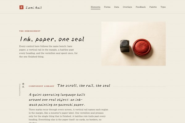
Sumi Rail is an ink-and-paper operating language built around one real object: a sumi-e ink-wash painting on gasenshi paper. The painting is the interface — brush strokes and graded washes on bare paper, photographed under one soft top-left light. Around it sits a vertical reading rail that names each region like a mounter's paper label, and one vermilion seal, pressed at a slight tilt, that marks the single thing that is finished. Everything else is the paper the painting is on: small quiet type, one hairline rule trailing past every heading, no frames, no cards, no second colour.
Generation 3 of Sumi Rail, revised in place from the round-3 descendant of the approved Inspora-method specimen (2026-09-29). Kept: the name, the warm paper ground, the vertical rail, the single vermilion seal, Ma as structural emptiness, and the pairing with Sumi (sumi-ink-wash). Changed: the abstract potter's-kiln scene becomes a scroll-mounting workshop built around one real ink-wash painting; the CTA moves from a vermilion pill to a square ink block so vermilion belongs to the seal alone; IBM Plex Mono is dropped for a two-family set (Yuji Boku, BIZ UDPMincho); panel shadows and the panel fill under list rows are dropped — rows sit straight on the paper, parted by a hairline; status marks that were coloured squares for every row become plain quiet words, with the seal reserved for the one finished thing.
Low-to-medium, mounter's-bench density: one object and a short headline per view, 96 to 128px between sections on desktop and 64 to 88px on phones, 52px controls, list rows parted by a single hairline with 24 to 28px of padding, prose held under about 46 characters beside the object.
Phones (390px) stack to one column, the rail lies down to a horizontal band, non-essential nav links and table columns hide, and the painting takes the full width with the headline below it. Tablets (768 to 1024px) keep two-column groupings with the rail beside the content. Ultra-wide caps and centres the content; only the landing hero spans the full width.
sumi-ink-wash
Sumi-e ink-wash brushwork of the workshop's own subjects: decisive loaded-brush strokes and graded washes of one dark sumi pigment on bare warm gasenshi paper, with large untouched paper carrying the composition as negative space, and studio product photographs of the workshop's own tools (a stone seal, a lacquered vermilion ink pad) under one soft top-left light on the same paper. One object, one light, generous emptiness.
One full-bleed hero per landing: an ink-wash painting (this season's subject) standing low and to one side of the frame, with large bare paper across the rest for the rail, headline, copy and one action. No baked-in text, no seal baked into the image — the seal is drawn live in HTML/SVG so it recolours on a palette swap. Inside pages use a different real object from the same workshop (the stone seal and ink pad, photographed on the same paper) rather than the painting again. No people's hands, no bloom, no lens flare.
# Sumi Rail

## Philosophy

Sumi Rail is an ink-and-paper operating language built around one real object: a sumi-e ink-wash painting on gasenshi paper. The painting is the interface — brush strokes and graded washes on bare paper, photographed under one soft top-left light. Around it sits a vertical reading rail that names each region like a mounter's paper label, and one vermilion seal, pressed at a slight tilt, that marks the single thing that is finished. Everything else is the paper the painting is on: small quiet type, one hairline rule trailing past every heading, no frames, no cards, no second colour.

### Values

- One object is the interface: the ink-wash painting, rendered as a real material thing, the only image on a view and never repeated whole.
- The seal is spent once. It marks the one confirmed, finished, ready thing — never a decoration, never multiplied into a wall of badges.
- The rail is architecture, not a menu: navigation and section names read as a mounter's upright paper label in the margin.
- Ink and paper, one accent. Vermilion belongs to the seal alone; the primary action is ink on paper, not colour.
- Faces by job: Yuji Boku for the brush headline, the brand mark and section titles; BIZ UDPMincho for everything read at length.
- Ma — intentional emptiness — is a structural material: at least one large quiet zone per major view, so density never goes uniform.

### Anti-Values

- A charcoal frame or inset border around every panel.
- Status flooded into bright chips or a wall of coloured dots.
- Vermilion spent on a button, a link, or anything that is not the one finished thing.
- Soft drop shadows, glossy gradients, or bounce/overshoot motion.
- Centred, symmetrical layouts that erase the measured asymmetry of the rail.
- Showing the whole painting twice on one page, or pairing the ink button with a second loud action.

### Visual Character

- The painting stands once per page, low and to one side with bare paper on every other side: a heron in still water on the landing hero, a different moment (the mounter's own seal and ink pad, or a close wash detail) further down the page.
- One vermilion seal (--accent, #B23C27), a rotated square with a paper-coloured glyph cut into it, appears once per view at most — pressed beside the rail on the hero, stamped once in a list of otherwise-quiet status words, or held at the close.
- The vertical rail (Yuji Boku bold column word plus a BIZ UDPMincho caption, writing-mode vertical-rl) sits in the margin of every major section, naming it the way a mounter labels a roll of paper.
- A hairline rule (var(--border), 1px) trails past every section heading; it is the only line in the language besides the single rule that parts one list row from the next.
- The ink button is a square block of --text on --bg-coloured type, never the vermilion accent and never a pill: it lifts 1px on hover and presses back on click, like a stamp coming down.

### Lineage

> Generation 3 of Sumi Rail, revised in place from the round-3 descendant of the approved Inspora-method specimen (2026-09-29). Kept: the name, the warm paper ground, the vertical rail, the single vermilion seal, Ma as structural emptiness, and the pairing with Sumi (sumi-ink-wash). Changed: the abstract potter's-kiln scene becomes a scroll-mounting workshop built around one real ink-wash painting; the CTA moves from a vermilion pill to a square ink block so vermilion belongs to the seal alone; IBM Plex Mono is dropped for a two-family set (Yuji Boku, BIZ UDPMincho); panel shadows and the panel fill under list rows are dropped — rows sit straight on the paper, parted by a hairline; status marks that were coloured squares for every row become plain quiet words, with the seal reserved for the one finished thing.

## Tokens

### Colors

| Name | Value |
|------|-------|
| bg | `#F1EDE1` |
| surface | `#E8E2D2` |
| text | `#1B1815` |
| muted | `#6B6259` |
| border | `#D9D0BE` |
| accent | `#B23C27` |
| accent_ink | `#8E2E1D` |
| on_accent | `#FBF7EC` |
| indigo | `#3A4B63` |
| matcha | `#4F6142` |
| success | `#4F6142` |
| warning | `#8C5D18` |
| error | `#8E2E1D` |
| info | `#3A4B63` |

### Derived

- **Note**: Every colour past the eleven role vars is one of them by another name: success is matcha, info is indigo, error is accent_ink. Hover and secondary-copy shades are color-mix(in srgb, ...) blends of text/muted/surface, never a new literal hex. A palette swap carries the seal, the buttons and every status word with it.

### Typography

- **Heading Font**: Yuji Boku
- **Body Font**: BIZ UDPMincho
- **Heading Weight**: 400
- **Body Weight**: 400
- **Button Weight**: 700
- **Heading Transform**: none
- **Letter Spacing**: -0.01em on Yuji Boku display; 0 on body
- **Line Height**: 1.68
- **Base Size**: 17px
- **Scale**: ["13px","15px","17px","21px","28px","40px","64px"]
- **Roles**: {"display":"Yuji Boku 400: the brush headline, the brand mark, the rail's bold column word, section titles, the seal's glyph","body":"BIZ UDPMincho 400 at 17px for copy, nav, list rows and the rail's small caption; 15px for secondary support lines; 13px for the smallest meta","mono":"none — dropped IBM Plex Mono from the prior generation; BIZ UDPMincho sets dates and counts too, so the page carries only two families"}
- **Google Fonts Url**: https://fonts.googleapis.com/css2?family=Yuji+Boku&family=BIZ+UDPMincho:wght@400;700&display=swap

### Radii

- **None**: 0px
- **Full**: 9999px

### Shadows

- **Overlay**: 0 1px 0 rgba(27,24,21,.06), 0 18px 36px -12px rgba(27,24,21,.16)
- **Note**: No shadow anywhere except the one open overlay (a dialog or menu lifted off the paper). Panels, rows and cards carry no shadow at all — structure is bare paper, space and the trailing rule.

### Spacing

- **Base**: 8px
- **Scale**: ["4px","8px","16px","24px","40px","64px","96px","128px"]

### Surfaces

- **Treatment**: bare paper
- **Material**: The scroll is the only material object: a sumi ink-wash painting on gasenshi paper, brush strokes and graded washes, photographed flat under one soft top-left light. Everything else is the same paper the painting is on.
- **Card Style**: No cards. Content sits straight on the paper, grouped by space and a Yuji Boku title with its trailing hairline rule. A --surface tint of paper appears only as a form-control well or the one open overlay (a dialog or menu), so a view has at most one filled surface.
- **Table**: Rows and lists sit on the page paper itself, parted by a single hairline rule per row, never by a filled row background.
- **Rail**: A vertical column of upright glyphs (writing-mode: vertical-rl) names the region in the margin, like a mounter's paper label. It lies down to a horizontal band on mobile.

### Borders

- **Default Width**: 0
- **Style**: none
- **Character**: No frame around anything. The only line in the language is the trailing hairline rule that runs past a heading, and the single hairline that parts one list row from the next. Focus is a 2px ink outline at 2px offset.

### Motion

- **Duration**: 220ms
- **Easing**: cubic-bezier(.22,1,.36,1)
- **Seal Press**: A hovered or focused seal spreads a soft vermilion bleed 3px past its own edge over 260ms and settles; the glyph itself never moves. It is the one physical verb: the seal presses and the ink spreads.
- **Button Press**: The ink block lifts 1px on hover and presses back down 1px past rest on active, 160ms, no bounce.
- **Philosophy**: Motion is deliberate, never springy: a brush stroke does not bounce. The settled state is the default and renders with no JavaScript; an inline script adds .anim to <html> to gate scroll reveals, and prefers-reduced-motion skips all of it.

### Controls

- **Height**: 52px
- **Radius**: 0px
- **Wells**: --bg inside a --surface well, on the --bg page

## Rules

### Composition

- Give every view one object moment: the painting whole and low on one side of the paper, or a different real detail of the workshop (the seal and ink pad, a wash close-up) further down the page — never the same whole painting twice.
- Stand the painting on bare paper with air on every side; never frame it, never scrim it, never put text over the inked part.
- Order a page like a mounter's bench: the object and the rail that names it, then the headline, copy and one ink action on the paper beside it, then the ledger.
- Separate by space and the trailing rule, never by boxes: lists and forms sit straight on the paper; a filled --surface appears only as a control well or an open overlay.
- Spend the vermilion seal once per view — the one finished thing — and leave every other status as a quiet word.

### Hierarchy

- The brush headline and the rail's bold column word are the only large things; the mid-tier (ledes, card titles, labels) stays at 17 to 21px.
- Yuji Boku 400 for the headline (40 to 64px), section titles (28 to 40px), the rail's column word and the wordmark (21 to 28px).
- BIZ UDPMincho 400 at 17px for copy, nav and list rows; 15px for secondary lines and the rail's caption; 13px for the smallest meta.
- Status is a plain word at 15px, dimmed to --muted, except the one finished item, which gets the seal instead of a word.

### Density

Low-to-medium, mounter's-bench density: one object and a short headline per view, 96 to 128px between sections on desktop and 64 to 88px on phones, 52px controls, list rows parted by a single hairline with 24 to 28px of padding, prose held under about 46 characters beside the object.

### Signature Patterns

- The painting: a sumi-e ink-wash photograph (assets/hero.jpg on the landing) standing low and to one side of a full-bleed paper ground, with large bare paper around it for the headline and rail; inside pages use a different real object from the same workshop (assets/seal-stone.jpg) rather than the painting again.
- The seal: an inline SVG rotated square (transform: rotate(-2deg)) in --accent with a --on-accent glyph masked through it and a roughened ink edge (SVG feTurbulence/feDisplacementMap); on hover or focus it spreads a soft vermilion bleed 3px past its own edge and settles.
- The rail: writing-mode: vertical-rl, text-orientation: upright, a Yuji Boku bold column word plus a BIZ UDPMincho caption at wide tracking, lying down to a horizontal band with the caption first on mobile.
- The trailing rule: a 1px --border hairline that starts right after a heading's last glyph and runs to the section edge.
- The ledger: BIZ UDPMincho rows straight on the paper, parted by one hairline each, the finished row carrying the seal and every other row a plain --muted status word.
- The ink button: a square block of --text with --bg-coloured label, 52px tall, no radius, lifting 1px on hover and pressing 1px past rest on active — never vermilion, never a pill.

## Layout

### Grid

- **Type**: object-and-rail editorial page
- **Max Width**: 1180px content (1220px on the embodiment), 1320 to 1360px from 1800px wide
- **Gutter**: 24px desktop, 16px phone
- **Column Behavior**: Sections run a narrow rail column (auto width) beside a fluid content column on minmax(0,1fr); card grids run 2 or 3 up on minmax(0,1fr) tracks. Every grid child keeps min-width:0.

### Whitespace

- **Section Gap**: 96 to 128px desktop, 64 to 88px phone
- **Row Gap**: no cards; rows part by a single hairline with 22 to 28px padding; 40 to 64px between groups
- **Content Padding**: content sits on the paper aligned to the grid edge; the one overlay pads 28 to 32px
- **Approach**: Bare paper is empty by design: the painting and every group need air, and each view carries one focal point.

### Density

- **Default**: comfortable
- **Comfortable**: {"button_height":"52px","input_height":"52px","row_height":"56 to 64px list rows with a single hairline between"}

### Responsive

Phones (390px) stack to one column, the rail lies down to a horizontal band, non-essential nav links and table columns hide, and the painting takes the full width with the headline below it. Tablets (768 to 1024px) keep two-column groupings with the rail beside the content. Ultra-wide caps and centres the content; only the landing hero spans the full width.

### Breakpoints

- **Mobile**: 390px
- **Phone Max**: 640px
- **Tablet**: 768 to 1024px
- **Desktop**: 1280px
- **Wide**: 1440px
- **Ultrawide**: 1800px and 2560px

## Guidance

### Do

- Put the painting whole, low and to one side of the paper, with the rail and headline in the open paper beside it.
- Spend the vermilion seal on one thing per view — the one finished, ready, confirmed item.
- Write in the workshop's own words: mino paper, the karibari board, gasenshi, a paulownia box, weeks of drying, a mounter's name.
- Part rows and groups with the single trailing hairline and space, never a filled background.
- Style every control explicitly: flat 52px wells with no radius, a square ink button, a 2px ink focus ring.
- Show a different real object or moment lower on the page than the hero used.

### Don't

- Don't frame containers in a charcoal border or an inset inner frame.
- Don't colour the primary button vermilion; the seal is the only vermilion thing.
- Don't add a second accent hue beyond the seal, indigo and matcha.
- Don't fill every list row with a background tint or stack panels.
- Don't show the whole painting twice, or pair the ink button with a second loud action.
- Don't put emoji or symbol glyphs on buttons or in copy.

### Accessibility

Ink #1B1815 on paper #F1EDE1 is 15.1:1; muted #6B6259 is 5.1:1; the accent-ink link colour #8E2E1D is 7.0:1; the seal's paper glyph #FBF7EC on vermilion #B23C27 is 5.5:1; indigo #3A4B63 is 7.6:1, matcha #4F6142 is 5.75:1 and warning #8C5D18 is 4.9:1, all on #F1EDE1. Ink-on-paper buttons (#F1EDE1 on #1B1815) read at 15.1:1. Focus is a visible 2px ink outline at 2px offset on every control. The seal carries an aria-label naming its status; decorative seals are aria-hidden. prefers-reduced-motion skips the reveal, the seal bleed and the button lift; state changes still happen.

## Imagery Direction

### Pairs With

sumi-ink-wash

### Summary

Sumi-e ink-wash brushwork of the workshop's own subjects: decisive loaded-brush strokes and graded washes of one dark sumi pigment on bare warm gasenshi paper, with large untouched paper carrying the composition as negative space, and studio product photographs of the workshop's own tools (a stone seal, a lacquered vermilion ink pad) under one soft top-left light on the same paper. One object, one light, generous emptiness.

### Subjects

- a heron standing in still water
- misted pine ridges, a pair
- a cast-iron kettle study
- a stone hanko seal beside a lacquered vermilion ink pad
- a scroll half-mounted on the karibari drying board
- a roll of mino lining paper

### Usage

One full-bleed hero per landing: an ink-wash painting (this season's subject) standing low and to one side of the frame, with large bare paper across the rest for the rail, headline, copy and one action. No baked-in text, no seal baked into the image — the seal is drawn live in HTML/SVG so it recolours on a palette swap. Inside pages use a different real object from the same workshop (the stone seal and ink pad, photographed on the same paper) rather than the painting again. No people's hands, no bloom, no lens flare.
---
version: "alpha"
name: "Sumi Rail"
description: "Sumi Rail is an ink-and-paper operating language built around one real object: a sumi-e ink-wash painting on gasenshi paper. The painting is the interface — brush strokes and graded washes on bare paper, photographed under one soft top-l..."
colors:
  bg: "#F1EDE1"
  surface: "#E8E2D2"
  text: "#1B1815"
  muted: "#6B6259"
  border: "#D9D0BE"
  accent: "#B23C27"
  accent_ink: "#8E2E1D"
  on_accent: "#FBF7EC"
  indigo: "#3A4B63"
  matcha: "#4F6142"
  success: "#4F6142"
  warning: "#8C5D18"
  error: "#8E2E1D"
  info: "#3A4B63"
typography:
  headline-lg:
    fontFamily: "Yuji Boku"
    fontSize: "2.075rem"
    fontWeight: 700
    lineHeight: 1.1
    letterSpacing: "-0.02em"
  headline-md:
    fontFamily: "Yuji Boku"
    fontSize: "1.66rem"
    fontWeight: 600
    lineHeight: 1.15
    letterSpacing: "-0.02em"
  body-md:
    fontFamily: "BIZ UDPMincho"
    fontSize: "17px"
    fontWeight: 400
    lineHeight: 1.68
    letterSpacing: "-0.02em"
  label-md:
    fontFamily: "BIZ UDPMincho"
    fontSize: "0.75rem"
    fontWeight: 600
    lineHeight: 1
    letterSpacing: "0.08em"
rounded:
  none: "0px"
  full: "9999px"
spacing:
  base: "8px"
  xs: "4px"
  sm: "8px"
  md: "16px"
  lg: "24px"
  xl: "40px"
  2xl: "64px"
  3xl: "96px"
  4xl: "128px"
components:
  color-reference-bg:
    backgroundColor: "{colors.bg}"
  color-reference-surface:
    backgroundColor: "{colors.surface}"
  color-reference-text:
    backgroundColor: "{colors.text}"
  color-reference-muted:
    backgroundColor: "{colors.muted}"
  color-reference-border:
    backgroundColor: "{colors.border}"
  color-reference-accent:
    backgroundColor: "{colors.accent}"
  color-reference-accent_ink:
    backgroundColor: "{colors.accent_ink}"
  color-reference-on_accent:
    backgroundColor: "{colors.on_accent}"
  color-reference-indigo:
    backgroundColor: "{colors.indigo}"
  color-reference-matcha:
    backgroundColor: "{colors.matcha}"
  color-reference-success:
    backgroundColor: "{colors.success}"
  color-reference-warning:
    backgroundColor: "{colors.warning}"
  color-reference-error:
    backgroundColor: "{colors.error}"
  color-reference-info:
    backgroundColor: "{colors.info}"
  button-primary:
    backgroundColor: "{colors.accent}"
    textColor: "{colors.on_accent}"
    typography: "{typography.label-md}"
    rounded: "{rounded.none}"
    padding: "{spacing.md}"
  card-surface:
    backgroundColor: "{colors.surface}"
    textColor: "{colors.text}"
    rounded: "{rounded.none}"
    padding: "{spacing.md}"
  input-default:
    backgroundColor: "{colors.surface}"
    textColor: "{colors.text}"
    rounded: "{rounded.none}"
    height: "44px"
---

# Sumi Rail

## Overview

Sumi Rail is an ink-and-paper operating language built around one real object: a sumi-e ink-wash painting on gasenshi paper. The painting is the interface — brush strokes and graded washes on bare paper, photographed under one soft top-left light. Around it sits a vertical reading rail that names each region like a mounter's paper label, and one vermilion seal, pressed at a slight tilt, that marks the single thing that is finished. Everything else is the paper the painting is on: small quiet type, one hairline rule trailing past every heading, no frames, no cards, no second colour.

### Values

- One object is the interface: the ink-wash painting, rendered as a real material thing, the only image on a view and never repeated whole.
- The seal is spent once. It marks the one confirmed, finished, ready thing — never a decoration, never multiplied into a wall of badges.
- The rail is architecture, not a menu: navigation and section names read as a mounter's upright paper label in the margin.
- Ink and paper, one accent. Vermilion belongs to the seal alone; the primary action is ink on paper, not colour.
- Faces by job: Yuji Boku for the brush headline, the brand mark and section titles; BIZ UDPMincho for everything read at length.
- Ma — intentional emptiness — is a structural material: at least one large quiet zone per major view, so density never goes uniform.

### Anti-Values

- A charcoal frame or inset border around every panel.
- Status flooded into bright chips or a wall of coloured dots.
- Vermilion spent on a button, a link, or anything that is not the one finished thing.
- Soft drop shadows, glossy gradients, or bounce/overshoot motion.
- Centred, symmetrical layouts that erase the measured asymmetry of the rail.
- Showing the whole painting twice on one page, or pairing the ink button with a second loud action.

### Visual Character

- The painting stands once per page, low and to one side with bare paper on every other side: a heron in still water on the landing hero, a different moment (the mounter's own seal and ink pad, or a close wash detail) further down the page.
- One vermilion seal (--accent, #B23C27), a rotated square with a paper-coloured glyph cut into it, appears once per view at most — pressed beside the rail on the hero, stamped once in a list of otherwise-quiet status words, or held at the close.
- The vertical rail (Yuji Boku bold column word plus a BIZ UDPMincho caption, writing-mode vertical-rl) sits in the margin of every major section, naming it the way a mounter labels a roll of paper.
- A hairline rule (var(--border), 1px) trails past every section heading; it is the only line in the language besides the single rule that parts one list row from the next.
- The ink button is a square block of --text on --bg-coloured type, never the vermilion accent and never a pill: it lifts 1px on hover and presses back on click, like a stamp coming down.

### Lineage

> Generation 3 of Sumi Rail, revised in place from the round-3 descendant of the approved Inspora-method specimen (2026-09-29). Kept: the name, the warm paper ground, the vertical rail, the single vermilion seal, Ma as structural emptiness, and the pairing with Sumi (sumi-ink-wash). Changed: the abstract potter's-kiln scene becomes a scroll-mounting workshop built around one real ink-wash painting; the CTA moves from a vermilion pill to a square ink block so vermilion belongs to the seal alone; IBM Plex Mono is dropped for a two-family set (Yuji Boku, BIZ UDPMincho); panel shadows and the panel fill under list rows are dropped — rows sit straight on the paper, parted by a hairline; status marks that were coloured squares for every row become plain quiet words, with the seal reserved for the one finished thing.

## Colors

Use the YAML color tokens as the normative palette. The prose below names the roles agents should preserve when generating UI.

| Token | Value |
|-------|-------|
| bg | `#F1EDE1` |
| surface | `#E8E2D2` |
| text | `#1B1815` |
| muted | `#6B6259` |
| border | `#D9D0BE` |
| accent | `#B23C27` |
| accent_ink | `#8E2E1D` |
| on_accent | `#FBF7EC` |
| indigo | `#3A4B63` |
| matcha | `#4F6142` |
| success | `#4F6142` |
| warning | `#8C5D18` |
| error | `#8E2E1D` |
| info | `#3A4B63` |

## Typography

Load the fonts from Google Fonts: https://fonts.googleapis.com/css2?family=Yuji+Boku&family=BIZ+UDPMincho:wght@400;700&display=swap

- **Headline-Lg**: Yuji Boku, 2.075rem, weight 700, line-height 1.1.
- **Headline-Md**: Yuji Boku, 1.66rem, weight 600, line-height 1.15.
- **Body-Md**: BIZ UDPMincho, 17px, weight 400, line-height 1.68.
- **Label-Md**: BIZ UDPMincho, 0.75rem, weight 600, line-height 1.

## Layout

### Spacing Tokens

- **Base**: `8px`
- **Xs**: `4px`
- **Sm**: `8px`
- **Md**: `16px`
- **Lg**: `24px`
- **Xl**: `40px`
- **2xl**: `64px`
- **3xl**: `96px`
- **4xl**: `128px`

### Grid

- **Type**: object-and-rail editorial page
- **Max Width**: 1180px content (1220px on the embodiment), 1320 to 1360px from 1800px wide
- **Gutter**: 24px desktop, 16px phone
- **Column Behavior**: Sections run a narrow rail column (auto width) beside a fluid content column on minmax(0,1fr); card grids run 2 or 3 up on minmax(0,1fr) tracks. Every grid child keeps min-width:0.

### Whitespace

- **Section Gap**: 96 to 128px desktop, 64 to 88px phone
- **Row Gap**: no cards; rows part by a single hairline with 22 to 28px padding; 40 to 64px between groups
- **Content Padding**: content sits on the paper aligned to the grid edge; the one overlay pads 28 to 32px
- **Approach**: Bare paper is empty by design: the painting and every group need air, and each view carries one focal point.

### Density

- **Default**: comfortable
- **Comfortable**: {"button_height":"52px","input_height":"52px","row_height":"56 to 64px list rows with a single hairline between"}

### Responsive

Phones (390px) stack to one column, the rail lies down to a horizontal band, non-essential nav links and table columns hide, and the painting takes the full width with the headline below it. Tablets (768 to 1024px) keep two-column groupings with the rail beside the content. Ultra-wide caps and centres the content; only the landing hero spans the full width.

### Breakpoints

- **Mobile**: 390px
- **Phone Max**: 640px
- **Tablet**: 768 to 1024px
- **Desktop**: 1280px
- **Wide**: 1440px
- **Ultrawide**: 1800px and 2560px

## Elevation & Depth

### Shadows

- **Overlay**: 0 1px 0 rgba(27,24,21,.06), 0 18px 36px -12px rgba(27,24,21,.16)
- **Note**: No shadow anywhere except the one open overlay (a dialog or menu lifted off the paper). Panels, rows and cards carry no shadow at all — structure is bare paper, space and the trailing rule.

## Shapes

### Rounded

- **None**: `0px`
- **Full**: `9999px`

### Surfaces

- **Treatment**: bare paper
- **Material**: The scroll is the only material object: a sumi ink-wash painting on gasenshi paper, brush strokes and graded washes, photographed flat under one soft top-left light. Everything else is the same paper the painting is on.
- **Card Style**: No cards. Content sits straight on the paper, grouped by space and a Yuji Boku title with its trailing hairline rule. A --surface tint of paper appears only as a form-control well or the one open overlay (a dialog or menu), so a view has at most one filled surface.
- **Table**: Rows and lists sit on the page paper itself, parted by a single hairline rule per row, never by a filled row background.
- **Rail**: A vertical column of upright glyphs (writing-mode: vertical-rl) names the region in the margin, like a mounter's paper label. It lies down to a horizontal band on mobile.

### Borders

- **Default Width**: 0
- **Style**: none
- **Character**: No frame around anything. The only line in the language is the trailing hairline rule that runs past a heading, and the single hairline that parts one list row from the next. Focus is a 2px ink outline at 2px offset.

## Components

### Composition

- Give every view one object moment: the painting whole and low on one side of the paper, or a different real detail of the workshop (the seal and ink pad, a wash close-up) further down the page — never the same whole painting twice.
- Stand the painting on bare paper with air on every side; never frame it, never scrim it, never put text over the inked part.
- Order a page like a mounter's bench: the object and the rail that names it, then the headline, copy and one ink action on the paper beside it, then the ledger.
- Separate by space and the trailing rule, never by boxes: lists and forms sit straight on the paper; a filled --surface appears only as a control well or an open overlay.
- Spend the vermilion seal once per view — the one finished thing — and leave every other status as a quiet word.

### Hierarchy

- The brush headline and the rail's bold column word are the only large things; the mid-tier (ledes, card titles, labels) stays at 17 to 21px.
- Yuji Boku 400 for the headline (40 to 64px), section titles (28 to 40px), the rail's column word and the wordmark (21 to 28px).
- BIZ UDPMincho 400 at 17px for copy, nav and list rows; 15px for secondary lines and the rail's caption; 13px for the smallest meta.
- Status is a plain word at 15px, dimmed to --muted, except the one finished item, which gets the seal instead of a word.

### Density

Low-to-medium, mounter's-bench density: one object and a short headline per view, 96 to 128px between sections on desktop and 64 to 88px on phones, 52px controls, list rows parted by a single hairline with 24 to 28px of padding, prose held under about 46 characters beside the object.

### Signature Patterns

- The painting: a sumi-e ink-wash photograph (assets/hero.jpg on the landing) standing low and to one side of a full-bleed paper ground, with large bare paper around it for the headline and rail; inside pages use a different real object from the same workshop (assets/seal-stone.jpg) rather than the painting again.
- The seal: an inline SVG rotated square (transform: rotate(-2deg)) in --accent with a --on-accent glyph masked through it and a roughened ink edge (SVG feTurbulence/feDisplacementMap); on hover or focus it spreads a soft vermilion bleed 3px past its own edge and settles.
- The rail: writing-mode: vertical-rl, text-orientation: upright, a Yuji Boku bold column word plus a BIZ UDPMincho caption at wide tracking, lying down to a horizontal band with the caption first on mobile.
- The trailing rule: a 1px --border hairline that starts right after a heading's last glyph and runs to the section edge.
- The ledger: BIZ UDPMincho rows straight on the paper, parted by one hairline each, the finished row carrying the seal and every other row a plain --muted status word.
- The ink button: a square block of --text with --bg-coloured label, 52px tall, no radius, lifting 1px on hover and pressing 1px past rest on active — never vermilion, never a pill.

## shadcn/ui Usage

When the target app uses shadcn/ui, copy DESIGN.md with shadcn instead of the plain DESIGN.md. It contains the same Katagami design-language source plus the shadcn/ui primitives, imports, theme variables, component recipes, and preview-shot guidance.

DESIGN.md with shadcn: `/language/en-01a0ecb8-a67e-70e0-8f8c-abbbf058e18c/DESIGN.with-shadcn.md`.

Machine-readable companions for automation: `/language/en-01a0ecb8-a67e-70e0-8f8c-abbbf058e18c/shadcn.json` (registry theme), `/language/en-01a0ecb8-a67e-70e0-8f8c-abbbf058e18c/shadcn-components.md` (component recipes) and `/language/en-01a0ecb8-a67e-70e0-8f8c-abbbf058e18c/shadcn-shots.json` (preview shots). The human-facing handoff is still DESIGN.md with shadcn.

Install recommended primitives with `npx shadcn@latest add button card input textarea select dialog sheet tabs badge separator checkbox switch slider tooltip dropdown-menu table`.

Use these primitives in shadcn apps:
- button
- card
- input
- textarea
- select
- dialog
- sheet
- tabs
- badge
- separator
- checkbox
- switch
- slider
- tooltip
- dropdown-menu
- table

Implementation rule for agents: import shadcn primitives from `@/components/ui/*`, apply the generated CSS variables first, then compose the language-specific recipes from the companion MD. Katagami remains the source of truth; shadcn names are the implementation surface.

## Do's and Don'ts

- Do Put the painting whole, low and to one side of the paper, with the rail and headline in the open paper beside it.
- Do Spend the vermilion seal on one thing per view — the one finished, ready, confirmed item.
- Do Write in the workshop's own words: mino paper, the karibari board, gasenshi, a paulownia box, weeks of drying, a mounter's name.
- Do Part rows and groups with the single trailing hairline and space, never a filled background.
- Do Style every control explicitly: flat 52px wells with no radius, a square ink button, a 2px ink focus ring.
- Do Show a different real object or moment lower on the page than the hero used.
- Don't Don't frame containers in a charcoal border or an inset inner frame.
- Don't Don't colour the primary button vermilion; the seal is the only vermilion thing.
- Don't Don't add a second accent hue beyond the seal, indigo and matcha.
- Don't Don't fill every list row with a background tint or stack panels.
- Don't Don't show the whole painting twice, or pair the ink button with a second loud action.
- Don't Don't put emoji or symbol glyphs on buttons or in copy.

### Accessibility

Ink #1B1815 on paper #F1EDE1 is 15.1:1; muted #6B6259 is 5.1:1; the accent-ink link colour #8E2E1D is 7.0:1; the seal's paper glyph #FBF7EC on vermilion #B23C27 is 5.5:1; indigo #3A4B63 is 7.6:1, matcha #4F6142 is 5.75:1 and warning #8C5D18 is 4.9:1, all on #F1EDE1. Ink-on-paper buttons (#F1EDE1 on #1B1815) read at 15.1:1. Focus is a visible 2px ink outline at 2px offset on every control. The seal carries an aria-label naming its status; decorative seals are aria-hidden. prefers-reduced-motion skips the reveal, the seal bleed and the button lift; state changes still happen.

## Imagery Direction

### Pairs With

sumi-ink-wash

### Summary

Sumi-e ink-wash brushwork of the workshop's own subjects: decisive loaded-brush strokes and graded washes of one dark sumi pigment on bare warm gasenshi paper, with large untouched paper carrying the composition as negative space, and studio product photographs of the workshop's own tools (a stone seal, a lacquered vermilion ink pad) under one soft top-left light on the same paper. One object, one light, generous emptiness.

### Subjects

- a heron standing in still water
- misted pine ridges, a pair
- a cast-iron kettle study
- a stone hanko seal beside a lacquered vermilion ink pad
- a scroll half-mounted on the karibari drying board
- a roll of mino lining paper

### Usage

One full-bleed hero per landing: an ink-wash painting (this season's subject) standing low and to one side of the frame, with large bare paper across the rest for the rail, headline, copy and one action. No baked-in text, no seal baked into the image — the seal is drawn live in HTML/SVG so it recolours on a palette swap. Inside pages use a different real object from the same workshop (the stone seal and ink pad, photographed on the same paper) rather than the painting again. No people's hands, no bloom, no lens flare.
```json
{
  "$schema": "https://ui.shadcn.com/schema/registry-item.json",
  "name": "sumi-rail",
  "type": "registry:theme",
  "title": "Sumi Rail shadcn Theme",
  "cssVars": {
    "theme": {},
    "light": {
      "background": "#F1EDE1",
      "foreground": "#1B1815",
      "card": "#E8E2D2",
      "card-foreground": "#1B1815",
      "popover": "#E8E2D2",
      "popover-foreground": "#1B1815",
      "primary": "#1B1815",
      "primary-foreground": "#ffffff",
      "secondary": "#f4f4f5",
      "secondary-foreground": "#111111",
      "muted": "#6B6259",
      "muted-foreground": "#1B1815",
      "accent": "#B23C27",
      "accent-foreground": "#ffffff",
      "destructive": "#8E2E1D",
      "border": "#D9D0BE",
      "input": "#D9D0BE",
      "ring": "#B23C27",
      "chart-1": "#1B1815",
      "chart-2": "#f4f4f5",
      "chart-3": "#B23C27",
      "chart-4": "#4F6142",
      "chart-5": "#8C5D18",
      "sidebar": "#E8E2D2",
      "sidebar-foreground": "#1B1815",
      "sidebar-primary": "#1B1815",
      "sidebar-primary-foreground": "#ffffff",
      "sidebar-accent": "#3A4B63",
      "sidebar-accent-foreground": "#ffffff",
      "sidebar-border": "#D9D0BE",
      "sidebar-ring": "#B23C27",
      "radius": "0.625rem"
    },
    "dark": {
      "background": "#0f1115",
      "foreground": "#f8fafc",
      "card": "#181b22",
      "card-foreground": "#f8fafc",
      "popover": "#181b22",
      "popover-foreground": "#f8fafc",
      "primary": "#1B1815",
      "primary-foreground": "#ffffff",
      "secondary": "#252a33",
      "secondary-foreground": "#f8fafc",
      "muted": "#252a33",
      "muted-foreground": "#a1a1aa",
      "accent": "#B23C27",
      "accent-foreground": "#ffffff",
      "destructive": "#8E2E1D",
      "border": "#303642",
      "input": "#303642",
      "ring": "#B23C27",
      "chart-1": "#1B1815",
      "chart-2": "#f4f4f5",
      "chart-3": "#B23C27",
      "chart-4": "#4F6142",
      "chart-5": "#8C5D18",
      "sidebar": "#181b22",
      "sidebar-foreground": "#f8fafc",
      "sidebar-primary": "#1B1815",
      "sidebar-primary-foreground": "#ffffff",
      "sidebar-accent": "#B23C27",
      "sidebar-accent-foreground": "#ffffff",
      "sidebar-border": "#303642",
      "sidebar-ring": "#B23C27",
      "radius": "0.625rem"
    }
  },
  "meta": {
    "source": "katagami",
    "languageId": "en-01a0ecb8-a67e-70e0-8f8c-abbbf058e18c",
    "slug": "sumi-rail",
    "componentManifest": [
      "button",
      "card",
      "input",
      "textarea",
      "select",
      "dialog",
      "sheet",
      "tabs",
      "badge",
      "separator",
      "checkbox",
      "switch",
      "slider",
      "tooltip",
      "dropdown-menu",
      "table"
    ],
    "installCommand": "npx shadcn@latest add button card input textarea select dialog sheet tabs badge separator checkbox switch slider tooltip dropdown-menu table",
    "nativeTokenNames": {
      "colors": [
        "accent",
        "accent_ink",
        "bg",
        "border",
        "error",
        "indigo",
        "info",
        "matcha",
        "muted",
        "on_accent",
        "success",
        "surface",
        "text",
        "warning"
      ],
      "derived": [
        "note"
      ],
      "typography": [
        "base_size",
        "body_font",
        "body_weight",
        "button_weight",
        "google_fonts_url",
        "heading_font",
        "heading_transform",
        "heading_weight",
        "letter_spacing",
        "line_height",
        "roles",
        "scale"
      ],
      "radii": [
        "full",
        "none"
      ],
      "shadows": [
        "note",
        "overlay"
      ],
      "spacing": [
        "base",
        "scale"
      ],
      "surfaces": [
        "card_style",
        "material",
        "rail",
        "table",
        "treatment"
      ],
      "borders": [
        "character",
        "default_width",
        "style"
      ],
      "motion": [
        "button_press",
        "duration",
        "easing",
        "philosophy",
        "seal_press"
      ],
      "controls": [
        "height",
        "radius",
        "wells"
      ]
    }
  }
}
```The art style its pictures are drawn in and the colours its tokens carry.
The theme variables are generated from the tokens. Component recipes and preview shots have not been written for this language yet.
For an app that uses shadcn/ui: the DESIGN.md plus the install list, theme variables, component recipes, preview shots and a starter TSX file, in one Markdown file.
The same pieces as separate files: theme, CSS, TSX starter, recipes and the preview contract.
npx shadcn@latest add button card input textarea select dialog sheet tabs badge separator checkbox switch slider tooltip dropdown-menu table:root {
--background: #F1EDE1;
--foreground: #1B1815;
--card: #E8E2D2;
--card-foreground: #1B1815;
--popover: #E8E2D2;
--popover-foreground: #1B1815;
--primary: #1B1815;
--primary-foreground: #ffffff;
--secondary: #f4f4f5;
--secondary-foreground: #111111;
--muted: #6B6259;
--muted-foreground: #1B1815;
--accent: #B23C27;
--accent-foreground: #ffffff;
--destructive: #8E2E1D;
--border: #D9D0BE;
--input: #D9D0BE;
--ring: #B23C27;
--chart-1: #1B1815;
--chart-2: #f4f4f5;
--chart-3: #B23C27;
--chart-4: #4F6142;
--chart-5: #8C5D18;
--sidebar: #E8E2D2;
--sidebar-foreground: #1B1815;
--sidebar-primary: #1B1815;
--sidebar-primary-foreground: #ffffff;
--sidebar-accent: #3A4B63;
--sidebar-accent-foreground: #ffffff;
--sidebar-border: #D9D0BE;
--sidebar-ring: #B23C27;
--radius: 0.625rem;
}
.dark {
--background: #0f1115;
--foreground: #f8fafc;
--card: #181b22;
--card-foreground: #f8fafc;
--popover: #181b22;
--popover-foreground: #f8fafc;
--primary: #1B1815;
--primary-foreground: #ffffff;
--secondary: #252a33;
--secondary-foreground: #f8fafc;
--muted: #252a33;
--muted-foreground: #a1a1aa;
--accent: #B23C27;
--accent-foreground: #ffffff;
--destructive: #8E2E1D;
--border: #303642;
--input: #303642;
--ring: #B23C27;
--chart-1: #1B1815;
--chart-2: #f4f4f5;
--chart-3: #B23C27;
--chart-4: #4F6142;
--chart-5: #8C5D18;
--sidebar: #181b22;
--sidebar-foreground: #f8fafc;
--sidebar-primary: #1B1815;
--sidebar-primary-foreground: #ffffff;
--sidebar-accent: #B23C27;
--sidebar-accent-foreground: #ffffff;
--sidebar-border: #303642;
--sidebar-ring: #B23C27;
--radius: 0.625rem;
}
import { Badge } from "@/components/ui/badge";
import { Button } from "@/components/ui/button";
import {
  Card,
  CardContent,
  CardDescription,
  CardFooter,
  CardHeader,
  CardTitle,
} from "@/components/ui/card";
import { Input } from "@/components/ui/input";
import { Tabs, TabsList, TabsTrigger } from "@/components/ui/tabs";

export function SumiRailShadcnKit() {
  return (
    <section className="grid gap-4 rounded-[var(--radius)] border bg-background p-4 text-foreground">
      <div className="flex items-start justify-between gap-4">
        <div>
          <Badge variant="outline">shadcn/ui</Badge>
          <h2 className="mt-3 text-2xl font-semibold tracking-tight">Sumi Rail</h2>
          <p className="mt-1 max-w-xl text-sm text-muted-foreground">
            Use the Katagami registry theme, then compose these shadcn primitives
            with the language-specific component recipes.
          </p>
        </div>
        <Button>Apply theme</Button>
      </div>

      <Tabs defaultValue="components">
        <TabsList>
          <TabsTrigger value="components">Components</TabsTrigger>
          <TabsTrigger value="states">States</TabsTrigger>
          <TabsTrigger value="export">Export</TabsTrigger>
        </TabsList>
      </Tabs>

      <Card>
        <CardHeader>
          <CardTitle>Component recipe</CardTitle>
          <CardDescription>
            Replace this starter content with the agent-authored product scene
            from components.md and preview-shots.json.
          </CardDescription>
        </CardHeader>
        <CardContent className="grid gap-3 sm:grid-cols-[1fr_auto]">
          <Input defaultValue="Tokenized shadcn surface" aria-label="Recipe name" />
          <Button variant="secondary">Preview state</Button>
        </CardContent>
        <CardFooter className="justify-between">
          <Badge>Ready</Badge>
          <Button variant="outline">Copy recipe</Button>
        </CardFooter>
      </Card>
    </section>
  );
}
{
  "$schema": "https://ui.shadcn.com/schema/registry-item.json",
  "name": "sumi-rail",
  "type": "registry:theme",
  "title": "Sumi Rail",
  "description": "An ink-wash painting on gasenshi paper as the interface: bare paper, a vertical rail, no radius, one vermilion seal spent once.",
  "cssVars": {
    "theme": {
      "font-sans": "BIZ UDPMincho, serif",
      "font-display": "Yuji Boku, serif",
      "radius": "0px"
    },
    "light": {
      "background": "#F1EDE1",
      "foreground": "#1B1815",
      "card": "#F1EDE1",
      "card-foreground": "#1B1815",
      "popover": "#F1EDE1",
      "popover-foreground": "#1B1815",
      "primary": "#1B1815",
      "primary-foreground": "#F1EDE1",
      "secondary": "#E8E2D2",
      "secondary-foreground": "#1B1815",
      "muted": "#E8E2D2",
      "muted-foreground": "#6B6259",
      "accent": "#B23C27",
      "accent-foreground": "#FBF7EC",
      "destructive": "#8E2E1D",
      "destructive-foreground": "#F1EDE1",
      "border": "transparent",
      "input": "transparent",
      "ring": "#1B1815",
      "chart-1": "#1B1815",
      "chart-2": "#6B6259",
      "chart-3": "#B23C27",
      "chart-4": "#4F6142",
      "chart-5": "#3A4B63",
      "radius": "0px"
    },
    "dark": {
      "background": "#F1EDE1",
      "foreground": "#1B1815",
      "card": "#F1EDE1",
      "card-foreground": "#1B1815",
      "popover": "#F1EDE1",
      "popover-foreground": "#1B1815",
      "primary": "#1B1815",
      "primary-foreground": "#F1EDE1",
      "secondary": "#E8E2D2",
      "secondary-foreground": "#1B1815",
      "muted": "#E8E2D2",
      "muted-foreground": "#6B6259",
      "accent": "#B23C27",
      "accent-foreground": "#FBF7EC",
      "destructive": "#8E2E1D",
      "destructive-foreground": "#F1EDE1",
      "border": "transparent",
      "input": "transparent",
      "ring": "#1B1815",
      "chart-1": "#1B1815",
      "chart-2": "#6B6259",
      "chart-3": "#B23C27",
      "chart-4": "#4F6142",
      "chart-5": "#3A4B63",
      "radius": "0px"
    }
  },
  "componentManifest": [
    "button",
    "card",
    "input",
    "textarea",
    "select",
    "dialog",
    "sheet",
    "tabs",
    "badge",
    "separator",
    "checkbox",
    "switch",
    "slider",
    "tooltip",
    "dropdown-menu",
    "table"
  ],
  "meta": {
    "nativeTokenNames": {
      "bg": "background",
      "surface": "card / secondary / muted / popover",
      "text": "foreground / primary",
      "muted": "muted-foreground",
      "accent": "native only (the seal, not shadcn primary)",
      "error": "destructive",
      "indigo": "native only",
      "matcha": "native only"
    },
    "note": "Sumi Rail's primary action is ink (text-on-bg), never the vermilion accent; the shadcn primary role therefore maps to ink, and accent stays native-only for the seal device.",
    "componentManifest": [
      "button",
      "card",
      "input",
      "textarea",
      "select",
      "dialog",
      "sheet",
      "tabs",
      "badge",
      "separator",
      "checkbox",
      "switch",
      "slider",
      "tooltip",
      "dropdown-menu",
      "table"
    ]
  }
}
---
artifact: component-recipes-v1
language: sumi-rail
author: katagami-agent
primitives: 16
---

# Sumi Rail shadcn/ui Components

Author: `katagami-agent`

## Intent

Sumi Rail dresses shadcn/ui as the quiet, flat interface around one real object: a sumi-e ink-wash painting on gasenshi paper. The painting is the only image in a view, shown whole once per page, low and to one side with bare paper around it. Nothing else is boxed: content sits straight on the paper, parted by space and a single hairline; the only filled surfaces are control wells and the one open overlay, square with no radius and no border. Vermilion is spent once per view, on the one finished thing — never on a button.

## Required primitives

button, card, input, textarea, select, dialog, sheet, tabs, badge, separator, checkbox, switch, slider, tooltip, dropdown-menu, table. Import them from `@/components/ui/*`; do not build a second component system.

## Token cues

```css
--background:#F1EDE1; --foreground:#1B1815;
--card:#F1EDE1; --card-foreground:#1B1815;
--popover:#F1EDE1; --popover-foreground:#1B1815;
--primary:#1B1815; --primary-foreground:#F1EDE1;
--secondary:#E8E2D2; --secondary-foreground:#1B1815;
--muted:#E8E2D2; --muted-foreground:#6B6259;
--accent:#B23C27; --accent-foreground:#FBF7EC;
--destructive:#8E2E1D;
--border:transparent; --input:transparent; --ring:#1B1815;
--radius:0px;
--font-sans:"BIZ UDPMincho"; --font-display:"Yuji Boku";
```

Native names are kept in the theme: `bg`, `surface`, `accent_ink`, `on_accent`, `indigo`, `matcha`. `--primary` maps to ink, not vermilion — Sumi Rail's primary action is never the accent colour; `--accent` stays native-only for the seal device.

## Visual character to preserve

- One object per view: the ink-wash painting, low and to one side of the paper. Never put it in a Card.
- No borders, dividers, cards or panels. Rows and groups separate by space, a trailing hairline and type value; at most one filled surface per view.
- One radius degree: `0px` on every rectangle. `9999px` is reserved for the one round part, the switch track and knob.
- Vermilion only on the seal, spent once per view, for the one finished thing.
- Yuji Boku for the brush headline and titles, BIZ UDPMincho for everything read at length — two families, no third.
- No shadow anywhere except the one open overlay.

## ShadSync visual profile

- family: ink-and-paper
- material: bare warm paper around one photographed or painted object
- contour: square, radius 0
- border: none
- underlay: false
- grain: true
- stickerBadges: false
- motion: deliberate press and ink-bleed on the seal, no bounce
- density: comfortable
- accents: vermilion-seal

## Signature component recipes

- **button:** `h-[52px] rounded-none px-6 font-bold text-[15.5px] whitespace-nowrap`, no border. `default` is `bg-primary text-primary-foreground` (ink on paper) — never `bg-accent` — one per view. It lifts `-translate-y-px` on hover and presses `translate-y-px` on active, like a stamp; no bounce. `secondary` is `bg-secondary`; `ghost` is an inset `1.5px` border-colour outline with text only; `destructive` is `text-destructive` with an inset `1.5px` destructive outline, never a solid red block. Focus: `outline-2 outline-offset-2 outline-ring`.
- **card:** no frame around content: `bg-transparent border-0 shadow-none p-0 gap-5`, grouped by space with a Yuji Boku title at 20px and a trailing hairline. `bg-card` with no radius is reserved for overlays and wells. Never wrap the painting or the ledger in one.
- **input:** a flat well on the page: `h-[52px] rounded-none border-0 bg-secondary px-[14px] text-[16px]` with a `1.5px` inset border-colour ring at rest. Placeholder in `text-muted-foreground`. Focus swaps the ring to `2px` ink.
- **textarea:** the input well at `min-h-[96px] py-3 leading-[1.5]`, vertical resize only.
- **select:** the input well with a custom 14px SVG chevron in `muted-foreground`; `SelectContent` is a `bg-popover rounded-none p-1.5` panel with the one overlay shadow; items are square rows that tint `bg-secondary` when highlighted.
- **dialog:** `bg-popover rounded-none p-8` with the one overlay shadow over the paper; Yuji Boku title, BIZ UDPMincho body, a destructive-outline action beside a quiet one. Close is a 40px ghost with a drawn SVG cross.
- **sheet:** a right-side `bg-popover` panel, square edges, sliding in on the deliberate ease; lists rows in BIZ UDPMincho parted by a hairline.
- **tabs:** `TabsList` has no tray (`bg-transparent p-0 gap-0 border-b border-border`); triggers are BIZ UDPMincho 700 labels at 14.5px in `text-muted-foreground` with `mr-[26px] pb-3`; the active trigger takes `text-foreground` and a `2px` ink underline. No filled pill.
- **badge:** a status word, not a pill: `bg-transparent p-0 h-auto font-normal text-[14.5px] text-muted-foreground`. Only the one finished status swaps the word for the seal component; no other badge gets colour.
- **separator:** the trailing hairline (`bg-border h-px`) between a heading and its rule, and between one list row and the next. Never a frame around a group.
- **checkbox:** 21px, `rounded-none bg-secondary`; checked fills `bg-primary` with a drawn tick in `primary-foreground`, no spring.
- **switch:** the one round exception — `w-[46px] h-[26px] rounded-full bg-secondary` with a `muted-foreground` knob; checked turns the track `bg-primary` and the knob `primary-foreground`, sliding on the deliberate ease.
- **slider:** a 2px `border`-coloured track, range in ink, a round (`9999px`) `20px` ink thumb; the value prints in BIZ UDPMincho above the track.
- **tooltip:** `bg-foreground text-background rounded-none px-3 py-2 text-[13px]` with a small drawn arrow, no shadow.
- **dropdown-menu:** a `bg-popover rounded-none p-1.5` panel with the one overlay shadow; items are BIZ UDPMincho rows with a muted detail on the right, highlighted with `bg-secondary`.
- **table:** the ledger. Rows sit on the page (`bg-transparent`, border-top hairline, no other dividers), BIZ UDPMincho at 15px; the finished row carries the seal component in place of a status word, every other row stays `text-muted-foreground`. Hover tints the row `bg-foreground/[0.02]`. Hide non-essential columns below 640px.

### The seal (the signature, outside shadcn)

The seal is not a shadcn primitive. Build it once: an inline SVG rotated square (`rotate(-2deg)`) filled `var(--accent)` with a `var(--on-accent)` glyph cut through an SVG `<mask>`, its edge roughened by `feTurbulence` + `feDisplacementMap`. On hover or focus a `::before` pseudo-element spreads a blurred `var(--accent)` glow 3 to 6px past the seal's own edge over 260ms and settles — the one physical verb in the language, ink pressing into paper. Spend it once per view, only on the finished item; every other status stays a plain `muted-foreground` word.

## Preview shots

- `application-shell`: on the bench today. Rail of plain labels, three records on bare paper, drying-board meters, and the ledger with the seal on the one finished row.
- `detail-editor`: reserve the karibari board. Piece-name well with focus ring, board select, note textarea, checkbox, switches, the drying-weeks slider, one ink Confirm.
- `data-operations`: the ledger and the board. Tabs, a board dropdown, the ledger table with the seal on one row only, a destructive dialog to discard an unsealed scroll.

Each shot carries a renderable `scene` with headline, description, actions and rows, fields or stats.

## Implementation contract

- Start from local `@/components/ui/*` shadcn primitives and apply `/katagami/shadcn/sumi-rail/registry-theme.json`.
- Keep `--border` and `--input` transparent; wells get their tone from `bg-secondary` on the page.
- Set `--radius: 0px` and use it on every control; only the switch track and knob are round.
- One `default` (ink) button per view; a second action is a quiet `accent-ink`-coloured text link, never a second button.
- No Card frames around content; show the painting whole once per page.
- Render the seal as its own component; spend it once per view, on the finished item only.
- Respect `prefers-reduced-motion`: skip the seal's bleed and the button's lift, keep the state change.

## Copy-paste component example

```tsx
import { Button } from "@/components/ui/button";
import { Card, CardContent, CardHeader, CardTitle } from "@/components/ui/card";
import { Badge } from "@/components/ui/badge";

const ledger = [
  { who: "Ueda family", what: "Heron in still water", status: "Ready", sealed: true },
  { who: "Sato", what: "Pine ridge, a pair", status: "Drying, week 3 of 4", sealed: false },
  { who: "Mori", what: "Iron kettle study", status: "Lining", sealed: false },
];

export function BenchLedger() {
  return (
    <Card className="gap-4 border-0 bg-transparent p-0 shadow-none">
      <CardHeader className="flex-row items-baseline justify-between border-b p-0 pb-4">
        <CardTitle className="font-[Yuji_Boku] text-[21px]">This month's ledger</CardTitle>
        <Badge className="h-auto bg-transparent p-0 text-[13px] text-muted-foreground">3 pieces</Badge>
      </CardHeader>
      <CardContent className="flex flex-col p-0 text-[15px]">
        {ledger.map((row) => (
          <div key={row.who} className="grid grid-cols-[1fr_auto] items-center gap-3 border-t py-4 first:border-t-0">
            <div>
              <div className="font-medium">{row.what}</div>
              <div className="mt-1 text-[13px] text-muted-foreground">{row.who}</div>
            </div>
            <span className={row.sealed ? "flex items-center gap-2 text-foreground" : "text-muted-foreground"}>
              {row.sealed && (
                <svg width="20" height="20" viewBox="0 0 20 20" role="img" aria-label="sealed">
                  <rect x="1" y="1" width="18" height="18" fill="var(--accent)" transform="rotate(-2 10 10)" />
                </svg>
              )}
              {row.status}
            </span>
          </div>
        ))}
        <Button className="mt-5 h-[52px] w-fit rounded-none px-6 text-[15.5px] font-bold">
          Arrange delivery
        </Button>
      </CardContent>
    </Card>
  );
}
```
{
  "artifact": "katagami:shadcn-preview-shots",
  "version": "preview-shots-v1",
  "schema": "katagami:shadcn-preview-shots/renderable-v1",
  "renderable": true,
  "author": "katagami-agent",
  "requiresVisualProfile": true,
  "language": {
    "id": "en-019efd5c-b9c0-7190-90fa-b9390d8f8ab6",
    "name": "Sumi Rail",
    "slug": "sumi-rail"
  },
  "installCommand": "npx shadcn@latest add button card input textarea select dialog sheet tabs badge separator checkbox switch slider tooltip dropdown-menu table",
  "primitives": [
    "button",
    "card",
    "input",
    "textarea",
    "select",
    "dialog",
    "sheet",
    "tabs",
    "badge",
    "separator",
    "checkbox",
    "switch",
    "slider",
    "tooltip",
    "dropdown-menu",
    "table"
  ],
  "identityNotes": [
    "One object per view: an ink-wash painting standing low and to one side on bare paper, or a different real workshop object further down the page.",
    "No borders, dividers, cards or panels; content sits on the paper, parted by a single hairline, with at most one filled surface (a well or an overlay) per view.",
    "One vermilion seal, spent once, for the single finished thing; every other status is a plain quiet word.",
    "Yuji Boku for the brush headline and titles, BIZ UDPMincho for everything read at length."
  ],
  "visualProfile": {
    "family": "ink-and-paper",
    "material": "bare warm paper around one photographed or painted object",
    "contour": "square",
    "border": "none",
    "underlay": false,
    "grain": true,
    "stickerBadges": false,
    "motion": "deliberate press and ink-bleed on the seal, no bounce",
    "density": "comfortable",
    "radius": [
      0,
      9999
    ],
    "accents": [
      "vermilion-seal"
    ]
  },
  "componentRecipes": [
    {
      "primitive": "button",
      "intent": "48 to 54px, no radius, BIZ UDPMincho 700, never wraps. Primary is a square block of ink (text) on paper (bg) — never the vermilion accent — one per view; it lifts 1px on hover and presses 1px past rest on active, like a stamp. Secondary is a surface-tinted quiet block; ghost is an inset border outline; destructive is error-coloured text with an inset error outline. Focus is a 2px ink outline.",
      "recipe": "48 to 54px, no radius, BIZ UDPMincho 700, never wraps. Primary is a square block of ink (text) on paper (bg) — never the vermilion accent — one per view; it lifts 1px on hover and presses 1px past rest on active, like a stamp. Secondary is a surface-tinted quiet block; ghost is an inset border outline; destructive is error-coloured text with an inset error outline. Focus is a 2px ink outline."
    },
    {
      "primitive": "card",
      "intent": "No frame: transparent, no fill, no shadow, grouped by space and a Yuji Boku title with its trailing hairline rule. The surface tint is reserved for form wells and the one open overlay, never a card.",
      "recipe": "No frame: transparent, no fill, no shadow, grouped by space and a Yuji Boku title with its trailing hairline rule. The surface tint is reserved for form wells and the one open overlay, never a card."
    },
    {
      "primitive": "input",
      "intent": "A flat 52px well of the surface tint, no radius, no border box, a 1.5px inset border-colour ring at rest and a 2px ink ring on focus.",
      "recipe": "A flat 52px well of the surface tint, no radius, no border box, a 1.5px inset border-colour ring at rest and a 2px ink ring on focus."
    },
    {
      "primitive": "textarea",
      "intent": "The input well, taller (96px), vertical resize only, same ink focus ring.",
      "recipe": "The input well, taller (96px), vertical resize only, same ink focus ring."
    },
    {
      "primitive": "select",
      "intent": "The input well with a custom SVG chevron in the muted colour; content is a paper panel with the overlay shadow, rows parted by a hairline.",
      "recipe": "The input well with a custom SVG chevron in the muted colour; content is a paper panel with the overlay shadow, rows parted by a hairline."
    },
    {
      "primitive": "dialog",
      "intent": "A paper panel with the one overlay shadow and no radius; Yuji Boku title; a destructive-outline action beside a quiet one; drawn SVG close.",
      "recipe": "A paper panel with the one overlay shadow and no radius; Yuji Boku title; a destructive-outline action beside a quiet one; drawn SVG close."
    },
    {
      "primitive": "sheet",
      "intent": "A paper side panel sliding in on the deliberate ease, listing rows in BIZ UDPMincho parted by a hairline.",
      "recipe": "A paper side panel sliding in on the deliberate ease, listing rows in BIZ UDPMincho parted by a hairline."
    },
    {
      "primitive": "tabs",
      "intent": "No tray: BIZ UDPMincho 700 triggers on a single hairline border-bottom; the active trigger takes a 2px ink underline. No filled pill.",
      "recipe": "No tray: BIZ UDPMincho 700 triggers on a single hairline border-bottom; the active trigger takes a 2px ink underline. No filled pill."
    },
    {
      "primitive": "badge",
      "intent": "A status word, not a pill: muted text by default; only the one finished status swaps the word for the seal. No background fill.",
      "recipe": "A status word, not a pill: muted text by default; only the one finished status swaps the word for the seal. No background fill."
    },
    {
      "primitive": "separator",
      "intent": "The trailing hairline (--border), 1px, used between a heading and its rule, and between one list row and the next; never a frame.",
      "recipe": "The trailing hairline (--border), 1px, used between a heading and its rule, and between one list row and the next; never a frame."
    },
    {
      "primitive": "checkbox",
      "intent": "21px square well that fills ink with a drawn paper tick when checked, no radius.",
      "recipe": "21px square well that fills ink with a drawn paper tick when checked, no radius."
    },
    {
      "primitive": "switch",
      "intent": "The one round exception: a 9999px lamp-shaped track in the surface tint with a muted knob; on, the track turns ink and the knob turns paper, sliding with a deliberate ease.",
      "recipe": "The one round exception: a 9999px lamp-shaped track in the surface tint with a muted knob; on, the track turns ink and the knob turns paper, sliding with a deliberate ease."
    },
    {
      "primitive": "slider",
      "intent": "A 2px border-coloured track with a round (9999px) ink thumb; the value prints in BIZ UDPMincho above it.",
      "recipe": "A 2px border-coloured track with a round (9999px) ink thumb; the value prints in BIZ UDPMincho above it."
    },
    {
      "primitive": "tooltip",
      "intent": "An ink rectangle, no radius, paper-coloured text, a small drawn arrow, no shadow, no pill.",
      "recipe": "An ink rectangle, no radius, paper-coloured text, a small drawn arrow, no shadow, no pill."
    },
    {
      "primitive": "dropdown-menu",
      "intent": "A paper panel with the one overlay shadow; BIZ UDPMincho rows, the open/active row tinted with the surface colour, no radius.",
      "recipe": "A paper panel with the one overlay shadow; BIZ UDPMincho rows, the open/active row tinted with the surface colour, no radius."
    },
    {
      "primitive": "table",
      "intent": "The ledger: BIZ UDPMincho rows straight on the page, parted by a single hairline, no dividers otherwise; the finished row carries the seal; hover tints the row a faint ink wash at 2% opacity.",
      "recipe": "The ledger: BIZ UDPMincho rows straight on the page, parted by a single hairline, no dividers otherwise; the finished row carries the seal; hover tints the row a faint ink wash at 2% opacity."
    }
  ],
  "shots": [
    {
      "id": "application-shell",
      "title": "On the bench today",
      "viewport": "desktop",
      "primitives": [
        "button",
        "card",
        "badge",
        "table",
        "switch",
        "slider",
        "tooltip"
      ],
      "composition": "A workshop desk: a rail of plain labels, three records on bare paper, the drying-board meters, and the ledger table with the seal on the one finished row, all straight on the page with no panels.",
      "mustShow": [
        "the seal on the Ueda heron row",
        "one ink Confirm reservation button",
        "plain status words on the other rows",
        "the meters"
      ],
      "avoid": [
        "borders or dividers",
        "cards or panels around content",
        "colour on any status but the finished one",
        "a second accent"
      ],
      "mustShowStates": [
        "active tab",
        "primary ink button",
        "switch on",
        "row hover"
      ],
      "avoidRules": [
        "no borders",
        "no chrome frames",
        "no colour washes",
        "no emoji on buttons"
      ],
      "scene": {
        "eyebrow": "Tue 29 Sep · workshop hours",
        "headline": "On the bench today",
        "description": "The heron scroll came off the karibari board clean and is sealed; Sato's pine ridge and Mori's kettle study are still drying and lining.",
        "primaryAction": "Confirm reservation",
        "secondaryAction": "Print the ledger",
        "stats": [
          {
            "label": "Pieces this month",
            "value": "3"
          },
          {
            "label": "Sealed",
            "value": "1",
            "tone": "success"
          },
          {
            "label": "Days to the next hang",
            "value": "0"
          },
          {
            "label": "Boards in use",
            "value": "2 of 3",
            "tone": "warning"
          }
        ],
        "rows": [
          {
            "label": "Heron in still water",
            "value": "Ueda family",
            "status": "Ready"
          },
          {
            "label": "Pine ridge, a pair",
            "value": "Sato",
            "status": "Drying, week 3 of 4"
          },
          {
            "label": "Iron kettle study",
            "value": "Mori",
            "status": "Lining"
          }
        ]
      }
    },
    {
      "id": "detail-editor",
      "title": "Reserve the karibari board",
      "viewport": "desktop",
      "primitives": [
        "card",
        "input",
        "select",
        "textarea",
        "checkbox",
        "switch",
        "slider",
        "button",
        "badge"
      ],
      "composition": "A form straight on the paper: a piece-name well with the focus ring, a board select, a note textarea, a checkbox, two switches, the drying-weeks slider, one ink Confirm and a quiet Hold link.",
      "mustShow": [
        "focused input well",
        "custom select chevron",
        "checked ink checkbox",
        "switch on in ink",
        "drying slider at 4 weeks"
      ],
      "avoid": [
        "browser default controls",
        "outlined inputs with grey borders",
        "rounded corners on any control"
      ],
      "mustShowStates": [
        "focus ring in ink",
        "checked",
        "switch on",
        "primary button"
      ],
      "avoidRules": [
        "no borders",
        "no nested cards"
      ],
      "scene": {
        "eyebrow": "Sato · pine ridge, a pair",
        "headline": "Reserve the karibari board",
        "description": "Keep tension even along the left edge; the paper took an uneven wash near the fold.",
        "primaryAction": "Confirm reservation",
        "secondaryAction": "Hold",
        "fields": [
          {
            "label": "Piece name",
            "value": "Pine ridge, a pair",
            "type": "text"
          },
          {
            "label": "Board",
            "value": "North wall, wide board",
            "type": "select"
          },
          {
            "label": "Note for the mounter",
            "value": "Keep tension even along the left edge.",
            "type": "text"
          },
          {
            "label": "Drying weeks",
            "value": "4",
            "type": "range"
          }
        ],
        "statuses": [
          "Focus",
          "Checked",
          "Confirmed"
        ]
      }
    },
    {
      "id": "data-operations",
      "title": "The ledger and the board",
      "viewport": "desktop",
      "primitives": [
        "tabs",
        "dropdown-menu",
        "table",
        "badge",
        "dialog",
        "sheet",
        "button",
        "separator"
      ],
      "composition": "Tabs for This week, This month and All time, a board dropdown, the ledger table with the seal on the finished row, and a destructive dialog to discard an unsealed scroll.",
      "mustShow": [
        "active tab",
        "open board menu",
        "the seal on one row only",
        "destructive-outline Discard scroll"
      ],
      "avoid": [
        "row dividers",
        "solid red buttons",
        "a second accent colour"
      ],
      "mustShowStates": [
        "active tab",
        "menu open",
        "row hover",
        "destructive action"
      ],
      "avoidRules": [
        "no dividers",
        "no second accent"
      ],
      "scene": {
        "eyebrow": "This month · 3 pieces on the bench",
        "headline": "The ledger and the board",
        "description": "Pine ridge, a pair has not been sealed; discarding removes it from the drying board.",
        "primaryAction": "File a new piece",
        "secondaryAction": "Discard scroll",
        "rows": [
          {
            "label": "Heron in still water",
            "value": "Ueda family · 0 days",
            "status": "Ready"
          },
          {
            "label": "Pine ridge, a pair",
            "value": "Sato · 6 days",
            "status": "Drying"
          },
          {
            "label": "Iron kettle study",
            "value": "Mori · 2 days",
            "status": "Lining"
          }
        ],
        "statuses": [
          "Ready",
          "Drying",
          "Lining"
        ]
      }
    }
  ],
  "qualityRules": {
    "do": [
      "Keep the painting as the one object per view, shown once per page",
      "Separate with space and a single hairline, never a divider",
      "Spend the seal once per view, for the one finished thing",
      "Print copy in BIZ UDPMincho, headlines in Yuji Boku"
    ],
    "dont": [
      "No borders or frames",
      "No cards or panels around content",
      "No colour on an in-progress status",
      "No radius on a rectangle, no second accent",
      "No emoji on buttons"
    ]
  }
}
Keep Sumi Rail and swap a palette and an art style onto it. The landing recolors live.
 Sumi Rail