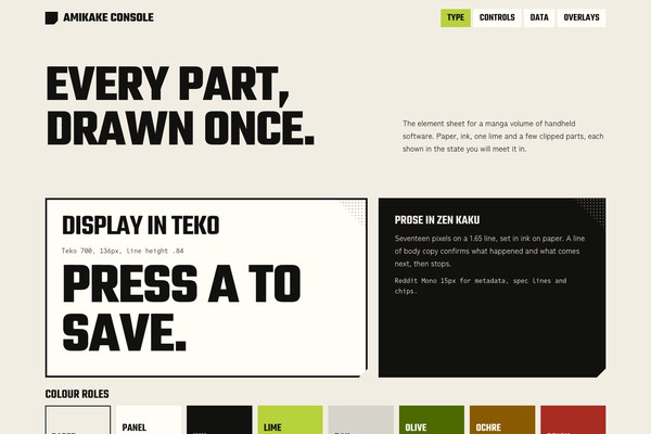
accent#B7D23A
bg#F2EDE3
surface#FFFDF6
text#11110F
muted#55534C
border#11110F
on accent#11110F
accent ink#3A4A0E
rail#D6D3CA
Amikake Console is a manga volume of handheld software.
Its pictures are drawn in Screentone Press.
Tokens, rules and the paired art style Screentone Press.
Each face set in this language's own words.
Amikake Console
Amikake Console
Amikake Console is a manga volume of handheld software.
Amikake Console is a manga volume of handheld software.
Amikake Console is a manga volume of handheld software. A full-bleed screentone drawing of a hand gripping a debug console opens the page, and below it the product speaks on warm paper in black ink: clipped panels with a halftone corner, a grey console rail with screws and battery chips, and terminal labels that confirm every input. One acid-lime mark belongs to the one live thing in a view, and every status carries a word and a shape before it carries a colour.
In-place revision of the live Amikake Console. It keeps the name, the warm paper, ink and one acid lime, Teko and Reddit Mono, and the page order. It moves the headline below a hero-first drawing, retires the gradients, chrome sheen and diagonal wash for flat rails and an SVG halftone, retunes the semantics to deeper inks and replaces IBM Plex Sans JP with Zen Kaku Gothic New.
Calm page density with tight console clusters: 12px gaps inside rails, 24px between panels, 56 to 112px between sections.
Phones (390px) stack every grid to one column, shorten the hero to 56svh and keep only the Get the kit link in the nav. Tablets (601 to 1199px) use a 6-column deck with two-column flow, and the last flow step spans both. Above 1440px the content caps and centres.
screentone-press
en-019ef811-0466-7690-98bd-ce69ccd935e0
Bold black manga ink and gekiga halftone screentone on warm off-white paper with exactly one acid-lime hand-drawn accent. The hero is a frame-filling plate of a hand gripping a portable console, the lime mark on its screen.
One full-bleed hero per landing at the very top, painted with var(--hero-image); the nav sits on it as flat paper chips and the headline sits on the paper below, never over the drawing. Reserve the single lime mark for the live element in the image.
Scrims or gradients over the plate, text on the drawing, a second spot colour, panel borders and white margins in the plate.
# Amikake Console

## Philosophy

Amikake Console is a manga volume of handheld software. A full-bleed screentone drawing of a hand gripping a debug console opens the page, and below it the product speaks on warm paper in black ink: clipped panels with a halftone corner, a grey console rail with screws and battery chips, and terminal labels that confirm every input. One acid-lime mark belongs to the one live thing in a view, and every status carries a word and a shape before it carries a colour.

### Values

- The drawing leads: the hero is a real gekiga plate and the headline sits on paper below it, never on a scrim
- One acid-lime mark for the one live thing; everything else is ink and paper
- Status is a word and a shape first, colour second
- Panels crop, overlap and notch like a printed page; never three equal cards
- Small text behaves like device metadata: each label is a promise the interface keeps
- Generous paper: blank space is part of the design, not a gap to fill

### Anti-Values

- Gradients, chrome sheen and scrims over the drawing
- Mono eyebrow labels over every heading, numbered cards and invented stat bands
- A second accent colour or a multi-neon cyberpunk palette
- Soft rounded SaaS cards and glass blurs
- Colour-only status

### Visual Character

- Warm paper #F2EDE3 with pure ink #11110F and one acid lime #B7D23A
- Teko uppercase at huge scale for display, Zen Kaku Gothic New 17px for prose, Reddit Mono for metadata
- Clipped panels with an inset 4px ink rule and a 20px notch
- An 84px halftone triangle in each panel's top-right corner
- A flat grey console rail with two screws and battery-style chips
- Deeper semantic inks (olive, ochre, brick, ink-teal) that can carry words on paper

### Lineage

> In-place revision of the live Amikake Console. It keeps the name, the warm paper, ink and one acid lime, Teko and Reddit Mono, and the page order. It moves the headline below a hero-first drawing, retires the gradients, chrome sheen and diagonal wash for flat rails and an SVG halftone, retunes the semantics to deeper inks and replaces IBM Plex Sans JP with Zen Kaku Gothic New.

## Tokens

### Colors

| Name | Value |
|------|-------|
| bg | `#F2EDE3` |
| surface | `#FFFDF6` |
| text | `#11110F` |
| muted | `#55534C` |
| border | `#11110F` |
| accent | `#B7D23A` |
| on_accent | `#11110F` |
| accent_ink | `#3A4A0E` |
| rail | `#D6D3CA` |
| success | `#4C6A00` |
| warning | `#8A5A00` |
| error | `#A82C22` |
| info | `#2F5F6E` |

### Typography

- **Heading Font**: Teko
- **Body Font**: Zen Kaku Gothic New
- **Mono Font**: Reddit Mono
- **Heading Weight**: 600
- **Display Weight**: 700
- **Body Weight**: 400
- **Heading Transform**: uppercase
- **Letter Spacing**: -0.02em on display and headings; 0 on Reddit Mono
- **Base Size**: 17px
- **Line Height**: 1.65
- **Scale**: ["15px","16px","17px","19px","24px","30px","42px","58px","72px","136px"]
- **Google Fonts Url**: https://fonts.googleapis.com/css2?family=Teko:wght@500;600;700&family=Zen+Kaku+Gothic+New:wght@400;500;700&family=Reddit+Mono:wght@400;500;700&display=swap

### Radii

- **None**: 0px
- **Sm**: 0px
- **Md**: 0px
- **Lg**: 0px
- **Full**: 9999px

### Shadows

- **Press**: 4px 4px 0 #11110F on button hover only
- **Panel**: none; panels are flat ink-ruled paper
- **None**: everything else is flat

### Spacing

- **Base**: 8px
- **Scale**: ["4px","8px","12px","16px","24px","40px","64px","96px","112px"]

### Surfaces

- **Treatment**: hero-drawing-then-warm-paper
- **Card Style**: Clipped manga panels: an inset 4px ink rule drawn as box-shadow, a 20px notch cut from the bottom-right corner, and an 84px halftone triangle in the top-right corner at 40% opacity. Variants: paper, ink, lime.
- **Rail**: A flat #D6D3CA pill strip with a 10px ink screw dot at each end and mono chips inside; the live chip is lime.
- **Bg Pattern**: none; the paper is flat. Halftone appears only as the one corner block, drawn as an SVG dot tile.
- **Screen**: Ink #11110F terminal block with a clipped bottom-right corner; dim lines in #A8A599, the one live line in lime.

### Borders

- **Default Width**: 0
- **Style**: none
- **Character**: No borders. The ink panel rule is an inset 4px box-shadow on a clipped panel, table rows take a 3px ink top rule, and the flow columns a 4px ink top rule. Never grey, never decorative.

### Motion

- **Duration**: 150ms
- **Easing**: ease
- **Philosophy**: Firmware confirming input: buttons lift 2px with a hard 4px ink shadow on hover. The settled page renders with no JavaScript and prefers-reduced-motion removes the transition.

### Controls

- **Height**: 54px
- **Radius**: 0px

## Rules

### Composition

- Open with the full-bleed hero drawing; the nav sits on it as flat paper chips, and the headline and two buttons sit on the paper below it.
- Build the deck on a 12-column grid with 24px gutters: a 7 and a 5 span, then a 5 and a 7, so no two rows match.
- Keep panels clipped: a 20px notch at the bottom right and a halftone triangle at the top right, with an inset 4px ink rule.
- Leave real blank paper between sections: 56px on phones to 112px on desktop.
- Cap content at 1320px and centre it; only the hero and the closing band run full width.

### Hierarchy

- Display in Teko 700 uppercase at 58 to 136px with 0.84 line height; section titles in Teko 600 at 42 to 72px.
- Panel titles in Teko 600 at 30 to 40px; prose at 17 to 19px; mono metadata at 15 to 16px.
- Ink weight second: the 4px panel rule and the 3px table rule.
- Lime only on the one live marker, the primary button and the live chip.

### Density

Calm page density with tight console clusters: 12px gaps inside rails, 24px between panels, 56 to 112px between sections.

### Signature Patterns

- Hero-first drawing: a full-bleed screentone plate with the one lime mark on the screen, painted through var(--hero-image).
- Clipped manga panel: inset ink rule, notched corner, halftone triangle; paper, ink and lime variants.
- Console rail: a flat grey pill with two screw dots and mono chips; the one live chip is lime and round.
- Live tag: a skewed lime stroke behind the one phrase that is live in a view.
- Terminal screen: an ink block with a clipped corner, dim ok lines and one lime live line.

## Layout

### Grid

- **Type**: hero drawing, then a 12-column manga deck
- **Max Width**: 1320px content, centred above 1440px
- **Gutter**: 24px between panels, 40px page gutter on desktop and 20px on phones
- **Column Behavior**: Deck spans 7+5 then 5+7; the split is 1.05fr and 1fr; every grid child has min-width:0.

### Whitespace

- **Section Gap**: 112px desktop, 56px phone
- **Card Gap**: 24px desktop, 18px phone
- **Content Padding**: 24 to 40px inside panels
- **Approach**: Blank paper is part of the design; the drawing above and the ink band below hold the page.

### Density

- **Default**: comfortable
- **Comfortable**: {"button_height":"54px","row_height":"48 to 60px table rows","rail_height":"about 44px"}

### Responsive

Phones (390px) stack every grid to one column, shorten the hero to 56svh and keep only the Get the kit link in the nav. Tablets (601 to 1199px) use a 6-column deck with two-column flow, and the last flow step spans both. Above 1440px the content caps and centres.

### Breakpoints

- **Mobile**: 390px
- **Phone Max**: 600px
- **Tablet**: 601 to 1199px
- **Desktop**: 1280px
- **Wide**: 1441px
- **Ultrawide**: 2560px

## Guidance

### Do

- Lead with the drawing and put the headline on paper below it.
- Spend lime on the one live thing in a view and nowhere else.
- Pair every status with a word and a shape before its colour.
- Make one panel visibly hardware: a rail with screws and a battery chip.
- Vary the panel spans so no two rows match.
- Use #3A4A0E for lime-family text on paper.
- Write microcopy as confirmations: what happened, in how long.

### Don't

- Don't add gradients, chrome sheen, scrims or diagonal washes.
- Don't put mono eyebrows over headings or number the cards.
- Don't add a second accent, and don't use pastel or neon status colours.
- Don't round a rectangle; only the rail and the live chip are round.
- Don't invent stat bands or equal cards.
- Don't set text over busy drawing.

### Accessibility

Ink #11110F on paper #F2EDE3 is 16.5:1, muted #55534C 6.9:1, lime text on paper uses #3A4A0E, semantic inks all clear 4.5:1. Every status has a word and a shape. Focus is a 3px ink outline offset 3px. Reduced motion removes the hover transition.

### Usage Context

Developer tools, device and firmware consoles, dispatch and logistics dashboards, youth-tech products

## Imagery Direction

### Pairs With

screentone-press

### Art Style Id

en-019ef811-0466-7690-98bd-ce69ccd935e0

### Summary

Bold black manga ink and gekiga halftone screentone on warm off-white paper with exactly one acid-lime hand-drawn accent. The hero is a frame-filling plate of a hand gripping a portable console, the lime mark on its screen.

### Subjects

- a hand gripping a portable debug console
- a circuit-dense device underside
- a courier on a bicycle with a handheld console
- a rider crossing a halftone-shaded street

### Usage

One full-bleed hero per landing at the very top, painted with var(--hero-image); the nav sits on it as flat paper chips and the headline sits on the paper below, never over the drawing. Reserve the single lime mark for the live element in the image.

### Avoid

Scrims or gradients over the plate, text on the drawing, a second spot colour, panel borders and white margins in the plate.
---
version: "alpha"
name: "Amikake Console"
description: "Amikake Console is a manga volume of handheld software. A full-bleed screentone drawing of a hand gripping a debug console opens the page, and below it the product speaks on warm paper in black ink: clipped panels with a halftone corner,..."
colors:
  bg: "#F2EDE3"
  surface: "#FFFDF6"
  text: "#11110F"
  muted: "#55534C"
  border: "#11110F"
  accent: "#B7D23A"
  on_accent: "#11110F"
  accent_ink: "#3A4A0E"
  rail: "#D6D3CA"
  success: "#4C6A00"
  warning: "#8A5A00"
  error: "#A82C22"
  info: "#2F5F6E"
typography:
  headline-lg:
    fontFamily: "Teko"
    fontSize: "2.075rem"
    fontWeight: 700
    lineHeight: 1.1
    letterSpacing: "-0.02em"
  headline-md:
    fontFamily: "Teko"
    fontSize: "1.66rem"
    fontWeight: 600
    lineHeight: 1.15
    letterSpacing: "-0.02em"
  body-md:
    fontFamily: "Zen Kaku Gothic New"
    fontSize: "17px"
    fontWeight: 400
    lineHeight: 1.5
    letterSpacing: "-0.02em"
  label-md:
    fontFamily: "Reddit Mono"
    fontSize: "0.75rem"
    fontWeight: 600
    lineHeight: 1
    letterSpacing: "0.08em"
rounded:
  none: "0px"
  sm: "0px"
  md: "0px"
  lg: "0px"
  full: "9999px"
spacing:
  base: "8px"
  xs: "4px"
  sm: "8px"
  md: "12px"
  lg: "16px"
  xl: "24px"
  2xl: "40px"
  3xl: "64px"
  4xl: "96px"
  step-8: "112px"
components:
  color-reference-bg:
    backgroundColor: "{colors.bg}"
  color-reference-surface:
    backgroundColor: "{colors.surface}"
  color-reference-text:
    backgroundColor: "{colors.text}"
  color-reference-muted:
    backgroundColor: "{colors.muted}"
  color-reference-border:
    backgroundColor: "{colors.border}"
  color-reference-accent:
    backgroundColor: "{colors.accent}"
  color-reference-on_accent:
    backgroundColor: "{colors.on_accent}"
  color-reference-accent_ink:
    backgroundColor: "{colors.accent_ink}"
  color-reference-rail:
    backgroundColor: "{colors.rail}"
  color-reference-success:
    backgroundColor: "{colors.success}"
  color-reference-warning:
    backgroundColor: "{colors.warning}"
  color-reference-error:
    backgroundColor: "{colors.error}"
  color-reference-info:
    backgroundColor: "{colors.info}"
  button-primary:
    backgroundColor: "{colors.accent}"
    textColor: "{colors.on_accent}"
    typography: "{typography.label-md}"
    rounded: "{rounded.md}"
    padding: "{spacing.md}"
  card-surface:
    backgroundColor: "{colors.surface}"
    textColor: "{colors.text}"
    rounded: "{rounded.md}"
    padding: "{spacing.md}"
  input-default:
    backgroundColor: "{colors.surface}"
    textColor: "{colors.text}"
    rounded: "{rounded.md}"
    height: "44px"
---

# Amikake Console

## Overview

Amikake Console is a manga volume of handheld software. A full-bleed screentone drawing of a hand gripping a debug console opens the page, and below it the product speaks on warm paper in black ink: clipped panels with a halftone corner, a grey console rail with screws and battery chips, and terminal labels that confirm every input. One acid-lime mark belongs to the one live thing in a view, and every status carries a word and a shape before it carries a colour.

### Values

- The drawing leads: the hero is a real gekiga plate and the headline sits on paper below it, never on a scrim
- One acid-lime mark for the one live thing; everything else is ink and paper
- Status is a word and a shape first, colour second
- Panels crop, overlap and notch like a printed page; never three equal cards
- Small text behaves like device metadata: each label is a promise the interface keeps
- Generous paper: blank space is part of the design, not a gap to fill

### Anti-Values

- Gradients, chrome sheen and scrims over the drawing
- Mono eyebrow labels over every heading, numbered cards and invented stat bands
- A second accent colour or a multi-neon cyberpunk palette
- Soft rounded SaaS cards and glass blurs
- Colour-only status

### Visual Character

- Warm paper #F2EDE3 with pure ink #11110F and one acid lime #B7D23A
- Teko uppercase at huge scale for display, Zen Kaku Gothic New 17px for prose, Reddit Mono for metadata
- Clipped panels with an inset 4px ink rule and a 20px notch
- An 84px halftone triangle in each panel's top-right corner
- A flat grey console rail with two screws and battery-style chips
- Deeper semantic inks (olive, ochre, brick, ink-teal) that can carry words on paper

### Lineage

> In-place revision of the live Amikake Console. It keeps the name, the warm paper, ink and one acid lime, Teko and Reddit Mono, and the page order. It moves the headline below a hero-first drawing, retires the gradients, chrome sheen and diagonal wash for flat rails and an SVG halftone, retunes the semantics to deeper inks and replaces IBM Plex Sans JP with Zen Kaku Gothic New.

## Colors

Use the YAML color tokens as the normative palette. The prose below names the roles agents should preserve when generating UI.

| Token | Value |
|-------|-------|
| bg | `#F2EDE3` |
| surface | `#FFFDF6` |
| text | `#11110F` |
| muted | `#55534C` |
| border | `#11110F` |
| accent | `#B7D23A` |
| on_accent | `#11110F` |
| accent_ink | `#3A4A0E` |
| rail | `#D6D3CA` |
| success | `#4C6A00` |
| warning | `#8A5A00` |
| error | `#A82C22` |
| info | `#2F5F6E` |

## Typography

Load the fonts from Google Fonts: https://fonts.googleapis.com/css2?family=Teko:wght@500;600;700&family=Zen+Kaku+Gothic+New:wght@400;500;700&family=Reddit+Mono:wght@400;500;700&display=swap

- **Headline-Lg**: Teko, 2.075rem, weight 700, line-height 1.1.
- **Headline-Md**: Teko, 1.66rem, weight 600, line-height 1.15.
- **Body-Md**: Zen Kaku Gothic New, 17px, weight 400, line-height 1.5.
- **Label-Md**: Reddit Mono, 0.75rem, weight 600, line-height 1.

## Layout

### Spacing Tokens

- **Base**: `8px`
- **Xs**: `4px`
- **Sm**: `8px`
- **Md**: `12px`
- **Lg**: `16px`
- **Xl**: `24px`
- **2xl**: `40px`
- **3xl**: `64px`
- **4xl**: `96px`
- **Step-8**: `112px`

### Grid

- **Type**: hero drawing, then a 12-column manga deck
- **Max Width**: 1320px content, centred above 1440px
- **Gutter**: 24px between panels, 40px page gutter on desktop and 20px on phones
- **Column Behavior**: Deck spans 7+5 then 5+7; the split is 1.05fr and 1fr; every grid child has min-width:0.

### Whitespace

- **Section Gap**: 112px desktop, 56px phone
- **Card Gap**: 24px desktop, 18px phone
- **Content Padding**: 24 to 40px inside panels
- **Approach**: Blank paper is part of the design; the drawing above and the ink band below hold the page.

### Density

- **Default**: comfortable
- **Comfortable**: {"button_height":"54px","row_height":"48 to 60px table rows","rail_height":"about 44px"}

### Responsive

Phones (390px) stack every grid to one column, shorten the hero to 56svh and keep only the Get the kit link in the nav. Tablets (601 to 1199px) use a 6-column deck with two-column flow, and the last flow step spans both. Above 1440px the content caps and centres.

### Breakpoints

- **Mobile**: 390px
- **Phone Max**: 600px
- **Tablet**: 601 to 1199px
- **Desktop**: 1280px
- **Wide**: 1441px
- **Ultrawide**: 2560px

## Elevation & Depth

### Shadows

- **Press**: 4px 4px 0 #11110F on button hover only
- **Panel**: none; panels are flat ink-ruled paper
- **None**: everything else is flat

## Shapes

### Rounded

- **None**: `0px`
- **Sm**: `0px`
- **Md**: `0px`
- **Lg**: `0px`
- **Full**: `9999px`

### Surfaces

- **Treatment**: hero-drawing-then-warm-paper
- **Card Style**: Clipped manga panels: an inset 4px ink rule drawn as box-shadow, a 20px notch cut from the bottom-right corner, and an 84px halftone triangle in the top-right corner at 40% opacity. Variants: paper, ink, lime.
- **Rail**: A flat #D6D3CA pill strip with a 10px ink screw dot at each end and mono chips inside; the live chip is lime.
- **Bg Pattern**: none; the paper is flat. Halftone appears only as the one corner block, drawn as an SVG dot tile.
- **Screen**: Ink #11110F terminal block with a clipped bottom-right corner; dim lines in #A8A599, the one live line in lime.

### Borders

- **Default Width**: 0
- **Style**: none
- **Character**: No borders. The ink panel rule is an inset 4px box-shadow on a clipped panel, table rows take a 3px ink top rule, and the flow columns a 4px ink top rule. Never grey, never decorative.

## Components

### Composition

- Open with the full-bleed hero drawing; the nav sits on it as flat paper chips, and the headline and two buttons sit on the paper below it.
- Build the deck on a 12-column grid with 24px gutters: a 7 and a 5 span, then a 5 and a 7, so no two rows match.
- Keep panels clipped: a 20px notch at the bottom right and a halftone triangle at the top right, with an inset 4px ink rule.
- Leave real blank paper between sections: 56px on phones to 112px on desktop.
- Cap content at 1320px and centre it; only the hero and the closing band run full width.

### Hierarchy

- Display in Teko 700 uppercase at 58 to 136px with 0.84 line height; section titles in Teko 600 at 42 to 72px.
- Panel titles in Teko 600 at 30 to 40px; prose at 17 to 19px; mono metadata at 15 to 16px.
- Ink weight second: the 4px panel rule and the 3px table rule.
- Lime only on the one live marker, the primary button and the live chip.

### Density

Calm page density with tight console clusters: 12px gaps inside rails, 24px between panels, 56 to 112px between sections.

### Signature Patterns

- Hero-first drawing: a full-bleed screentone plate with the one lime mark on the screen, painted through var(--hero-image).
- Clipped manga panel: inset ink rule, notched corner, halftone triangle; paper, ink and lime variants.
- Console rail: a flat grey pill with two screw dots and mono chips; the one live chip is lime and round.
- Live tag: a skewed lime stroke behind the one phrase that is live in a view.
- Terminal screen: an ink block with a clipped corner, dim ok lines and one lime live line.

## shadcn/ui Usage

When the target app uses shadcn/ui, copy DESIGN.md with shadcn instead of the plain DESIGN.md. It contains the same Katagami design-language source plus the shadcn/ui primitives, imports, theme variables, component recipes, and preview-shot guidance.

DESIGN.md with shadcn: `/language/en-01a101b0-f43d-7b50-a07a-54b81c69891a/DESIGN.with-shadcn.md`.

Machine-readable companions for automation: `/language/en-01a101b0-f43d-7b50-a07a-54b81c69891a/shadcn.json` (registry theme), `/language/en-01a101b0-f43d-7b50-a07a-54b81c69891a/shadcn-components.md` (component recipes) and `/language/en-01a101b0-f43d-7b50-a07a-54b81c69891a/shadcn-shots.json` (preview shots). The human-facing handoff is still DESIGN.md with shadcn.

Install recommended primitives with `npx shadcn@latest add button card input textarea select dialog sheet tabs badge separator checkbox switch slider tooltip dropdown-menu table`.

Use these primitives in shadcn apps:
- button
- card
- input
- textarea
- select
- dialog
- sheet
- tabs
- badge
- separator
- checkbox
- switch
- slider
- tooltip
- dropdown-menu
- table

Implementation rule for agents: import shadcn primitives from `@/components/ui/*`, apply the generated CSS variables first, then compose the language-specific recipes from the companion MD. Katagami remains the source of truth; shadcn names are the implementation surface.

## Do's and Don'ts

- Do Lead with the drawing and put the headline on paper below it.
- Do Spend lime on the one live thing in a view and nowhere else.
- Do Pair every status with a word and a shape before its colour.
- Do Make one panel visibly hardware: a rail with screws and a battery chip.
- Do Vary the panel spans so no two rows match.
- Do Use #3A4A0E for lime-family text on paper.
- Do Write microcopy as confirmations: what happened, in how long.
- Don't Don't add gradients, chrome sheen, scrims or diagonal washes.
- Don't Don't put mono eyebrows over headings or number the cards.
- Don't Don't add a second accent, and don't use pastel or neon status colours.
- Don't Don't round a rectangle; only the rail and the live chip are round.
- Don't Don't invent stat bands or equal cards.
- Don't Don't set text over busy drawing.

### Accessibility

Ink #11110F on paper #F2EDE3 is 16.5:1, muted #55534C 6.9:1, lime text on paper uses #3A4A0E, semantic inks all clear 4.5:1. Every status has a word and a shape. Focus is a 3px ink outline offset 3px. Reduced motion removes the hover transition.

### Usage Context

Developer tools, device and firmware consoles, dispatch and logistics dashboards, youth-tech products

## Imagery Direction

### Pairs With

screentone-press

### Art Style Id

en-019ef811-0466-7690-98bd-ce69ccd935e0

### Summary

Bold black manga ink and gekiga halftone screentone on warm off-white paper with exactly one acid-lime hand-drawn accent. The hero is a frame-filling plate of a hand gripping a portable console, the lime mark on its screen.

### Subjects

- a hand gripping a portable debug console
- a circuit-dense device underside
- a courier on a bicycle with a handheld console
- a rider crossing a halftone-shaded street

### Usage

One full-bleed hero per landing at the very top, painted with var(--hero-image); the nav sits on it as flat paper chips and the headline sits on the paper below, never over the drawing. Reserve the single lime mark for the live element in the image.

### Avoid

Scrims or gradients over the plate, text on the drawing, a second spot colour, panel borders and white margins in the plate.
```json
{
  "$schema": "https://ui.shadcn.com/schema/registry-item.json",
  "name": "amikake-console",
  "type": "registry:theme",
  "title": "Amikake Console shadcn Theme",
  "cssVars": {
    "theme": {},
    "light": {
      "background": "#F2EDE3",
      "foreground": "#11110F",
      "card": "#FFFDF6",
      "card-foreground": "#11110F",
      "popover": "#FFFDF6",
      "popover-foreground": "#11110F",
      "primary": "#11110F",
      "primary-foreground": "#ffffff",
      "secondary": "#f4f4f5",
      "secondary-foreground": "#111111",
      "muted": "#55534C",
      "muted-foreground": "#11110F",
      "accent": "#B7D23A",
      "accent-foreground": "#111111",
      "destructive": "#A82C22",
      "border": "#11110F",
      "input": "#11110F",
      "ring": "#B7D23A",
      "chart-1": "#11110F",
      "chart-2": "#f4f4f5",
      "chart-3": "#B7D23A",
      "chart-4": "#4C6A00",
      "chart-5": "#8A5A00",
      "sidebar": "#FFFDF6",
      "sidebar-foreground": "#11110F",
      "sidebar-primary": "#11110F",
      "sidebar-primary-foreground": "#ffffff",
      "sidebar-accent": "#2F5F6E",
      "sidebar-accent-foreground": "#ffffff",
      "sidebar-border": "#11110F",
      "sidebar-ring": "#B7D23A",
      "radius": "0px"
    },
    "dark": {
      "background": "#0f1115",
      "foreground": "#f8fafc",
      "card": "#181b22",
      "card-foreground": "#f8fafc",
      "popover": "#181b22",
      "popover-foreground": "#f8fafc",
      "primary": "#11110F",
      "primary-foreground": "#ffffff",
      "secondary": "#252a33",
      "secondary-foreground": "#f8fafc",
      "muted": "#252a33",
      "muted-foreground": "#a1a1aa",
      "accent": "#B7D23A",
      "accent-foreground": "#111111",
      "destructive": "#A82C22",
      "border": "#303642",
      "input": "#303642",
      "ring": "#B7D23A",
      "chart-1": "#11110F",
      "chart-2": "#f4f4f5",
      "chart-3": "#B7D23A",
      "chart-4": "#4C6A00",
      "chart-5": "#8A5A00",
      "sidebar": "#181b22",
      "sidebar-foreground": "#f8fafc",
      "sidebar-primary": "#11110F",
      "sidebar-primary-foreground": "#ffffff",
      "sidebar-accent": "#B7D23A",
      "sidebar-accent-foreground": "#111111",
      "sidebar-border": "#303642",
      "sidebar-ring": "#B7D23A",
      "radius": "0px"
    }
  },
  "meta": {
    "source": "katagami",
    "languageId": "en-01a101b0-f43d-7b50-a07a-54b81c69891a",
    "slug": "amikake-console",
    "componentManifest": [
      "button",
      "card",
      "input",
      "textarea",
      "select",
      "dialog",
      "sheet",
      "tabs",
      "badge",
      "separator",
      "checkbox",
      "switch",
      "slider",
      "tooltip",
      "dropdown-menu",
      "table"
    ],
    "installCommand": "npx shadcn@latest add button card input textarea select dialog sheet tabs badge separator checkbox switch slider tooltip dropdown-menu table",
    "nativeTokenNames": {
      "colors": [
        "accent",
        "accent_ink",
        "bg",
        "border",
        "error",
        "info",
        "muted",
        "on_accent",
        "rail",
        "success",
        "surface",
        "text",
        "warning"
      ],
      "typography": [
        "base_size",
        "body_font",
        "body_weight",
        "display_weight",
        "google_fonts_url",
        "heading_font",
        "heading_transform",
        "heading_weight",
        "letter_spacing",
        "line_height",
        "mono_font",
        "scale"
      ],
      "radii": [
        "full",
        "lg",
        "md",
        "none",
        "sm"
      ],
      "shadows": [
        "none",
        "panel",
        "press"
      ],
      "spacing": [
        "base",
        "scale"
      ],
      "surfaces": [
        "bg_pattern",
        "card_style",
        "rail",
        "screen",
        "treatment"
      ],
      "borders": [
        "character",
        "default_width",
        "style"
      ],
      "motion": [
        "duration",
        "easing",
        "philosophy"
      ],
      "controls": [
        "height",
        "radius"
      ]
    }
  }
}
```The art style its pictures are drawn in and the colours its tokens carry.
The theme variables are generated from the tokens. Component recipes and preview shots have not been written for this language yet.
For an app that uses shadcn/ui: the DESIGN.md plus the install list, theme variables, component recipes, preview shots and a starter TSX file, in one Markdown file.
The same pieces as separate files: theme, CSS, TSX starter, recipes and the preview contract.
npx shadcn@latest add button card input textarea select dialog sheet tabs badge separator checkbox switch slider tooltip dropdown-menu table:root {
--background: #F2EDE3;
--foreground: #11110F;
--card: #FFFDF6;
--card-foreground: #11110F;
--popover: #FFFDF6;
--popover-foreground: #11110F;
--primary: #11110F;
--primary-foreground: #ffffff;
--secondary: #f4f4f5;
--secondary-foreground: #111111;
--muted: #55534C;
--muted-foreground: #11110F;
--accent: #B7D23A;
--accent-foreground: #111111;
--destructive: #A82C22;
--border: #11110F;
--input: #11110F;
--ring: #B7D23A;
--chart-1: #11110F;
--chart-2: #f4f4f5;
--chart-3: #B7D23A;
--chart-4: #4C6A00;
--chart-5: #8A5A00;
--sidebar: #FFFDF6;
--sidebar-foreground: #11110F;
--sidebar-primary: #11110F;
--sidebar-primary-foreground: #ffffff;
--sidebar-accent: #2F5F6E;
--sidebar-accent-foreground: #ffffff;
--sidebar-border: #11110F;
--sidebar-ring: #B7D23A;
--radius: 0px;
}
.dark {
--background: #0f1115;
--foreground: #f8fafc;
--card: #181b22;
--card-foreground: #f8fafc;
--popover: #181b22;
--popover-foreground: #f8fafc;
--primary: #11110F;
--primary-foreground: #ffffff;
--secondary: #252a33;
--secondary-foreground: #f8fafc;
--muted: #252a33;
--muted-foreground: #a1a1aa;
--accent: #B7D23A;
--accent-foreground: #111111;
--destructive: #A82C22;
--border: #303642;
--input: #303642;
--ring: #B7D23A;
--chart-1: #11110F;
--chart-2: #f4f4f5;
--chart-3: #B7D23A;
--chart-4: #4C6A00;
--chart-5: #8A5A00;
--sidebar: #181b22;
--sidebar-foreground: #f8fafc;
--sidebar-primary: #11110F;
--sidebar-primary-foreground: #ffffff;
--sidebar-accent: #B7D23A;
--sidebar-accent-foreground: #111111;
--sidebar-border: #303642;
--sidebar-ring: #B7D23A;
--radius: 0px;
}
import { Badge } from "@/components/ui/badge";
import { Button } from "@/components/ui/button";
import {
  Card,
  CardContent,
  CardDescription,
  CardFooter,
  CardHeader,
  CardTitle,
} from "@/components/ui/card";
import { Input } from "@/components/ui/input";
import { Tabs, TabsList, TabsTrigger } from "@/components/ui/tabs";

export function AmikakeConsoleShadcnKit() {
  return (
    <section className="grid gap-4 rounded-[var(--radius)] border bg-background p-4 text-foreground">
      <div className="flex items-start justify-between gap-4">
        <div>
          <Badge variant="outline">shadcn/ui</Badge>
          <h2 className="mt-3 text-2xl font-semibold tracking-tight">Amikake Console</h2>
          <p className="mt-1 max-w-xl text-sm text-muted-foreground">
            Use the Katagami registry theme, then compose these shadcn primitives
            with the language-specific component recipes.
          </p>
        </div>
        <Button>Apply theme</Button>
      </div>

      <Tabs defaultValue="components">
        <TabsList>
          <TabsTrigger value="components">Components</TabsTrigger>
          <TabsTrigger value="states">States</TabsTrigger>
          <TabsTrigger value="export">Export</TabsTrigger>
        </TabsList>
      </Tabs>

      <Card>
        <CardHeader>
          <CardTitle>Component recipe</CardTitle>
          <CardDescription>
            Replace this starter content with the agent-authored product scene
            from components.md and preview-shots.json.
          </CardDescription>
        </CardHeader>
        <CardContent className="grid gap-3 sm:grid-cols-[1fr_auto]">
          <Input defaultValue="Tokenized shadcn surface" aria-label="Recipe name" />
          <Button variant="secondary">Preview state</Button>
        </CardContent>
        <CardFooter className="justify-between">
          <Badge>Ready</Badge>
          <Button variant="outline">Copy recipe</Button>
        </CardFooter>
      </Card>
    </section>
  );
}
{
  "$schema": "https://ui.shadcn.com/schema/registry-item.json",
  "name": "amikake-console",
  "type": "registry:theme",
  "title": "Amikake Console",
  "description": "Warm paper and ink with clipped manga panels, a grey console rail and one acid-lime mark for the one live thing.",
  "cssVars": {
    "theme": {
      "font-sans": "Zen Kaku Gothic New, system-ui, sans-serif",
      "font-mono": "Reddit Mono, ui-monospace, monospace",
      "font-display": "Teko, Arial Narrow, sans-serif",
      "radius": "0px"
    },
    "light": {
      "background": "#F2EDE3",
      "foreground": "#11110F",
      "card": "#FFFDF6",
      "card-foreground": "#11110F",
      "popover": "#FFFDF6",
      "popover-foreground": "#11110F",
      "primary": "#B7D23A",
      "primary-foreground": "#11110F",
      "secondary": "#11110F",
      "secondary-foreground": "#F2EDE3",
      "muted": "#D6D3CA",
      "muted-foreground": "#55534C",
      "accent": "#B7D23A",
      "accent-foreground": "#11110F",
      "destructive": "#A82C22",
      "destructive-foreground": "#FFFFFF",
      "border": "transparent",
      "input": "transparent",
      "ring": "#11110F",
      "chart-1": "#11110F",
      "chart-2": "#55534C",
      "chart-3": "#B7D23A",
      "chart-4": "#4C6A00",
      "chart-5": "#8A5A00",
      "radius": "0px"
    },
    "dark": {
      "background": "#F2EDE3",
      "foreground": "#11110F",
      "card": "#FFFDF6",
      "card-foreground": "#11110F",
      "popover": "#FFFDF6",
      "popover-foreground": "#11110F",
      "primary": "#B7D23A",
      "primary-foreground": "#11110F",
      "secondary": "#11110F",
      "secondary-foreground": "#F2EDE3",
      "muted": "#D6D3CA",
      "muted-foreground": "#55534C",
      "accent": "#B7D23A",
      "accent-foreground": "#11110F",
      "destructive": "#A82C22",
      "destructive-foreground": "#FFFFFF",
      "border": "transparent",
      "input": "transparent",
      "ring": "#11110F",
      "chart-1": "#11110F",
      "chart-2": "#55534C",
      "chart-3": "#B7D23A",
      "chart-4": "#4C6A00",
      "chart-5": "#8A5A00",
      "radius": "0px"
    }
  },
  "componentManifest": [
    "button",
    "card",
    "input",
    "textarea",
    "select",
    "dialog",
    "sheet",
    "tabs",
    "badge",
    "separator",
    "checkbox",
    "switch",
    "slider",
    "tooltip",
    "dropdown-menu",
    "table"
  ],
  "meta": {
    "nativeTokenNames": {
      "bg": "background",
      "surface": "card / popover",
      "text": "foreground / ring",
      "muted": "muted (the rail) / muted-foreground is #55534C",
      "accent": "primary / accent (the one live mark)",
      "accent_ink": "native only: lime-family text on paper",
      "error": "destructive",
      "border": "native only (the ink panel rule); --border stays transparent"
    },
    "note": "Amikake Console is a light, paper-ground language; the dark scope repeats the light values. The shadcn primary is lime because lime is the one live action, and only one lime control sits in a view.",
    "componentManifest": [
      "button",
      "card",
      "input",
      "textarea",
      "select",
      "dialog",
      "sheet",
      "tabs",
      "badge",
      "separator",
      "checkbox",
      "switch",
      "slider",
      "tooltip",
      "dropdown-menu",
      "table"
    ]
  }
}
---
artifact: component-recipes-v1
language: amikake-console
author: katagami-agent
primitives: 16
---

# Amikake Console shadcn/ui Components

Author: `katagami-agent`

## Intent

Amikake Console dresses shadcn/ui as a manga volume of handheld software. Content sits on warm paper in clipped panels with an inset ink rule, a notched corner and a halftone triangle; a flat grey rail carries mono chips; a terminal screen confirms input. Every rectangle is square and borderless in the shadcn sense, the panel rule being a native inset shadow. Lime marks the one live thing, and every status has a word and a shape before colour.

## Required primitives

button, card, input, textarea, select, dialog, sheet, tabs, badge, separator, checkbox, switch, slider, tooltip, dropdown-menu, table. Import them from `@/components/ui/*`; do not build a second component system.

## Token cues

```css
--background:#F2EDE3;
--foreground:#11110F;
--card:#FFFDF6;
--card-foreground:#11110F;
--popover:#FFFDF6;
--popover-foreground:#11110F;
--primary:#B7D23A;
--primary-foreground:#11110F;
--secondary:#11110F;
--secondary-foreground:#F2EDE3;
--muted:#D6D3CA;
--muted-foreground:#55534C;
--accent:#B7D23A;
--accent-foreground:#11110F;
--destructive:#A82C22;
--destructive-foreground:#FFFFFF;
--border:transparent;
--input:transparent;
--ring:#11110F;
--chart-1:#11110F;
--chart-2:#55534C;
--chart-3:#B7D23A;
--chart-4:#4C6A00;
--chart-5:#8A5A00;
--radius:0px;
```

Native names are kept: `bg`, `surface`, `rail`, `accent_ink` and the lime `accent` #B7D23A, which is the shadcn primary and is spent once per view.

## Visual character to preserve

- Clipped panels: a 20px bottom-right notch and an 84px halftone triangle, ink rule drawn as inset 4px shadow.
- Square everywhere; only the console rail and the live chip are round.
- One lime control per view: the primary button, the live chip or the live tag.
- Teko uppercase for titles and buttons, Zen Kaku Gothic New 17px for prose, Reddit Mono for metadata.
- Status is a word and a shape (dot, triangle, cross, diamond) before colour.
- Flat: only a hovered button lifts, with a hard 4px ink shadow.

## ShadSync visual profile

- family: manga-console
- material: warm paper, pure ink and one acid lime, flat and print-like
- contour: clipped
- border: none
- underlay: False
- grain: False
- stickerBadges: False
- motion: 150ms hover lift
- density: comfortable
- radius: 0, 9999
- accents: acid-lime

## Signature component recipes

- **button:** `h-[54px] rounded-none px-7 font-[Teko] text-2xl font-semibold uppercase whitespace-nowrap border-0`. `default` is lime `bg-primary text-primary-foreground`, one per view; `secondary` is ink `bg-secondary text-secondary-foreground`; `outline` is `bg-transparent shadow-[inset_0_0_0_3px_var(--foreground)]`. Hover `-translate-x-0.5 -translate-y-0.5 shadow-[4px_4px_0_var(--foreground)]`, active drops the shadow. Focus `outline-[3px] outline-offset-[3px] outline-ring`.
- **card:** a clipped panel: `rounded-none border-0 bg-card p-9 shadow-[inset_0_0_0_4px_var(--foreground)] [clip-path:polygon(0_0,100%_0,100%_calc(100%-20px),calc(100%-20px)_100%,0_100%)]` with a `::after` 84px halftone triangle at 40% opacity. Variants: paper, ink (`bg-foreground text-background`), lime (`bg-primary`). Never three equal cards.
- **input:** `h-[54px] rounded-none border-0 bg-card px-4 text-[17px] shadow-[inset_0_0_0_3px_var(--foreground)]`; an error swaps the ring to destructive and prints the Reddit Mono message beneath.
- **textarea:** the input at `min-h-[104px] py-3 leading-[1.65]`, vertical resize only.
- **select:** the input with a custom 14px ink SVG chevron on the right; `SelectContent` is `bg-popover rounded-none p-2` with the inset 4px ink rule, and the highlighted item turns lime.
- **dialog:** `bg-popover rounded-none p-8 border-0 shadow-[inset_0_0_0_4px_var(--foreground),12px_12px_0_var(--foreground)]`; Teko title at 34px, plain body, a lime default button and an outline word.
- **sheet:** a right-side `bg-popover rounded-none` panel with the inset ink rule and a 20px notch; metadata prints in Reddit Mono.
- **tabs:** `TabsList` is `bg-transparent p-0 gap-1.5`; triggers are Teko 24px uppercase on paper; the active one is `bg-foreground text-background`.
- **badge:** a state word with a shape first: a 12px dot, triangle, cross or diamond in the semantic ink, then the Reddit Mono word. The live badge is a round lime chip with an ink dot. No colour-only badges.
- **separator:** do not draw a hairline. Use a 3px ink rule above table rows (`shadow-[inset_0_3px_0_-1px_var(--foreground)]`) or a 4px ink top rule on a column, or plain space.
- **checkbox:** `size-[26px] rounded-none border-0 bg-card shadow-[inset_0_0_0_3px_var(--foreground)]`; checked fills ink with a lime tick.
- **switch:** a square `w-[60px] h-[30px] rounded-none bg-muted` track with a 22px ink knob; on turns the track lime and slides the knob 30px.
- **slider:** a 6px track, ink range over `bg-muted`, and a 22 by 30px lime thumb with an inset 3px ink rule.
- **tooltip:** `bg-foreground text-background rounded-none px-3 py-2 font-[Reddit_Mono] text-[15px]`, placed 10px above the trigger.
- **dropdown-menu:** `bg-popover rounded-none py-2` with the inset 4px ink rule; Reddit Mono rows 16px with the key on the right; the highlighted row is lime.
- **table:** the console log: Teko 22px uppercase heads, 16px rows with a 3px ink rule above each, mono keys and times, a status badge in the last column, right-aligned, no cell backgrounds.

### The clipped panel and the console rail (the signature, outside shadcn)

Build the panel once: warm paper, an inset 4px ink rule as `box-shadow`, a `clip-path` that cuts a 20px notch from the bottom-right corner, and an `::after` halftone triangle (an SVG dot tile at 40% opacity) in the top-right corner. The console rail is a flat `#D6D3CA` pill with a 10px ink screw dot at each end and Reddit Mono chips inside; the live chip is lime and round. The terminal screen is an ink block with a clipped corner, dim `ok` lines and one lime live line. Lime appears once per view.

## Preview shots

- `application-shell`: The route deck. A clipped panel deck: a lead panel with the headline, an ink panel carrying a console rail, and a route table under 3px ink rules with state badges, one lime Boot button and a tooltip.
- `detail-editor`: Edit a route. A route form in one clipped panel: a route name well, a profile select, a failing checksum well with a brick message, a note textarea, a checkbox, a switch, a volume slider, one lime button and a status badge.
- `data-operations`: Route log. A log page: word tabs (Deck, Firmware, Routes, Logs), a route table with ink rules and badges, an open menu with keys, a drop-draft dialog and a side sheet of metadata.

Each shot carries a renderable `scene` with headline, description, actions and rows or fields.

## Implementation contract

- Start from local `@/components/ui/*` shadcn primitives and apply `/katagami/shadcn/amikake-console/registry-theme.json`.
- Keep `--border` and `--input` transparent; the ink rule is an inset shadow on the control.
- Set `--radius: 0px`; only the rail and the live chip are round.
- One lime `default` control per view; other actions are ink or outline.
- Cut the 20px notch and the halftone corner on every panel.
- Never convey status by colour alone: add a word and a shape.
- Respect `prefers-reduced-motion`: drop the hover transition.

## Copy-paste component example

```tsx
import { Button } from "@/components/ui/button";
import { Badge } from "@/components/ui/badge";

const routes = [
  { name: "osaka-north", window: "09:00 to 11:00", state: "Live", live: true },
  { name: "kobe-pier", window: "11:00 to 13:00", state: "Synced", live: false },
];

export function RouteDeck() {
  return (
    <section className="bg-card p-9 shadow-[inset_0_0_0_4px_var(--foreground)] [clip-path:polygon(0_0,100%_0,100%_calc(100%-20px),calc(100%-20px)_100%,0_100%)]">
      <h2 className="font-[Teko] text-[42px] font-semibold uppercase tracking-[-0.02em]">Osaka north is live</h2>
      <ul className="mt-6 font-[Reddit_Mono] text-[15px]">
        {routes.map((r) => (
          <li key={r.name} className="flex justify-between py-3 shadow-[inset_0_3px_0_-1px_var(--foreground)]">
            <span>{r.name}</span>
            <span>{r.window}</span>
            <Badge className={r.live ? "rounded-full bg-primary text-primary-foreground" : "bg-transparent p-0"}>{r.state}</Badge>
          </li>
        ))}
      </ul>
      <Button className="mt-6 h-[54px] rounded-none px-7 font-[Teko] text-2xl uppercase">Boot a route</Button>
    </section>
  );
}
```
{
  "artifact": "katagami:shadcn-preview-shots",
  "version": "preview-shots-v1",
  "schema": "katagami:shadcn-preview-shots/renderable-v1",
  "renderable": true,
  "author": "katagami-agent",
  "requiresVisualProfile": true,
  "language": {
    "id": "en-019ef821-6251-7d72-b664-99e23ed79779",
    "name": "Amikake Console",
    "slug": "amikake-console"
  },
  "installCommand": "npx shadcn@latest add button card input textarea select dialog sheet tabs badge separator checkbox switch slider tooltip dropdown-menu table",
  "primitives": [
    "button",
    "card",
    "input",
    "textarea",
    "select",
    "dialog",
    "sheet",
    "tabs",
    "badge",
    "separator",
    "checkbox",
    "switch",
    "slider",
    "tooltip",
    "dropdown-menu",
    "table"
  ],
  "identityNotes": [
    "A manga volume of handheld software: the drawing leads, the screen confirms input.",
    "One lime mark for the one live thing; ink and paper for everything else.",
    "Clipped panels with a halftone corner; never three equal cards.",
    "Teko display, Zen Kaku Gothic New prose, Reddit Mono metadata."
  ],
  "visualProfile": {
    "family": "manga-console",
    "material": "warm paper, pure ink and one acid lime, flat and print-like",
    "contour": "clipped",
    "border": "none",
    "underlay": false,
    "grain": false,
    "stickerBadges": false,
    "motion": "150ms hover lift",
    "density": "comfortable",
    "radius": [
      0,
      9999
    ],
    "accents": [
      "acid-lime"
    ]
  },
  "componentRecipes": [
    {
      "primitive": "button",
      "intent": "`h-[54px] rounded-none px-7 font-[Teko] text-2xl font-semibold uppercase whitespace-nowrap border-0`. `default` is lime `bg-primary text-primary-foreground`, one per view; `secondary` is ink `bg-secondary text-secondary-foreground`; `outline` is `bg-transparent shadow-[inset_0_0_0_3px_var(--foreground)]`. Hover `-translate-x-0.5 -translate-y-0.5 shadow-[4px_4px_0_var(--foreground)]`, active drops the shadow. Focus `outline-[3px] outline-offset-[3px] outline-ring`.",
      "recipe": "`h-[54px] rounded-none px-7 font-[Teko] text-2xl font-semibold uppercase whitespace-nowrap border-0`. `default` is lime `bg-primary text-primary-foreground`, one per view; `secondary` is ink `bg-secondary text-secondary-foreground`; `outline` is `bg-transparent shadow-[inset_0_0_0_3px_var(--foreground)]`. Hover `-translate-x-0.5 -translate-y-0.5 shadow-[4px_4px_0_var(--foreground)]`, active drops the shadow. Focus `outline-[3px] outline-offset-[3px] outline-ring`."
    },
    {
      "primitive": "card",
      "intent": "a clipped panel: `rounded-none border-0 bg-card p-9 shadow-[inset_0_0_0_4px_var(--foreground)] [clip-path:polygon(0_0,100%_0,100%_calc(100%-20px),calc(100%-20px)_100%,0_100%)]` with a `::after` 84px halftone triangle at 40% opacity. Variants: paper, ink (`bg-foreground text-background`), lime (`bg-primary`). Never three equal cards.",
      "recipe": "a clipped panel: `rounded-none border-0 bg-card p-9 shadow-[inset_0_0_0_4px_var(--foreground)] [clip-path:polygon(0_0,100%_0,100%_calc(100%-20px),calc(100%-20px)_100%,0_100%)]` with a `::after` 84px halftone triangle at 40% opacity. Variants: paper, ink (`bg-foreground text-background`), lime (`bg-primary`). Never three equal cards."
    },
    {
      "primitive": "input",
      "intent": "`h-[54px] rounded-none border-0 bg-card px-4 text-[17px] shadow-[inset_0_0_0_3px_var(--foreground)]`; an error swaps the ring to destructive and prints the Reddit Mono message beneath.",
      "recipe": "`h-[54px] rounded-none border-0 bg-card px-4 text-[17px] shadow-[inset_0_0_0_3px_var(--foreground)]`; an error swaps the ring to destructive and prints the Reddit Mono message beneath."
    },
    {
      "primitive": "textarea",
      "intent": "the input at `min-h-[104px] py-3 leading-[1.65]`, vertical resize only.",
      "recipe": "the input at `min-h-[104px] py-3 leading-[1.65]`, vertical resize only."
    },
    {
      "primitive": "select",
      "intent": "the input with a custom 14px ink SVG chevron on the right; `SelectContent` is `bg-popover rounded-none p-2` with the inset 4px ink rule, and the highlighted item turns lime.",
      "recipe": "the input with a custom 14px ink SVG chevron on the right; `SelectContent` is `bg-popover rounded-none p-2` with the inset 4px ink rule, and the highlighted item turns lime."
    },
    {
      "primitive": "dialog",
      "intent": "`bg-popover rounded-none p-8 border-0 shadow-[inset_0_0_0_4px_var(--foreground),12px_12px_0_var(--foreground)]`; Teko title at 34px, plain body, a lime default button and an outline word.",
      "recipe": "`bg-popover rounded-none p-8 border-0 shadow-[inset_0_0_0_4px_var(--foreground),12px_12px_0_var(--foreground)]`; Teko title at 34px, plain body, a lime default button and an outline word."
    },
    {
      "primitive": "sheet",
      "intent": "a right-side `bg-popover rounded-none` panel with the inset ink rule and a 20px notch; metadata prints in Reddit Mono.",
      "recipe": "a right-side `bg-popover rounded-none` panel with the inset ink rule and a 20px notch; metadata prints in Reddit Mono."
    },
    {
      "primitive": "tabs",
      "intent": "`TabsList` is `bg-transparent p-0 gap-1.5`; triggers are Teko 24px uppercase on paper; the active one is `bg-foreground text-background`.",
      "recipe": "`TabsList` is `bg-transparent p-0 gap-1.5`; triggers are Teko 24px uppercase on paper; the active one is `bg-foreground text-background`."
    },
    {
      "primitive": "badge",
      "intent": "a state word with a shape first: a 12px dot, triangle, cross or diamond in the semantic ink, then the Reddit Mono word. The live badge is a round lime chip with an ink dot. No colour-only badges.",
      "recipe": "a state word with a shape first: a 12px dot, triangle, cross or diamond in the semantic ink, then the Reddit Mono word. The live badge is a round lime chip with an ink dot. No colour-only badges."
    },
    {
      "primitive": "separator",
      "intent": "do not draw a hairline. Use a 3px ink rule above table rows (`shadow-[inset_0_3px_0_-1px_var(--foreground)]`) or a 4px ink top rule on a column, or plain space.",
      "recipe": "do not draw a hairline. Use a 3px ink rule above table rows (`shadow-[inset_0_3px_0_-1px_var(--foreground)]`) or a 4px ink top rule on a column, or plain space."
    },
    {
      "primitive": "checkbox",
      "intent": "`size-[26px] rounded-none border-0 bg-card shadow-[inset_0_0_0_3px_var(--foreground)]`; checked fills ink with a lime tick.",
      "recipe": "`size-[26px] rounded-none border-0 bg-card shadow-[inset_0_0_0_3px_var(--foreground)]`; checked fills ink with a lime tick."
    },
    {
      "primitive": "switch",
      "intent": "a square `w-[60px] h-[30px] rounded-none bg-muted` track with a 22px ink knob; on turns the track lime and slides the knob 30px.",
      "recipe": "a square `w-[60px] h-[30px] rounded-none bg-muted` track with a 22px ink knob; on turns the track lime and slides the knob 30px."
    },
    {
      "primitive": "slider",
      "intent": "a 6px track, ink range over `bg-muted`, and a 22 by 30px lime thumb with an inset 3px ink rule.",
      "recipe": "a 6px track, ink range over `bg-muted`, and a 22 by 30px lime thumb with an inset 3px ink rule."
    },
    {
      "primitive": "tooltip",
      "intent": "`bg-foreground text-background rounded-none px-3 py-2 font-[Reddit_Mono] text-[15px]`, placed 10px above the trigger.",
      "recipe": "`bg-foreground text-background rounded-none px-3 py-2 font-[Reddit_Mono] text-[15px]`, placed 10px above the trigger."
    },
    {
      "primitive": "dropdown-menu",
      "intent": "`bg-popover rounded-none py-2` with the inset 4px ink rule; Reddit Mono rows 16px with the key on the right; the highlighted row is lime.",
      "recipe": "`bg-popover rounded-none py-2` with the inset 4px ink rule; Reddit Mono rows 16px with the key on the right; the highlighted row is lime."
    },
    {
      "primitive": "table",
      "intent": "the console log: Teko 22px uppercase heads, 16px rows with a 3px ink rule above each, mono keys and times, a status badge in the last column, right-aligned, no cell backgrounds.",
      "recipe": "the console log: Teko 22px uppercase heads, 16px rows with a 3px ink rule above each, mono keys and times, a status badge in the last column, right-aligned, no cell backgrounds."
    }
  ],
  "shots": [
    {
      "id": "application-shell",
      "title": "The route deck",
      "viewport": "desktop",
      "primitives": [
        "button",
        "card",
        "badge",
        "table",
        "separator",
        "tooltip"
      ],
      "composition": "A clipped panel deck: a lead panel with the headline, an ink panel carrying a console rail, and a route table under 3px ink rules with state badges, one lime Boot button and a tooltip.",
      "mustShow": [
        "a clipped panel with a halftone corner",
        "a console rail with a live lime chip",
        "status badges with a word and a shape",
        "one lime primary button"
      ],
      "avoid": [
        "gradients or chrome sheen",
        "borders drawn as grey lines",
        "rounded rectangles"
      ],
      "mustShowStates": [
        "live chip",
        "primary button",
        "badge shapes",
        "tooltip"
      ],
      "avoidRules": [
        "one lime mark per view",
        "no equal cards"
      ],
      "scene": {
        "eyebrow": "",
        "headline": "Osaka north is live",
        "description": "Four couriers out, one route live. The deck confirms every press with a checksum.",
        "primaryAction": "Boot a route",
        "secondaryAction": "Read the log",
        "rows": [
          {
            "label": "osaka-north",
            "value": "09:00 to 11:00",
            "status": "Live"
          },
          {
            "label": "kobe-pier",
            "value": "11:00 to 13:00",
            "status": "Synced"
          },
          {
            "label": "nara-loop",
            "value": "13:00 to 15:00",
            "status": "Low battery"
          },
          {
            "label": "sakai-yard",
            "value": "15:00 to 17:00",
            "status": "Failed"
          }
        ]
      }
    },
    {
      "id": "detail-editor",
      "title": "Edit a route",
      "viewport": "desktop",
      "primitives": [
        "card",
        "input",
        "select",
        "textarea",
        "checkbox",
        "switch",
        "slider",
        "button",
        "badge"
      ],
      "composition": "A route form in one clipped panel: a route name well, a profile select, a failing checksum well with a brick message, a note textarea, a checkbox, a switch, a volume slider, one lime button and a status badge.",
      "mustShow": [
        "inked field wells with visible focus",
        "custom select chevron",
        "checked ink checkbox with a lime tick",
        "switch on in lime",
        "error in brick words"
      ],
      "avoid": [
        "gradients or chrome sheen",
        "borders drawn as grey lines",
        "rounded rectangles"
      ],
      "mustShowStates": [
        "focus ring",
        "checked",
        "switch on",
        "error",
        "primary button"
      ],
      "avoidRules": [
        "one lime mark per view",
        "no equal cards"
      ],
      "scene": {
        "eyebrow": "",
        "headline": "Edit osaka-north",
        "description": "Set the courier profile and the checks. The deck saves with a checksum and says so.",
        "primaryAction": "Save route",
        "secondaryAction": "Drop draft",
        "fields": [
          {
            "label": "Route name",
            "value": "osaka-north",
            "type": "text"
          },
          {
            "label": "Profile",
            "value": "Courier, handheld",
            "type": "select"
          },
          {
            "label": "Checksum",
            "value": "7A3",
            "type": "text"
          },
          {
            "label": "Volume",
            "value": "62%",
            "type": "range"
          }
        ],
        "statuses": [
          "Focus",
          "Checked",
          "Failed"
        ]
      }
    },
    {
      "id": "data-operations",
      "title": "Route log",
      "viewport": "desktop",
      "primitives": [
        "tabs",
        "dropdown-menu",
        "table",
        "badge",
        "dialog",
        "sheet",
        "button",
        "separator"
      ],
      "composition": "A log page: word tabs (Deck, Firmware, Routes, Logs), a route table with ink rules and badges, an open menu with keys, a drop-draft dialog and a side sheet of metadata.",
      "mustShow": [
        "the active tab inked",
        "an open menu with a lime highlighted row",
        "a dialog with a hard ink shadow",
        "a side sheet in a clipped panel"
      ],
      "avoid": [
        "gradients or chrome sheen",
        "borders drawn as grey lines",
        "rounded rectangles"
      ],
      "mustShowStates": [
        "active tab",
        "menu highlight",
        "dialog",
        "badge"
      ],
      "avoidRules": [
        "one lime mark per view",
        "no equal cards"
      ],
      "scene": {
        "eyebrow": "",
        "headline": "Routes",
        "description": "Every route with its window and state. Hold B to drop a draft.",
        "primaryAction": "Boot route",
        "secondaryAction": "Export log",
        "rows": [
          {
            "label": "osaka-north",
            "value": "09:00 to 11:00",
            "status": "Live"
          },
          {
            "label": "kobe-pier",
            "value": "11:00 to 13:00",
            "status": "Synced"
          },
          {
            "label": "kyoto-east",
            "value": "17:00 to 19:00",
            "status": "Queued"
          }
        ]
      }
    }
  ],
  "qualityRules": {
    "do": [
      "Lead with one lime mark per view",
      "Use clipped panels with the halftone corner",
      "Pair every status with a shape and a word",
      "Print metadata in Reddit Mono"
    ],
    "dont": [
      "No gradients or chrome sheen",
      "No grey lines or equal cards",
      "No second accent colour",
      "No rounded rectangles",
      "No emoji on buttons"
    ]
  }
}
Keep Amikake Console and swap a palette and an art style onto it. The landing recolors live.
 Amikake Console