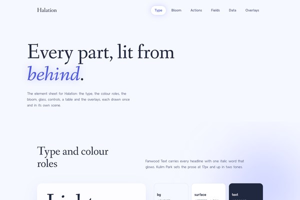
accent#4F5BDB
bg#F6F8FF
text#20283F
muted#5B6586
surface solid#FFFFFF
accent 2#8ED8D2
accent soft#B8C2FF
on accent#FFFFFF
success#1D7A70
Halation is the glow that escapes a bright edge.
Its pictures are drawn in Bloomline.
Tokens, rules and the paired art style Bloomline.
Each face set in this language's own words.
Halation
Halation
Halation is the glow that escapes a bright edge.
Halation is the glow that escapes a bright edge.
Halation is the glow that escapes a bright edge. One confident hairline draws the form and colour blooms out from it like mist over a near-white field. Emphasis is a glow, never a block. The page is one full-bleed Bloomline picture with the headline on its calm ground, one floating glass panel, one quiet form and one closing sentence, in a serif with a soft hand and a clean humanist sans.
Revised in place from the live Halation (en-019efa16-d17d-7320-a992-4f271c14b4c2): the same periwinkle and mint bloom family, glass and hairline bird, with a deeper accent for AA, new fonts and a calmer page order.
Low. 80 to 150px between sections on desktop, a few facts per panel, lines held to about 26em.
The halation bloom: a blurred radial colour wash sits behind a word or panel and fades to nothing; emphasis arrives as glow (a soft shadow on the italic word, a halo under the primary button, a lit field edge) and never as a hard fill.
One centred wrap at 1180px with 24 to 48px side padding; the hero spans the full viewport and its copy aligns to the wrap edge. The panel is two columns (1.15fr copy, 1fr drawing), the in-use section two columns (copy, form).
Structural: 80 to 150px section padding, 28px under the lede, 36 to 40px above a button.
low
Under 900px the hero swaps to a tall picture with the copy above it, panels and the form stack to one column. Renders from 390px to 2560px; content caps and centres, only the hero spans the viewport.
bloomline
en-019efa08-950f-7d72-a8cf-f5dca1311660
A hairline songbird in a single ink contour whose body dissolves into feathered periwinkle and seafoam blooms on a near-white #F6F8FF ground, composed with an empty calm area for the headline: bird on the right 45 percent on desktop, on the bottom half on phones.
One full-bleed hero painted with var(--hero-image): a wide picture with the bird right and calm ground left, and a tall picture with the bird low and calm ground above for phones. No scrim, panel or fade over it.
A scrim, multiply veil or text over the bird; coloured patches that read as solid fills; photographic rendering.
# Halation

## Philosophy

Halation is the glow that escapes a bright edge. One confident hairline draws the form and colour blooms out from it like mist over a near-white field. Emphasis is a glow, never a block. The page is one full-bleed Bloomline picture with the headline on its calm ground, one floating glass panel, one quiet form and one closing sentence, in a serif with a soft hand and a clean humanist sans.

### Values

- Atmosphere over decoration
- Glow, not fill, for emphasis
- One line draws the form
- Calm pacing with room to breathe
- Honest status: a word beside every colour

### Anti-Values

- Dense dashboards
- Hard borders and drop shadows
- Stock quotes, stat rows and three matching cards
- Scrims and veils over the picture
- Saturated solid fields

### Visual Character

- A full-bleed hairline songbird whose body dissolves into periwinkle and mint blooms, with the headline on the calm ground beside it.
- Blurred radial blooms behind the panel and the closing sentence.
- One translucent white glass panel with a 24px radius and a soft indigo shadow.
- One italic accent word that glows in #4F5BDB.
- Pill buttons in #4F5BDB with a halo shadow that widens on hover.

### Lineage

> Revised in place from the live Halation (en-019efa16-d17d-7320-a992-4f271c14b4c2): the same periwinkle and mint bloom family, glass and hairline bird, with a deeper accent for AA, new fonts and a calmer page order.

## Tokens

### Colors

| Name | Value |
|------|-------|
| bg | `#F6F8FF` |
| surface | `rgba(255,255,255,0.78)` |
| surface_solid | `#FFFFFF` |
| text | `#20283F` |
| muted | `#5B6586` |
| border | `rgba(79,91,219,0.16)` |
| accent | `#4F5BDB` |
| accent_2 | `#8ED8D2` |
| accent_soft | `#B8C2FF` |
| on_accent | `#FFFFFF` |
| success | `#1D7A70` |
| warning | `#8A5A12` |
| error | `#B8325A` |
| info | `#4F5BDB` |

### Derived

- **Bloom Periwinkle**: radial wash of rgba(111,124,255,0.42) fading to transparent at 65%, blurred 90px
- **Bloom Mint**: radial wash of rgba(142,216,210,0.45) fading to transparent at 65%, blurred 90px
- **Glass Blur**: backdrop blur 18px
- **Focus Glow**: 0 0 0 2px accent plus 0 0 28px rgba(111,124,255,0.35)
- **Em Glow**: text-shadow 0 0 36px rgba(111,124,255,0.45) on the one accent word

### Typography

- **Heading Font**: Fanwood Text
- **Body Font**: Kulim Park
- **Heading Weight**: 400
- **Body Weight**: 400
- **Button Weight**: 700
- **Heading Transform**: none
- **Letter Spacing**: -0.01em
- **Base Size**: 17px
- **Line Height**: 1.62
- **Scale**: ["17px","18px","22px","28px","34px","48px","60px","78px","104px"]
- **Google Fonts Url**: https://fonts.googleapis.com/css2?family=Fanwood+Text:ital@0;1&family=Kulim+Park:wght@300;400;600;700&display=swap

### Radii

- **None**: 0
- **Md**: 16px
- **Lg**: 24px
- **Full**: 9999px

### Shadows

- **Sm**: 0 14px 40px rgba(79,91,219,0.35)
- **Md**: 0 24px 60px rgba(79,91,219,0.12)
- **Lg**: 0 36px 90px rgba(79,91,219,0.14)

### Spacing

- **Base**: 8px
- **Scale**: [4,8,12,16,24,32,48,64,96,150]

### Surfaces

- **Treatment**: glass
- **Card Style**: one translucent white panel with backdrop blur over blurred colour blooms; never nested
- **Bg Pattern**: blurred radial colour blooms

### Borders

- **Default Width**: 0
- **Accent Width**: 0
- **Style**: none
- **Character**: No borders. Edges are a 1px luminous ring made of a box-shadow in the border colour on fields and chips only, never a rule or a frame.

### Motion

- **Duration**: 600ms
- **Easing**: cubic-bezier(0.22,1,0.36,1)
- **Philosophy**: Deliberate. The settled page is complete with no JS; hover lifts a button 2px and widens its glow. Everything is skipped under prefers-reduced-motion.

### Controls

- **Height**: 54px (52 for fields, 40 for chips)
- **Radius**: 9999px on buttons and chips, 16px on fields, 24px on panels
- **Glow**: focus lights the field's edge in accent plus a soft halo

## Rules

### Composition

- Open with one full-bleed hero picture and put the headline on its calm ground, never over the bird.
- Give a view one glass panel at most, floating on a bloom, never inside another panel.
- Let blooms sit behind content and fade to nothing at their edges; they are atmosphere, not blocks.
- Close with one sentence, centred, and one action.

### Hierarchy

- Fanwood Text 400 for every headline, 48 to 104px on the hero and 34 to 78px below, with one italic accent word glowing in the accent.
- Kulim Park 17px and up for prose in two tones: ink for the fact, muted for the reassurance.
- Hierarchy comes from scale and space before colour; status is always a word plus a glow dot.

### Density

Low. 80 to 150px between sections on desktop, a few facts per panel, lines held to about 26em.

### Signature

The halation bloom: a blurred radial colour wash sits behind a word or panel and fades to nothing; emphasis arrives as glow (a soft shadow on the italic word, a halo under the primary button, a lit field edge) and never as a hard fill.

## Layout

### Grid

One centred wrap at 1180px with 24 to 48px side padding; the hero spans the full viewport and its copy aligns to the wrap edge. The panel is two columns (1.15fr copy, 1fr drawing), the in-use section two columns (copy, form).

### Whitespace

Structural: 80 to 150px section padding, 28px under the lede, 36 to 40px above a button.

### Density

low

### Responsive

Under 900px the hero swaps to a tall picture with the copy above it, panels and the form stack to one column. Renders from 390px to 2560px; content caps and centres, only the hero spans the viewport.

### Breakpoints

- **Desktop**: default
- **Tablet**: 900px
- **Mobile**: 390px

## Guidance

### Do

- Use colour as atmosphere and emphasis as glow.
- Put the headline on the hero's calm ground and keep the bird clear of the letters.
- Keep one glass panel, one form and one closing sentence.
- Pair every status colour with a word.
- Paint the hero from a Bloomline picture through var(--hero-image).

### Don't

- Don't add eyebrow labels, stat rows, stock quotes or three matching cards.
- Don't lay a gradient scrim or a multiply veil over the hero.
- Don't fill an area with a saturated solid colour.
- Don't use a hard border, a thick outline or a hard drop shadow.
- Don't nest panels.

### Accessibility

Body 17px and up. Ink #20283F on #F6F8FF is 13.8:1; muted #5B6586 is 5.4:1; the button label white on #4F5BDB is 5.45:1; the status inks #1D7A70, #8A5A12 and #B8325A all clear 4.8:1 on the ground and each sits beside a word. Focus lights the field edge in the accent with a halo. The settled page renders with no JS and motion respects prefers-reduced-motion.

### Usage Context

Calm editorial products, studios, journals and wellness or fashion sites that want a luminous gallery-wall feel rather than a dense dashboard.

## Imagery Direction

### Pairs With

bloomline

### Art Style Id

en-019efa08-950f-7d72-a8cf-f5dca1311660

### Summary

A hairline songbird in a single ink contour whose body dissolves into feathered periwinkle and seafoam blooms on a near-white #F6F8FF ground, composed with an empty calm area for the headline: bird on the right 45 percent on desktop, on the bottom half on phones.

### Subjects

- a songbird in flight
- feathers and botanical stems
- single-line gestures

### Usage

One full-bleed hero painted with var(--hero-image): a wide picture with the bird right and calm ground left, and a tall picture with the bird low and calm ground above for phones. No scrim, panel or fade over it.

### Avoid

A scrim, multiply veil or text over the bird; coloured patches that read as solid fills; photographic rendering.
---
version: "alpha"
name: "Halation"
description: "Halation is the glow that escapes a bright edge. One confident hairline draws the form and colour blooms out from it like mist over a near-white field. Emphasis is a glow, never a block. The page is one full-bleed Bloomline picture with..."
colors:
  bg: "#F6F8FF"
  surface_solid: "#FFFFFF"
  text: "#20283F"
  muted: "#5B6586"
  accent: "#4F5BDB"
  accent_2: "#8ED8D2"
  accent_soft: "#B8C2FF"
  on_accent: "#FFFFFF"
  success: "#1D7A70"
  warning: "#8A5A12"
  error: "#B8325A"
  info: "#4F5BDB"
typography:
  headline-lg:
    fontFamily: "Fanwood Text"
    fontSize: "2.075rem"
    fontWeight: 700
    lineHeight: 1.1
    letterSpacing: "-0.01em"
  headline-md:
    fontFamily: "Fanwood Text"
    fontSize: "1.66rem"
    fontWeight: 600
    lineHeight: 1.15
    letterSpacing: "-0.01em"
  body-md:
    fontFamily: "Kulim Park"
    fontSize: "17px"
    fontWeight: 400
    lineHeight: 1.5
    letterSpacing: "-0.01em"
  label-md:
    fontFamily: "Kulim Park"
    fontSize: "0.75rem"
    fontWeight: 600
    lineHeight: 1
    letterSpacing: "0.08em"
rounded:
  none: "0px"
  md: "16px"
  lg: "24px"
  full: "9999px"
spacing:
  base: "8px"
  xs: "4px"
  sm: "8px"
  md: "12px"
  lg: "16px"
  xl: "24px"
  2xl: "32px"
  3xl: "48px"
  4xl: "64px"
  step-8: "96px"
  step-9: "150px"
components:
  color-reference-bg:
    backgroundColor: "{colors.bg}"
  color-reference-surface_solid:
    backgroundColor: "{colors.surface_solid}"
  color-reference-text:
    backgroundColor: "{colors.text}"
  color-reference-muted:
    backgroundColor: "{colors.muted}"
  color-reference-accent:
    backgroundColor: "{colors.accent}"
  color-reference-accent_2:
    backgroundColor: "{colors.accent_2}"
  color-reference-accent_soft:
    backgroundColor: "{colors.accent_soft}"
  color-reference-on_accent:
    backgroundColor: "{colors.on_accent}"
  color-reference-success:
    backgroundColor: "{colors.success}"
  color-reference-warning:
    backgroundColor: "{colors.warning}"
  color-reference-error:
    backgroundColor: "{colors.error}"
  color-reference-info:
    backgroundColor: "{colors.info}"
  button-primary:
    backgroundColor: "{colors.accent}"
    textColor: "{colors.on_accent}"
    typography: "{typography.label-md}"
    rounded: "{rounded.md}"
    padding: "{spacing.md}"
---

# Halation

## Overview

Halation is the glow that escapes a bright edge. One confident hairline draws the form and colour blooms out from it like mist over a near-white field. Emphasis is a glow, never a block. The page is one full-bleed Bloomline picture with the headline on its calm ground, one floating glass panel, one quiet form and one closing sentence, in a serif with a soft hand and a clean humanist sans.

### Values

- Atmosphere over decoration
- Glow, not fill, for emphasis
- One line draws the form
- Calm pacing with room to breathe
- Honest status: a word beside every colour

### Anti-Values

- Dense dashboards
- Hard borders and drop shadows
- Stock quotes, stat rows and three matching cards
- Scrims and veils over the picture
- Saturated solid fields

### Visual Character

- A full-bleed hairline songbird whose body dissolves into periwinkle and mint blooms, with the headline on the calm ground beside it.
- Blurred radial blooms behind the panel and the closing sentence.
- One translucent white glass panel with a 24px radius and a soft indigo shadow.
- One italic accent word that glows in #4F5BDB.
- Pill buttons in #4F5BDB with a halo shadow that widens on hover.

### Lineage

> Revised in place from the live Halation (en-019efa16-d17d-7320-a992-4f271c14b4c2): the same periwinkle and mint bloom family, glass and hairline bird, with a deeper accent for AA, new fonts and a calmer page order.

## Colors

Use the YAML color tokens as the normative palette. The prose below names the roles agents should preserve when generating UI.

| Token | Value |
|-------|-------|
| bg | `#F6F8FF` |
| surface_solid | `#FFFFFF` |
| text | `#20283F` |
| muted | `#5B6586` |
| accent | `#4F5BDB` |
| accent_2 | `#8ED8D2` |
| accent_soft | `#B8C2FF` |
| on_accent | `#FFFFFF` |
| success | `#1D7A70` |
| warning | `#8A5A12` |
| error | `#B8325A` |
| info | `#4F5BDB` |

## Typography

Load the fonts from Google Fonts: https://fonts.googleapis.com/css2?family=Fanwood+Text:ital@0;1&family=Kulim+Park:wght@300;400;600;700&display=swap

- **Headline-Lg**: Fanwood Text, 2.075rem, weight 700, line-height 1.1.
- **Headline-Md**: Fanwood Text, 1.66rem, weight 600, line-height 1.15.
- **Body-Md**: Kulim Park, 17px, weight 400, line-height 1.5.
- **Label-Md**: Kulim Park, 0.75rem, weight 600, line-height 1.

## Layout

### Spacing Tokens

- **Base**: `8px`
- **Xs**: `4px`
- **Sm**: `8px`
- **Md**: `12px`
- **Lg**: `16px`
- **Xl**: `24px`
- **2xl**: `32px`
- **3xl**: `48px`
- **4xl**: `64px`
- **Step-8**: `96px`
- **Step-9**: `150px`

### Grid

One centred wrap at 1180px with 24 to 48px side padding; the hero spans the full viewport and its copy aligns to the wrap edge. The panel is two columns (1.15fr copy, 1fr drawing), the in-use section two columns (copy, form).

### Whitespace

Structural: 80 to 150px section padding, 28px under the lede, 36 to 40px above a button.

### Density

low

### Responsive

Under 900px the hero swaps to a tall picture with the copy above it, panels and the form stack to one column. Renders from 390px to 2560px; content caps and centres, only the hero spans the viewport.

### Breakpoints

- **Desktop**: default
- **Tablet**: 900px
- **Mobile**: 390px

## Elevation & Depth

### Shadows

- **Sm**: 0 14px 40px rgba(79,91,219,0.35)
- **Md**: 0 24px 60px rgba(79,91,219,0.12)
- **Lg**: 0 36px 90px rgba(79,91,219,0.14)

## Shapes

### Rounded

- **None**: `0px`
- **Md**: `16px`
- **Lg**: `24px`
- **Full**: `9999px`

### Surfaces

- **Treatment**: glass
- **Card Style**: one translucent white panel with backdrop blur over blurred colour blooms; never nested
- **Bg Pattern**: blurred radial colour blooms

### Borders

- **Default Width**: 0
- **Accent Width**: 0
- **Style**: none
- **Character**: No borders. Edges are a 1px luminous ring made of a box-shadow in the border colour on fields and chips only, never a rule or a frame.

## Components

### Composition

- Open with one full-bleed hero picture and put the headline on its calm ground, never over the bird.
- Give a view one glass panel at most, floating on a bloom, never inside another panel.
- Let blooms sit behind content and fade to nothing at their edges; they are atmosphere, not blocks.
- Close with one sentence, centred, and one action.

### Hierarchy

- Fanwood Text 400 for every headline, 48 to 104px on the hero and 34 to 78px below, with one italic accent word glowing in the accent.
- Kulim Park 17px and up for prose in two tones: ink for the fact, muted for the reassurance.
- Hierarchy comes from scale and space before colour; status is always a word plus a glow dot.

### Density

Low. 80 to 150px between sections on desktop, a few facts per panel, lines held to about 26em.

### Signature

The halation bloom: a blurred radial colour wash sits behind a word or panel and fades to nothing; emphasis arrives as glow (a soft shadow on the italic word, a halo under the primary button, a lit field edge) and never as a hard fill.

## shadcn/ui Usage

When the target app uses shadcn/ui, copy DESIGN.md with shadcn instead of the plain DESIGN.md. It contains the same Katagami design-language source plus the shadcn/ui primitives, imports, theme variables, component recipes, and preview-shot guidance.

DESIGN.md with shadcn: `/language/en-01a11301-0432-7801-b605-9da96034f800/DESIGN.with-shadcn.md`.

Machine-readable companions for automation: `/language/en-01a11301-0432-7801-b605-9da96034f800/shadcn.json` (registry theme), `/language/en-01a11301-0432-7801-b605-9da96034f800/shadcn-components.md` (component recipes) and `/language/en-01a11301-0432-7801-b605-9da96034f800/shadcn-shots.json` (preview shots). The human-facing handoff is still DESIGN.md with shadcn.

Install recommended primitives with `npx shadcn@latest add button card input textarea select dialog sheet tabs badge separator checkbox switch slider tooltip dropdown-menu table`.

Use these primitives in shadcn apps:
- button
- card
- input
- textarea
- select
- dialog
- sheet
- tabs
- badge
- separator
- checkbox
- switch
- slider
- tooltip
- dropdown-menu
- table

Implementation rule for agents: import shadcn primitives from `@/components/ui/*`, apply the generated CSS variables first, then compose the language-specific recipes from the companion MD. Katagami remains the source of truth; shadcn names are the implementation surface.

## Do's and Don'ts

- Do Use colour as atmosphere and emphasis as glow.
- Do Put the headline on the hero's calm ground and keep the bird clear of the letters.
- Do Keep one glass panel, one form and one closing sentence.
- Do Pair every status colour with a word.
- Do Paint the hero from a Bloomline picture through var(--hero-image).
- Don't Don't add eyebrow labels, stat rows, stock quotes or three matching cards.
- Don't Don't lay a gradient scrim or a multiply veil over the hero.
- Don't Don't fill an area with a saturated solid colour.
- Don't Don't use a hard border, a thick outline or a hard drop shadow.
- Don't Don't nest panels.

### Accessibility

Body 17px and up. Ink #20283F on #F6F8FF is 13.8:1; muted #5B6586 is 5.4:1; the button label white on #4F5BDB is 5.45:1; the status inks #1D7A70, #8A5A12 and #B8325A all clear 4.8:1 on the ground and each sits beside a word. Focus lights the field edge in the accent with a halo. The settled page renders with no JS and motion respects prefers-reduced-motion.

### Usage Context

Calm editorial products, studios, journals and wellness or fashion sites that want a luminous gallery-wall feel rather than a dense dashboard.

## Imagery Direction

### Pairs With

bloomline

### Art Style Id

en-019efa08-950f-7d72-a8cf-f5dca1311660

### Summary

A hairline songbird in a single ink contour whose body dissolves into feathered periwinkle and seafoam blooms on a near-white #F6F8FF ground, composed with an empty calm area for the headline: bird on the right 45 percent on desktop, on the bottom half on phones.

### Subjects

- a songbird in flight
- feathers and botanical stems
- single-line gestures

### Usage

One full-bleed hero painted with var(--hero-image): a wide picture with the bird right and calm ground left, and a tall picture with the bird low and calm ground above for phones. No scrim, panel or fade over it.

### Avoid

A scrim, multiply veil or text over the bird; coloured patches that read as solid fills; photographic rendering.
```json
{
  "$schema": "https://ui.shadcn.com/schema/registry-item.json",
  "name": "halation",
  "type": "registry:theme",
  "title": "Halation shadcn Theme",
  "cssVars": {
    "theme": {},
    "light": {
      "background": "#F6F8FF",
      "foreground": "#20283F",
      "card": "rgba(255,255,255,0.78)",
      "card-foreground": "#20283F",
      "popover": "rgba(255,255,255,0.78)",
      "popover-foreground": "#20283F",
      "primary": "#20283F",
      "primary-foreground": "#ffffff",
      "secondary": "#f4f4f5",
      "secondary-foreground": "#111111",
      "muted": "#5B6586",
      "muted-foreground": "#20283F",
      "accent": "#4F5BDB",
      "accent-foreground": "#ffffff",
      "destructive": "#B8325A",
      "border": "rgba(79,91,219,0.16)",
      "input": "rgba(79,91,219,0.16)",
      "ring": "#4F5BDB",
      "chart-1": "#20283F",
      "chart-2": "#f4f4f5",
      "chart-3": "#4F5BDB",
      "chart-4": "#1D7A70",
      "chart-5": "#8A5A12",
      "sidebar": "rgba(255,255,255,0.78)",
      "sidebar-foreground": "#20283F",
      "sidebar-primary": "#20283F",
      "sidebar-primary-foreground": "#ffffff",
      "sidebar-accent": "#4F5BDB",
      "sidebar-accent-foreground": "#ffffff",
      "sidebar-border": "rgba(79,91,219,0.16)",
      "sidebar-ring": "#4F5BDB",
      "radius": "16px"
    },
    "dark": {
      "background": "#0f1115",
      "foreground": "#f8fafc",
      "card": "#181b22",
      "card-foreground": "#f8fafc",
      "popover": "#181b22",
      "popover-foreground": "#f8fafc",
      "primary": "#20283F",
      "primary-foreground": "#ffffff",
      "secondary": "#252a33",
      "secondary-foreground": "#f8fafc",
      "muted": "#252a33",
      "muted-foreground": "#a1a1aa",
      "accent": "#4F5BDB",
      "accent-foreground": "#ffffff",
      "destructive": "#B8325A",
      "border": "#303642",
      "input": "#303642",
      "ring": "#4F5BDB",
      "chart-1": "#20283F",
      "chart-2": "#f4f4f5",
      "chart-3": "#4F5BDB",
      "chart-4": "#1D7A70",
      "chart-5": "#8A5A12",
      "sidebar": "#181b22",
      "sidebar-foreground": "#f8fafc",
      "sidebar-primary": "#20283F",
      "sidebar-primary-foreground": "#ffffff",
      "sidebar-accent": "#4F5BDB",
      "sidebar-accent-foreground": "#ffffff",
      "sidebar-border": "#303642",
      "sidebar-ring": "#4F5BDB",
      "radius": "16px"
    }
  },
  "meta": {
    "source": "katagami",
    "languageId": "en-01a11301-0432-7801-b605-9da96034f800",
    "slug": "halation",
    "componentManifest": [
      "button",
      "card",
      "input",
      "textarea",
      "select",
      "dialog",
      "sheet",
      "tabs",
      "badge",
      "separator",
      "checkbox",
      "switch",
      "slider",
      "tooltip",
      "dropdown-menu",
      "table"
    ],
    "installCommand": "npx shadcn@latest add button card input textarea select dialog sheet tabs badge separator checkbox switch slider tooltip dropdown-menu table",
    "nativeTokenNames": {
      "colors": [
        "accent",
        "accent_2",
        "accent_soft",
        "bg",
        "border",
        "error",
        "info",
        "muted",
        "on_accent",
        "success",
        "surface",
        "surface_solid",
        "text",
        "warning"
      ],
      "derived": [
        "bloom_mint",
        "bloom_periwinkle",
        "em_glow",
        "focus_glow",
        "glass_blur"
      ],
      "typography": [
        "base_size",
        "body_font",
        "body_weight",
        "button_weight",
        "google_fonts_url",
        "heading_font",
        "heading_transform",
        "heading_weight",
        "letter_spacing",
        "line_height",
        "scale"
      ],
      "radii": [
        "full",
        "lg",
        "md",
        "none"
      ],
      "shadows": [
        "lg",
        "md",
        "sm"
      ],
      "spacing": [
        "base",
        "scale"
      ],
      "surfaces": [
        "bg_pattern",
        "card_style",
        "treatment"
      ],
      "borders": [
        "accent_width",
        "character",
        "default_width",
        "style"
      ],
      "motion": [
        "duration",
        "easing",
        "philosophy"
      ],
      "controls": [
        "glow",
        "height",
        "radius"
      ]
    }
  }
}
```The art style its pictures are drawn in and the colours its tokens carry.
The theme variables are generated from the tokens. Component recipes and preview shots have not been written for this language yet.
For an app that uses shadcn/ui: the DESIGN.md plus the install list, theme variables, component recipes, preview shots and a starter TSX file, in one Markdown file.
The same pieces as separate files: theme, CSS, TSX starter, recipes and the preview contract.
npx shadcn@latest add button card input textarea select dialog sheet tabs badge separator checkbox switch slider tooltip dropdown-menu table:root {
--background: #F6F8FF;
--foreground: #20283F;
--card: rgba(255,255,255,0.78);
--card-foreground: #20283F;
--popover: rgba(255,255,255,0.78);
--popover-foreground: #20283F;
--primary: #20283F;
--primary-foreground: #ffffff;
--secondary: #f4f4f5;
--secondary-foreground: #111111;
--muted: #5B6586;
--muted-foreground: #20283F;
--accent: #4F5BDB;
--accent-foreground: #ffffff;
--destructive: #B8325A;
--border: rgba(79,91,219,0.16);
--input: rgba(79,91,219,0.16);
--ring: #4F5BDB;
--chart-1: #20283F;
--chart-2: #f4f4f5;
--chart-3: #4F5BDB;
--chart-4: #1D7A70;
--chart-5: #8A5A12;
--sidebar: rgba(255,255,255,0.78);
--sidebar-foreground: #20283F;
--sidebar-primary: #20283F;
--sidebar-primary-foreground: #ffffff;
--sidebar-accent: #4F5BDB;
--sidebar-accent-foreground: #ffffff;
--sidebar-border: rgba(79,91,219,0.16);
--sidebar-ring: #4F5BDB;
--radius: 16px;
}
.dark {
--background: #0f1115;
--foreground: #f8fafc;
--card: #181b22;
--card-foreground: #f8fafc;
--popover: #181b22;
--popover-foreground: #f8fafc;
--primary: #20283F;
--primary-foreground: #ffffff;
--secondary: #252a33;
--secondary-foreground: #f8fafc;
--muted: #252a33;
--muted-foreground: #a1a1aa;
--accent: #4F5BDB;
--accent-foreground: #ffffff;
--destructive: #B8325A;
--border: #303642;
--input: #303642;
--ring: #4F5BDB;
--chart-1: #20283F;
--chart-2: #f4f4f5;
--chart-3: #4F5BDB;
--chart-4: #1D7A70;
--chart-5: #8A5A12;
--sidebar: #181b22;
--sidebar-foreground: #f8fafc;
--sidebar-primary: #20283F;
--sidebar-primary-foreground: #ffffff;
--sidebar-accent: #4F5BDB;
--sidebar-accent-foreground: #ffffff;
--sidebar-border: #303642;
--sidebar-ring: #4F5BDB;
--radius: 16px;
}
import { Badge } from "@/components/ui/badge";
import { Button } from "@/components/ui/button";
import {
  Card,
  CardContent,
  CardDescription,
  CardFooter,
  CardHeader,
  CardTitle,
} from "@/components/ui/card";
import { Input } from "@/components/ui/input";
import { Tabs, TabsList, TabsTrigger } from "@/components/ui/tabs";

export function HalationShadcnKit() {
  return (
    <section className="grid gap-4 rounded-[var(--radius)] border bg-background p-4 text-foreground">
      <div className="flex items-start justify-between gap-4">
        <div>
          <Badge variant="outline">shadcn/ui</Badge>
          <h2 className="mt-3 text-2xl font-semibold tracking-tight">Halation</h2>
          <p className="mt-1 max-w-xl text-sm text-muted-foreground">
            Use the Katagami registry theme, then compose these shadcn primitives
            with the language-specific component recipes.
          </p>
        </div>
        <Button>Apply theme</Button>
      </div>

      <Tabs defaultValue="components">
        <TabsList>
          <TabsTrigger value="components">Components</TabsTrigger>
          <TabsTrigger value="states">States</TabsTrigger>
          <TabsTrigger value="export">Export</TabsTrigger>
        </TabsList>
      </Tabs>

      <Card>
        <CardHeader>
          <CardTitle>Component recipe</CardTitle>
          <CardDescription>
            Replace this starter content with the agent-authored product scene
            from components.md and preview-shots.json.
          </CardDescription>
        </CardHeader>
        <CardContent className="grid gap-3 sm:grid-cols-[1fr_auto]">
          <Input defaultValue="Tokenized shadcn surface" aria-label="Recipe name" />
          <Button variant="secondary">Preview state</Button>
        </CardContent>
        <CardFooter className="justify-between">
          <Badge>Ready</Badge>
          <Button variant="outline">Copy recipe</Button>
        </CardFooter>
      </Card>
    </section>
  );
}
{
  "$schema": "https://ui.shadcn.com/schema/registry-item.json",
  "name": "halation",
  "type": "registry:theme",
  "title": "Halation",
  "description": "A milky cool ground, a hairline songbird that dissolves into periwinkle and mint blooms, one glass panel and pill buttons that glow instead of fill.",
  "cssVars": {
    "theme": {
      "font-sans": "Kulim Park, system-ui, sans-serif",
      "font-mono": "ui-monospace, SFMono-Regular, monospace",
      "font-display": "Fanwood Text, Georgia, serif",
      "radius": "16px"
    },
    "light": {
      "background": "#F6F8FF",
      "foreground": "#20283F",
      "card": "#FFFFFF",
      "card-foreground": "#20283F",
      "popover": "#FFFFFF",
      "popover-foreground": "#20283F",
      "primary": "#4F5BDB",
      "primary-foreground": "#FFFFFF",
      "secondary": "#FFFFFF",
      "secondary-foreground": "#20283F",
      "muted": "#EEF1FF",
      "muted-foreground": "#5B6586",
      "accent": "#E8ECFF",
      "accent-foreground": "#4F5BDB",
      "destructive": "#B8325A",
      "destructive-foreground": "#FFFFFF",
      "border": "transparent",
      "input": "transparent",
      "ring": "#4F5BDB",
      "chart-1": "#4F5BDB",
      "chart-2": "#8ED8D2",
      "chart-3": "#B8C2FF",
      "chart-4": "#1D7A70",
      "chart-5": "#8A5A12",
      "radius": "16px"
    },
    "dark": {
      "background": "#F6F8FF",
      "foreground": "#20283F",
      "card": "#FFFFFF",
      "card-foreground": "#20283F",
      "popover": "#FFFFFF",
      "popover-foreground": "#20283F",
      "primary": "#4F5BDB",
      "primary-foreground": "#FFFFFF",
      "secondary": "#FFFFFF",
      "secondary-foreground": "#20283F",
      "muted": "#EEF1FF",
      "muted-foreground": "#5B6586",
      "accent": "#E8ECFF",
      "accent-foreground": "#4F5BDB",
      "destructive": "#B8325A",
      "destructive-foreground": "#FFFFFF",
      "border": "transparent",
      "input": "transparent",
      "ring": "#4F5BDB",
      "chart-1": "#4F5BDB",
      "chart-2": "#8ED8D2",
      "chart-3": "#B8C2FF",
      "chart-4": "#1D7A70",
      "chart-5": "#8A5A12",
      "radius": "16px"
    }
  },
  "componentManifest": [
    "button",
    "card",
    "input",
    "textarea",
    "select",
    "dialog",
    "sheet",
    "tabs",
    "badge",
    "separator",
    "checkbox",
    "switch",
    "slider",
    "tooltip",
    "dropdown-menu",
    "table"
  ],
  "meta": {
    "nativeTokenNames": {
      "bg": "background",
      "surface": "card (glass at 78%, with a backdrop blur)",
      "text": "foreground",
      "muted": "muted-foreground",
      "accent": "primary / ring",
      "accent_2": "chart-2 (mint bloom, never text)",
      "accent_soft": "chart-3 (cornflower wash)",
      "error": "destructive",
      "success": "chart-4",
      "warning": "chart-5",
      "border": "luminous hairline rgba(79,91,219,0.16); --border stays transparent and the ring comes from ring-1 ring-primary/15"
    },
    "note": "Halation is a light, high-key language; the dark scope repeats the light values. The shadcn primary is the deepened periwinkle #4F5BDB, and emphasis is a glow, not a fill.",
    "componentManifest": [
      "button",
      "card",
      "input",
      "textarea",
      "select",
      "dialog",
      "sheet",
      "tabs",
      "badge",
      "separator",
      "checkbox",
      "switch",
      "slider",
      "tooltip",
      "dropdown-menu",
      "table"
    ]
  }
}
---
artifact: component-recipes-v1
language: halation
author: katagami-agent
primitives: 16
---

# Halation shadcn/ui Components

Author: `katagami-agent`

## Intent

Halation dresses shadcn/ui as a calm, luminous gallery wall: a milky #F6F8FF ground with blurred radial blooms, one translucent glass Card per view, white 16px fields with a lit edge, pill buttons in #4F5BDB with a halo, and status chips that always carry a word. Emphasis is a glow, never a block; nothing carries a hard border or a grey shadow.

## Required primitives

button, card, input, textarea, select, dialog, sheet, tabs, badge, separator, checkbox, switch, slider, tooltip, dropdown-menu, table. Import them from `@/components/ui/*`; do not build a second component system.

## Token cues

```css
--background:#F6F8FF;
--foreground:#20283F;
--card:#FFFFFF;
--card-foreground:#20283F;
--popover:#FFFFFF;
--popover-foreground:#20283F;
--primary:#4F5BDB;
--primary-foreground:#FFFFFF;
--secondary:#FFFFFF;
--secondary-foreground:#20283F;
--muted:#EEF1FF;
--muted-foreground:#5B6586;
--accent:#E8ECFF;
--accent-foreground:#4F5BDB;
--destructive:#B8325A;
--destructive-foreground:#FFFFFF;
--border:transparent;
--input:transparent;
--ring:#4F5BDB;
--chart-1:#4F5BDB;
--chart-2:#8ED8D2;
--chart-3:#B8C2FF;
--chart-4:#1D7A70;
--chart-5:#8A5A12;
--radius:16px;
```

Native names are kept in the theme: `surface` (glass at 78%), `accent_2` (mint bloom) and `accent_soft` (cornflower). The accent `#4F5BDB` is also the shadcn primary.

## Visual character to preserve

- One glass panel per view, floating on a bloom; never nest Cards.
- Emphasis is a glow: halo under the pill, lit field edge, soft shadow on the one italic word.
- Radii from {0, 16, 24, 9999}: 16 on fields, 24 on panels and dialogs, full on pills and chips.
- Every status colour sits beside a word.
- Fanwood Text for headlines, Kulim Park at 17px and up for prose; no mono.
- No scrim or veil over the hero picture.

## ShadSync visual profile

- family: glass-bloom
- material: translucent white glass over blurred radial colour blooms on a milky cool ground
- contour: hairline
- border: none
- underlay: True
- grain: False
- stickerBadges: False
- motion: lift and glow on hover
- density: airy
- radius: 16, 24, 9999
- accents: periwinkle, mint

## Signature component recipes

- **button:** `h-[54px] rounded-full px-8 font-bold text-[17px] whitespace-nowrap border-0`. `default` is `bg-primary text-primary-foreground shadow-[0_14px_40px_rgba(79,91,219,.35)]`, one per view; hover `-translate-y-0.5 shadow-[0_20px_52px_rgba(79,91,219,.45)]` on `duration-[600ms] ease-[cubic-bezier(.22,1,.36,1)]`. `outline` is a white pill with accent text and a 1px ring from `ring-1 ring-primary/15`. `link` is accent text with a soft glow. Focus: `ring-2 ring-ring shadow-[0_0_28px_rgba(111,124,255,.35)]`.
- **card:** one glass panel per view: `bg-white/80 backdrop-blur-[18px] rounded-3xl border-0 p-8 shadow-[0_36px_90px_rgba(79,91,219,.14)]`, floating on a blurred radial bloom. Never nest a Card in a Card; title in Fanwood Text at 34 to 60px.
- **input:** `h-[52px] rounded-2xl border-0 bg-white px-[18px] text-[17px] shadow-none ring-1 ring-primary/15`; focus `ring-2 ring-ring shadow-[0_0_28px_rgba(111,124,255,.35)]`; an error uses `ring-2 ring-destructive` and a destructive word beneath.
- **textarea:** the input at `min-h-[120px] rounded-2xl py-3.5 leading-[1.62]`, vertical resize only.
- **select:** the input with a custom 14px accent chevron; `SelectContent` is `bg-white rounded-2xl p-2 shadow-[0_24px_60px_rgba(79,91,219,.18)]`; highlighted items take `bg-accent text-accent-foreground rounded-xl`.
- **dialog:** `bg-white rounded-3xl p-8 border-0 shadow-[0_36px_90px_rgba(79,91,219,.2)]` over a 30% ink overlay; Fanwood Text title, muted body, one accent pill and a quiet link word.
- **sheet:** a right-side `bg-white rounded-l-3xl border-0` panel with the same indigo lift, sliding on `cubic-bezier(.22,1,.36,1)`; a bloom sits behind its header.
- **tabs:** `TabsList` is a pill tray (`bg-white/80 rounded-full p-1.5 ring-1 ring-primary/15`); triggers are 44px pills in `text-muted-foreground`; the active trigger takes `bg-white text-primary shadow-[0_0_28px_rgba(111,124,255,.3)]`.
- **badge:** a status chip: `h-10 rounded-full bg-white px-4 text-[17px] font-semibold ring-1 ring-primary/15` with a glowing 10px dot in the status ink and the word in `text-foreground`. Never colour alone.
- **separator:** do not draw one. Group by space (24 to 48px) and a bloom behind the group; when a line is unavoidable it is a 1px `bg-primary/15` hairline.
- **checkbox:** `size-[26px] rounded-lg border-0 bg-white ring-1 ring-primary/15`; checked fills `bg-primary` with a drawn white tick and a soft `shadow-[0_0_18px_rgba(79,91,219,.45)]`.
- **switch:** a `w-[52px] h-[30px] rounded-full bg-white ring-1 ring-primary/15` track with a 22px cornflower knob; checked turns the track accent, the knob white and adds a glow, sliding on `duration-[600ms]`.
- **slider:** a 6px `bg-[#B8C2FF]` rounded track, an accent range, a 26px white thumb with a 2px accent ring and a soft glow; the reading is a muted word beside the label.
- **tooltip:** `bg-foreground text-background rounded-xl px-3.5 py-2 text-[17px]` with a small arrow; one short sentence.
- **dropdown-menu:** `bg-white rounded-2xl p-2 shadow-[0_24px_60px_rgba(79,91,219,.18)]`; 44px rows with a muted shortcut on the right, highlighted `bg-accent text-primary rounded-xl`; the destructive row is in rose ink.
- **table:** rows sit on the page with no dividers: `bg-transparent`, cells 16px with `p-4`, the first cell semibold with rounded ends; hover washes the row `bg-[#B8C2FF]/20`; status is a Badge chip, numbers are right aligned and tabular.

### The bloom (the signature, outside shadcn)

A bloom is a blurred radial wash: an absolutely positioned, `pointer-events: none` circle of 44 to 48vw (max 760px) with `filter: blur(90px)` and `background: radial-gradient(circle, rgba(111,124,255,.42), transparent 65%)` (mint: `rgba(142,216,210,.45)`), placed behind a glass Card or a closing sentence inside an `overflow: hidden` section. Emphasis words use `text-shadow: 0 0 36px rgba(111,124,255,.45)`. The hero is a full-bleed Bloomline picture painted with `var(--hero-image)`, with a tall variant under 900px.

## Preview shots

- `application-shell`: The studio overview. A glass panel floats on a periwinkle bloom: Fanwood Text headline with one glowing italic word, a short lede, one accent pill, then a table of palettes on the page with status chips and a tooltip on one contrast figure.
- `detail-editor`: Send the study notes. One glass form over a mint bloom: name and email fields, one lit field, a palette select, a note textarea, a checkbox, a glow switch, the blur slider, one accent pill and a status chip.
- `data-operations`: The palette ledger. Pill tabs for Day, Week and Month, the palette menu open on white with a soft indigo lift, ledger rows on the page with status chips, and a dialog asking to remove a palette over a faint bloom.

Each shot carries a renderable `scene` with headline, description, actions and rows or fields.

## Implementation contract

- Start from local `@/components/ui/*` shadcn primitives and apply `/katagami/shadcn/halation/registry-theme.json`.
- Keep `--border` and `--input` transparent; draw the luminous edge with `ring-1 ring-primary/15`.
- Use radii only from 0, 16, 24 and 9999 (`--radius: 16px`).
- One `default` pill per view; a second action is a quiet pill or a link word.
- One glass Card per view, never nested; no scrim over the hero picture.
- Never rely on colour alone: a status colour needs its word.
- Respect `prefers-reduced-motion`: skip the lift and the glow transitions.

## Copy-paste component example

```tsx
import { Button } from "@/components/ui/button";
import { Card, CardContent, CardHeader, CardTitle } from "@/components/ui/card";
import { Badge } from "@/components/ui/badge";

const palettes = [
  { name: "Periwinkle", uses: "1,204", state: "Saved", ink: "text-[#1D7A70]" },
  { name: "Seafoam", uses: "862", state: "Needs a look", ink: "text-[#8A5A12]" },
  { name: "Rose ink", uses: "41", state: "Not sent", ink: "text-[#B8325A]" },
];

export function Studio() {
  return (
    <Card className="gap-6 rounded-3xl border-0 bg-white/80 p-8 shadow-[0_36px_90px_rgba(79,91,219,.14)] backdrop-blur-[18px]">
      <CardHeader className="p-0">
        <CardTitle className="font-[Fanwood_Text] text-[48px] font-normal tracking-[-0.01em]">
          Colour follows the <em className="text-primary [text-shadow:0_0_36px_rgba(111,124,255,.45)]">line</em>.
        </CardTitle>
        <p className="text-[17px] leading-[1.62] text-muted-foreground">Four palettes are in use this week.</p>
      </CardHeader>
      <CardContent className="flex flex-col p-0">
        {palettes.map((p) => (
          <div key={p.name} className="grid grid-cols-[1fr_auto_auto] items-center gap-6 rounded-2xl px-4 py-4 hover:bg-[#B8C2FF]/20">
            <span className="font-semibold">{p.name}</span>
            <span className="tabular-nums">{p.uses}</span>
            <Badge className={`h-10 rounded-full bg-white px-4 text-[17px] font-semibold ring-1 ring-primary/15 ${p.ink}`}>{p.state}</Badge>
          </div>
        ))}
        <Button className="mt-6 h-[54px] self-start rounded-full px-8 text-[17px] font-bold shadow-[0_14px_40px_rgba(79,91,219,.35)]">Take the tokens</Button>
      </CardContent>
    </Card>
  );
}
```
{
  "artifact": "katagami:shadcn-preview-shots",
  "version": "preview-shots-v1",
  "schema": "katagami:shadcn-preview-shots/renderable-v1",
  "renderable": true,
  "author": "katagami-agent",
  "requiresVisualProfile": true,
  "language": {
    "id": "en-019efa16-d17d-7320-a992-4f271c14b4c2",
    "name": "Halation",
    "slug": "halation"
  },
  "installCommand": "npx shadcn@latest add button card input textarea select dialog sheet tabs badge separator checkbox switch slider tooltip dropdown-menu table",
  "primitives": [
    "button",
    "card",
    "input",
    "textarea",
    "select",
    "dialog",
    "sheet",
    "tabs",
    "badge",
    "separator",
    "checkbox",
    "switch",
    "slider",
    "tooltip",
    "dropdown-menu",
    "table"
  ],
  "identityNotes": [
    "A hairline songbird dissolving into periwinkle and mint blooms is the picture; the headline sits on its calm ground.",
    "One glass panel, one form and one closing sentence per page.",
    "Emphasis is a glow, never a block.",
    "Fanwood Text with one glowing italic word, Kulim Park for prose."
  ],
  "visualProfile": {
    "family": "glass-bloom",
    "material": "translucent white glass over blurred radial colour blooms on a milky cool ground",
    "contour": "hairline",
    "border": "none",
    "underlay": true,
    "grain": false,
    "stickerBadges": false,
    "motion": "lift and glow on hover",
    "density": "airy",
    "radius": [
      16,
      24,
      9999
    ],
    "accents": [
      "periwinkle",
      "mint"
    ]
  },
  "componentRecipes": [
    {
      "primitive": "button",
      "intent": "`h-[54px] rounded-full px-8 font-bold text-[17px] whitespace-nowrap border-0`. `default` is `bg-primary text-primary-foreground shadow-[0_14px_40px_rgba(79,91,219,.35)]`, one per view; hover `-translate-y-0.5 shadow-[0_20px_52px_rgba(79,91,219,.45)]` on `duration-[600ms] ease-[cubic-bezier(.22,1,.36,1)]`. `outline` is a white pill with accent text and a 1px ring from `ring-1 ring-primary/15`. `link` is accent text with a soft glow. Focus: `ring-2 ring-ring shadow-[0_0_28px_rgba(111,124,255,.35)]`.",
      "recipe": "`h-[54px] rounded-full px-8 font-bold text-[17px] whitespace-nowrap border-0`. `default` is `bg-primary text-primary-foreground shadow-[0_14px_40px_rgba(79,91,219,.35)]`, one per view; hover `-translate-y-0.5 shadow-[0_20px_52px_rgba(79,91,219,.45)]` on `duration-[600ms] ease-[cubic-bezier(.22,1,.36,1)]`. `outline` is a white pill with accent text and a 1px ring from `ring-1 ring-primary/15`. `link` is accent text with a soft glow. Focus: `ring-2 ring-ring shadow-[0_0_28px_rgba(111,124,255,.35)]`."
    },
    {
      "primitive": "card",
      "intent": "one glass panel per view: `bg-white/80 backdrop-blur-[18px] rounded-3xl border-0 p-8 shadow-[0_36px_90px_rgba(79,91,219,.14)]`, floating on a blurred radial bloom. Never nest a Card in a Card; title in Fanwood Text at 34 to 60px.",
      "recipe": "one glass panel per view: `bg-white/80 backdrop-blur-[18px] rounded-3xl border-0 p-8 shadow-[0_36px_90px_rgba(79,91,219,.14)]`, floating on a blurred radial bloom. Never nest a Card in a Card; title in Fanwood Text at 34 to 60px."
    },
    {
      "primitive": "input",
      "intent": "`h-[52px] rounded-2xl border-0 bg-white px-[18px] text-[17px] shadow-none ring-1 ring-primary/15`; focus `ring-2 ring-ring shadow-[0_0_28px_rgba(111,124,255,.35)]`; an error uses `ring-2 ring-destructive` and a destructive word beneath.",
      "recipe": "`h-[52px] rounded-2xl border-0 bg-white px-[18px] text-[17px] shadow-none ring-1 ring-primary/15`; focus `ring-2 ring-ring shadow-[0_0_28px_rgba(111,124,255,.35)]`; an error uses `ring-2 ring-destructive` and a destructive word beneath."
    },
    {
      "primitive": "textarea",
      "intent": "the input at `min-h-[120px] rounded-2xl py-3.5 leading-[1.62]`, vertical resize only.",
      "recipe": "the input at `min-h-[120px] rounded-2xl py-3.5 leading-[1.62]`, vertical resize only."
    },
    {
      "primitive": "select",
      "intent": "the input with a custom 14px accent chevron; `SelectContent` is `bg-white rounded-2xl p-2 shadow-[0_24px_60px_rgba(79,91,219,.18)]`; highlighted items take `bg-accent text-accent-foreground rounded-xl`.",
      "recipe": "the input with a custom 14px accent chevron; `SelectContent` is `bg-white rounded-2xl p-2 shadow-[0_24px_60px_rgba(79,91,219,.18)]`; highlighted items take `bg-accent text-accent-foreground rounded-xl`."
    },
    {
      "primitive": "dialog",
      "intent": "`bg-white rounded-3xl p-8 border-0 shadow-[0_36px_90px_rgba(79,91,219,.2)]` over a 30% ink overlay; Fanwood Text title, muted body, one accent pill and a quiet link word.",
      "recipe": "`bg-white rounded-3xl p-8 border-0 shadow-[0_36px_90px_rgba(79,91,219,.2)]` over a 30% ink overlay; Fanwood Text title, muted body, one accent pill and a quiet link word."
    },
    {
      "primitive": "sheet",
      "intent": "a right-side `bg-white rounded-l-3xl border-0` panel with the same indigo lift, sliding on `cubic-bezier(.22,1,.36,1)`; a bloom sits behind its header.",
      "recipe": "a right-side `bg-white rounded-l-3xl border-0` panel with the same indigo lift, sliding on `cubic-bezier(.22,1,.36,1)`; a bloom sits behind its header."
    },
    {
      "primitive": "tabs",
      "intent": "`TabsList` is a pill tray (`bg-white/80 rounded-full p-1.5 ring-1 ring-primary/15`); triggers are 44px pills in `text-muted-foreground`; the active trigger takes `bg-white text-primary shadow-[0_0_28px_rgba(111,124,255,.3)]`.",
      "recipe": "`TabsList` is a pill tray (`bg-white/80 rounded-full p-1.5 ring-1 ring-primary/15`); triggers are 44px pills in `text-muted-foreground`; the active trigger takes `bg-white text-primary shadow-[0_0_28px_rgba(111,124,255,.3)]`."
    },
    {
      "primitive": "badge",
      "intent": "a status chip: `h-10 rounded-full bg-white px-4 text-[17px] font-semibold ring-1 ring-primary/15` with a glowing 10px dot in the status ink and the word in `text-foreground`. Never colour alone.",
      "recipe": "a status chip: `h-10 rounded-full bg-white px-4 text-[17px] font-semibold ring-1 ring-primary/15` with a glowing 10px dot in the status ink and the word in `text-foreground`. Never colour alone."
    },
    {
      "primitive": "separator",
      "intent": "do not draw one. Group by space (24 to 48px) and a bloom behind the group; when a line is unavoidable it is a 1px `bg-primary/15` hairline.",
      "recipe": "do not draw one. Group by space (24 to 48px) and a bloom behind the group; when a line is unavoidable it is a 1px `bg-primary/15` hairline."
    },
    {
      "primitive": "checkbox",
      "intent": "`size-[26px] rounded-lg border-0 bg-white ring-1 ring-primary/15`; checked fills `bg-primary` with a drawn white tick and a soft `shadow-[0_0_18px_rgba(79,91,219,.45)]`.",
      "recipe": "`size-[26px] rounded-lg border-0 bg-white ring-1 ring-primary/15`; checked fills `bg-primary` with a drawn white tick and a soft `shadow-[0_0_18px_rgba(79,91,219,.45)]`."
    },
    {
      "primitive": "switch",
      "intent": "a `w-[52px] h-[30px] rounded-full bg-white ring-1 ring-primary/15` track with a 22px cornflower knob; checked turns the track accent, the knob white and adds a glow, sliding on `duration-[600ms]`.",
      "recipe": "a `w-[52px] h-[30px] rounded-full bg-white ring-1 ring-primary/15` track with a 22px cornflower knob; checked turns the track accent, the knob white and adds a glow, sliding on `duration-[600ms]`."
    },
    {
      "primitive": "slider",
      "intent": "a 6px `bg-[#B8C2FF]` rounded track, an accent range, a 26px white thumb with a 2px accent ring and a soft glow; the reading is a muted word beside the label.",
      "recipe": "a 6px `bg-[#B8C2FF]` rounded track, an accent range, a 26px white thumb with a 2px accent ring and a soft glow; the reading is a muted word beside the label."
    },
    {
      "primitive": "tooltip",
      "intent": "`bg-foreground text-background rounded-xl px-3.5 py-2 text-[17px]` with a small arrow; one short sentence.",
      "recipe": "`bg-foreground text-background rounded-xl px-3.5 py-2 text-[17px]` with a small arrow; one short sentence."
    },
    {
      "primitive": "dropdown-menu",
      "intent": "`bg-white rounded-2xl p-2 shadow-[0_24px_60px_rgba(79,91,219,.18)]`; 44px rows with a muted shortcut on the right, highlighted `bg-accent text-primary rounded-xl`; the destructive row is in rose ink.",
      "recipe": "`bg-white rounded-2xl p-2 shadow-[0_24px_60px_rgba(79,91,219,.18)]`; 44px rows with a muted shortcut on the right, highlighted `bg-accent text-primary rounded-xl`; the destructive row is in rose ink."
    },
    {
      "primitive": "table",
      "intent": "rows sit on the page with no dividers: `bg-transparent`, cells 16px with `p-4`, the first cell semibold with rounded ends; hover washes the row `bg-[#B8C2FF]/20`; status is a Badge chip, numbers are right aligned and tabular.",
      "recipe": "rows sit on the page with no dividers: `bg-transparent`, cells 16px with `p-4`, the first cell semibold with rounded ends; hover washes the row `bg-[#B8C2FF]/20`; status is a Badge chip, numbers are right aligned and tabular."
    }
  ],
  "shots": [
    {
      "id": "application-shell",
      "title": "The studio overview",
      "viewport": "desktop",
      "primitives": [
        "button",
        "card",
        "badge",
        "table",
        "separator",
        "tooltip"
      ],
      "composition": "A glass panel floats on a periwinkle bloom: Fanwood Text headline with one glowing italic word, a short lede, one accent pill, then a table of palettes on the page with status chips and a tooltip on one contrast figure.",
      "mustShow": [
        "one glass card with a bloom behind it",
        "one accent pill button",
        "status chips with a glowing dot and a word",
        "table rows with no dividers"
      ],
      "avoid": [
        "borders or hard shadows",
        "three matching cards",
        "eyebrow labels",
        "a saturated solid block"
      ],
      "mustShowStates": [
        "primary pill",
        "row hover on cornflower",
        "chip with a word",
        "tooltip open"
      ],
      "avoidRules": [
        "no scrim",
        "no nested panels",
        "no emoji on buttons"
      ],
      "scene": {
        "eyebrow": "Studio notes",
        "headline": "Colour follows the line.",
        "description": "Four palettes are in use this week. The seafoam one needs a look before it goes near text.",
        "primaryAction": "Take the tokens",
        "secondaryAction": "Open the palettes",
        "rows": [
          {
            "label": "Periwinkle",
            "value": "1,204 uses · 5.1:1",
            "status": "Saved"
          },
          {
            "label": "Seafoam",
            "value": "862 uses · 1.5:1",
            "status": "Needs a look"
          },
          {
            "label": "Cornflower",
            "value": "377 uses · 1.6:1",
            "status": "Draft"
          },
          {
            "label": "Rose ink",
            "value": "41 uses · 5.4:1",
            "status": "Not sent"
          }
        ]
      }
    },
    {
      "id": "detail-editor",
      "title": "Send the study notes",
      "viewport": "desktop",
      "primitives": [
        "card",
        "input",
        "select",
        "textarea",
        "checkbox",
        "switch",
        "slider",
        "button",
        "badge"
      ],
      "composition": "One glass form over a mint bloom: name and email fields, one lit field, a palette select, a note textarea, a checkbox, a glow switch, the blur slider, one accent pill and a status chip.",
      "mustShow": [
        "focused field with a lit edge and halo",
        "custom select chevron",
        "checked accent checkbox",
        "switch on with a glow",
        "error in rose ink with a word"
      ],
      "avoid": [
        "browser default controls",
        "hard outlines",
        "a second panel nested inside"
      ],
      "mustShowStates": [
        "focus glow",
        "checked",
        "switch on",
        "error",
        "primary pill"
      ],
      "avoidRules": [
        "no borders",
        "no nested cards"
      ],
      "scene": {
        "eyebrow": "Halation",
        "headline": "Send the study notes",
        "description": "We write down the palette, the type and the one bloom, and send them to you as a DESIGN.md.",
        "primaryAction": "Send the notes",
        "secondaryAction": "Save as a draft",
        "fields": [
          {
            "label": "Name",
            "value": "Hazuki Mori",
            "type": "text"
          },
          {
            "label": "Palette",
            "value": "Periwinkle and mint",
            "type": "select"
          },
          {
            "label": "Note",
            "value": "Keep the bird clear of the headline.",
            "type": "text"
          },
          {
            "label": "Blur",
            "value": "90px",
            "type": "range"
          }
        ],
        "statuses": [
          "Focus",
          "Checked",
          "Saved"
        ]
      }
    },
    {
      "id": "data-operations",
      "title": "The palette ledger",
      "viewport": "desktop",
      "primitives": [
        "tabs",
        "dropdown-menu",
        "table",
        "badge",
        "dialog",
        "sheet",
        "button",
        "separator"
      ],
      "composition": "Pill tabs for Day, Week and Month, the palette menu open on white with a soft indigo lift, ledger rows on the page with status chips, and a dialog asking to remove a palette over a faint bloom.",
      "mustShow": [
        "active tab pill with a glow",
        "open menu",
        "Needs a look chip in amber ink",
        "Remove palette dialog"
      ],
      "avoid": [
        "row dividers",
        "solid red buttons",
        "grey shadows"
      ],
      "mustShowStates": [
        "active tab",
        "menu open",
        "row hover",
        "destructive word"
      ],
      "avoidRules": [
        "no dividers",
        "no hard borders"
      ],
      "scene": {
        "eyebrow": "This week",
        "headline": "The palette ledger",
        "description": "Four palettes were touched this week. One wants a look before it goes on text.",
        "primaryAction": "Keep it",
        "secondaryAction": "Remove",
        "rows": [
          {
            "label": "Periwinkle · accent",
            "value": "1,204",
            "status": "Saved"
          },
          {
            "label": "Seafoam · bloom",
            "value": "862",
            "status": "Needs a look"
          },
          {
            "label": "Cornflower · wash",
            "value": "377",
            "status": "Draft"
          },
          {
            "label": "Rose · error ink",
            "value": "41",
            "status": "Not sent"
          }
        ],
        "statuses": [
          "Saved",
          "Needs a look",
          "Draft",
          "Not sent"
        ]
      }
    }
  ],
  "qualityRules": {
    "do": [
      "One glass Card per view with a bloom behind it",
      "Glow for emphasis: halo, lit edge, soft text shadow",
      "One accent pill per view",
      "A word beside every status colour"
    ],
    "dont": [
      "No hard borders or grey shadows",
      "No nested Cards",
      "No scrim over the hero",
      "No emoji on buttons"
    ]
  }
}
Keep Halation and swap a palette and an art style onto it. The landing recolors live.
 Halation