accent#F2A516
bg#4A2A1A
surface#2B1A11
text#F5E9D8
muted#C09B78
border#5A3B26
on accent#1E120C
success#93A860
warning#D19A2C
Brass is a quiet interface language for a machine room lit by one lamp instead of one sun.
Its pictures are drawn in Vitrine.
Tokens, rules and the paired art style Vitrine.
Each face set in this language's own words.
Brass
Brass
Brass is a quiet interface language for a machine room lit by one lamp instead of one sun.
Brass is a quiet interface language for a machine room lit by one lamp instead of one sun.
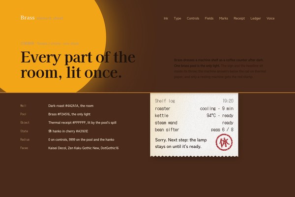
Brass is a quiet interface language for a machine room lit by one lamp instead of one sun. Where its parent Kissaten sets the room in daylight paper, Brass sets it after dark: a flat brass lamp pool is the only light, spilling warmth onto sign lettering and a headline in near-black ink, while a lacquered counter with a brass rail divides the warm room above from the machine shelf below. The machine still answers on a strip of thermal receipt and a cherry 休 hanko when it rests, but the paper now catches only the lamp's spill light, staged in the dark rather than laid flat under daylight.
Generation 1 of Brass, descended from Kissaten (en-01a0eca4-0d9f-7072-b71e-29c924c659be) by evolution from arni's approved round-2 specimen (.p-kissaten-a, pairs-round2/kissaten.html, 2026-09-27). It keeps the counter dividing room from machine, the thermal receipt, the cherry 休 hanko and the humane machine voice; it turns Kissaten's flat daylight paper into one lamp-lit room after dark, replaces the cream ground with dark-roast wall and brass, and trades Kissaten's Zen Kurenaido / Noto Serif JP / Sono faces for Kaisei Decol / Zen Kaku Gothic New / DotGothic16.
Calm product-page density: 128px between sections on desktop and 96px on phones, 18 to 28px row padding, one button per view, prose held to about 60 characters.
Phones (390px) stack to one column, keep only Hours in the nav, show the plate's plain-wall side with no lamp behind the text, and hide non-essential table columns. Tablets (768 to 1100px) keep two-column lists with their own spacing and the lamp shifted further right in the plate so it stays clear of the headline. From 1800px the content caps and centres; only the hero spans the viewport.
vitrine
en-019ef8db-fa2d-70a0-b590-9c5c21e853a0
Backlit specimen photography of the brass lamp itself: the fixture and its pool of light emerging from a charcoal-dark ground, a warm brass rim tracing one side of the shade and a cool porcelain-steam rim catching the other, the two-accent chiaroscuro Vitrine calls for. The plate is graded so its dark ground meets the page's #4A2A1A with no seam, and the lamp's own glow becomes the hero's brass pool the sign lettering sits inside.
One full-bleed hero per landing: the Vitrine lamp plate painted with var(--hero-image), positioned so the lamp and its glow sit in the right two-thirds of the frame and the sign lettering and headline sit clear of it on the plain wall at left, at every desktop and tablet width. Phones show only the plate's plain-wall side, with no part of the lamp behind the text; the receipt on the shelf carries the object there instead. Inside pages carry no illustration; the pool and the receipt are the objects.
A second light source, people, other furniture, a picture frame or display case around the lamp, saturated multi-colour lighting, white backgrounds.
# Brass

## Philosophy

Brass is a quiet interface language for a machine room lit by one lamp instead of one sun. Where its parent Kissaten sets the room in daylight paper, Brass sets it after dark: a flat brass lamp pool is the only light, spilling warmth onto sign lettering and a headline in near-black ink, while a lacquered counter with a brass rail divides the warm room above from the machine shelf below. The machine still answers on a strip of thermal receipt and a cherry 休 hanko when it rests, but the paper now catches only the lamp's spill light, staged in the dark rather than laid flat under daylight.

### Values

- One lamp is the interface: a flat brass pool is the only light in the room, and nothing outside its throw gets warmth.
- The counter is a real object, not a rule: a lacquered plank with a brass rail, thick enough to divide the room from the machine shelf.
- Red is still state, not decoration: the 休 hanko appears only on a resting machine, now caught in spill light instead of daylight.
- White is reserved for two objects: the porcelain cup and the thermal receipt, the only pale things in a dark room.
- Flat and precise around the light: separation by space and the value of the type, never by boxes or lines.

### Anti-Values

- A second light source, a coloured sky, or any glow that is not the one lamp.
- Hairline card frames, corner ticks or panes around anything.
- A ruled paper field or window mullions laid under copy.
- White as a page background; white belongs only to the cup and the receipt.
- Hostile error language, neon, glass, gradients on the page, or rounded corners on a control.

### Visual Character

- Dark-roast wall #4A2A1A ground with a flat brass lamp pool #F2A516, top-left, the only light.
- Sign lettering and headline in near-black ink #1E120C, set inside the pool's throw.
- The lacquered counter #2B1A11 with a brass rail #C8812F: one physical line dividing the room above from the machine shelf below.
- The porcelain cup and the thermal receipt #FFFFFF: the only pale objects, both catching the pool's spill light.
- The 休 hanko in cherry #A3161E, carved thick with ink voids, rotated -11deg, pressed onto the receipt as the state of a resting machine.
- Type staged inside the light: Kaisei Decol 700 for the one big sign line, Zen Kaku Gothic New for prose, DotGothic16 for what the machine prints.
- Square geometry on every control; the lamp pool and the hanko are the only two circles, both radius 9999 as organic blobs, never a gradient.

### Lineage

> Generation 1 of Brass, descended from Kissaten (en-01a0eca4-0d9f-7072-b71e-29c924c659be) by evolution from arni's approved round-2 specimen (.p-kissaten-a, pairs-round2/kissaten.html, 2026-09-27). It keeps the counter dividing room from machine, the thermal receipt, the cherry 休 hanko and the humane machine voice; it turns Kissaten's flat daylight paper into one lamp-lit room after dark, replaces the cream ground with dark-roast wall and brass, and trades Kissaten's Zen Kurenaido / Noto Serif JP / Sono faces for Kaisei Decol / Zen Kaku Gothic New / DotGothic16.

## Tokens

### Colors

| Name | Value |
|------|-------|
| bg | `#4A2A1A` |
| surface | `#2B1A11` |
| text | `#F5E9D8` |
| muted | `#C09B78` |
| border | `#5A3B26` |
| accent | `#F2A516` |
| on_accent | `#1E120C` |
| success | `#93A860` |
| warning | `#D19A2C` |
| error | `#EE7A69` |
| info | `#AFA090` |
| rail | `#C8812F` |
| porcelain | `#FFFFFF` |
| ink | `#1E120C` |
| shade | `#180D07` |
| hanko | `#A3161E` |

### Derived

- **Pool Bloom**: box-shadow: 0 0 6cqi 2cqi color-mix(in srgb, var(--accent) 45%, transparent), 0 0 16cqi 6cqi color-mix(in srgb, var(--accent) 18%, transparent), only on the lamp pool; on hover/focus of the one button the blur radii grow to 9cqi/22cqi over 640ms
- **Spill Light**: linear-gradient(104deg, color-mix(in srgb, var(--porcelain) 55%, transparent) 0, transparent 45%), the pool's falloff painted across the receipt and the cup, top-left origin
- **Rail Shadow**: color-mix(in srgb, var(--shade) 55%, transparent) 0 2px 0, a single hard line under the brass rail where the counter meets the shelf
- **Receipt Shadow**: two layers tinted from --shade: a tight .34cqi .53cqi .47cqi at 30% and a soft 1.25cqi 2.34cqi 2.8cqi at 16%, only on the receipt

### Typography

- **Heading Font**: Kaisei Decol
- **Body Font**: Zen Kaku Gothic New
- **Mono Font**: DotGothic16
- **Heading Weight**: 700
- **Body Weight**: 500
- **Button Weight**: 700
- **Mono Weight**: 400, the receipt rail and the verdict row
- **Heading Transform**: none
- **Letter Spacing**: -0.02em on display and body; 0 on DotGothic16 and on the wordmark
- **Base Size**: 17px
- **Line Height**: 1.6
- **Scale**: ["13px","14.5px","17px","20px","26px","36px","48px","72px","96px"]
- **Receipt Print**: DotGothic16 at 5cqi of the receipt width (15 to 22px), Zen Kaku Gothic New at 5.2cqi for the apology line
- **Google Fonts Url**: https://fonts.googleapis.com/css2?family=Kaisei+Decol:wght@700&family=Zen+Kaku+Gothic+New:wght@500;700&family=DotGothic16&display=swap

### Radii

- **None**: 0px
- **Md**: 0px
- **Lg**: 0px
- **Full**: 9999px

### Shadows

- **Pool**: a soft brass bloom halo (see derived.pool_bloom), only on the lamp pool
- **Receipt**: two layers tinted from --shade: a tight .34cqi .53cqi .47cqi at 30% and a soft 1.25cqi 2.34cqi 2.8cqi at 16%, only on the receipt
- **Lift**: 0 1px 2px shade 30%, 0 14px 32px -12px shade 45%, only on an open menu or dialog
- **None**: everything else is flat

### Spacing

- **Base**: 8px
- **Scale**: ["4px","8px","12px","16px","24px","32px","48px","64px","96px","128px"]

### Surfaces

- **Treatment**: one-lit-object-in-a-dark-room
- **Material**: The brass lamp pool is the only light: a flat amber blob #F2A516 with a soft bloom halo, top-left in the room, spilling warmth onto the sign lettering and the headline in near-black ink #1E120C. Below it, a lacquered counter #2B1A11 with a brass rail #C8812F divides the room from the machine shelf; the porcelain cup and the thermal receipt are the only white objects, and both catch the pool's spill light. Everything the pool does not reach stays flat dark-roast #4A2A1A.
- **Card Style**: No cards. Lists, menus, hours and forms sit straight on the wall or the shelf, parted by space and the value of the type.
- **Wells**: Lacquer #2B1A11 wells for inputs, the chosen tab and the checked segment; at most one filled surface per view.
- **Bg Pattern**: none; the wall is flat dark-roast. The brass rail is the only line.

### Borders

- **Default Width**: 0
- **Style**: none
- **Character**: No borders, hairlines or frames. The one line in the language is the brass rail atop the counter (max(1px,.23cqi) of #C8812F), once per view, between the room and the machine shelf. Focus is a 2px brass outline at 3px offset; a focused field draws a 2px brass line under its well.

### Motion

- **Duration**: 180ms
- **Easing**: cubic-bezier(0.2, 0, 0.1, 1)
- **Bloom**: 640ms cubic-bezier(.2,0,.1,1): the pool's bloom halo grows from 6cqi/16cqi blur to 9cqi/22cqi and eases back, a lamp turned up rather than a flash
- **Print**: 1.9s: translateY(-101%) to 0 in steps(22), then a .6cqi dip on cubic-bezier(.3,.7,.4,1) and back
- **Press**: .5s cubic-bezier(.3,1.4,.5,1) at 1.45s: the hanko lands from scale 1.5 to .93 to 1 at -11deg
- **Reveal**: 900ms cubic-bezier(.2,0,.1,1), 16px rise, 80ms stagger, IntersectionObserver
- **Philosophy**: Motion is a physical verb: the lamp turns up, the receipt prints again, the stamp presses. Settled first, gated by .anim on html, and skipped under prefers-reduced-motion.

### Controls

- **Height**: 48px (40 small, 56 large)
- **Radius**: 0px
- **Well Height**: 52px

## Rules

### Composition

- Build every view around the brass pool: the sign and the headline sit inside its throw, and the counter below divides the room from the machine.
- Give a view at most one object moment: the pool over the sign, the hanko pressed beside a resting machine, or the receipt caught in spill light on the shelf. Show the whole receipt once per page.
- Keep the pool and the receipt whole, with dark ground on every side; the headline, the copy and one action sit inside the pool's light, never behind a panel.
- Lists, menus, hours and forms sit straight on the wall or the shelf, parted by space; at most one filled surface (lacquer wells) per view.

### Hierarchy

- One big light line per view in Kaisei Decol 700 (48px on phones, 72px on desktop, 96px from 1800px); section titles at 36px, 26px on phones.
- Prose in Zen Kaku Gothic New 500 at 17px, in two tones: the fact in porcelain text, the reassurance in muted.
- DotGothic16 prints what the machine says: readings, times, labels and the receipt.
- State is a word at weight 700; a finished state steps back to muted 500; a resting machine gets the 休 hanko.

### Density

Calm product-page density: 128px between sections on desktop and 96px on phones, 18 to 28px row padding, one button per view, prose held to about 60 characters.

### Signature Patterns

- The brass pool: a flat amber blob, top-left, the only light in the room; on the landing it is the hero's lamp glow behind the sign.
- The brass rail: one line atop the lacquered counter, between the room above and the machine shelf below.
- The thermal receipt: fed out onto the shelf below the rail, printed in DotGothic16, lit only by the pool's spill light, with a torn foot and a two-layer shade shadow.
- The 休 hanko: a cherry seal, carved thick with ink voids, pressed once as the state of a resting machine.
- Turn the lamp up: hover or focus the slot (or the one button) and the pool blooms wider for a moment while the receipt drops back under the rail, prints again, dips, settles, and the hanko presses with a small overshoot.
- Humane notes: a DotGothic16 time, one sentence in ink saying what happened, one in muted saying what to do next.

## Layout

### Grid

- **Type**: object-first product page on a lit counter
- **Max Width**: 1180px content on the landing and 1240px on the embodiment, 1320px from 1800px wide
- **Gutter**: 40px desktop, 32px tablet, 20px phone
- **Column Behavior**: Two-column heads use minmax(0,5fr) minmax(0,6fr); lists use minmax(0,1fr) columns; every grid child has min-width:0.

### Whitespace

- **Section Gap**: 128px desktop, 96px phone
- **Card Gap**: no cards; 18 to 28px row padding, 40 to 64px between groups
- **Content Padding**: content sits on the wall aligned to the grid edge; overlays pad 32px
- **Approach**: The dark wall is the room. Space and the value of the type do the separating; the brass rail is the only line.

### Density

- **Default**: comfortable
- **Comfortable**: {"button_height":"48px","input_height":"52px","row_height":"56 to 72px list rows"}

### Responsive

Phones (390px) stack to one column, keep only Hours in the nav, show the plate's plain-wall side with no lamp behind the text, and hide non-essential table columns. Tablets (768 to 1100px) keep two-column lists with their own spacing and the lamp shifted further right in the plate so it stays clear of the headline. From 1800px the content caps and centres; only the hero spans the viewport.

### Breakpoints

- **Mobile**: 390px
- **Phone Max**: 640px
- **Tablet**: 820 to 1100px
- **Desktop**: 1280px
- **Wide**: 1800px
- **Ultrawide**: 2560px

## Guidance

### Do

- Start from dark-roast wall and one brass pool; let the pool be the only light in a view.
- Stage the receipt on the machine shelf below the brass rail, lit only by the pool's spill.
- Spend cherry only on the 休 hanko of a resting machine.
- Write every machine note as what happened, what is being done, and one next step.
- Separate rows by space and type value; keep at most one filled surface per view.
- Keep one button per view; make a second action a word that inks up.
- Style every control explicitly, square, with a 2px brass focus outline.

### Don't

- Don't add a second light source, a gradient sky, or any glow beyond the one pool.
- Don't frame anything with hairlines, corner ticks or panes.
- Don't lay a rule field, mullions or texture under copy.
- Don't use white as a page background; white belongs only to the cup and the receipt.
- Don't cover the lamp plate with a panel or scrim, and don't show the receipt twice on a page.
- Don't round corners on a control, add glow or glass beyond the pool, or put emoji on buttons.

### Accessibility

AA and better against the dark wall: porcelain text #F5E9D8 is 10.7:1 and muted #C09B78 is 5.0:1 on #4A2A1A; near-black ink #1E120C is 8.9:1 on the brass pool #F2A516 and 18.3:1 on porcelain #FFFFFF; the semantic inks (success #93A860, warning #D19A2C, error #EE7A69, info #AFA090) clear 4.6:1 or better on the wall and 5.3:1 or better on the lacquer shelf; the hanko is 7.8:1 on porcelain and always carries a word beside it. Focus is a 2px brass outline at 3px offset, or a 2px brass line under a well. The receipt's print verb and the pool's bloom run only inside prefers-reduced-motion: no-preference; the settled receipt renders with no JavaScript, and the slot is a focusable button with a label.

### Usage Context

Calm developer tools, companion agents, maintenance consoles and service counters after hours, and any product where a machine should feel patient, domestic and lit by one warm light instead of a bank of screens.

## Imagery Direction

### Pairs With

vitrine

### Art Style Id

en-019ef8db-fa2d-70a0-b590-9c5c21e853a0

### Summary

Backlit specimen photography of the brass lamp itself: the fixture and its pool of light emerging from a charcoal-dark ground, a warm brass rim tracing one side of the shade and a cool porcelain-steam rim catching the other, the two-accent chiaroscuro Vitrine calls for. The plate is graded so its dark ground meets the page's #4A2A1A with no seam, and the lamp's own glow becomes the hero's brass pool the sign lettering sits inside.

### Subjects

- the brass lamp fixture and its shade, backlit
- the pool of amber light it throws
- the lacquered counter's brass rail catching a cool glint
- a porcelain cup of crema at the light's edge

### Usage

One full-bleed hero per landing: the Vitrine lamp plate painted with var(--hero-image), positioned so the lamp and its glow sit in the right two-thirds of the frame and the sign lettering and headline sit clear of it on the plain wall at left, at every desktop and tablet width. Phones show only the plate's plain-wall side, with no part of the lamp behind the text; the receipt on the shelf carries the object there instead. Inside pages carry no illustration; the pool and the receipt are the objects.

### Avoid

A second light source, people, other furniture, a picture frame or display case around the lamp, saturated multi-colour lighting, white backgrounds.
---
version: "alpha"
name: "Brass"
description: "Brass is a quiet interface language for a machine room lit by one lamp instead of one sun. Where its parent Kissaten sets the room in daylight paper, Brass sets it after dark: a flat brass lamp pool is the only light, spilling warmth ont..."
colors:
  bg: "#4A2A1A"
  surface: "#2B1A11"
  text: "#F5E9D8"
  muted: "#C09B78"
  border: "#5A3B26"
  accent: "#F2A516"
  on_accent: "#1E120C"
  success: "#93A860"
  warning: "#D19A2C"
  error: "#EE7A69"
  info: "#AFA090"
  rail: "#C8812F"
  porcelain: "#FFFFFF"
  ink: "#1E120C"
  shade: "#180D07"
  hanko: "#A3161E"
typography:
  headline-lg:
    fontFamily: "Kaisei Decol"
    fontSize: "2.075rem"
    fontWeight: 700
    lineHeight: 1.1
    letterSpacing: "-0.02em"
  headline-md:
    fontFamily: "Kaisei Decol"
    fontSize: "1.66rem"
    fontWeight: 600
    lineHeight: 1.15
    letterSpacing: "-0.02em"
  body-md:
    fontFamily: "Zen Kaku Gothic New"
    fontSize: "17px"
    fontWeight: 400
    lineHeight: 1.5
    letterSpacing: "-0.02em"
  label-md:
    fontFamily: "DotGothic16"
    fontSize: "0.75rem"
    fontWeight: 600
    lineHeight: 1
    letterSpacing: "0.08em"
rounded:
  none: "0px"
  md: "0px"
  lg: "0px"
  full: "9999px"
spacing:
  base: "8px"
  xs: "4px"
  sm: "8px"
  md: "12px"
  lg: "16px"
  xl: "24px"
  2xl: "32px"
  3xl: "48px"
  4xl: "64px"
  step-8: "96px"
  step-9: "128px"
components:
  color-reference-bg:
    backgroundColor: "{colors.bg}"
  color-reference-surface:
    backgroundColor: "{colors.surface}"
  color-reference-text:
    backgroundColor: "{colors.text}"
  color-reference-muted:
    backgroundColor: "{colors.muted}"
  color-reference-border:
    backgroundColor: "{colors.border}"
  color-reference-accent:
    backgroundColor: "{colors.accent}"
  color-reference-on_accent:
    backgroundColor: "{colors.on_accent}"
  color-reference-success:
    backgroundColor: "{colors.success}"
  color-reference-warning:
    backgroundColor: "{colors.warning}"
  color-reference-error:
    backgroundColor: "{colors.error}"
  color-reference-info:
    backgroundColor: "{colors.info}"
  color-reference-rail:
    backgroundColor: "{colors.rail}"
  color-reference-porcelain:
    backgroundColor: "{colors.porcelain}"
  color-reference-ink:
    backgroundColor: "{colors.ink}"
  color-reference-shade:
    backgroundColor: "{colors.shade}"
  color-reference-hanko:
    backgroundColor: "{colors.hanko}"
  button-primary:
    backgroundColor: "{colors.accent}"
    textColor: "{colors.on_accent}"
    typography: "{typography.label-md}"
    rounded: "{rounded.md}"
    padding: "{spacing.md}"
  card-surface:
    backgroundColor: "{colors.surface}"
    textColor: "{colors.text}"
    rounded: "{rounded.md}"
    padding: "{spacing.md}"
  input-default:
    backgroundColor: "{colors.surface}"
    textColor: "{colors.text}"
    rounded: "{rounded.md}"
    height: "44px"
---

# Brass

## Overview

Brass is a quiet interface language for a machine room lit by one lamp instead of one sun. Where its parent Kissaten sets the room in daylight paper, Brass sets it after dark: a flat brass lamp pool is the only light, spilling warmth onto sign lettering and a headline in near-black ink, while a lacquered counter with a brass rail divides the warm room above from the machine shelf below. The machine still answers on a strip of thermal receipt and a cherry 休 hanko when it rests, but the paper now catches only the lamp's spill light, staged in the dark rather than laid flat under daylight.

### Values

- One lamp is the interface: a flat brass pool is the only light in the room, and nothing outside its throw gets warmth.
- The counter is a real object, not a rule: a lacquered plank with a brass rail, thick enough to divide the room from the machine shelf.
- Red is still state, not decoration: the 休 hanko appears only on a resting machine, now caught in spill light instead of daylight.
- White is reserved for two objects: the porcelain cup and the thermal receipt, the only pale things in a dark room.
- Flat and precise around the light: separation by space and the value of the type, never by boxes or lines.

### Anti-Values

- A second light source, a coloured sky, or any glow that is not the one lamp.
- Hairline card frames, corner ticks or panes around anything.
- A ruled paper field or window mullions laid under copy.
- White as a page background; white belongs only to the cup and the receipt.
- Hostile error language, neon, glass, gradients on the page, or rounded corners on a control.

### Visual Character

- Dark-roast wall #4A2A1A ground with a flat brass lamp pool #F2A516, top-left, the only light.
- Sign lettering and headline in near-black ink #1E120C, set inside the pool's throw.
- The lacquered counter #2B1A11 with a brass rail #C8812F: one physical line dividing the room above from the machine shelf below.
- The porcelain cup and the thermal receipt #FFFFFF: the only pale objects, both catching the pool's spill light.
- The 休 hanko in cherry #A3161E, carved thick with ink voids, rotated -11deg, pressed onto the receipt as the state of a resting machine.
- Type staged inside the light: Kaisei Decol 700 for the one big sign line, Zen Kaku Gothic New for prose, DotGothic16 for what the machine prints.
- Square geometry on every control; the lamp pool and the hanko are the only two circles, both radius 9999 as organic blobs, never a gradient.

### Lineage

> Generation 1 of Brass, descended from Kissaten (en-01a0eca4-0d9f-7072-b71e-29c924c659be) by evolution from arni's approved round-2 specimen (.p-kissaten-a, pairs-round2/kissaten.html, 2026-09-27). It keeps the counter dividing room from machine, the thermal receipt, the cherry 休 hanko and the humane machine voice; it turns Kissaten's flat daylight paper into one lamp-lit room after dark, replaces the cream ground with dark-roast wall and brass, and trades Kissaten's Zen Kurenaido / Noto Serif JP / Sono faces for Kaisei Decol / Zen Kaku Gothic New / DotGothic16.

## Colors

Use the YAML color tokens as the normative palette. The prose below names the roles agents should preserve when generating UI.

| Token | Value |
|-------|-------|
| bg | `#4A2A1A` |
| surface | `#2B1A11` |
| text | `#F5E9D8` |
| muted | `#C09B78` |
| border | `#5A3B26` |
| accent | `#F2A516` |
| on_accent | `#1E120C` |
| success | `#93A860` |
| warning | `#D19A2C` |
| error | `#EE7A69` |
| info | `#AFA090` |
| rail | `#C8812F` |
| porcelain | `#FFFFFF` |
| ink | `#1E120C` |
| shade | `#180D07` |
| hanko | `#A3161E` |

## Typography

Load the fonts from Google Fonts: https://fonts.googleapis.com/css2?family=Kaisei+Decol:wght@700&family=Zen+Kaku+Gothic+New:wght@500;700&family=DotGothic16&display=swap

- **Headline-Lg**: Kaisei Decol, 2.075rem, weight 700, line-height 1.1.
- **Headline-Md**: Kaisei Decol, 1.66rem, weight 600, line-height 1.15.
- **Body-Md**: Zen Kaku Gothic New, 17px, weight 400, line-height 1.5.
- **Label-Md**: DotGothic16, 0.75rem, weight 600, line-height 1.

## Layout

### Spacing Tokens

- **Base**: `8px`
- **Xs**: `4px`
- **Sm**: `8px`
- **Md**: `12px`
- **Lg**: `16px`
- **Xl**: `24px`
- **2xl**: `32px`
- **3xl**: `48px`
- **4xl**: `64px`
- **Step-8**: `96px`
- **Step-9**: `128px`

### Grid

- **Type**: object-first product page on a lit counter
- **Max Width**: 1180px content on the landing and 1240px on the embodiment, 1320px from 1800px wide
- **Gutter**: 40px desktop, 32px tablet, 20px phone
- **Column Behavior**: Two-column heads use minmax(0,5fr) minmax(0,6fr); lists use minmax(0,1fr) columns; every grid child has min-width:0.

### Whitespace

- **Section Gap**: 128px desktop, 96px phone
- **Card Gap**: no cards; 18 to 28px row padding, 40 to 64px between groups
- **Content Padding**: content sits on the wall aligned to the grid edge; overlays pad 32px
- **Approach**: The dark wall is the room. Space and the value of the type do the separating; the brass rail is the only line.

### Density

- **Default**: comfortable
- **Comfortable**: {"button_height":"48px","input_height":"52px","row_height":"56 to 72px list rows"}

### Responsive

Phones (390px) stack to one column, keep only Hours in the nav, show the plate's plain-wall side with no lamp behind the text, and hide non-essential table columns. Tablets (768 to 1100px) keep two-column lists with their own spacing and the lamp shifted further right in the plate so it stays clear of the headline. From 1800px the content caps and centres; only the hero spans the viewport.

### Breakpoints

- **Mobile**: 390px
- **Phone Max**: 640px
- **Tablet**: 820 to 1100px
- **Desktop**: 1280px
- **Wide**: 1800px
- **Ultrawide**: 2560px

## Elevation & Depth

### Shadows

- **Pool**: a soft brass bloom halo (see derived.pool_bloom), only on the lamp pool
- **Receipt**: two layers tinted from --shade: a tight .34cqi .53cqi .47cqi at 30% and a soft 1.25cqi 2.34cqi 2.8cqi at 16%, only on the receipt
- **Lift**: 0 1px 2px shade 30%, 0 14px 32px -12px shade 45%, only on an open menu or dialog
- **None**: everything else is flat

## Shapes

### Rounded

- **None**: `0px`
- **Md**: `0px`
- **Lg**: `0px`
- **Full**: `9999px`

### Surfaces

- **Treatment**: one-lit-object-in-a-dark-room
- **Material**: The brass lamp pool is the only light: a flat amber blob #F2A516 with a soft bloom halo, top-left in the room, spilling warmth onto the sign lettering and the headline in near-black ink #1E120C. Below it, a lacquered counter #2B1A11 with a brass rail #C8812F divides the room from the machine shelf; the porcelain cup and the thermal receipt are the only white objects, and both catch the pool's spill light. Everything the pool does not reach stays flat dark-roast #4A2A1A.
- **Card Style**: No cards. Lists, menus, hours and forms sit straight on the wall or the shelf, parted by space and the value of the type.
- **Wells**: Lacquer #2B1A11 wells for inputs, the chosen tab and the checked segment; at most one filled surface per view.
- **Bg Pattern**: none; the wall is flat dark-roast. The brass rail is the only line.

### Borders

- **Default Width**: 0
- **Style**: none
- **Character**: No borders, hairlines or frames. The one line in the language is the brass rail atop the counter (max(1px,.23cqi) of #C8812F), once per view, between the room and the machine shelf. Focus is a 2px brass outline at 3px offset; a focused field draws a 2px brass line under its well.

## Components

### Composition

- Build every view around the brass pool: the sign and the headline sit inside its throw, and the counter below divides the room from the machine.
- Give a view at most one object moment: the pool over the sign, the hanko pressed beside a resting machine, or the receipt caught in spill light on the shelf. Show the whole receipt once per page.
- Keep the pool and the receipt whole, with dark ground on every side; the headline, the copy and one action sit inside the pool's light, never behind a panel.
- Lists, menus, hours and forms sit straight on the wall or the shelf, parted by space; at most one filled surface (lacquer wells) per view.

### Hierarchy

- One big light line per view in Kaisei Decol 700 (48px on phones, 72px on desktop, 96px from 1800px); section titles at 36px, 26px on phones.
- Prose in Zen Kaku Gothic New 500 at 17px, in two tones: the fact in porcelain text, the reassurance in muted.
- DotGothic16 prints what the machine says: readings, times, labels and the receipt.
- State is a word at weight 700; a finished state steps back to muted 500; a resting machine gets the 休 hanko.

### Density

Calm product-page density: 128px between sections on desktop and 96px on phones, 18 to 28px row padding, one button per view, prose held to about 60 characters.

### Signature Patterns

- The brass pool: a flat amber blob, top-left, the only light in the room; on the landing it is the hero's lamp glow behind the sign.
- The brass rail: one line atop the lacquered counter, between the room above and the machine shelf below.
- The thermal receipt: fed out onto the shelf below the rail, printed in DotGothic16, lit only by the pool's spill light, with a torn foot and a two-layer shade shadow.
- The 休 hanko: a cherry seal, carved thick with ink voids, pressed once as the state of a resting machine.
- Turn the lamp up: hover or focus the slot (or the one button) and the pool blooms wider for a moment while the receipt drops back under the rail, prints again, dips, settles, and the hanko presses with a small overshoot.
- Humane notes: a DotGothic16 time, one sentence in ink saying what happened, one in muted saying what to do next.

## shadcn/ui Usage

When the target app uses shadcn/ui, copy DESIGN.md with shadcn instead of the plain DESIGN.md. It contains the same Katagami design-language source plus the shadcn/ui primitives, imports, theme variables, component recipes, and preview-shot guidance.

DESIGN.md with shadcn: `/language/en-01a0edf8-64a0-7402-b3ee-61499203f098/DESIGN.with-shadcn.md`.

Machine-readable companions for automation: `/language/en-01a0edf8-64a0-7402-b3ee-61499203f098/shadcn.json` (registry theme), `/language/en-01a0edf8-64a0-7402-b3ee-61499203f098/shadcn-components.md` (component recipes) and `/language/en-01a0edf8-64a0-7402-b3ee-61499203f098/shadcn-shots.json` (preview shots). The human-facing handoff is still DESIGN.md with shadcn.

Install recommended primitives with `npx shadcn@latest add button card input textarea select dialog sheet tabs badge separator checkbox switch slider tooltip dropdown-menu table`.

Use these primitives in shadcn apps:
- button
- card
- input
- textarea
- select
- dialog
- sheet
- tabs
- badge
- separator
- checkbox
- switch
- slider
- tooltip
- dropdown-menu
- table

Implementation rule for agents: import shadcn primitives from `@/components/ui/*`, apply the generated CSS variables first, then compose the language-specific recipes from the companion MD. Katagami remains the source of truth; shadcn names are the implementation surface.

## Do's and Don'ts

- Do Start from dark-roast wall and one brass pool; let the pool be the only light in a view.
- Do Stage the receipt on the machine shelf below the brass rail, lit only by the pool's spill.
- Do Spend cherry only on the 休 hanko of a resting machine.
- Do Write every machine note as what happened, what is being done, and one next step.
- Do Separate rows by space and type value; keep at most one filled surface per view.
- Do Keep one button per view; make a second action a word that inks up.
- Do Style every control explicitly, square, with a 2px brass focus outline.
- Don't Don't add a second light source, a gradient sky, or any glow beyond the one pool.
- Don't Don't frame anything with hairlines, corner ticks or panes.
- Don't Don't lay a rule field, mullions or texture under copy.
- Don't Don't use white as a page background; white belongs only to the cup and the receipt.
- Don't Don't cover the lamp plate with a panel or scrim, and don't show the receipt twice on a page.
- Don't Don't round corners on a control, add glow or glass beyond the pool, or put emoji on buttons.

### Accessibility

AA and better against the dark wall: porcelain text #F5E9D8 is 10.7:1 and muted #C09B78 is 5.0:1 on #4A2A1A; near-black ink #1E120C is 8.9:1 on the brass pool #F2A516 and 18.3:1 on porcelain #FFFFFF; the semantic inks (success #93A860, warning #D19A2C, error #EE7A69, info #AFA090) clear 4.6:1 or better on the wall and 5.3:1 or better on the lacquer shelf; the hanko is 7.8:1 on porcelain and always carries a word beside it. Focus is a 2px brass outline at 3px offset, or a 2px brass line under a well. The receipt's print verb and the pool's bloom run only inside prefers-reduced-motion: no-preference; the settled receipt renders with no JavaScript, and the slot is a focusable button with a label.

### Usage Context

Calm developer tools, companion agents, maintenance consoles and service counters after hours, and any product where a machine should feel patient, domestic and lit by one warm light instead of a bank of screens.

## Imagery Direction

### Pairs With

vitrine

### Art Style Id

en-019ef8db-fa2d-70a0-b590-9c5c21e853a0

### Summary

Backlit specimen photography of the brass lamp itself: the fixture and its pool of light emerging from a charcoal-dark ground, a warm brass rim tracing one side of the shade and a cool porcelain-steam rim catching the other, the two-accent chiaroscuro Vitrine calls for. The plate is graded so its dark ground meets the page's #4A2A1A with no seam, and the lamp's own glow becomes the hero's brass pool the sign lettering sits inside.

### Subjects

- the brass lamp fixture and its shade, backlit
- the pool of amber light it throws
- the lacquered counter's brass rail catching a cool glint
- a porcelain cup of crema at the light's edge

### Usage

One full-bleed hero per landing: the Vitrine lamp plate painted with var(--hero-image), positioned so the lamp and its glow sit in the right two-thirds of the frame and the sign lettering and headline sit clear of it on the plain wall at left, at every desktop and tablet width. Phones show only the plate's plain-wall side, with no part of the lamp behind the text; the receipt on the shelf carries the object there instead. Inside pages carry no illustration; the pool and the receipt are the objects.

### Avoid

A second light source, people, other furniture, a picture frame or display case around the lamp, saturated multi-colour lighting, white backgrounds.
```json
{
  "$schema": "https://ui.shadcn.com/schema/registry-item.json",
  "name": "brass",
  "type": "registry:theme",
  "title": "Brass shadcn Theme",
  "cssVars": {
    "theme": {},
    "light": {
      "background": "#4A2A1A",
      "foreground": "#F5E9D8",
      "card": "#2B1A11",
      "card-foreground": "#F5E9D8",
      "popover": "#2B1A11",
      "popover-foreground": "#F5E9D8",
      "primary": "#F5E9D8",
      "primary-foreground": "#111111",
      "secondary": "#f4f4f5",
      "secondary-foreground": "#111111",
      "muted": "#C09B78",
      "muted-foreground": "#F5E9D8",
      "accent": "#F2A516",
      "accent-foreground": "#ffffff",
      "destructive": "#EE7A69",
      "border": "#5A3B26",
      "input": "#5A3B26",
      "ring": "#F2A516",
      "chart-1": "#F5E9D8",
      "chart-2": "#f4f4f5",
      "chart-3": "#F2A516",
      "chart-4": "#93A860",
      "chart-5": "#D19A2C",
      "sidebar": "#2B1A11",
      "sidebar-foreground": "#F5E9D8",
      "sidebar-primary": "#F5E9D8",
      "sidebar-primary-foreground": "#111111",
      "sidebar-accent": "#AFA090",
      "sidebar-accent-foreground": "#ffffff",
      "sidebar-border": "#5A3B26",
      "sidebar-ring": "#F2A516",
      "radius": "0px"
    },
    "dark": {
      "background": "#0f1115",
      "foreground": "#f8fafc",
      "card": "#181b22",
      "card-foreground": "#f8fafc",
      "popover": "#181b22",
      "popover-foreground": "#f8fafc",
      "primary": "#F5E9D8",
      "primary-foreground": "#111111",
      "secondary": "#252a33",
      "secondary-foreground": "#f8fafc",
      "muted": "#252a33",
      "muted-foreground": "#a1a1aa",
      "accent": "#F2A516",
      "accent-foreground": "#ffffff",
      "destructive": "#EE7A69",
      "border": "#303642",
      "input": "#303642",
      "ring": "#F2A516",
      "chart-1": "#F5E9D8",
      "chart-2": "#f4f4f5",
      "chart-3": "#F2A516",
      "chart-4": "#93A860",
      "chart-5": "#D19A2C",
      "sidebar": "#181b22",
      "sidebar-foreground": "#f8fafc",
      "sidebar-primary": "#F5E9D8",
      "sidebar-primary-foreground": "#111111",
      "sidebar-accent": "#F2A516",
      "sidebar-accent-foreground": "#ffffff",
      "sidebar-border": "#303642",
      "sidebar-ring": "#F2A516",
      "radius": "0px"
    }
  },
  "meta": {
    "source": "katagami",
    "languageId": "en-01a0edf8-64a0-7402-b3ee-61499203f098",
    "slug": "brass",
    "componentManifest": [
      "button",
      "card",
      "input",
      "textarea",
      "select",
      "dialog",
      "sheet",
      "tabs",
      "badge",
      "separator",
      "checkbox",
      "switch",
      "slider",
      "tooltip",
      "dropdown-menu",
      "table"
    ],
    "installCommand": "npx shadcn@latest add button card input textarea select dialog sheet tabs badge separator checkbox switch slider tooltip dropdown-menu table",
    "nativeTokenNames": {
      "colors": [
        "accent",
        "bg",
        "border",
        "error",
        "hanko",
        "info",
        "ink",
        "muted",
        "on_accent",
        "porcelain",
        "rail",
        "shade",
        "success",
        "surface",
        "text",
        "warning"
      ],
      "derived": [
        "pool_bloom",
        "rail_shadow",
        "receipt_shadow",
        "spill_light"
      ],
      "typography": [
        "base_size",
        "body_font",
        "body_weight",
        "button_weight",
        "google_fonts_url",
        "heading_font",
        "heading_transform",
        "heading_weight",
        "letter_spacing",
        "line_height",
        "mono_font",
        "mono_weight",
        "receipt_print",
        "scale"
      ],
      "radii": [
        "full",
        "lg",
        "md",
        "none"
      ],
      "shadows": [
        "lift",
        "none",
        "pool",
        "receipt"
      ],
      "spacing": [
        "base",
        "scale"
      ],
      "surfaces": [
        "bg_pattern",
        "card_style",
        "material",
        "treatment",
        "wells"
      ],
      "borders": [
        "character",
        "default_width",
        "style"
      ],
      "motion": [
        "bloom",
        "duration",
        "easing",
        "philosophy",
        "press",
        "print",
        "reveal"
      ],
      "controls": [
        "height",
        "radius",
        "well_height"
      ]
    }
  }
}
```The art style its pictures are drawn in and the colours its tokens carry.
The theme variables are generated from the tokens. Component recipes and preview shots have not been written for this language yet.
For an app that uses shadcn/ui: the DESIGN.md plus the install list, theme variables, component recipes, preview shots and a starter TSX file, in one Markdown file.
The same pieces as separate files: theme, CSS, TSX starter, recipes and the preview contract.
npx shadcn@latest add button card input textarea select dialog sheet tabs badge separator checkbox switch slider tooltip dropdown-menu table:root {
--background: #4A2A1A;
--foreground: #F5E9D8;
--card: #2B1A11;
--card-foreground: #F5E9D8;
--popover: #2B1A11;
--popover-foreground: #F5E9D8;
--primary: #F5E9D8;
--primary-foreground: #111111;
--secondary: #f4f4f5;
--secondary-foreground: #111111;
--muted: #C09B78;
--muted-foreground: #F5E9D8;
--accent: #F2A516;
--accent-foreground: #ffffff;
--destructive: #EE7A69;
--border: #5A3B26;
--input: #5A3B26;
--ring: #F2A516;
--chart-1: #F5E9D8;
--chart-2: #f4f4f5;
--chart-3: #F2A516;
--chart-4: #93A860;
--chart-5: #D19A2C;
--sidebar: #2B1A11;
--sidebar-foreground: #F5E9D8;
--sidebar-primary: #F5E9D8;
--sidebar-primary-foreground: #111111;
--sidebar-accent: #AFA090;
--sidebar-accent-foreground: #ffffff;
--sidebar-border: #5A3B26;
--sidebar-ring: #F2A516;
--radius: 0px;
}
.dark {
--background: #0f1115;
--foreground: #f8fafc;
--card: #181b22;
--card-foreground: #f8fafc;
--popover: #181b22;
--popover-foreground: #f8fafc;
--primary: #F5E9D8;
--primary-foreground: #111111;
--secondary: #252a33;
--secondary-foreground: #f8fafc;
--muted: #252a33;
--muted-foreground: #a1a1aa;
--accent: #F2A516;
--accent-foreground: #ffffff;
--destructive: #EE7A69;
--border: #303642;
--input: #303642;
--ring: #F2A516;
--chart-1: #F5E9D8;
--chart-2: #f4f4f5;
--chart-3: #F2A516;
--chart-4: #93A860;
--chart-5: #D19A2C;
--sidebar: #181b22;
--sidebar-foreground: #f8fafc;
--sidebar-primary: #F5E9D8;
--sidebar-primary-foreground: #111111;
--sidebar-accent: #F2A516;
--sidebar-accent-foreground: #ffffff;
--sidebar-border: #303642;
--sidebar-ring: #F2A516;
--radius: 0px;
}
import { Badge } from "@/components/ui/badge";
import { Button } from "@/components/ui/button";
import {
  Card,
  CardContent,
  CardDescription,
  CardFooter,
  CardHeader,
  CardTitle,
} from "@/components/ui/card";
import { Input } from "@/components/ui/input";
import { Tabs, TabsList, TabsTrigger } from "@/components/ui/tabs";

export function BrassShadcnKit() {
  return (
    <section className="grid gap-4 rounded-[var(--radius)] border bg-background p-4 text-foreground">
      <div className="flex items-start justify-between gap-4">
        <div>
          <Badge variant="outline">shadcn/ui</Badge>
          <h2 className="mt-3 text-2xl font-semibold tracking-tight">Brass</h2>
          <p className="mt-1 max-w-xl text-sm text-muted-foreground">
            Use the Katagami registry theme, then compose these shadcn primitives
            with the language-specific component recipes.
          </p>
        </div>
        <Button>Apply theme</Button>
      </div>

      <Tabs defaultValue="components">
        <TabsList>
          <TabsTrigger value="components">Components</TabsTrigger>
          <TabsTrigger value="states">States</TabsTrigger>
          <TabsTrigger value="export">Export</TabsTrigger>
        </TabsList>
      </Tabs>

      <Card>
        <CardHeader>
          <CardTitle>Component recipe</CardTitle>
          <CardDescription>
            Replace this starter content with the agent-authored product scene
            from components.md and preview-shots.json.
          </CardDescription>
        </CardHeader>
        <CardContent className="grid gap-3 sm:grid-cols-[1fr_auto]">
          <Input defaultValue="Tokenized shadcn surface" aria-label="Recipe name" />
          <Button variant="secondary">Preview state</Button>
        </CardContent>
        <CardFooter className="justify-between">
          <Badge>Ready</Badge>
          <Button variant="outline">Copy recipe</Button>
        </CardFooter>
      </Card>
    </section>
  );
}
{
  "$schema": "https://ui.shadcn.com/schema/registry-item.json",
  "name": "brass",
  "type": "registry:theme",
  "title": "Brass",
  "description": "A dark-roast wall lit by one flat brass pool, around a thermal receipt stamped 休: flat, square, borderless, one ink button, cherry only for a resting machine.",
  "cssVars": {
    "theme": {
      "font-sans": "Zen Kaku Gothic New, sans-serif",
      "font-mono": "DotGothic16, ui-monospace, monospace",
      "font-display": "Kaisei Decol, serif",
      "radius": "0px"
    },
    "light": {
      "background": "#4A2A1A",
      "foreground": "#F5E9D8",
      "card": "#4A2A1A",
      "card-foreground": "#F5E9D8",
      "popover": "#2B1A11",
      "popover-foreground": "#F5E9D8",
      "primary": "#1E120C",
      "primary-foreground": "#FFFFFF",
      "secondary": "#2B1A11",
      "secondary-foreground": "#F5E9D8",
      "muted": "#2B1A11",
      "muted-foreground": "#C09B78",
      "accent": "#2B1A11",
      "accent-foreground": "#F5E9D8",
      "destructive": "#EE7A69",
      "destructive-foreground": "#1E120C",
      "border": "transparent",
      "input": "transparent",
      "ring": "#C8812F",
      "chart-1": "#F2A516",
      "chart-2": "#C8812F",
      "chart-3": "#93A860",
      "chart-4": "#D19A2C",
      "chart-5": "#EE7A69",
      "radius": "0px"
    },
    "dark": {
      "background": "#4A2A1A",
      "foreground": "#F5E9D8",
      "card": "#4A2A1A",
      "card-foreground": "#F5E9D8",
      "popover": "#2B1A11",
      "popover-foreground": "#F5E9D8",
      "primary": "#1E120C",
      "primary-foreground": "#FFFFFF",
      "secondary": "#2B1A11",
      "secondary-foreground": "#F5E9D8",
      "muted": "#2B1A11",
      "muted-foreground": "#C09B78",
      "accent": "#2B1A11",
      "accent-foreground": "#F5E9D8",
      "destructive": "#EE7A69",
      "destructive-foreground": "#1E120C",
      "border": "transparent",
      "input": "transparent",
      "ring": "#C8812F",
      "chart-1": "#F2A516",
      "chart-2": "#C8812F",
      "chart-3": "#93A860",
      "chart-4": "#D19A2C",
      "chart-5": "#EE7A69",
      "radius": "0px"
    }
  },
  "componentManifest": [
    "button",
    "card",
    "input",
    "textarea",
    "select",
    "dialog",
    "sheet",
    "tabs",
    "badge",
    "separator",
    "checkbox",
    "switch",
    "slider",
    "tooltip",
    "dropdown-menu",
    "table"
  ],
  "meta": {
    "nativeTokenNames": {
      "bg": "background / card",
      "surface": "secondary / muted / accent / popover (lacquer wells and overlays)",
      "text": "foreground",
      "muted": "muted-foreground",
      "accent (brass pool)": "chart-1 and the pool (native only, not the shadcn accent role)",
      "rail": "ring / chart-2 and focus outlines",
      "porcelain": "primary-foreground; the receipt's own background (native only)",
      "ink": "primary",
      "error": "destructive",
      "shade": "native only",
      "border": "native only (tracks); --border stays transparent"
    },
    "note": "Brass is a dark, wall-ground language; the dark scope repeats the light values, there is no separate literal light theme. The shadcn primary is ink (the button block), not the brass pool: the pool is the one light, never an action colour. Popover uses the lacquer surface, not the receipt's porcelain white, because white is reserved for the receipt and the cup alone.",
    "componentManifest": [
      "button",
      "card",
      "input",
      "textarea",
      "select",
      "dialog",
      "sheet",
      "tabs",
      "badge",
      "separator",
      "checkbox",
      "switch",
      "slider",
      "tooltip",
      "dropdown-menu",
      "table"
    ]
  }
}
---
artifact: component-recipes-v1
language: brass
author: katagami-agent
primitives: 16
---

# Brass shadcn/ui Components

Author: `katagami-agent`

## Intent

Brass dresses shadcn/ui as the flat, precise room around one lamp and one real object: a flat brass pool that is the only light, and a strip of thermal receipt paper fed out onto the machine shelf below the brass rail, printed with the machine's log and a plain apology, and stamped with a cherry 休 hanko when a machine is resting. The pool and the receipt are the only raised things in a view. Nothing else is boxed: content sits on the dark-roast wall, parted by space; the only filled surfaces are lacquer wells and an open overlay on lacquer, all square, with no border. Ink is the action; brass is the light; cherry is only the resting state.

## Required primitives

button, card, input, textarea, select, dialog, sheet, tabs, badge, separator, checkbox, switch, slider, tooltip, dropdown-menu, table. Import them from `@/components/ui/*`; do not build a second component system.

## Token cues

```css
--background:#4A2A1A; --foreground:#F5E9D8;
--card:#4A2A1A; --card-foreground:#F5E9D8;
--popover:#2B1A11; --popover-foreground:#F5E9D8;
--primary:#1E120C; --primary-foreground:#FFFFFF;
--secondary:#2B1A11; --secondary-foreground:#F5E9D8;
--muted:#2B1A11; --muted-foreground:#C09B78;
--accent:#2B1A11; --accent-foreground:#F5E9D8;
--destructive:#EE7A69;
--border:transparent; --input:transparent; --ring:#C8812F;
--radius:0px;
```

Native names are kept in the theme: `bg`, `surface`, `porcelain`, `rail`, `shade`, and the brass pool `accent` `#F2A516`, which is never a shadcn primary or the shadcn `accent` role.

## Visual character to preserve

- One light per view: the brass pool. Everything it doesn't reach stays flat dark-roast wall.
- One object per view: the receipt on the machine shelf below the rail. Never put it in a Card.
- No borders, dividers, cards or panels. Rows and groups separate by space and type value; at most one filled surface per view.
- Two radius degrees only: 0 on every rectangle, 9999 on exactly the pool and the hanko.
- Cherry only on the 休 hanko of a resting machine.
- Kaisei Decol for the one big sign line, Zen Kaku Gothic New 17px for prose in two tones, DotGothic16 for what the machine prints.
- One light, the lamp itself; the receipt's shadow is two layers tinted near-black. Only open overlays lift; everything else is flat.

## ShadSync visual profile

- family: lit-object
- material: flat dark-roast wall and porcelain around one brass pool and one thermal receipt lit by its spill
- contour: default, radius 0 (radius 9999 only on the pool and the hanko, native, outside shadcn primitives)
- border: none
- underlay: false
- grain: false
- stickerBadges: false
- motion: bloom, print and press on hover
- density: comfortable
- accents: brass-pool, hanko-cherry

## Signature component recipes

- **button:** `h-12 rounded-none px-6 font-bold text-[17px] whitespace-nowrap border-0`. `default` is `bg-primary text-primary-foreground` (ink with a porcelain label), one per view; it rises `-translate-y-px` on hover and bleeds a soft brass ring (`box-shadow:0_0_0_8px_color-mix(in_srgb,var(--chart-1)_22%,transparent)`), presses `translate-y-px` on active. A second action is a `link` variant word with a porcelain ink-up underline (`bg-[linear-gradient(currentColor,currentColor)] bg-no-repeat bg-[length:0_1px] hover:bg-[length:100%_1px]`). `destructive` is a wants-a-look word, never a solid block. Focus: `outline-2 outline-offset-[3px] outline-ring`.
- **card:** no frame around content: `bg-transparent border-0 shadow-none p-0 gap-5 rounded-none`, grouped by space under a Kaisei Decol title at 26 to 36px with `tracking-[-0.02em]`. Never wrap the pool, the receipt, a list or the ledger in one.
- **input:** a flat lacquer well: `h-[52px] rounded-none border-0 bg-secondary px-4 text-[17px] shadow-none`; focus `shadow-[inset_0_-2px_0_var(--ring)]` instead of a ring box; an error uses the destructive colour for the underline and the DotGothic16 message.
- **textarea:** the input well at `min-h-[112px] py-3.5 leading-[1.6]`, vertical resize only.
- **select:** the input well with a custom 12px SVG chevron in `muted-foreground`; `SelectContent` is `bg-popover rounded-none p-2` with the lift shadow; items are square rows that tint `bg-[color-mix(in_srgb,var(--background)_55%,transparent)]` when highlighted.
- **dialog:** `bg-popover rounded-none p-8 border-0` with the two-layer near-black lift shadow; Kaisei Decol title, muted body, one ink button and a quiet word (Keep it open).
- **sheet:** a right-side `bg-popover rounded-none` panel sliding in on `cubic-bezier(.2,0,.1,1)`; machine readings print in DotGothic16.
- **tabs:** `TabsList` has no tray (`bg-transparent p-0 gap-1`); triggers are 44px words in `text-muted-foreground`; the active trigger takes `bg-secondary text-foreground rounded-none`. No underline.
- **badge:** a state word, not a pill: `bg-transparent p-0 font-bold` in porcelain text while working, `font-medium text-muted-foreground` when finished, `text-destructive` when it wants a look. A resting machine shows the 休 hanko beside its word instead.
- **separator:** do not draw one. Use spacing (18 to 28px row padding, 40 to 64px between groups). The only line is the brass rail: a full-bleed `h-px bg-[var(--ring)]`, once per view.
- **checkbox:** `size-[22px] rounded-none border-0 bg-secondary`; checked fills `bg-[var(--chart-1)]` (the pool's brass) with a drawn ink tick.
- **switch:** a square `w-12 h-[26px] rounded-none bg-secondary` track with a square muted knob; checked turns the track brass and the knob ink, sliding on `cubic-bezier(.3,1.4,.5,1)`.
- **slider:** a 4px `bg-secondary` track, brass range, an 18px square brass thumb; the reading prints in DotGothic16 beneath (94° held within 1°).
- **tooltip:** `bg-primary text-primary-foreground rounded-none px-3 py-2 font-mono text-[14.5px]`, no arrow.
- **dropdown-menu:** `bg-popover rounded-none py-2` with the lift shadow; sans-serif rows with a DotGothic16 shortcut on the right, highlighted `bg-[color-mix(in_srgb,var(--background)_55%,transparent)]`.
- **table:** the ledger. Rows sit on the wall (`bg-transparent`, no dividers), hours and stools in DotGothic16 at 14.5px, orders and states in Zen Kaku Gothic New at 17px; hover tints the row `bg-secondary/65`. Hide non-essential columns below 640px.

### The pool, the receipt and the hanko (the signature, outside shadcn)

The pool is not a shadcn primitive. Draw it once as a flat CSS circle (`border-radius:9999px; background:var(--chart-1)`) with a soft blurred `box-shadow` bloom, never a gradient; on hover or focus of the one button its blur radii grow for 640ms and ease back. The receipt is a container-sized component (`container-type: inline-size`): thermal paper `#FFFFFF` with a faint noise tooth, a slot shadow at the top, a spill-light falloff from the pool, a torn serrated foot (`clip-path` polygon), a tight and a soft near-black drop shadow, DotGothic16 print at 5cqi and the apology in Zen Kaku Gothic New. Stage it on the shelf below the brass rail inside an `overflow: hidden` slot. The hanko is an SVG seal in `#A3161E` with a turbulence ink mask, multiplied onto the paper at -11deg. Hover or focus the slot, or the one button, to print it again: the pool blooms, then `steps(22)` feed, a .6cqi dip, then the press with overshoot.

## Preview shots

- `application-shell`: the machine shelf. Headline and two-tone copy inside the pool's throw, the receipt on the shelf below the rail, the machines on the wall with state words and the 休 stamp beside the roaster.
- `detail-editor`: keep a seat under the lamp. Lacquer wells, a focused well with its brass underline, a stool picker, textarea, checkbox, switch, the water slider, one ink button.
- `data-operations`: the ledger keeps the night. Word tabs, the counter menu open, the ledger rows with state words, and a dialog to close a bay.

Each shot carries a renderable `scene` with headline, description, actions and rows or fields.

## Implementation contract

- Start from local `@/components/ui/*` shadcn primitives and apply `/katagami/shadcn/brass/registry-theme.json`.
- Keep `--border` and `--input` transparent; wells get their tone from `bg-secondary` on the wall.
- Set `--radius: 0px` and use it on every control; the pool and the hanko are the only two circles, built outside shadcn.
- One `default` (ink) button per view; a second action is a word that inks up.
- No Card frames around content; show the receipt once per page.
- Keep brass and cherry off every shadcn primitive's fill; brass is the pool and the ring, cherry belongs to the hanko.
- Respect `prefers-reduced-motion`: skip the bloom, the print and the press, keep the printed receipt.

## Copy-paste component example

```tsx
import { Button } from "@/components/ui/button";
import { Card, CardContent, CardHeader, CardTitle } from "@/components/ui/card";
import { Badge } from "@/components/ui/badge";

const machines = [
  { name: "Roaster", reading: "cooling · 9 min left", state: "Resting", resting: true },
  { name: "Kettle", reading: "94°C · held ±1°", state: "Ready", resting: false },
  { name: "Steam wand", reading: "1.2 bar", state: "Ready", resting: false },
];

export function MachineShelf() {
  return (
    <Card className="gap-6 rounded-none border-0 bg-transparent p-0 shadow-none">
      <CardHeader className="p-0">
        <CardTitle className="font-[Kaisei_Decol] text-[36px] font-bold tracking-[-0.02em]">
          One lamp keeps the time.
        </CardTitle>
        <p className="text-[17px] leading-[1.6]">
          The roaster is cooling under the brass light.{" "}
          <span className="text-muted-foreground">The counter minds it while you wait.</span>
        </p>
      </CardHeader>
      <div className="-mx-[100vw] h-px bg-[var(--ring)] px-[100vw]" aria-hidden />
      <CardContent className="flex flex-col p-0">
        {machines.map((m) => (
          <div key={m.name} className="grid grid-cols-[1fr_auto_auto] items-center gap-6 py-5 hover:bg-secondary/65">
            <span className="font-bold">{m.name}</span>
            <span className="font-mono text-[14.5px]">{m.reading}</span>
            <Badge className={m.resting ? "bg-transparent p-0 text-[17px] font-bold text-foreground" : "bg-transparent p-0 text-[17px] font-medium text-muted-foreground"}>
              {m.state}
            </Badge>
          </div>
        ))}
        <Button className="mt-6 h-12 self-start rounded-none px-6 text-[17px] font-bold">Turn the lamp up</Button>
      </CardContent>
    </Card>
  );
}
```
{
  "artifact": "katagami:shadcn-preview-shots",
  "version": "preview-shots-v1",
  "schema": "katagami:shadcn-preview-shots/renderable-v1",
  "renderable": true,
  "author": "katagami-agent",
  "requiresVisualProfile": true,
  "language": {
    "id": "brass",
    "name": "Brass",
    "slug": "brass"
  },
  "installCommand": "npx shadcn@latest add button card input textarea select dialog sheet tabs badge separator checkbox switch slider tooltip dropdown-menu table",
  "primitives": [
    "button",
    "card",
    "input",
    "textarea",
    "select",
    "dialog",
    "sheet",
    "tabs",
    "badge",
    "separator",
    "checkbox",
    "switch",
    "slider",
    "tooltip",
    "dropdown-menu",
    "table"
  ],
  "identityNotes": [
    "One light per view: a flat brass pool, drawn in CSS as a solid circle with a soft bloom halo, never a gradient.",
    "One object per view: the thermal receipt fed out onto the machine shelf below the brass rail, stamped 休 when a machine is resting.",
    "No borders, dividers, cards or panels; content sits on the dark-roast wall, parted by space, with at most one filled surface (lacquer wells) per view.",
    "Ink is the action; cherry is only the resting stamp; white is reserved for the receipt and the cup.",
    "Kaisei Decol for the one big sign line, Zen Kaku Gothic New for prose in two tones, DotGothic16 for what the machine prints."
  ],
  "visualProfile": {
    "family": "lit-object",
    "material": "flat dark-roast wall and porcelain around one brass pool and one thermal receipt lit by its spill",
    "contour": "default",
    "border": "none",
    "underlay": false,
    "grain": false,
    "stickerBadges": false,
    "motion": "bloom, print and press on hover",
    "density": "comfortable",
    "radius": [0, 9999],
    "accents": ["brass-pool", "hanko-cherry"]
  },
  "componentRecipes": [
    {
      "primitive": "button",
      "intent": "48px, radius 0, Zen Kaku Gothic New 700 at 17px, no border, never wraps. Default is ink with a porcelain label, one per view; it rises 1px on hover and bleeds a soft brass ring, presses 1px on active. A second action is a word with a porcelain ink-up line, not a second button. Destructive is a word in wants-a-look ink. Focus is a 2px brass outline at 3px offset.",
      "recipe": "48px, radius 0, Zen Kaku Gothic New 700 at 17px, no border, never wraps. Default is ink with a porcelain label, one per view; it rises 1px on hover and bleeds a soft brass ring, presses 1px on active. A second action is a word with a porcelain ink-up line, not a second button. Destructive is a word in wants-a-look ink. Focus is a 2px brass outline at 3px offset."
    },
    {
      "primitive": "card",
      "intent": "No frame around content: transparent, no border, no shadow, no padding, grouped by space under a Kaisei Decol title. Never wrap the pool, the receipt or a list in one.",
      "recipe": "No frame around content: transparent, no border, no shadow, no padding, grouped by space under a Kaisei Decol title. Never wrap the pool, the receipt or a list in one."
    },
    {
      "primitive": "input",
      "intent": "A flat 52px lacquer well (bg-secondary), square, no border; focus draws a 2px brass line under it (inset box-shadow), an error draws it in wants-a-look ink with the message below.",
      "recipe": "A flat 52px lacquer well (bg-secondary), square, no border; focus draws a 2px brass line under it (inset box-shadow), an error draws it in wants-a-look ink with the message below."
    },
    {
      "primitive": "textarea",
      "intent": "The input well at 112px, vertical resize only, line-height 1.6, same brass underline on focus.",
      "recipe": "The input well at 112px, vertical resize only, line-height 1.6, same brass underline on focus."
    },
    {
      "primitive": "select",
      "intent": "The input well with a custom SVG chevron in muted; content is a lacquer panel (bg-popover) with the lift shadow and square rows that tint lacquer when highlighted.",
      "recipe": "The input well with a custom SVG chevron in muted; content is a lacquer panel (bg-popover) with the lift shadow and square rows that tint lacquer when highlighted."
    },
    {
      "primitive": "dialog",
      "intent": "A lacquer panel, square, 32px padding, with the two-layer near-black lift shadow; Kaisei Decol title at 26px, muted body, one ink button and a quiet word to back out.",
      "recipe": "A lacquer panel, square, 32px padding, with the two-layer near-black lift shadow; Kaisei Decol title at 26px, muted body, one ink button and a quiet word to back out."
    },
    {
      "primitive": "sheet",
      "intent": "A lacquer side panel, square, sliding in on cubic-bezier(.2,0,.1,1); machine readings inside print in DotGothic16.",
      "recipe": "A lacquer side panel, square, sliding in on cubic-bezier(.2,0,.1,1); machine readings inside print in DotGothic16."
    },
    {
      "primitive": "tabs",
      "intent": "No tray: 44px word triggers in muted; the active trigger sits on lacquer in porcelain text. No underline, no border.",
      "recipe": "No tray: 44px word triggers in muted; the active trigger sits on lacquer in porcelain text. No underline, no border."
    },
    {
      "primitive": "badge",
      "intent": "A state word, not a pill: weight 700 in porcelain text while working, muted 500 when finished, wants-a-look ink when it wants a look; a resting machine gets the 休 hanko beside the word instead of a badge.",
      "recipe": "A state word, not a pill: weight 700 in porcelain text while working, muted 500 when finished, wants-a-look ink when it wants a look; a resting machine gets the 休 hanko beside the word instead of a badge."
    },
    {
      "primitive": "separator",
      "intent": "Not drawn. Use space; the only line in the language is the full-bleed brass rail, once per view. Render transparent if a primitive needs one.",
      "recipe": "Not drawn. Use space; the only line in the language is the full-bleed brass rail, once per view. Render transparent if a primitive needs one."
    },
    {
      "primitive": "checkbox",
      "intent": "22px lacquer square, radius 0; checked fills brass with a drawn ink tick.",
      "recipe": "22px lacquer square, radius 0; checked fills brass with a drawn ink tick."
    },
    {
      "primitive": "switch",
      "intent": "A square 48 by 26 lacquer track with a square muted knob; on turns the track brass and the knob ink, sliding on a spring.",
      "recipe": "A square 48 by 26 lacquer track with a square muted knob; on turns the track brass and the knob ink, sliding on a spring."
    },
    {
      "primitive": "slider",
      "intent": "A 4px lacquer track, brass range, an 18px square brass thumb; the reading prints in DotGothic16 under it (94° held within 1°).",
      "recipe": "A 4px lacquer track, brass range, an 18px square brass thumb; the reading prints in DotGothic16 under it (94° held within 1°)."
    },
    {
      "primitive": "tooltip",
      "intent": "Ink block with porcelain DotGothic16 text at 14.5px, square, no arrow.",
      "recipe": "Ink block with porcelain DotGothic16 text at 14.5px, square, no arrow."
    },
    {
      "primitive": "dropdown-menu",
      "intent": "A lacquer panel with the lift shadow; sans-serif rows with a DotGothic16 shortcut on the right, highlighted on lacquer.",
      "recipe": "A lacquer panel with the lift shadow; sans-serif rows with a DotGothic16 shortcut on the right, highlighted on lacquer."
    },
    {
      "primitive": "table",
      "intent": "The ledger: rows on the wall with no dividers, hours and stools in DotGothic16, orders and states in Zen Kaku Gothic New; state words carry weight 700 or wants-a-look ink; hover tints the row with lacquer at 65%. Hide non-essential columns below 640px.",
      "recipe": "The ledger: rows on the wall with no dividers, hours and stools in DotGothic16, orders and states in Zen Kaku Gothic New; state words carry weight 700 or wants-a-look ink; hover tints the row with lacquer at 65%. Hide non-essential columns below 640px."
    }
  ],
  "shots": [
    {
      "id": "application-shell",
      "title": "The machine shelf",
      "viewport": "desktop",
      "primitives": ["button", "card", "badge", "table", "separator", "tooltip"],
      "composition": "The lamp: brand and plain nav words on the wall, the headline and two-tone copy inside the pool's throw, the receipt on the shelf below the rail as the one object, then the machines listed on the wall with state words and the 休 stamp beside the roaster.",
      "mustShow": [
        "the brass pool behind the sign and headline",
        "the receipt on the shelf below the rail",
        "one ink button Turn the lamp up",
        "the 休 hanko on a resting machine",
        "state words in porcelain text and muted"
      ],
      "avoid": [
        "borders or hairlines",
        "cards or panels around content",
        "red on anything but the stamp",
        "a second light source"
      ],
      "mustShowStates": [
        "primary ink button",
        "resting state with hanko",
        "row hover on lacquer",
        "finished state in muted"
      ],
      "avoidRules": ["no borders", "no corner ticks", "no rule field", "no emoji on buttons"],
      "scene": {
        "eyebrow": "Machine shelf · lamp on until close",
        "headline": "One lamp, and the shop keeps its own time.",
        "description": "The roaster is cooling under the brass light. The counter minds it while you wait.",
        "primaryAction": "Turn the lamp up",
        "secondaryAction": "See what else is on the shelf",
        "rows": [
          { "label": "Roaster", "value": "cooling · 9 min left", "status": "Resting" },
          { "label": "Kettle", "value": "94°C · held ±1°", "status": "Ready" },
          { "label": "Steam wand", "value": "1.2 bar", "status": "Ready" },
          { "label": "Bean sifter", "value": "pass 6 of 8", "status": "Sorting" }
        ]
      }
    },
    {
      "id": "detail-editor",
      "title": "Keep a seat under the lamp",
      "viewport": "desktop",
      "primitives": ["card", "input", "select", "textarea", "checkbox", "switch", "slider", "button", "badge"],
      "composition": "An order slip straight on the wall: lacquer wells for name and arrival, a focused well with its brass underline, a stool picker, a note textarea, a checkbox, a switch, the water slider, one ink button and a quiet word.",
      "mustShow": [
        "focused well with a brass underline",
        "custom select chevron",
        "checked brass checkbox",
        "switch on in brass",
        "error in wants-a-look words"
      ],
      "avoid": ["browser default controls", "outlined inputs", "rounded corners on a control"],
      "mustShowStates": ["focus underline", "checked", "switch on", "error", "primary button"],
      "avoidRules": ["no borders", "no nested cards"],
      "scene": {
        "eyebrow": "Akariya · Yanaka 2-chome",
        "headline": "Keep a seat under the lamp",
        "description": "Nine stools, counted from the door. We hold yours for fifteen minutes and print a note when the roaster is back.",
        "primaryAction": "Keep my stool",
        "secondaryAction": "Or ring the counter",
        "fields": [
          { "label": "Name", "value": "Sora Ibuki", "type": "text" },
          { "label": "Arriving", "value": "19:00, after the rush", "type": "select" },
          { "label": "Stool", "value": "3", "type": "text" },
          { "label": "Water temperature", "value": "94°", "type": "range" }
        ],
        "statuses": ["Focus", "Checked", "Held"]
      }
    },
    {
      "id": "data-operations",
      "title": "The ledger keeps the night",
      "viewport": "desktop",
      "primitives": ["tabs", "dropdown-menu", "table", "badge", "dialog", "sheet", "button", "separator"],
      "composition": "Word tabs for Tonight, This week and Paper, the counter menu open as a lacquer panel, the ledger rows on the wall with state words, and a dialog asking to close a bay.",
      "mustShow": [
        "active tab on lacquer",
        "open counter menu",
        "Wants a look in wants-a-look ink",
        "Close bay two dialog on lacquer"
      ],
      "avoid": ["row dividers", "solid red buttons", "a second accent beyond brass and cherry"],
      "mustShowStates": ["active tab", "menu open", "row hover", "destructive word"],
      "avoidRules": ["no dividers", "no second accent"],
      "scene": {
        "eyebrow": "Bay two · Wednesday",
        "headline": "The ledger keeps the night",
        "description": "Five orders since six. The steam wand wants a look before the evening rush.",
        "primaryAction": "Print to the paper",
        "secondaryAction": "Close bay two",
        "rows": [
          { "label": "19:20 · stool 03 · Yanaka dark drip", "value": "3:30", "status": "Pouring" },
          { "label": "19:02 · stool 07 · Roasted barley tea", "value": "1:55", "status": "Served" },
          { "label": "18:44 · stool 01 · Brass-rail espresso", "value": "2:40", "status": "Served" },
          { "label": "18:22 · stool 09 · Steam wand flush", "value": "9:15", "status": "Wants a look" },
          { "label": "17:58 · stool 05 · Yuzu soda", "value": "3:02", "status": "Served" }
        ],
        "statuses": ["Pouring", "Served", "Wants a look", "Resting"]
      }
    }
  ]
}
Keep Brass and swap a palette and an art style onto it. The landing recolors live.
 Brass
Brass