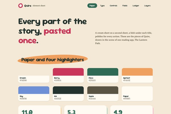
accent#C9365A
bg#F4E9D6
surface#FFFBF3
text#24332E
muted#5A5444
border#E4D7BE
surface 2#FBF2E1
on accent#FFFBF3
moss#2F6A55
Quire is a torn-paper storybook language with one mechanic: every surface is a sheet of paper laid on a second sheet that peeks out 7px to the right and 9px down.
Tokens and rules, ready for an agent to follow.
Each face set in this language's own words.
Quire
Quire
Quire is a torn-paper storybook language with one mechanic: every surface is a sheet of paper laid on a second sheet that peeks out 7px to the righ...
Quire is a torn-paper storybook language with one mechanic: every surface is a sheet of paper laid on a second sheet that peeks out 7px to the righ...
Quire is a torn-paper storybook language with one mechanic: every surface is a sheet of paper laid on a second sheet that peeks out 7px to the right and 9px down. There is no border and no blur, so warmth and depth come from paper alone. Cream ground, berry, moss and apricot like highlighters, sky kept cool for information, and a calm cream sky in the hero art so the headline sits on pixels at full strength. This revision keeps the idea and removes the generic parts: the gradient wash over the hero, the mono eyebrows and tag pill, the three icon cards and the contrast failures.
Refined from WhimsiCollage Storybook. This generation is revised in place from the approved range-round-8 specimen quire-i.
Compose each screen as one story spread: a full-bleed collage hero, then a short run of paper patches on underlays. One panel leads and smaller patches tuck beside it. Never nest cards and never use an icon trio.
Hierarchy comes from scale, colour patches, and the paste-shadow elevation rather than pure typography. Headings ride irregular blob backplates; primary actions become large friendly pebble shapes; supporting facts tuck into pill ribbons.
Moderate density with generous breathing room — busy in detail, never cramped in layout. Texture lives inside a disciplined macro-grid with roomy gutters.
Every major surface sits on a second paper sheet offset 7px right and 9px down (no blur). Titles ride an irregular apricot blob. Controls are pebbles with a 3px paper lift and a 3px moss focus ring at 3px offset. Facts replace icons: a big figure in moss, a title, one sentence.
Content caps at 1180px and centres; only the hero spans the viewport. Two-column blocks use 1.1fr and .9fr with a 56px gap; fact cards use three equal minmax(0,1fr) columns with a 30px gap; every grid child has min-width:0.
Sections sit 84px apart on desktop and 64px on phones. Titles ride a blob with 14px above the text, so a title is never stuck to a container top. Cards pad 30px 28px.
Generous; moderate detail inside roomy gutters.
Hero text sits on the calm cream sky of the wide plate at 900px and above, and on a tall portrait plate below it, with the nav button hidden on phones. Cards and the palette split stack to one column under 900px. Text uses clamp() with a 17px floor. Above about 1440px the content caps and centres.
torn-cut-paper-collage
Torn-paper collage plates in Decoupage: fibrous deckles, layered cut shapes and small offset underlays on warm board. The hero keeps the left half as calm cream sky so the headline reads on the picture at full strength, with no gradient or scrim over it.
One full-bleed hero per landing, painted with var(--hero-image), with a portrait variant under 900px. Keep the sky left half empty for type. Never lay a gradient wash over the art.
en-019ef726-f4e5-7052-bd9e-5ae2ab1ab703
# Quire

## Philosophy

Quire is a torn-paper storybook language with one mechanic: every surface is a sheet of paper laid on a second sheet that peeks out 7px to the right and 9px down. There is no border and no blur, so warmth and depth come from paper alone. Cream ground, berry, moss and apricot like highlighters, sky kept cool for information, and a calm cream sky in the hero art so the headline sits on pixels at full strength. This revision keeps the idea and removes the generic parts: the gradient wash over the hero, the mono eyebrows and tag pill, the three icon cards and the contrast failures.

### Values

- child-friendly warmth without babyish simplification
- narrative worldbuilding carried by the CSS structure, not just illustration
- visible craft, paper grain, and hand-touched imperfection
- gentle emotional guidance through colour and shape
- friendly discoverability through characterful, clearly-styled affordances

### Anti-Values

- sterile product minimalism and white-card SaaS inventories
- hard mechanical geometry or glassmorphism as the dominant motif
- grey hairline borders and accent edges
- mascot overload that replaces information design
- decoration without an idea — flourishes piled on by reflex

### Visual Character

- Cream paper #F4E9D6 with cream-white sheets #FFFBF3, never white and never a wash
- Paste-shadow underlays in peach, sage, rose and mist, offset 7px and 9px, no blur
- Irregular apricot blob behind each section title, rotated about a degree
- Pebble buttons in moss and berry, fully round, with a 3px paper lift
- Torn-paper collage hero with a calm cream sky on the left half
- Sour Gummy display at -0.02em, Averia Serif Libre 17px, Xanh Mono only for hex and measures

### Lineage

> Refined from WhimsiCollage Storybook. This generation is revised in place from the approved range-round-8 specimen quire-i.

## Tokens

### Colors

| Name | Value |
|------|-------|
| bg | `#F4E9D6` |
| surface | `#FFFBF3` |
| surface_2 | `#FBF2E1` |
| text | `#24332E` |
| muted | `#5A5444` |
| accent | `#C9365A` |
| on_accent | `#FFFBF3` |
| moss | `#2F6A55` |
| apricot | `#F0A05E` |
| sky | `#6D8FD6` |
| border | `#E4D7BE` |
| success | `#2F6A55` |
| warning | `#8A5A00` |
| error | `#B3261E` |
| info | `#2F5DA8` |
| underlay_peach | `#F7D4A8` |
| underlay_sage | `#BBD3C2` |
| underlay_rose | `#F6C0CB` |
| underlay_mist | `#C3D2EF` |

### Typography

- **Base Size**: 17px
- **Body Font**: Averia Serif Libre
- **Heading Font**: Sour Gummy
- **Mono Font**: Xanh Mono
- **Heading Weight**: 700
- **Heading Transform**: none
- **Letter Spacing**: -0.02em
- **Display Line Height**: 1.12
- **Line Height**: 1.55
- **Scale Ratio**: 1.25
- **Google Fonts Url**: https://fonts.googleapis.com/css2?family=Averia+Serif+Libre:wght@400;700&family=Sour+Gummy:wght@400;500;700&family=Xanh+Mono&display=swap

### Radii

- **None**: 0px
- **Sm**: 16px
- **Md**: 24px
- **Lg**: 24px
- **Full**: 9999px

### Shadows

- **Sm**: 0 3px 0 rgba(70,58,42,0.10)
- **Md**: 7px 9px 0 rgba(70,58,42,0.14)
- **Lg**: 0 14px 28px rgba(70,58,42,0.12)

### Spacing

- **Base**: 8px
- **Scale**: [4,8,12,16,24,32,48,64,96]

### Surfaces

- **Treatment**: paper
- **Bg Pattern**: noise
- **Card Style**: cream paper cards on a 7px right, 9px down underlay in a second paper tone, no borders, no blur

### Borders

- **Default Width**: 0px
- **Style**: none
- **Character**: no borders; depth from offset paste-shadows and paper inset rings on fields only

### Motion

- **Duration**: 240ms
- **Easing**: cubic-bezier(0.22, 1, 0.36, 1)
- **Philosophy**: snappy lifts and tiny collage rotations, never opacity-only fades; settled state visible with no JS, hidden start-state gated behind html.anim

## Rules

### Composition

Compose each screen as one story spread: a full-bleed collage hero, then a short run of paper patches on underlays. One panel leads and smaller patches tuck beside it. Never nest cards and never use an icon trio.

### Hierarchy

Hierarchy comes from scale, colour patches, and the paste-shadow elevation rather than pure typography. Headings ride irregular blob backplates; primary actions become large friendly pebble shapes; supporting facts tuck into pill ribbons.

### Density

Moderate density with generous breathing room — busy in detail, never cramped in layout. Texture lives inside a disciplined macro-grid with roomy gutters.

### Signature

Every major surface sits on a second paper sheet offset 7px right and 9px down (no blur). Titles ride an irregular apricot blob. Controls are pebbles with a 3px paper lift and a 3px moss focus ring at 3px offset. Facts replace icons: a big figure in moss, a title, one sentence.

## Layout

### Grid

Content caps at 1180px and centres; only the hero spans the viewport. Two-column blocks use 1.1fr and .9fr with a 56px gap; fact cards use three equal minmax(0,1fr) columns with a 30px gap; every grid child has min-width:0.

### Whitespace

Sections sit 84px apart on desktop and 64px on phones. Titles ride a blob with 14px above the text, so a title is never stuck to a container top. Cards pad 30px 28px.

### Density

Generous; moderate detail inside roomy gutters.

### Responsive

Hero text sits on the calm cream sky of the wide plate at 900px and above, and on a tall portrait plate below it, with the nav button hidden on phones. Cards and the palette split stack to one column under 900px. Text uses clamp() with a 17px floor. Above about 1440px the content caps and centres.

### Breakpoints

- **Lg**: 1200px+
- **Md**: 900–1199px
- **Sm**: 640–899px
- **Xs**: below 640px

## Guidance

### Do

- Lay every major surface on an offset second-colour paste-shadow underlay of 7px and 9px; depth comes from paper, not borders
- Keep the hero sky calm and put the headline on it, with no gradient or scrim
- Use berry, moss and apricot like highlighters; keep sky cool for information
- Lead cards with a measured fact in a big moss figure instead of an icon
- Ride section titles on an irregular apricot blob with room above
- Style every control as a pebble with a visible 3px moss focus ring

### Don't

- Don't lay a gradient wash over hero art behind the headline
- Don't add mono uppercase eyebrow labels, tag pills or three icon cards with generic copy
- Don't use borders, hairlines or blurred drop shadows
- Don't mix radii beyond 16 for fields, 24 for surfaces and 9999 for pebbles
- Don't let muted, warning or error text fall under AA on paper
- Don't close with a generic call to action card; end on a plain statement of the idea

### Accessibility

Maintain AA contrast on all copy (ink on paper), use large friendly hit targets, visible moss or berry focus rings, and keep paper texture behind text low-contrast. Respect prefers-reduced-motion; the settled page renders without JavaScript.

## Imagery Direction

### Pairs With

torn-cut-paper-collage

### Summary

Torn-paper collage plates in Decoupage: fibrous deckles, layered cut shapes and small offset underlays on warm board. The hero keeps the left half as calm cream sky so the headline reads on the picture at full strength, with no gradient or scrim over it.

### Subjects

- storybook landscapes
- friendly animals
- everyday objects as props
- warm domestic scenes
- meadows and lanterns

### Usage

One full-bleed hero per landing, painted with var(--hero-image), with a portrait variant under 900px. Keep the sky left half empty for type. Never lay a gradient wash over the art.

### Art Style Id

en-019ef726-f4e5-7052-bd9e-5ae2ab1ab703
---
version: "alpha"
name: "Quire"
description: "Quire is a torn-paper storybook language with one mechanic: every surface is a sheet of paper laid on a second sheet that peeks out 7px to the right and 9px down. There is no border and no blur, so warmth and depth come from paper alone...."
colors:
  bg: "#F4E9D6"
  surface: "#FFFBF3"
  surface_2: "#FBF2E1"
  text: "#24332E"
  muted: "#5A5444"
  accent: "#C9365A"
  on_accent: "#FFFBF3"
  moss: "#2F6A55"
  apricot: "#F0A05E"
  sky: "#6D8FD6"
  border: "#E4D7BE"
  success: "#2F6A55"
  warning: "#8A5A00"
  error: "#B3261E"
  info: "#2F5DA8"
  underlay_peach: "#F7D4A8"
  underlay_sage: "#BBD3C2"
  underlay_rose: "#F6C0CB"
  underlay_mist: "#C3D2EF"
typography:
  headline-lg:
    fontFamily: "Sour Gummy"
    fontSize: "2.075rem"
    fontWeight: 700
    lineHeight: 1.1
    letterSpacing: "-0.02em"
  headline-md:
    fontFamily: "Sour Gummy"
    fontSize: "1.66rem"
    fontWeight: 600
    lineHeight: 1.15
    letterSpacing: "-0.02em"
  body-md:
    fontFamily: "Averia Serif Libre"
    fontSize: "17px"
    fontWeight: 400
    lineHeight: 1.55
    letterSpacing: "-0.02em"
  label-md:
    fontFamily: "Xanh Mono"
    fontSize: "0.75rem"
    fontWeight: 600
    lineHeight: 1
    letterSpacing: "0.08em"
rounded:
  none: "0px"
  sm: "16px"
  md: "24px"
  lg: "24px"
  full: "9999px"
spacing:
  base: "8px"
  xs: "4px"
  sm: "8px"
  md: "12px"
  lg: "16px"
  xl: "24px"
  2xl: "32px"
  3xl: "48px"
  4xl: "64px"
  step-8: "96px"
components:
  color-reference-bg:
    backgroundColor: "{colors.bg}"
  color-reference-surface:
    backgroundColor: "{colors.surface}"
  color-reference-surface_2:
    backgroundColor: "{colors.surface_2}"
  color-reference-text:
    backgroundColor: "{colors.text}"
  color-reference-muted:
    backgroundColor: "{colors.muted}"
  color-reference-accent:
    backgroundColor: "{colors.accent}"
  color-reference-on_accent:
    backgroundColor: "{colors.on_accent}"
  color-reference-moss:
    backgroundColor: "{colors.moss}"
  color-reference-apricot:
    backgroundColor: "{colors.apricot}"
  color-reference-sky:
    backgroundColor: "{colors.sky}"
  color-reference-border:
    backgroundColor: "{colors.border}"
  color-reference-success:
    backgroundColor: "{colors.success}"
  color-reference-warning:
    backgroundColor: "{colors.warning}"
  color-reference-error:
    backgroundColor: "{colors.error}"
  color-reference-info:
    backgroundColor: "{colors.info}"
  color-reference-underlay_peach:
    backgroundColor: "{colors.underlay_peach}"
  color-reference-underlay_sage:
    backgroundColor: "{colors.underlay_sage}"
  color-reference-underlay_rose:
    backgroundColor: "{colors.underlay_rose}"
  color-reference-underlay_mist:
    backgroundColor: "{colors.underlay_mist}"
  button-primary:
    backgroundColor: "{colors.accent}"
    textColor: "{colors.on_accent}"
    typography: "{typography.label-md}"
    rounded: "{rounded.md}"
    padding: "{spacing.md}"
  card-surface:
    backgroundColor: "{colors.surface}"
    textColor: "{colors.text}"
    rounded: "{rounded.md}"
    padding: "{spacing.md}"
  input-default:
    backgroundColor: "{colors.surface}"
    textColor: "{colors.text}"
    rounded: "{rounded.md}"
    height: "44px"
---

# Quire

## Overview

Quire is a torn-paper storybook language with one mechanic: every surface is a sheet of paper laid on a second sheet that peeks out 7px to the right and 9px down. There is no border and no blur, so warmth and depth come from paper alone. Cream ground, berry, moss and apricot like highlighters, sky kept cool for information, and a calm cream sky in the hero art so the headline sits on pixels at full strength. This revision keeps the idea and removes the generic parts: the gradient wash over the hero, the mono eyebrows and tag pill, the three icon cards and the contrast failures.

### Values

- child-friendly warmth without babyish simplification
- narrative worldbuilding carried by the CSS structure, not just illustration
- visible craft, paper grain, and hand-touched imperfection
- gentle emotional guidance through colour and shape
- friendly discoverability through characterful, clearly-styled affordances

### Anti-Values

- sterile product minimalism and white-card SaaS inventories
- hard mechanical geometry or glassmorphism as the dominant motif
- grey hairline borders and accent edges
- mascot overload that replaces information design
- decoration without an idea — flourishes piled on by reflex

### Visual Character

- Cream paper #F4E9D6 with cream-white sheets #FFFBF3, never white and never a wash
- Paste-shadow underlays in peach, sage, rose and mist, offset 7px and 9px, no blur
- Irregular apricot blob behind each section title, rotated about a degree
- Pebble buttons in moss and berry, fully round, with a 3px paper lift
- Torn-paper collage hero with a calm cream sky on the left half
- Sour Gummy display at -0.02em, Averia Serif Libre 17px, Xanh Mono only for hex and measures

### Lineage

> Refined from WhimsiCollage Storybook. This generation is revised in place from the approved range-round-8 specimen quire-i.

## Colors

Use the YAML color tokens as the normative palette. The prose below names the roles agents should preserve when generating UI.

| Token | Value |
|-------|-------|
| bg | `#F4E9D6` |
| surface | `#FFFBF3` |
| surface_2 | `#FBF2E1` |
| text | `#24332E` |
| muted | `#5A5444` |
| accent | `#C9365A` |
| on_accent | `#FFFBF3` |
| moss | `#2F6A55` |
| apricot | `#F0A05E` |
| sky | `#6D8FD6` |
| border | `#E4D7BE` |
| success | `#2F6A55` |
| warning | `#8A5A00` |
| error | `#B3261E` |
| info | `#2F5DA8` |
| underlay_peach | `#F7D4A8` |
| underlay_sage | `#BBD3C2` |
| underlay_rose | `#F6C0CB` |
| underlay_mist | `#C3D2EF` |

## Typography

Load the fonts from Google Fonts: https://fonts.googleapis.com/css2?family=Averia+Serif+Libre:wght@400;700&family=Sour+Gummy:wght@400;500;700&family=Xanh+Mono&display=swap

- **Headline-Lg**: Sour Gummy, 2.075rem, weight 700, line-height 1.1.
- **Headline-Md**: Sour Gummy, 1.66rem, weight 600, line-height 1.15.
- **Body-Md**: Averia Serif Libre, 17px, weight 400, line-height 1.55.
- **Label-Md**: Xanh Mono, 0.75rem, weight 600, line-height 1.

## Layout

### Spacing Tokens

- **Base**: `8px`
- **Xs**: `4px`
- **Sm**: `8px`
- **Md**: `12px`
- **Lg**: `16px`
- **Xl**: `24px`
- **2xl**: `32px`
- **3xl**: `48px`
- **4xl**: `64px`
- **Step-8**: `96px`

### Grid

Content caps at 1180px and centres; only the hero spans the viewport. Two-column blocks use 1.1fr and .9fr with a 56px gap; fact cards use three equal minmax(0,1fr) columns with a 30px gap; every grid child has min-width:0.

### Whitespace

Sections sit 84px apart on desktop and 64px on phones. Titles ride a blob with 14px above the text, so a title is never stuck to a container top. Cards pad 30px 28px.

### Density

Generous; moderate detail inside roomy gutters.

### Responsive

Hero text sits on the calm cream sky of the wide plate at 900px and above, and on a tall portrait plate below it, with the nav button hidden on phones. Cards and the palette split stack to one column under 900px. Text uses clamp() with a 17px floor. Above about 1440px the content caps and centres.

### Breakpoints

- **Lg**: 1200px+
- **Md**: 900–1199px
- **Sm**: 640–899px
- **Xs**: below 640px

## Elevation & Depth

### Shadows

- **Sm**: 0 3px 0 rgba(70,58,42,0.10)
- **Md**: 7px 9px 0 rgba(70,58,42,0.14)
- **Lg**: 0 14px 28px rgba(70,58,42,0.12)

## Shapes

### Rounded

- **None**: `0px`
- **Sm**: `16px`
- **Md**: `24px`
- **Lg**: `24px`
- **Full**: `9999px`

### Surfaces

- **Treatment**: paper
- **Bg Pattern**: noise
- **Card Style**: cream paper cards on a 7px right, 9px down underlay in a second paper tone, no borders, no blur

### Borders

- **Default Width**: 0px
- **Style**: none
- **Character**: no borders; depth from offset paste-shadows and paper inset rings on fields only

## Components

### Composition

Compose each screen as one story spread: a full-bleed collage hero, then a short run of paper patches on underlays. One panel leads and smaller patches tuck beside it. Never nest cards and never use an icon trio.

### Hierarchy

Hierarchy comes from scale, colour patches, and the paste-shadow elevation rather than pure typography. Headings ride irregular blob backplates; primary actions become large friendly pebble shapes; supporting facts tuck into pill ribbons.

### Density

Moderate density with generous breathing room — busy in detail, never cramped in layout. Texture lives inside a disciplined macro-grid with roomy gutters.

### Signature

Every major surface sits on a second paper sheet offset 7px right and 9px down (no blur). Titles ride an irregular apricot blob. Controls are pebbles with a 3px paper lift and a 3px moss focus ring at 3px offset. Facts replace icons: a big figure in moss, a title, one sentence.

## shadcn/ui Usage

When the target app uses shadcn/ui, copy DESIGN.md with shadcn instead of the plain DESIGN.md. It contains the same Katagami design-language source plus the shadcn/ui primitives, imports, theme variables, component recipes, and preview-shot guidance.

DESIGN.md with shadcn: `/language/en-01a11414-4763-7b41-b0cf-1dbbb87c1c38/DESIGN.with-shadcn.md`.

Machine-readable companions for automation: `/language/en-01a11414-4763-7b41-b0cf-1dbbb87c1c38/shadcn.json` (registry theme), `/language/en-01a11414-4763-7b41-b0cf-1dbbb87c1c38/shadcn-components.md` (component recipes) and `/language/en-01a11414-4763-7b41-b0cf-1dbbb87c1c38/shadcn-shots.json` (preview shots). The human-facing handoff is still DESIGN.md with shadcn.

Install recommended primitives with `npx shadcn@latest add button card input textarea select dialog sheet tabs badge separator checkbox switch slider tooltip dropdown-menu table`.

Use these primitives in shadcn apps:
- button
- card
- input
- textarea
- select
- dialog
- sheet
- tabs
- badge
- separator
- checkbox
- switch
- slider
- tooltip
- dropdown-menu
- table

Implementation rule for agents: import shadcn primitives from `@/components/ui/*`, apply the generated CSS variables first, then compose the language-specific recipes from the companion MD. Katagami remains the source of truth; shadcn names are the implementation surface.

## Do's and Don'ts

- Do Lay every major surface on an offset second-colour paste-shadow underlay of 7px and 9px; depth comes from paper, not borders
- Do Keep the hero sky calm and put the headline on it, with no gradient or scrim
- Do Use berry, moss and apricot like highlighters; keep sky cool for information
- Do Lead cards with a measured fact in a big moss figure instead of an icon
- Do Ride section titles on an irregular apricot blob with room above
- Do Style every control as a pebble with a visible 3px moss focus ring
- Don't Don't lay a gradient wash over hero art behind the headline
- Don't Don't add mono uppercase eyebrow labels, tag pills or three icon cards with generic copy
- Don't Don't use borders, hairlines or blurred drop shadows
- Don't Don't mix radii beyond 16 for fields, 24 for surfaces and 9999 for pebbles
- Don't Don't let muted, warning or error text fall under AA on paper
- Don't Don't close with a generic call to action card; end on a plain statement of the idea

### Accessibility

Maintain AA contrast on all copy (ink on paper), use large friendly hit targets, visible moss or berry focus rings, and keep paper texture behind text low-contrast. Respect prefers-reduced-motion; the settled page renders without JavaScript.

## Imagery Direction

### Pairs With

torn-cut-paper-collage

### Summary

Torn-paper collage plates in Decoupage: fibrous deckles, layered cut shapes and small offset underlays on warm board. The hero keeps the left half as calm cream sky so the headline reads on the picture at full strength, with no gradient or scrim over it.

### Subjects

- storybook landscapes
- friendly animals
- everyday objects as props
- warm domestic scenes
- meadows and lanterns

### Usage

One full-bleed hero per landing, painted with var(--hero-image), with a portrait variant under 900px. Keep the sky left half empty for type. Never lay a gradient wash over the art.

### Art Style Id

en-019ef726-f4e5-7052-bd9e-5ae2ab1ab703
```json
{
  "$schema": "https://ui.shadcn.com/schema/registry-item.json",
  "name": "quire",
  "type": "registry:theme",
  "title": "Quire shadcn Theme",
  "cssVars": {
    "theme": {},
    "light": {
      "background": "#F4E9D6",
      "foreground": "#24332E",
      "card": "#FFFBF3",
      "card-foreground": "#24332E",
      "popover": "#FFFBF3",
      "popover-foreground": "#24332E",
      "primary": "#24332E",
      "primary-foreground": "#ffffff",
      "secondary": "#f4f4f5",
      "secondary-foreground": "#111111",
      "muted": "#5A5444",
      "muted-foreground": "#24332E",
      "accent": "#C9365A",
      "accent-foreground": "#ffffff",
      "destructive": "#B3261E",
      "border": "#E4D7BE",
      "input": "#E4D7BE",
      "ring": "#C9365A",
      "chart-1": "#24332E",
      "chart-2": "#f4f4f5",
      "chart-3": "#C9365A",
      "chart-4": "#2F6A55",
      "chart-5": "#8A5A00",
      "sidebar": "#FFFBF3",
      "sidebar-foreground": "#24332E",
      "sidebar-primary": "#24332E",
      "sidebar-primary-foreground": "#ffffff",
      "sidebar-accent": "#2F5DA8",
      "sidebar-accent-foreground": "#ffffff",
      "sidebar-border": "#E4D7BE",
      "sidebar-ring": "#C9365A",
      "radius": "24px"
    },
    "dark": {
      "background": "#0f1115",
      "foreground": "#f8fafc",
      "card": "#181b22",
      "card-foreground": "#f8fafc",
      "popover": "#181b22",
      "popover-foreground": "#f8fafc",
      "primary": "#24332E",
      "primary-foreground": "#ffffff",
      "secondary": "#252a33",
      "secondary-foreground": "#f8fafc",
      "muted": "#252a33",
      "muted-foreground": "#a1a1aa",
      "accent": "#C9365A",
      "accent-foreground": "#ffffff",
      "destructive": "#B3261E",
      "border": "#303642",
      "input": "#303642",
      "ring": "#C9365A",
      "chart-1": "#24332E",
      "chart-2": "#f4f4f5",
      "chart-3": "#C9365A",
      "chart-4": "#2F6A55",
      "chart-5": "#8A5A00",
      "sidebar": "#181b22",
      "sidebar-foreground": "#f8fafc",
      "sidebar-primary": "#24332E",
      "sidebar-primary-foreground": "#ffffff",
      "sidebar-accent": "#C9365A",
      "sidebar-accent-foreground": "#ffffff",
      "sidebar-border": "#303642",
      "sidebar-ring": "#C9365A",
      "radius": "24px"
    }
  },
  "meta": {
    "source": "katagami",
    "languageId": "en-01a11414-4763-7b41-b0cf-1dbbb87c1c38",
    "slug": "quire",
    "componentManifest": [
      "button",
      "card",
      "input",
      "textarea",
      "select",
      "dialog",
      "sheet",
      "tabs",
      "badge",
      "separator",
      "checkbox",
      "switch",
      "slider",
      "tooltip",
      "dropdown-menu",
      "table"
    ],
    "installCommand": "npx shadcn@latest add button card input textarea select dialog sheet tabs badge separator checkbox switch slider tooltip dropdown-menu table",
    "nativeTokenNames": {
      "colors": [
        "accent",
        "apricot",
        "bg",
        "border",
        "error",
        "info",
        "moss",
        "muted",
        "on_accent",
        "sky",
        "success",
        "surface",
        "surface_2",
        "text",
        "underlay_mist",
        "underlay_peach",
        "underlay_rose",
        "underlay_sage",
        "warning"
      ],
      "typography": [
        "base_size",
        "body_font",
        "display_line_height",
        "google_fonts_url",
        "heading_font",
        "heading_transform",
        "heading_weight",
        "letter_spacing",
        "line_height",
        "mono_font",
        "scale_ratio"
      ],
      "radii": [
        "full",
        "lg",
        "md",
        "none",
        "sm"
      ],
      "shadows": [
        "lg",
        "md",
        "sm"
      ],
      "spacing": [
        "base",
        "scale"
      ],
      "surfaces": [
        "bg_pattern",
        "card_style",
        "treatment"
      ],
      "borders": [
        "character",
        "default_width",
        "style"
      ],
      "motion": [
        "duration",
        "easing",
        "philosophy"
      ]
    }
  }
}
```The art style its pictures are drawn in and the colours its tokens carry.
The theme variables are generated from the tokens. Component recipes and preview shots have not been written for this language yet.
For an app that uses shadcn/ui: the DESIGN.md plus the install list, theme variables, component recipes, preview shots and a starter TSX file, in one Markdown file.
The same pieces as separate files: theme, CSS, TSX starter, recipes and the preview contract.
npx shadcn@latest add button card input textarea select dialog sheet tabs badge separator checkbox switch slider tooltip dropdown-menu table:root {
--background: #F4E9D6;
--foreground: #24332E;
--card: #FFFBF3;
--card-foreground: #24332E;
--popover: #FFFBF3;
--popover-foreground: #24332E;
--primary: #24332E;
--primary-foreground: #ffffff;
--secondary: #f4f4f5;
--secondary-foreground: #111111;
--muted: #5A5444;
--muted-foreground: #24332E;
--accent: #C9365A;
--accent-foreground: #ffffff;
--destructive: #B3261E;
--border: #E4D7BE;
--input: #E4D7BE;
--ring: #C9365A;
--chart-1: #24332E;
--chart-2: #f4f4f5;
--chart-3: #C9365A;
--chart-4: #2F6A55;
--chart-5: #8A5A00;
--sidebar: #FFFBF3;
--sidebar-foreground: #24332E;
--sidebar-primary: #24332E;
--sidebar-primary-foreground: #ffffff;
--sidebar-accent: #2F5DA8;
--sidebar-accent-foreground: #ffffff;
--sidebar-border: #E4D7BE;
--sidebar-ring: #C9365A;
--radius: 24px;
}
.dark {
--background: #0f1115;
--foreground: #f8fafc;
--card: #181b22;
--card-foreground: #f8fafc;
--popover: #181b22;
--popover-foreground: #f8fafc;
--primary: #24332E;
--primary-foreground: #ffffff;
--secondary: #252a33;
--secondary-foreground: #f8fafc;
--muted: #252a33;
--muted-foreground: #a1a1aa;
--accent: #C9365A;
--accent-foreground: #ffffff;
--destructive: #B3261E;
--border: #303642;
--input: #303642;
--ring: #C9365A;
--chart-1: #24332E;
--chart-2: #f4f4f5;
--chart-3: #C9365A;
--chart-4: #2F6A55;
--chart-5: #8A5A00;
--sidebar: #181b22;
--sidebar-foreground: #f8fafc;
--sidebar-primary: #24332E;
--sidebar-primary-foreground: #ffffff;
--sidebar-accent: #C9365A;
--sidebar-accent-foreground: #ffffff;
--sidebar-border: #303642;
--sidebar-ring: #C9365A;
--radius: 24px;
}
import { Badge } from "@/components/ui/badge";
import { Button } from "@/components/ui/button";
import {
  Card,
  CardContent,
  CardDescription,
  CardFooter,
  CardHeader,
  CardTitle,
} from "@/components/ui/card";
import { Input } from "@/components/ui/input";
import { Tabs, TabsList, TabsTrigger } from "@/components/ui/tabs";

export function QuireShadcnKit() {
  return (
    <section className="grid gap-4 rounded-[var(--radius)] border bg-background p-4 text-foreground">
      <div className="flex items-start justify-between gap-4">
        <div>
          <Badge variant="outline">shadcn/ui</Badge>
          <h2 className="mt-3 text-2xl font-semibold tracking-tight">Quire</h2>
          <p className="mt-1 max-w-xl text-sm text-muted-foreground">
            Use the Katagami registry theme, then compose these shadcn primitives
            with the language-specific component recipes.
          </p>
        </div>
        <Button>Apply theme</Button>
      </div>

      <Tabs defaultValue="components">
        <TabsList>
          <TabsTrigger value="components">Components</TabsTrigger>
          <TabsTrigger value="states">States</TabsTrigger>
          <TabsTrigger value="export">Export</TabsTrigger>
        </TabsList>
      </Tabs>

      <Card>
        <CardHeader>
          <CardTitle>Component recipe</CardTitle>
          <CardDescription>
            Replace this starter content with the agent-authored product scene
            from components.md and preview-shots.json.
          </CardDescription>
        </CardHeader>
        <CardContent className="grid gap-3 sm:grid-cols-[1fr_auto]">
          <Input defaultValue="Tokenized shadcn surface" aria-label="Recipe name" />
          <Button variant="secondary">Preview state</Button>
        </CardContent>
        <CardFooter className="justify-between">
          <Badge>Ready</Badge>
          <Button variant="outline">Copy recipe</Button>
        </CardFooter>
      </Card>
    </section>
  );
}
{
  "$schema": "https://ui.shadcn.com/schema/registry-item.json",
  "name": "quire",
  "type": "registry:theme",
  "title": "Quire",
  "description": "Cream paper sheets on second sheets, 7px right and 9px down: borderless, pebble buttons in moss and berry, blob titles in apricot.",
  "cssVars": {
    "theme": {
      "font-sans": "Averia Serif Libre, Georgia, serif",
      "font-mono": "Xanh Mono, Georgia, serif",
      "font-display": "Sour Gummy, ui-rounded, system-ui, sans-serif",
      "radius": "24px"
    },
    "light": {
      "background": "#F4E9D6",
      "foreground": "#24332E",
      "card": "#FFFBF3",
      "card-foreground": "#24332E",
      "popover": "#FFFBF3",
      "popover-foreground": "#24332E",
      "primary": "#2F6A55",
      "primary-foreground": "#FFFBF3",
      "secondary": "#FBF2E1",
      "secondary-foreground": "#24332E",
      "muted": "#FBF2E1",
      "muted-foreground": "#5A5444",
      "accent": "#F0A05E",
      "accent-foreground": "#24332E",
      "destructive": "#B3261E",
      "destructive-foreground": "#FFFBF3",
      "border": "transparent",
      "input": "transparent",
      "ring": "#2F6A55",
      "chart-1": "#C9365A",
      "chart-2": "#2F6A55",
      "chart-3": "#F0A05E",
      "chart-4": "#6D8FD6",
      "chart-5": "#5A5444",
      "radius": "24px"
    },
    "dark": {
      "background": "#F4E9D6",
      "foreground": "#24332E",
      "card": "#FFFBF3",
      "card-foreground": "#24332E",
      "popover": "#FFFBF3",
      "popover-foreground": "#24332E",
      "primary": "#2F6A55",
      "primary-foreground": "#FFFBF3",
      "secondary": "#FBF2E1",
      "secondary-foreground": "#24332E",
      "muted": "#FBF2E1",
      "muted-foreground": "#5A5444",
      "accent": "#F0A05E",
      "accent-foreground": "#24332E",
      "destructive": "#B3261E",
      "destructive-foreground": "#FFFBF3",
      "border": "transparent",
      "input": "transparent",
      "ring": "#2F6A55",
      "chart-1": "#C9365A",
      "chart-2": "#2F6A55",
      "chart-3": "#F0A05E",
      "chart-4": "#6D8FD6",
      "chart-5": "#5A5444",
      "radius": "24px"
    }
  },
  "componentManifest": [
    "button",
    "card",
    "input",
    "textarea",
    "select",
    "dialog",
    "sheet",
    "tabs",
    "badge",
    "separator",
    "checkbox",
    "switch",
    "slider",
    "tooltip",
    "dropdown-menu",
    "table"
  ],
  "meta": {
    "nativeTokenNames": {
      "bg": "background",
      "surface": "card / popover / secondary text sheet",
      "surface_2": "secondary / muted (wells)",
      "text": "foreground",
      "muted": "muted-foreground",
      "accent": "chart-1 and the loud button (berry, native only)",
      "moss": "primary / ring",
      "apricot": "accent (blob titles)",
      "sky": "chart-4",
      "border": "native only; --border stays transparent",
      "underlay_peach": "native only (paste-shadow)",
      "underlay_sage": "native only (paste-shadow)",
      "underlay_rose": "native only (paste-shadow)",
      "underlay_mist": "native only (paste-shadow)"
    },
    "note": "Quire is a light, cream-ground language; the dark scope repeats the light values. The shadcn primary is moss; berry is the one loud action and stays native.",
    "componentManifest": [
      "button",
      "card",
      "input",
      "textarea",
      "select",
      "dialog",
      "sheet",
      "tabs",
      "badge",
      "separator",
      "checkbox",
      "switch",
      "slider",
      "tooltip",
      "dropdown-menu",
      "table"
    ]
  }
}
---
artifact: component-recipes-v1
language: quire
author: katagami-agent
primitives: 16
---

# Quire shadcn/ui Components

Author: `katagami-agent`

## Intent

Quire dresses shadcn/ui as a torn-paper storybook: every surface is a cream sheet laid on a second sheet that peeks out 7px right and 9px down, with no border and no blur. Titles ride an apricot blob, buttons are fully round pebbles with a 3px lift, fields are cream wells with a moss focus ring, and the hero is a collage with calm cream sky for the headline. Moss leads, berry is loud, apricot is a highlighter.

## Required primitives

button, card, input, textarea, select, dialog, sheet, tabs, badge, separator, checkbox, switch, slider, tooltip, dropdown-menu, table. Import them from `@/components/ui/*`; do not build a second component system.

## Token cues

```css
--background:#F4E9D6;
--foreground:#24332E;
--card:#FFFBF3;
--card-foreground:#24332E;
--popover:#FFFBF3;
--popover-foreground:#24332E;
--primary:#2F6A55;
--primary-foreground:#FFFBF3;
--secondary:#FBF2E1;
--secondary-foreground:#24332E;
--muted:#FBF2E1;
--muted-foreground:#5A5444;
--accent:#F0A05E;
--accent-foreground:#24332E;
--destructive:#B3261E;
--destructive-foreground:#FFFBF3;
--border:transparent;
--input:transparent;
--ring:#2F6A55;
--chart-1:#C9365A;
--chart-2:#2F6A55;
--chart-3:#F0A05E;
--chart-4:#6D8FD6;
--chart-5:#5A5444;
--radius:24px;
```

Native names are kept in the theme: `surface`, `surface_2`, `moss`, `apricot`, `sky` and the four underlay colours. The paste-shadow is `box-shadow: 7px 9px 0 var(--u)`, which shadcn has no variable for.

## Visual character to preserve

- Every major surface is a cream sheet on a second sheet: `shadow-[7px_9px_0_var(--u)]` with `--u` one of peach, sage, rose or mist. No blur.
- No borders, ever: keep `--border` and `--input` transparent. Fields get a soft inset top shade, not a line.
- Radii only 16 (fields, swatches), 24 (sheets) and 9999 (pebbles, tabs, badges).
- Moss is the one primary per view; berry is the loud second action; quiet is cream with moss text.
- Section titles ride an irregular apricot blob with 14px above the text.
- Facts, not icons: a big Sour Gummy figure in moss, a title and one sentence.
- Sour Gummy 700 for display at -0.02em, Averia Serif Libre 17px for prose, Xanh Mono only for hex and measures.

## ShadSync visual profile

- family: paper-collage
- material: cream paper sheets on offset second sheets
- contour: soft
- border: none
- underlay: True
- grain: False
- stickerBadges: True
- motion: snappy lift and a half-degree turn
- density: comfortable
- radius: 16, 24, 9999
- accents: berry, moss, apricot

## Signature component recipes

- **button:** `h-[52px] rounded-full border-0 px-[26px] font-display text-[18px] font-bold whitespace-nowrap shadow-[0_3px_0_rgba(70,58,42,.1)]`. `default` is `bg-primary text-primary-foreground` (moss, one per view); it lifts `-translate-y-0.5 -rotate-[.5deg]` on hover and presses `translate-y-0.5 shadow-none`. A loud action is `bg-[#C9365A] text-primary-foreground`; `secondary` is `bg-secondary text-primary`. Focus: `outline-[3px] outline-offset-[3px] outline-ring`.
- **card:** a paper sheet: `bg-card rounded-3xl border-0 px-7 pt-[30px] pb-7 shadow-[7px_9px_0_var(--u)]` with `--u` set to a peach, sage, rose or mist underlay. Never nest cards, and never lead one with an icon; lead with a big moss figure.
- **input:** a cream well: `h-[52px] rounded-2xl border-0 bg-secondary px-[18px] text-[17px] shadow-[inset_0_2px_0_rgba(70,58,42,.1)]`; focus `outline-[3px] outline-offset-2 outline-ring`; an error is `shadow-[0_3px_0_#B3261E]` with the message in `text-destructive font-bold`.
- **textarea:** the input well at `min-h-24 py-3.5 rounded-2xl`, vertical resize only.
- **select:** the input well with a custom 14px moss SVG chevron at `right-[18px]`; `SelectContent` is `bg-popover rounded-3xl p-2.5` with the paste-shadow; items are `rounded-2xl` rows that tint `bg-accent/40` when highlighted.
- **dialog:** `bg-popover rounded-3xl p-8 border-0` with `shadow-[7px_9px_0_#BBD3C2]` over a soft cream overlay; Sour Gummy title, muted body, one moss pebble and one quiet pebble.
- **sheet:** a right-side `bg-popover rounded-l-3xl` panel on `cubic-bezier(.22,1,.36,1)` with the paste-shadow turned to the left.
- **tabs:** `TabsList` is a `bg-secondary rounded-full p-1.5 gap-1.5` tray; triggers are `rounded-full px-[22px] py-2 font-display font-bold text-muted-foreground`; the active one is `bg-card text-primary shadow-[0_3px_0_rgba(70,58,42,.1)]`.
- **badge:** a pebble: `rounded-full px-3.5 py-1 font-display text-[17px] font-bold bg-secondary` with the state colour as text (moss, info blue, amber, red), never a solid block.
- **separator:** do not draw one. Use 84px between sections and 30px between sheets; the apricot blob under a title is the only divider.
- **checkbox:** `size-[26px] rounded-lg border-0 bg-secondary`; checked fills `bg-primary` with a drawn paper tick. Radios use the same size with `rounded-full`.
- **switch:** a `w-14 h-8 rounded-full bg-secondary` track with a 24px paper knob and a 3px lift; checked turns the track moss and slides the knob 24px in 240ms.
- **slider:** a 12px `rounded-full bg-secondary` track, a moss range, and a 30px berry thumb with the 3px lift.
- **tooltip:** `bg-foreground text-background rounded-2xl px-4 py-2 text-[17px]` with a small triangle arrow.
- **dropdown-menu:** `bg-popover rounded-3xl p-2.5` with the paste-shadow; rows are `rounded-2xl px-4 py-3` with a Xanh Mono shortcut at the right, highlighted `bg-secondary`, hover `bg-[#F7D4A8]`.
- **table:** cream rows as separate pills: `border-spacing-y-2.5`, each cell `bg-secondary px-[18px] py-4`, first and last cells `rounded-2xl` on the outer side, hover `bg-[#F7D4A8]`; minutes in Xanh Mono; hide the reader column below 900px.

### The second sheet (the signature, outside shadcn)

Build one wrapper, `.sheet`, as `background: var(--card); border-radius: 24px; padding: 30px 28px 28px; box-shadow: 7px 9px 0 var(--u)`. Set `--u` per card to `#F7D4A8`, `#BBD3C2`, `#F6C0CB` or `#C3D2EF`. Never blur it and never add a border. Pair it with the blob title: an inline-block with `::before` inset `-2px -6px`, `background: #F0A05E`, `border-radius: 62% 38% 55% 45% / 58% 52% 48% 42%` and `rotate(-1.2deg)`. On hover a sheet lifts 3px; skip it under `prefers-reduced-motion`.

## Preview shots

- `application-shell`: The reading shelf. A cream page with a blob title, three sheets on peach, sage and rose underlays each leading with a big moss figure, a story table with state words and a lantern tooltip.
- `detail-editor`: A note for the grown-up. One sheet of cream wells: a name, a bedtime select, a note, a checkbox, the lantern switch, a page-speed slider, a moss button and a quiet word.
- `data-operations`: Tonight's reading ledger. Pill tabs for Story, Colours and Notes, the story menu open on a paste-shadow, the ledger rows as cream pills with state words, and a dialog asking to close the book.

Each shot carries a renderable `scene` with headline, description, actions and rows or fields.

## Implementation contract

- Start from local `@/components/ui/*` shadcn primitives and apply `/katagami/shadcn/quire/registry-theme.json`.
- Keep `--border` and `--input` transparent; wells get tone from `bg-secondary` on the sheet.
- Set `--radius: 24px`; use 16px on fields and full round on buttons, tabs and badges.
- One moss `default` button per view; berry is the loud second action.
- Every Card carries a paste-shadow underlay and a 24px radius; never nest cards.
- Keep text at 17px or larger and every colour at AA on cream.
- Respect `prefers-reduced-motion`: skip the lift and the turn.

## Copy-paste component example

```tsx
import { Button } from "@/components/ui/button";
import { Card, CardContent, CardHeader, CardTitle } from "@/components/ui/card";
import { Badge } from "@/components/ui/badge";

const stories = [
  { name: "The Lantern Path", minutes: 14, state: "Finished" },
  { name: "Heron at the Pond", minutes: 9, state: "Reading" },
];

export function Shelf() {
  return (
    <Card className="rounded-3xl border-0 bg-card px-7 pb-7 pt-[30px] shadow-[7px_9px_0_#BBD3C2]">
      <CardHeader className="p-0">
        <CardTitle className="font-[Sour_Gummy] text-[28px] font-bold tracking-[-0.02em]">Three stories left tonight</CardTitle>
      </CardHeader>
      <CardContent className="mt-4 flex flex-col gap-2.5 p-0">
        {stories.map((s) => (
          <div key={s.name} className="flex items-center justify-between rounded-2xl bg-secondary px-[18px] py-4 hover:bg-[#F7D4A8]">
            <span>{s.name}</span>
            <span className="font-mono">{s.minutes}</span>
            <Badge className="rounded-full bg-transparent px-3.5 font-[Sour_Gummy] text-[17px] font-bold text-primary">{s.state}</Badge>
          </div>
        ))}
        <Button className="mt-4 h-[52px] self-start rounded-full px-[26px] font-[Sour_Gummy] text-[18px] font-bold">Read</Button>
      </CardContent>
    </Card>
  );
}
```
{
  "artifact": "katagami:shadcn-preview-shots",
  "version": "preview-shots-v1",
  "schema": "katagami:shadcn-preview-shots/renderable-v1",
  "renderable": true,
  "author": "katagami-agent",
  "requiresVisualProfile": true,
  "language": {
    "id": "en-019ef73d-0680-7c83-94f4-113a79a5f834",
    "name": "Quire",
    "slug": "quire"
  },
  "installCommand": "npx shadcn@latest add button card input textarea select dialog sheet tabs badge separator checkbox switch slider tooltip dropdown-menu table",
  "primitives": [
    "button",
    "card",
    "input",
    "textarea",
    "select",
    "dialog",
    "sheet",
    "tabs",
    "badge",
    "separator",
    "checkbox",
    "switch",
    "slider",
    "tooltip",
    "dropdown-menu",
    "table"
  ],
  "identityNotes": [
    "Every surface rests on a second sheet offset 7px right and 9px down, with no blur and no border.",
    "Titles ride an irregular apricot blob; controls are pebbles with a moss focus ring.",
    "Berry, moss and apricot are highlighters; sky stays cool for information.",
    "Sour Gummy for display, Averia Serif Libre for prose, Xanh Mono for hex and measures."
  ],
  "visualProfile": {
    "family": "paper-collage",
    "material": "cream paper sheets on offset second sheets",
    "contour": "soft",
    "border": "none",
    "underlay": true,
    "grain": false,
    "stickerBadges": true,
    "motion": "snappy lift and a half-degree turn",
    "density": "comfortable",
    "radius": [
      16,
      24,
      9999
    ],
    "accents": [
      "berry",
      "moss",
      "apricot"
    ]
  },
  "componentRecipes": [
    {
      "primitive": "button",
      "intent": "`h-[52px] rounded-full border-0 px-[26px] font-display text-[18px] font-bold whitespace-nowrap shadow-[0_3px_0_rgba(70,58,42,.1)]`. `default` is `bg-primary text-primary-foreground` (moss, one per view); it lifts `-translate-y-0.5 -rotate-[.5deg]` on hover and presses `translate-y-0.5 shadow-none`. A loud action is `bg-[#C9365A] text-primary-foreground`; `secondary` is `bg-secondary text-primary`. Focus: `outline-[3px] outline-offset-[3px] outline-ring`.",
      "recipe": "`h-[52px] rounded-full border-0 px-[26px] font-display text-[18px] font-bold whitespace-nowrap shadow-[0_3px_0_rgba(70,58,42,.1)]`. `default` is `bg-primary text-primary-foreground` (moss, one per view); it lifts `-translate-y-0.5 -rotate-[.5deg]` on hover and presses `translate-y-0.5 shadow-none`. A loud action is `bg-[#C9365A] text-primary-foreground`; `secondary` is `bg-secondary text-primary`. Focus: `outline-[3px] outline-offset-[3px] outline-ring`."
    },
    {
      "primitive": "card",
      "intent": "a paper sheet: `bg-card rounded-3xl border-0 px-7 pt-[30px] pb-7 shadow-[7px_9px_0_var(--u)]` with `--u` set to a peach, sage, rose or mist underlay. Never nest cards, and never lead one with an icon; lead with a big moss figure.",
      "recipe": "a paper sheet: `bg-card rounded-3xl border-0 px-7 pt-[30px] pb-7 shadow-[7px_9px_0_var(--u)]` with `--u` set to a peach, sage, rose or mist underlay. Never nest cards, and never lead one with an icon; lead with a big moss figure."
    },
    {
      "primitive": "input",
      "intent": "a cream well: `h-[52px] rounded-2xl border-0 bg-secondary px-[18px] text-[17px] shadow-[inset_0_2px_0_rgba(70,58,42,.1)]`; focus `outline-[3px] outline-offset-2 outline-ring`; an error is `shadow-[0_3px_0_#B3261E]` with the message in `text-destructive font-bold`.",
      "recipe": "a cream well: `h-[52px] rounded-2xl border-0 bg-secondary px-[18px] text-[17px] shadow-[inset_0_2px_0_rgba(70,58,42,.1)]`; focus `outline-[3px] outline-offset-2 outline-ring`; an error is `shadow-[0_3px_0_#B3261E]` with the message in `text-destructive font-bold`."
    },
    {
      "primitive": "textarea",
      "intent": "the input well at `min-h-24 py-3.5 rounded-2xl`, vertical resize only.",
      "recipe": "the input well at `min-h-24 py-3.5 rounded-2xl`, vertical resize only."
    },
    {
      "primitive": "select",
      "intent": "the input well with a custom 14px moss SVG chevron at `right-[18px]`; `SelectContent` is `bg-popover rounded-3xl p-2.5` with the paste-shadow; items are `rounded-2xl` rows that tint `bg-accent/40` when highlighted.",
      "recipe": "the input well with a custom 14px moss SVG chevron at `right-[18px]`; `SelectContent` is `bg-popover rounded-3xl p-2.5` with the paste-shadow; items are `rounded-2xl` rows that tint `bg-accent/40` when highlighted."
    },
    {
      "primitive": "dialog",
      "intent": "`bg-popover rounded-3xl p-8 border-0` with `shadow-[7px_9px_0_#BBD3C2]` over a soft cream overlay; Sour Gummy title, muted body, one moss pebble and one quiet pebble.",
      "recipe": "`bg-popover rounded-3xl p-8 border-0` with `shadow-[7px_9px_0_#BBD3C2]` over a soft cream overlay; Sour Gummy title, muted body, one moss pebble and one quiet pebble."
    },
    {
      "primitive": "sheet",
      "intent": "a right-side `bg-popover rounded-l-3xl` panel on `cubic-bezier(.22,1,.36,1)` with the paste-shadow turned to the left.",
      "recipe": "a right-side `bg-popover rounded-l-3xl` panel on `cubic-bezier(.22,1,.36,1)` with the paste-shadow turned to the left."
    },
    {
      "primitive": "tabs",
      "intent": "`TabsList` is a `bg-secondary rounded-full p-1.5 gap-1.5` tray; triggers are `rounded-full px-[22px] py-2 font-display font-bold text-muted-foreground`; the active one is `bg-card text-primary shadow-[0_3px_0_rgba(70,58,42,.1)]`.",
      "recipe": "`TabsList` is a `bg-secondary rounded-full p-1.5 gap-1.5` tray; triggers are `rounded-full px-[22px] py-2 font-display font-bold text-muted-foreground`; the active one is `bg-card text-primary shadow-[0_3px_0_rgba(70,58,42,.1)]`."
    },
    {
      "primitive": "badge",
      "intent": "a pebble: `rounded-full px-3.5 py-1 font-display text-[17px] font-bold bg-secondary` with the state colour as text (moss, info blue, amber, red), never a solid block.",
      "recipe": "a pebble: `rounded-full px-3.5 py-1 font-display text-[17px] font-bold bg-secondary` with the state colour as text (moss, info blue, amber, red), never a solid block."
    },
    {
      "primitive": "separator",
      "intent": "do not draw one. Use 84px between sections and 30px between sheets; the apricot blob under a title is the only divider.",
      "recipe": "do not draw one. Use 84px between sections and 30px between sheets; the apricot blob under a title is the only divider."
    },
    {
      "primitive": "checkbox",
      "intent": "`size-[26px] rounded-lg border-0 bg-secondary`; checked fills `bg-primary` with a drawn paper tick. Radios use the same size with `rounded-full`.",
      "recipe": "`size-[26px] rounded-lg border-0 bg-secondary`; checked fills `bg-primary` with a drawn paper tick. Radios use the same size with `rounded-full`."
    },
    {
      "primitive": "switch",
      "intent": "a `w-14 h-8 rounded-full bg-secondary` track with a 24px paper knob and a 3px lift; checked turns the track moss and slides the knob 24px in 240ms.",
      "recipe": "a `w-14 h-8 rounded-full bg-secondary` track with a 24px paper knob and a 3px lift; checked turns the track moss and slides the knob 24px in 240ms."
    },
    {
      "primitive": "slider",
      "intent": "a 12px `rounded-full bg-secondary` track, a moss range, and a 30px berry thumb with the 3px lift.",
      "recipe": "a 12px `rounded-full bg-secondary` track, a moss range, and a 30px berry thumb with the 3px lift."
    },
    {
      "primitive": "tooltip",
      "intent": "`bg-foreground text-background rounded-2xl px-4 py-2 text-[17px]` with a small triangle arrow.",
      "recipe": "`bg-foreground text-background rounded-2xl px-4 py-2 text-[17px]` with a small triangle arrow."
    },
    {
      "primitive": "dropdown-menu",
      "intent": "`bg-popover rounded-3xl p-2.5` with the paste-shadow; rows are `rounded-2xl px-4 py-3` with a Xanh Mono shortcut at the right, highlighted `bg-secondary`, hover `bg-[#F7D4A8]`.",
      "recipe": "`bg-popover rounded-3xl p-2.5` with the paste-shadow; rows are `rounded-2xl px-4 py-3` with a Xanh Mono shortcut at the right, highlighted `bg-secondary`, hover `bg-[#F7D4A8]`."
    },
    {
      "primitive": "table",
      "intent": "cream rows as separate pills: `border-spacing-y-2.5`, each cell `bg-secondary px-[18px] py-4`, first and last cells `rounded-2xl` on the outer side, hover `bg-[#F7D4A8]`; minutes in Xanh Mono; hide the reader column below 900px.",
      "recipe": "cream rows as separate pills: `border-spacing-y-2.5`, each cell `bg-secondary px-[18px] py-4`, first and last cells `rounded-2xl` on the outer side, hover `bg-[#F7D4A8]`; minutes in Xanh Mono; hide the reader column below 900px."
    }
  ],
  "shots": [
    {
      "id": "application-shell",
      "title": "The reading shelf",
      "viewport": "desktop",
      "primitives": [
        "button",
        "card",
        "badge",
        "table",
        "separator",
        "tooltip"
      ],
      "composition": "A cream page with a blob title, three sheets on peach, sage and rose underlays each leading with a big moss figure, a story table with state words and a lantern tooltip.",
      "mustShow": [
        "offset second sheet under every card",
        "blob title",
        "moss button",
        "state words"
      ],
      "avoid": [
        "borders",
        "blurred shadows",
        "icon cards"
      ],
      "mustShowStates": [
        "primary moss button",
        "hover lift",
        "state words"
      ],
      "avoidRules": [
        "no borders",
        "no gradients",
        "no nested cards",
        "no emoji on buttons"
      ],
      "scene": {
        "eyebrow": "Bedtime shelf",
        "headline": "Three stories left tonight",
        "description": "Pick one and Mira can name every colour she finds.",
        "primaryAction": "Read",
        "secondaryAction": "Preview",
        "rows": [
          {
            "label": "The Lantern Path",
            "value": "14 min",
            "status": "Finished"
          },
          {
            "label": "Heron at the Pond",
            "value": "9 min",
            "status": "Reading"
          },
          {
            "label": "The Borrowed Moon",
            "value": "22 min",
            "status": "Paused"
          }
        ]
      }
    },
    {
      "id": "detail-editor",
      "title": "A note for the grown-up",
      "viewport": "desktop",
      "primitives": [
        "card",
        "input",
        "select",
        "textarea",
        "checkbox",
        "switch",
        "slider",
        "button",
        "badge"
      ],
      "composition": "One sheet of cream wells: a name, a bedtime select, a note, a checkbox, the lantern switch, a page-speed slider, a moss button and a quiet word.",
      "mustShow": [
        "focused well with a moss ring",
        "custom select chevron",
        "checked moss checkbox",
        "switch on",
        "error in red words"
      ],
      "avoid": [
        "browser default controls",
        "outlined inputs",
        "square corners"
      ],
      "mustShowStates": [
        "focus ring",
        "checked",
        "switch on",
        "error",
        "primary button"
      ],
      "avoidRules": [
        "no borders",
        "no gradients",
        "no nested cards",
        "no emoji on buttons"
      ],
      "scene": {
        "eyebrow": "Reader settings",
        "headline": "A note for the grown-up",
        "description": "Set the bedtime and let the lantern glow while she reads.",
        "primaryAction": "Save my place",
        "secondaryAction": "Skip for tonight",
        "fields": [
          {
            "label": "Reader name",
            "value": "Mira",
            "type": "text"
          },
          {
            "label": "Bedtime",
            "value": "7:30, after the bath",
            "type": "select"
          },
          {
            "label": "Note",
            "value": "She named every colour but the sky.",
            "type": "textarea"
          },
          {
            "label": "Page speed",
            "value": "60",
            "type": "range"
          }
        ],
        "statuses": [
          "Focus",
          "Checked",
          "Saved"
        ]
      }
    },
    {
      "id": "data-operations",
      "title": "Tonight's reading ledger",
      "viewport": "desktop",
      "primitives": [
        "tabs",
        "dropdown-menu",
        "table",
        "badge",
        "dialog",
        "sheet",
        "button",
        "separator"
      ],
      "composition": "Pill tabs for Story, Colours and Notes, the story menu open on a paste-shadow, the ledger rows as cream pills with state words, and a dialog asking to close the book.",
      "mustShow": [
        "active tab on a paper pill",
        "open menu",
        "Page missing in red",
        "Close the book dialog"
      ],
      "avoid": [
        "row dividers",
        "solid red buttons"
      ],
      "mustShowStates": [
        "active tab",
        "menu open",
        "row hover",
        "destructive word"
      ],
      "avoidRules": [
        "no borders",
        "no gradients",
        "no nested cards",
        "no emoji on buttons"
      ],
      "scene": {
        "eyebrow": "Tuesday",
        "headline": "Tonight's reading ledger",
        "description": "Four stories since six. One page is missing.",
        "primaryAction": "Keep reading",
        "secondaryAction": "Close",
        "rows": [
          {
            "label": "The Lantern Path",
            "value": "14",
            "status": "Finished"
          },
          {
            "label": "Heron at the Pond",
            "value": "9",
            "status": "Reading"
          },
          {
            "label": "The Borrowed Moon",
            "value": "22",
            "status": "Paused"
          },
          {
            "label": "Fox and the Kettle",
            "value": "3",
            "status": "Page missing"
          }
        ],
        "statuses": [
          "Finished",
          "Reading",
          "Paused",
          "Page missing"
        ]
      }
    }
  ],
  "qualityRules": {
    "do": [
      "Lay every sheet on a second sheet, 7px right and 9px down",
      "Keep the hero sky calm for the headline",
      "One moss button per view; berry is the loud second",
      "Lead cards with a measured fact"
    ],
    "dont": [
      "No borders or blurred shadows",
      "No gradient wash behind the headline",
      "No icon trio or mono eyebrows",
      "No radii outside 16, 24 and 9999",
      "No emoji on buttons"
    ]
  }
}
Keep Quire and swap a palette and an art style onto it. The landing recolors live.
 Quire
Quire